

Typography Feed (complete)
- Last week
-

Need to identify this font for figure creation in scientific journal
Member Giz… replied to Member Zeb… 's topic in Font Identification
downloaded the pdf, the link was posted -
Need to identify this font for figure creation in scientific journal
Member Bjø… replied to Member Zeb… 's topic in Font Identification
So, you had access to a PDF? The original post in this thread had a picture attached. -

Looking for a good alternative to Messenger with a broader character set
Member Kev… replied to Member Bjø… 's topic in Font Identification
Perhaps Nexa Rust? Reckfield is closer to Messenger's form, but unfortunately lacks the language support. -
Need to identify this font for figure creation in scientific journal
Member Giz… replied to Member Zeb… 's topic in Font Identification
Pitstop does not recognise rasterized text, but is a very powerful PDF preflighting and editing tool. For rasterized text Whatfontis is an escape but you get a number of possible hits, sometimes not very accurate. -
Need to identify this font for figure creation in scientific journal
Member Bjø… replied to Member Zeb… 's topic in Font Identification
Maybe I misunderstood. I got the impression that Enfocus Pitstop Pro was able to identify typefaces from a rasterized original. If I have access to a PDF, even Affinity Publisher is going to tell me which fonts are used. 🤷♂️ -
Need to identify this font for figure creation in scientific journal
Member Kev… replied to Member Zeb… 's topic in Font Identification
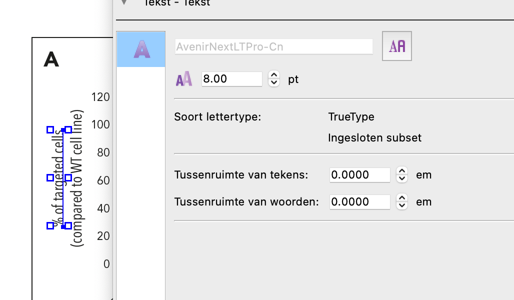
If you have Acrobat Pro, you can do the same thing by using its “Edit PDF” tool (only works on live type, not on anything that is an image only):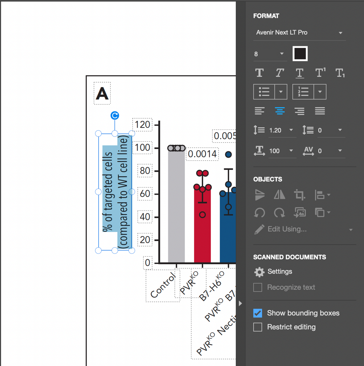
-
Need to identify this font for figure creation in scientific journal
Member Giz… replied to Member Zeb… 's topic in Font Identification
Enfocus Pitstop Pro https://www.enfocus.com/en -
Need to identify this font for figure creation in scientific journal
Member Bjø… replied to Member Zeb… 's topic in Font Identification
What kind of sorcery is that, mr. Gizzmo? "Blood" is a badass name for a scientific journal, BTW. 😎 -
Need to identify this font for figure creation in scientific journal
Member Giz… replied to Member Zeb… 's topic in Font Identification
-
Looking for a good alternative to Messenger with a broader character set
Member Bjø… replied to Member Bjø… 's topic in Font Identification
Oh, I’ve considered that for sure. I did it with Crafter (Crafter Nordic). I tried to be as respectful as possible about it, removing some glyphs to encourage people to get the original as well. https//torbo.no/crafter-nordic/ Did the same thing with Norwester, Franchise and Homestead as well, but they are not published anywhere (because I didn't bother to cripple them with removing special characters like I did with Crafter). Let’s see how this goes first. 😉👍 -

Need to identify this font for figure creation in scientific journal
Member Zeb… posted a topic in Font Identification
The scientific journal is called 'Blood'. The font is used in every figure. This is a link to a 'Blood' article (https://ashpublications.org/blood/article/143/15/1488/514990/CD155-PVR-determines-acute-myeloid-leukemia), the pdf is downloadable but a direct link to the pdf is not possible. Thanks a lot!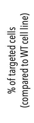
-
Member Zeb… joined the community
-

Looking for a good alternative to Messenger with a broader character set
Ralf Herrmann replied to Member Bjø… 's topic in Font Identification
Time to get into type design and add those letters. 😉 -
Looking for a good alternative to Messenger with a broader character set
Member Bjø… posted a topic in Font Identification
I just wonder if anybody know about an alternative to this delightful gem, but with a multilingual glyph-set. I really dig the rounded serifs, the quirky leg on the R and the overall beefiness of the typeface. The S has a delightful flow, in my honest opinon. Patricularly interested in ÆØÅ, as a Norwegian. Source: https://unblast.com/messenger-free-commercial-font/
-

17th Century English School hand lettering
Member Dan… replied to Member Dan… 's topic in Font Identification
Very nice suggestion. Thank you very much! -
.thumb.png.51dfb6cc71a655bbb607ec7a044b60c4.png)
17th Century English School hand lettering
Member Mis… replied to Member Dan… 's topic in Font Identification
Antiquarian Scribe is the most similar I can find. -
UK DBT 'Great Britain & Northern Ireland' typeface
Member Kev… replied to Member Ed… 's topic in Font Identification
Euclid Flex seems to be used for the last line, with the ampersand from stylistic set 12. With a bit of customization (the G), Euclid Flex Semibold is very close for GREAT as well. Euclid is used on their web site.- 1 reply
-
- 2
-

-
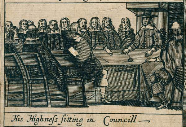
Hello, I am kindly asking your help to help me source a digital font that would be close to the lettering shown in the image attached. This is a woodcut print relating to the English Civil War, dated 1658. More info can be found here: https://www.bridgemanimages.com/en/english-school/the-protectoral-council-a-brief-chronology-of-the-most-remarkable-passages-1658-woodcut-print/woodcut-print/asset/1190757 Any suggestions are highly welcome. Thank you.
-
I need these fonts to create vector versions of a family's crest and logo.
Member Bjø… replied to Member Dur… 's topic in Font Identification
My pleasure. Sadly, I have no idea whatsoever about the other one. -

I need these fonts to create vector versions of a family's crest and logo.
Member Dur… replied to Member Dur… 's topic in Font Identification
Thank you very much, Bjørn! That sure takes care of my capitals. I won’t mark my question as “solved” just yet, as I'm still hoping to get an answer to the “blue text typeface” part of my question… It reminds me a bit of a ‘blunter’ Benguiat (but I tried it, and it didn’t do: too sharp, wrong ‘K’, wrong apostrophe, etc.) Thanks again! AOD
-
 Member kir… joined the community
 -
 Member thi… joined the community
 -
 Member sty… joined the community
 -
I need these fonts to create vector versions of a family's crest and logo.
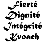
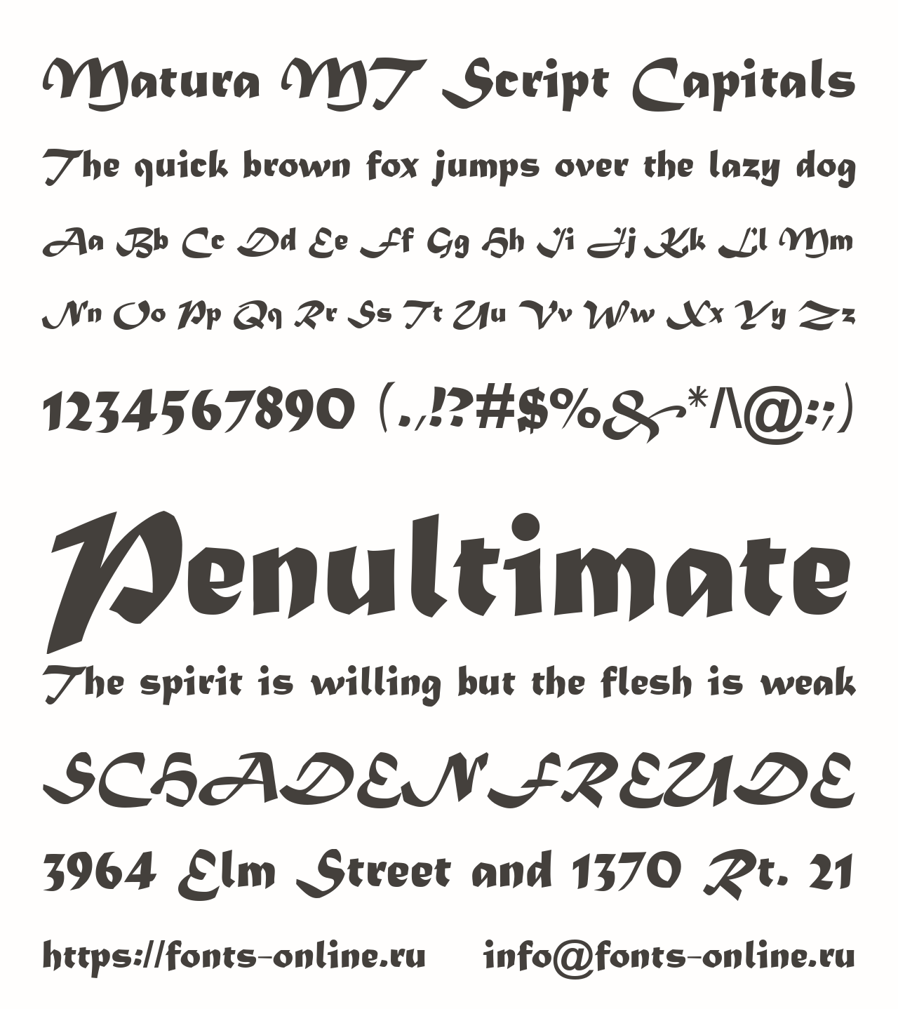
Member Bjø… replied to Member Dur… 's topic in Font Identification
It seems to be part of Matura MT Script Capitals. Please ignore the reference to the Russian font site. We do not endorse websites that paddle commercial fonts as freeware.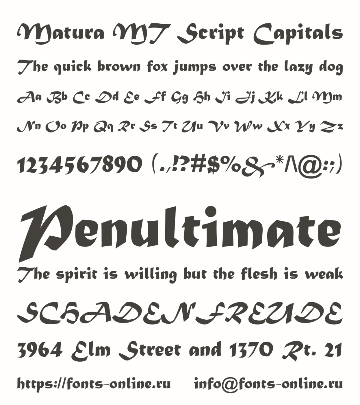
-
 Member buc… joined the community
 -
I need these fonts to create vector versions of a family's crest and logo.
Member Dur… posted a topic in Font Identification
I was asked to recreate these two familial items in a vector format : A family crest, and a logo. For the crest : I'll pentool my way through the banners, leaves and heraldic elements, but for the type, I'd rather use the original fonts, if a digital version exist. [Edit] I have now found what font was used for the lowercase: Matura MT Std Regular. Now I need to find the font used for the swash capitals, which doesn't seem to be part of Matura Standard. That said, I don't think the initials were hand-drawn, as the two capital 'D' are quite similar. For the logo : It looks like a rather basic typeface, but the lack of specific features, the small sample, circular setting, small size, and approximative printing make a precise identification rather difficult (Trying Identifont, I answered 'not sure' to most questions…) I suspect one will need to recognize it intuitively, by feeling. From the print quality shown in both scans, I'd be surprised if those fonts were less than 20 years old. If the font are free to download, that would be ideal, but, depending on the price, I might just make a purchase. As a last resort, if I can find a higher resolution sample that I could trace in Illustrator without too much guess work, that could work as well. Thank you very much, erudite typographers! Alain Omer Duranceau.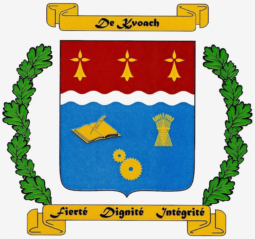

-

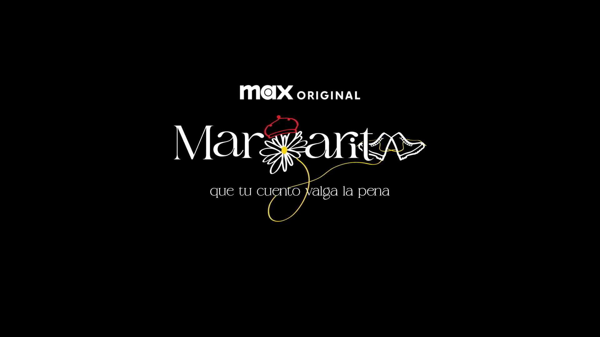
I am looking for the font used in the logo of a new MAX Margarita series.
Member 90s… posted a topic in Font Identification

-
Member Dur… joined the community
-

Looking for this font used in Looka
Member tsu… replied to Member tsu… 's topic in Font Identification
Thanksssss !!!! -
Looking for this font used in Looka
Member Mis… replied to Member tsu… 's topic in Font Identification
Looks like Esportica. -
Could you help me find the font used by Looka? I appreciate it in advance. Thank you.


-
Newsletter
Sign UpSubscribe to our monthly newsletter, which highlights recent and noteworthy content from the community.
-
New in Typography Weekly
-
Tell a friend
-
Article | See more …
-
Latest Videos | see more…
-
Latest Lists | see more…
-
Random Quote
I’ve come to think that Helvetica was never intended to be the cold, perfect, rational typeface it’s portrayed to be. There is a subtle warmth in the shapes that was lost over the years.


