


Two years ago I wrote an article with suggestions on how to design a Capital Sharp S (ẞ). Now that over 600 new type families with support for this new character have been released, I thought it would be a good time to review, how the type designers have drawn their Capital Sharp S. At first, I present the designs I consider most successful, grouped by their design principle. There is a convention in German of naming different designs of the uppercase and lowercase Sharp S by certain cities and I am following this convention.
Design “Dresden” with a an arc at the top left
This is the design most typefaces use. It works like a capitalized form of the lowercase character (ß). But in contrast to the lowercase design it has a diagonal stroke at the top right in order to differentiate it from the letter B.
Note how wide the character is in those examples. Designs that start from the lowercase ß can easily be too narrow, which might not be ideal among the other uppercase characters.
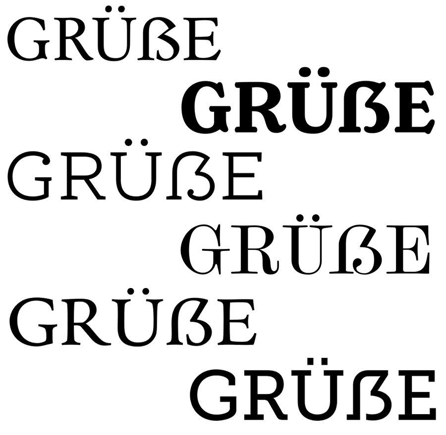 Typeface shown above: Espinoza Nova, Henriette, Ernestine, Scotch Modern, Andron, Museo Slab
Design “Dresden” with a corner at the top left
In the sample shown above, the arc on the top left is derived from the lowercase letter ß. Some designers think, that such an arc doesn’t work well within the Latin uppercase letters. So, to avoid this “lowercase look”, one could draw the top left of the Capital Sharp S as a corner. This works especially well with more geometric typefaces.
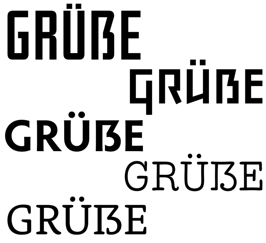
Typefaces shown above: Iwan Reschniev, Backstein, Hypatia Sans, LiebeRuth, Rooney
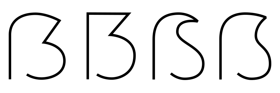
Design “Leipzig”
This design uses a clearly visible S as the right part of the Capital Sharp S. It works especially well with typefaces with a more calligraphic look. Very few typefaces use it, even though it is an interesting design that doesn’t cause any ambiguity problems.
Typefaces shown here: FF Oneleigh, Numina, FF Fontesque
Design “Zehlendorf”
This is a new approach that was introduced by Martin Wenzel and Jürgen Huber within their design for the corporate typeface of the German government. They named it “Zehlendorfer Form” after the district in Berlin where their office is located. Its design falls right between “Dresdner Form” and “Leipziger Form”. It doesn’t use a diagonal stroke in the top right part, but a narrow S-like arc. The white-space and width of the character makes it very distinct. Its very legible and cannot be mistaken for a B.
Conclusion
Up to this point in time, the design model “Dresden” is clearly the most popular one for designing the Capital Sharp S. But I would be happy to see more of the design model “Leipzig” (third letter) and “Zehlendorf” (fourth letter) in the future.
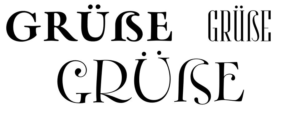
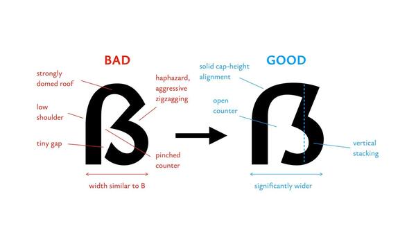
What not to do: A rounded top right segment
Not all Capital Sharp S designs are convincing yet. The problem I have seen most is to stick too close to the lowercase design of ß and give the Capital Sharp S a rounded top right part. This results in something like an “ugly B”, but cannot be read easily as sharp S (ẞ). I suggest this simple test: First, cover the left side of the letter. Now check: can the remaining right side be read as a B? Then the design should be improved.

What not to do: Using a double S design
I have seen several typefaces which just put SS in the slot for Capital Sharp S. This is like putting two independent V in the slot for W. Yes, there might be a historic, typographic or orthographic connection, but it’s still wrong. The Unicode slot U+1E9E was created for the character Capital Sharp S. A W is not the same as VV and ẞ is not the same as SS. If you don’t like the idea of a Capital Sharp S, you better not use U+1E9E at all. But don’t put a double S in it. In the same vein, don’t try to create an uppercase SS ligature as Capital Sharp S. The whole point of the Capital sharp S is, that ß and ss represent a different pronunciation nowadays and without ẞ this difference cannot be maintained in uppercase-only typesetting. So an SS ligature doesn’t solve anything. It is just read as SS and not as a representation of the sharp S character.

-
 1
1


Recommended Comments
Create an account or sign in to comment
You need to be a member in order to leave a comment
Create an account
Sign up for a new account in our community. It's easy!
Register a new accountSign in
Already have an account? Sign in here.
Sign In Now