

As a designer, I am interested in how certain solutions connect to the user. It is amazing to see how different solutions can change feelings, resulting in different ways of interaction. In consequence, in the type]media master I knew I wanted to design a typeface that would bring a new experience to the user in a specific area.
As I am coming from Portugal, the creation of Guia was very much influenced by my personal visual memory: It is very common to find diverse guidance systems in different Portuguese cities. They differ in material, technique and lettering. Those differences are connected with the individual cities. For example, if a city has a granite tradition, it is most probable to find street name signs made out of granite, with the letters carved into the stone. There are also signs in marble or metal, but most commonly, painted tiles can be seen, as all of Portugal has a great tile tradition. Even though, different executions can be found yet again within the technique of painted tiles. Those street plaques appear to be there since forever, and they have become part of the history of the city.
I know the portuguese sign tradition from my own experience, and I was visually supported by many images on Flickr. As I did not have the possibility to make a deeper research in person, online archives of photos were of great help.
Street sign made of stone in Aveiro, Portugal. Photo by Filipa Cruz, http://www.flickr.com/photos/sufragista/3230191056/

Enamel street sign in Tondela, Portugal. Photo by Filipa Cruz http://www.flickr.com/photos/sufragista/4570775315

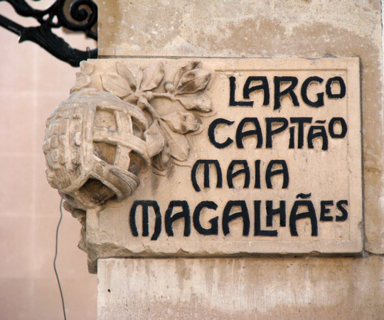
Street sign of painted tiles in Évora, Portugal
Inspiration sources for getting the feeling right were also found studying books on signage and lettering, such as Nicolete Gray’s “Lettering on Buildings” and Jock Kinner’s “Words and buildings: The art and practice of public lettering”. Their research images showed many manually-produced signs, which all had a strong appeal to me. The signs’ purpose was mostly illustrating and matching a place, rather than providing a coherent appearance, or offering greatest readability.
All those impressions helped me to get into an overall mood to create a typeface which would be personal, but at the same time useful and usable.
In Portugal, almost no standardizations for signage systems exist, except for the use of the typeface “Transport” for transit guidance. Today, when new pedestrian sign systems are being created, they are mostly designed using rational sans serifs, being totally out of context within the sign lettering tradition. There are no ties with the surrounding architecture or connections to the city history.
I felt there was a gap between the charming lettering of old street name plaques and current signage systems for pedestrian guidance. This area I decided to work on.
I do understand that the complexity of the cities nowadays is not the same as it was 100 years ago; not even 20 years ago. Hence, new solutions are required in order to guide persons around a city. What I wanted to experiment with, was to bring back some of the lettering-feel to an up-to-date wayfinding typeface. Ideally, new pedestrian signage systems could consequently transmit more of a humane feeling than they are doing right now.
The different styles of Guia and their features.
Guia shall provide multiple possibilities for the sign creator of today, yet retain a strong human touch, in order to make the user comfortable and welcome with the new place that he is about to discover.
For this reason, Guia is based on the movement of the broad-nib pen. In my research I found out that this particular way of creating letters results in pleasant shapes and it has advantages in readability in comparison to other contrast models. Contrast-less typefaces mostly have the characteristic of being uniform; so they do not evoke a feeling of their own.
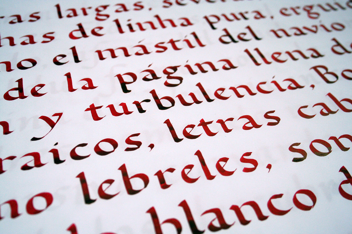
Calligraphy sheet produced during the design process of Guia
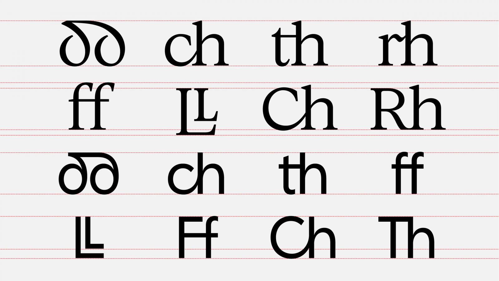
Many decisions were taken bearing a foreign reader in mind. If a foreigner arrives at a new place, he or she does not have the word-images of street names etc. in mind. In consequence, reading succeeds letter by letter. Therefore, the spacing of Guia is relatively wide. For the same reason, it does not have any ligatures. Persons which are not into type design or typography might just decipher a ligature as a strange character they do not know.
Guia does not have ligatures.
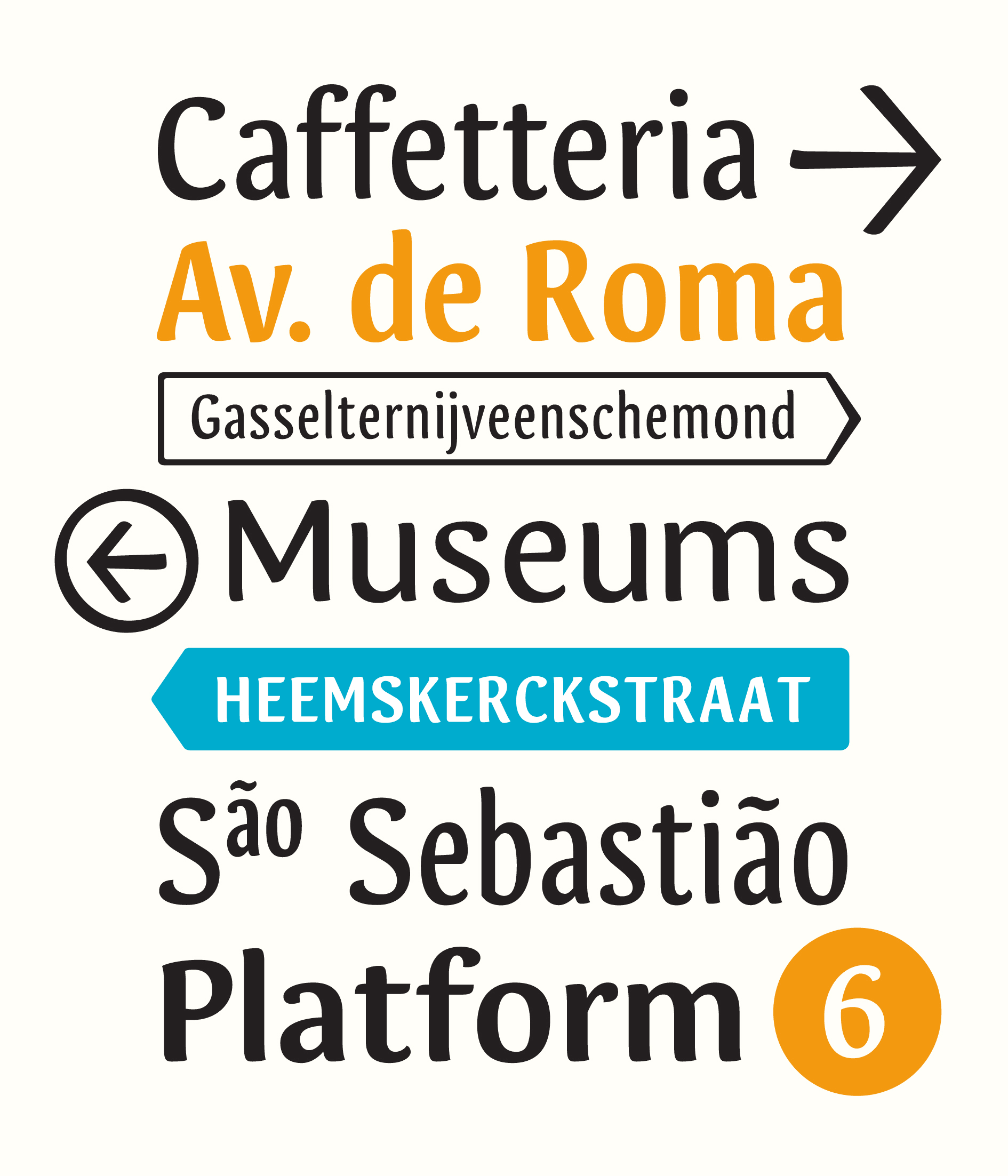
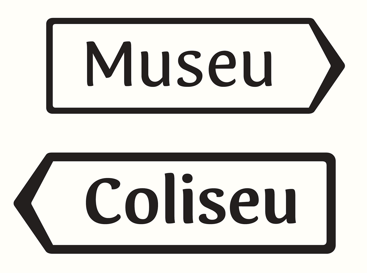
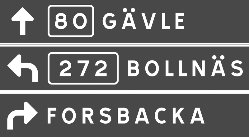
To make the typeface really fit for signage purposes, various OpenType features and additions were implemented. For instance, any word can be converted into a pointing sign, just by selecting a stylistic set. Also, different kinds of arrows exist; to work in a mixed or all-cap setting. Circled arrows provide the possibility of stand-alone usage.
In many languages such as Portuguese, Spanish and French, long words are abbreviated using superscript letters. For the purpose, Guia provides the whole alphabet in a superscript feature.
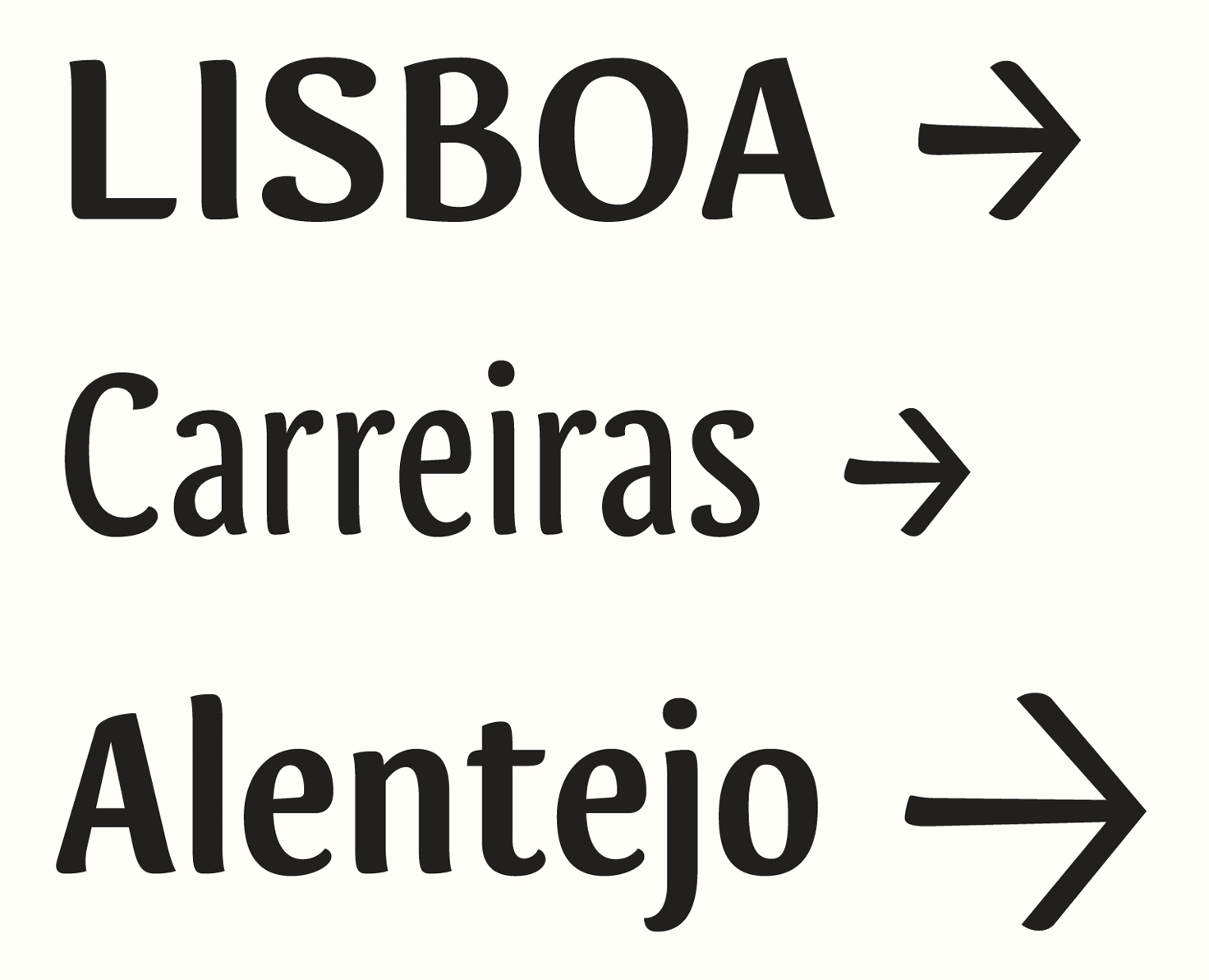
The arrows of Guia correspond to the cap-height, x-height and ascender/descender height.
With the help of OpenType, any word can be transformed into a sign
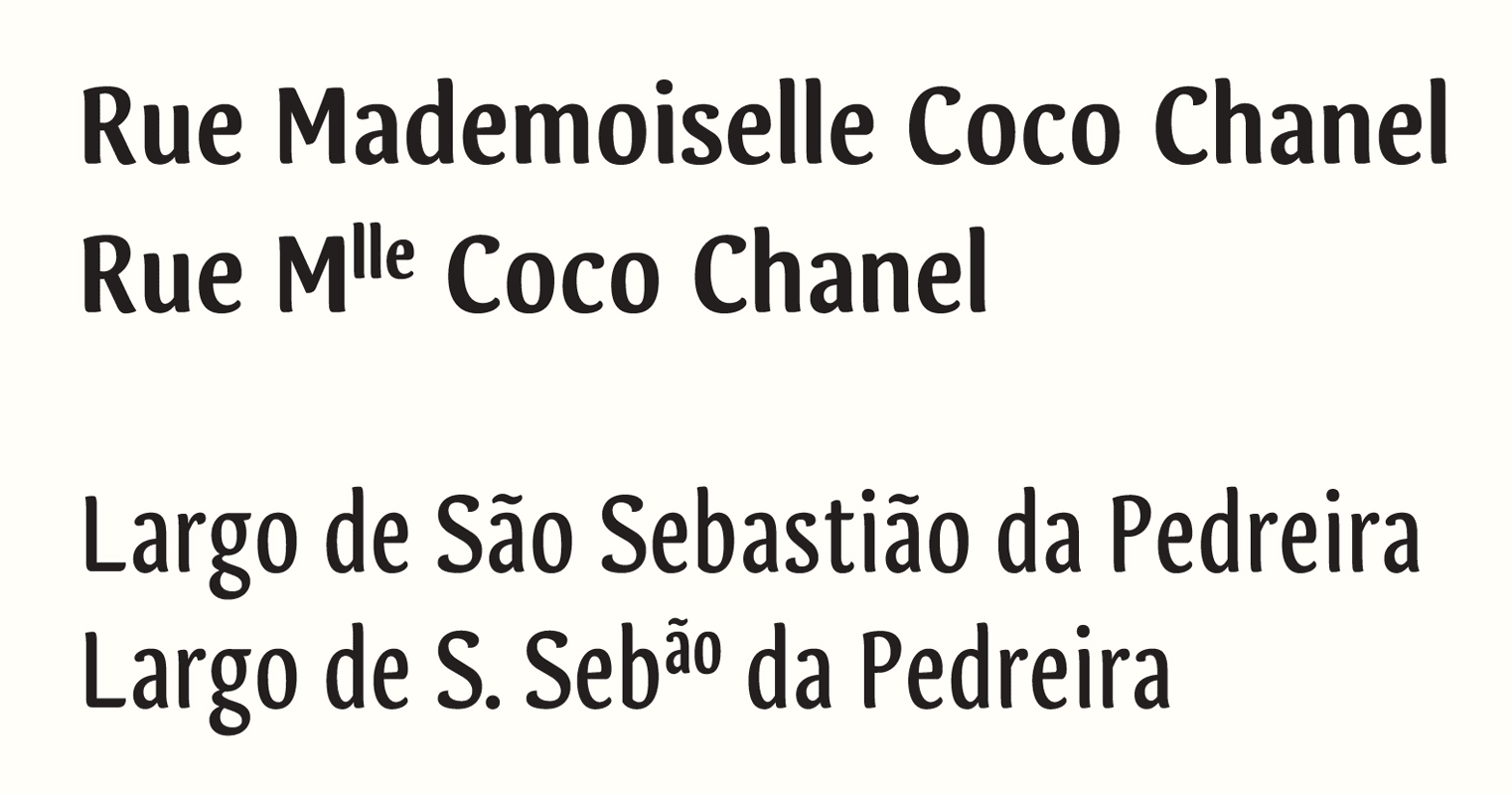
Guia contains the whole alphabet also in superior letters.
In all those details, I was also focusing on the broad-nib contrast. Even the arrows are based on the construction model, just as the circles around them. Those details might be negligible for an outsider, but I think they make the whole typeface more coherent in itself.
Another area I focused on concerns the recognition of the individual letters. Therefore, cap- and ascender-heights are significantly different, in order to make their distinction easier. Stem joints have been adjusted, to make the whole letter shape sharper, avoiding visual clogging. All those corrections lead to a better legibility, which I find to be essential for a signage typeface.
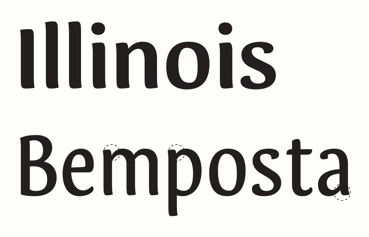
Different height of caps and ascenders. Adjusted stem joints avoid visual clogging.
Guia is composed by a Regular, Bold, Condensed, Bold Condensed and Extra Condensed style — yet this selection might not be absolute. It is still an ongoing project. I have learned a lot during its creation, and I am sure that many things will change before the typeface is ready to be released. A next step will be designing a set of pictograms and symbols; and I am curious how to get the broad nib feeling into them.
I am very glad I had the space and time to do this experiment, and I thank all the type]media teachers for being open to my ideas and for all their advice and support.
Tânia Raposo http://www.taniaraposo.com
-
 1
1


Recommended Comments
There are no comments to display.
Create an account or sign in to comment
You need to be a member in order to leave a comment
Create an account
Sign up for a new account in our community. It's easy!
Register a new accountSign in
Already have an account? Sign in here.
Sign In Now