


As you probably know, our eyes don’t move continuously along a line of text. Instead we perform so-called saccades, fast eye movements from one word or phrase to the next. This is caused by the fact, that only the fovea—the central part of our retina—allows a sharp and detailed visual perception.

In a typical reading situation just four to five letters around the fixation point are seen with 100% acuity. Still, an experienced reader will also gather information in advance from outside the fovea. This is called peripheral vision and while reading this can include up to 15 letters, which unfortunately are too blurred and distorted to be read in a true sense.
The Word Shape or “Bouma”
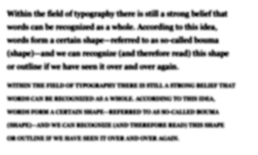
Within the field of typography there is still a strong belief that words can be recognized as a whole. According to this idea, words form a certain shape—referred to as so-called bouma (shape)—and we can recognize (and therefore read) this shape or outline if we have seen it over and over again. Even though this has never been proved nor explained in detail, it has been widely accepted as common knowledge in the fields of graphic design and typography. But evidence from the last 20 years of work in cognitive psychology indicate that we use the letters within a word to recognize a word.[1] For a detailed review of scientific studies in this area check out the paper of psychologist Kevin Larson, which is available online and was printed in issue 13 of Typo magazine. Here I am just quoting his conclusion: “Word shape is no longer a viable model of word recognition. The bulk of scientific evidence says that we recognize a word’s component letters, then use that visual information to recognize a word.”
Case closed? Not quite! The discussion around word shapes is also a discussion around the question whether or not mixed-case type setting is superior to uppercase type setting. And this is still a controversial topic.
Mixed case vs. uppercase
So let’s look again at the theory of word shapes. Even the supporters of this theory hardly offer any detailed descriptions or models how reading words through word shapes should actually work. I could think of two scenarios:
- the existence of ascenders and descenders makes words readable on their own
- a detailed envelope around the letters makes words readable on their own
In the first scenario, the existence of ascenders and descenders forms one of three basic shapes. The distribution of theses three shapes could make words readable. So, does it work?
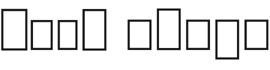
I guess not. Or to quote Paul Arthur[2]: “The average English word is five or six characters long and to think that each of these tens of thousands of five- or six-letter words has its own distinctive shape is nonsense.“ Way too many words have the same distribution of characters with ascenders, descenders and characters without neither of those. And almost all uppercase characters don’t have any ascenders or descenders at all. So how are they even readably if word shape is so important? In fact, in a study Miles Tinker[3] found mixed-case text just 12 % percent more efficient (quicker to read) than uppercase text. That’s a pretty weak result for anyone believing that word shapes are a fundamental concept of legibility. Or think of typing errors or scrambled letters like in this famous example: “Aoccdrnig to a rscheearch at Cmabrigde Uinervtisy …” The known word shapes are complete destroyed but an experienced reader can still read such texts without much problems.
In the second scenario we could try to lay the outline closer around the characters …
Doesn’t help much either, does it? We could put it closer and closer around the characters until we reach a point, where we might actually have chance to guess the letters. But then we would end up with a detailed image of our word shape. We might actually learn this image and recognize it again later. But such a detailed image can easily be broken and become unrecognizable if we just changed the tracking a little bit or switched to a different typeface. But the power of human reading is based on the fact, that is not based on detailed images but combined features. Just think of handwriting: Even the same character looks different every time it is written and so would detailed word shapes. Therefore if abstract word shapes are not readable (scenario 1) and detailed word shapes as images that appear over and over again in the same way are just not realistic (scenario 2), we can only come to the conclusion, that word shapes cannot be a fundamental principle of reading.
Now you might tend a little bit more to the (parallel) letter recognition model that scientist propose, but you might still think, that word shapes somehow support reading. (At least that’s the usual response I get, when I talk about this topic.) But that’s like the catholic church saying to science “Well, now that you found all these proofs of evolution, let’s agree there is probably evolution and creation.”
If we read single letters instead of whole words there seems to be no room for anything that we should gain from word shapes. In fact, we might even argue, that mixed-case text might not be in any way better than uppercase text. So not surprisingly, Kevin Larson explains the fact that uppercase text is read slightly slower this way: “This is entirely a practice effect. Most readers spend the bulk of their time reading lowercase text and are therefore more proficient at it. When readers are forced to read large quantities of uppercase text, their reading speed will eventually increase to the rate of lowercase text.”
But why is there not a single novel written in uppercase text, when mixed-case and uppercase text setting are supposed to be so similar? Why has the practice of writing mixed-case even evolved, considering uppercase writing was there first? Why are even small paragraphs of uppercase texts so unpleasant to read? Why is it that graphic designers and typographers insist that mixed-case is more legible than uppercase?
The value of mixed-case typesetting
To answer the above questions we need to consider the context we are talking about. So let’s look at my Onion-Layer Model of Legibility again:
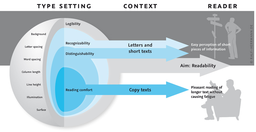
The upper half (grey background) deals with single letters and words. Here it is all about a legible text setting and the recognizability and distinguishability of letters. In this area uppercase letters can perform indeed very well. They have a very simple and distinguishable letter skeleton, without leaving much room ambiguity. Lowercase letters might be more troublesome in this regard. Just think of the similar outer shapes of e, o and one-storey a, which differences can easily blur together under bad viewing conditions. But in return, uppercase letters need much more space, and this is often ignored in scientific studies that just compare the legibility of single letters flashed on a computer screen. If the space is limited, for example on a sign, the uppercase text would need to be set smaller and the legibility would therefore be decreased. But when we talk about short pieces of information like headlines in a magazine or on a billboard, there is actually nothing wrong with uppercase text. Both uppercase and letters have their pros and cons and I consider it a myth to say that mixed-case setting is more legible per se.
But if we look at the lower half of our model (white background) the rules do change. Here it is all about the reading comfort of longer texts and this is an area where uppercase text will fail. It is no coincidence, that mixed-case typesetting, word spacing and modern punctuation all emerged from setting long texts (usually in books), because they all aid the reading comfort. When reading longer texts it not just about recognizing single letters one by one. Peripheral vision becomes an important factor and with it the vague and blurred information we can gather from it.
Just look at the following simulation. The same paragraph (Georgia, standard tracking) is set in mixed-case and in uppercase and the latter was scaled down so it takes up roughly as much space as the mixed-case text. From which text can you pick up more information?
The mixed-case text clearly offers much more information. Even though the single letters are not clearly recognizable we can guess pretty much all the words of the whole paragraph. It is also obvious that ascenders and descenders play an important role in this regard. Just look at the word typography/TYPOGRAPHY in the first line of each paragraph. In the first paragraph the letters that only use the space between the baseline and the x-height (o, a and r) are not clearly visible but the letters with ascenders or descenders leave no doubt, that it actually says “typography”. So does this mean we have recognized a stored image of the word shape of the word “typography”? No. It means that ascenders and descenders helped us to guess these single letters and consequently guess the whole word correctly. (Or to be more precise: Both things happen rather simultaneously and support each other.) I would love to see a scientific study which analyzes the role of ascenders and descenders in mixed-case reading, for example by simply varying the amount of ascenders in a reading test.
The uppercase paragraph on the other hand doesn’t provide much information. Guessing the words is much harder or even impossible and the only thing we can clearly see, is the space between the words, even though it is also obvious that the single words appear much more clearly and separated in the mixed-case paragraph. And that’s what makes uppercase text so unpleasant to read. There is less information to pick up from outside the fovea and this makes reading more strenuous.
So we should admit that science has smashed our lovely idea of reading words as a whole. But still, that does not mean that we need to abandon our typographic principles that have evolved over centuries. It don’t think it is true, that uppercase letters are intrinsically less legible—quite the contrary! But there are many situations where mixed-case text is still the better choice. For example, for longer texts where peripheral vision is important and also when text is supposed to be read under difficult viewing conditions like signage, where the text is supposed to read from a distance, might be lit or reflective and so on. In such situations, ascenders and descenders will support reading, even though not in the sense of whole word shapes, but in the sense of single letter recognition.
Footnotes
- ^ Kevin Larson, 2004, The Science of Word Recognition
- ^ Arthur & Passini; 1992; Wayfinding, People, Signs, and Architecture, McGraw-Hill Book Company
- ^ Tinker, Miles; 1963; Legibility in Print. Ames, Iowa: Iowa State University Press
-
 1
1


Recommended Comments
There are no comments to display.
Create an account or sign in to comment
You need to be a member in order to leave a comment
Create an account
Sign up for a new account in our community. It's easy!
Register a new accountSign in
Already have an account? Sign in here.
Sign In Now