


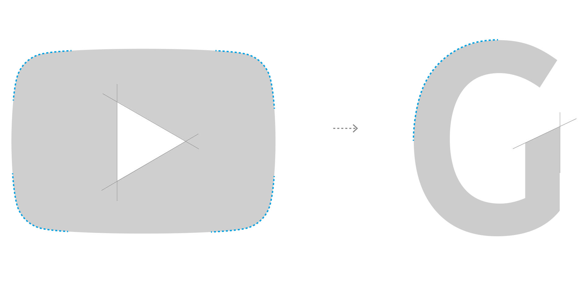
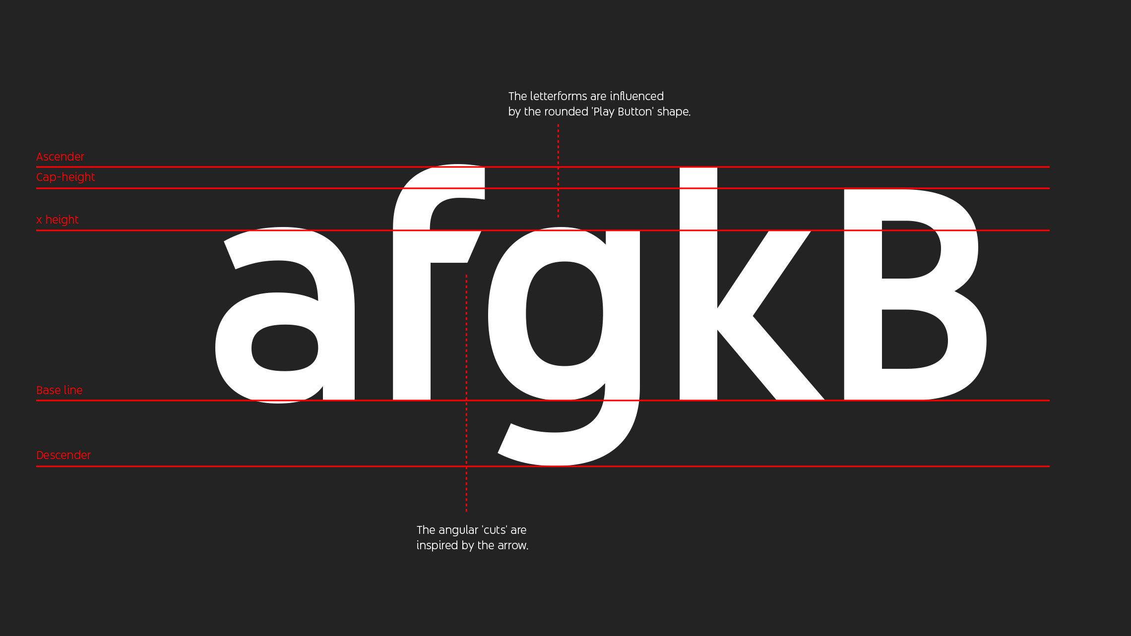
YouTube Sans was created by Saffron in partnership with Letterjuice in Barcelona and URW++ in Hamburg. Unfortunately, Saffron’s presentation page for the project rather feels like a sales pitch—or a parody of such presentations. We see typical clichés like adding construction circles to the finished artwork. Almost funny are the following images, that honestly want to draw a connection between the rounded YouTube play button and the execution of the YouTube Sans letters, such as the G. You know that this would be true for the vast majority of typefaces, right? And the tension of the specific arcs isn’t even similar.
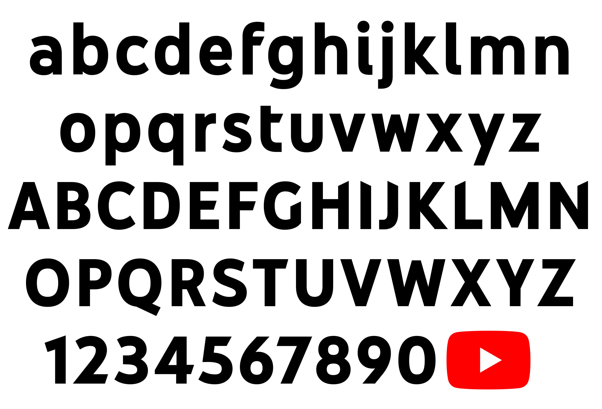
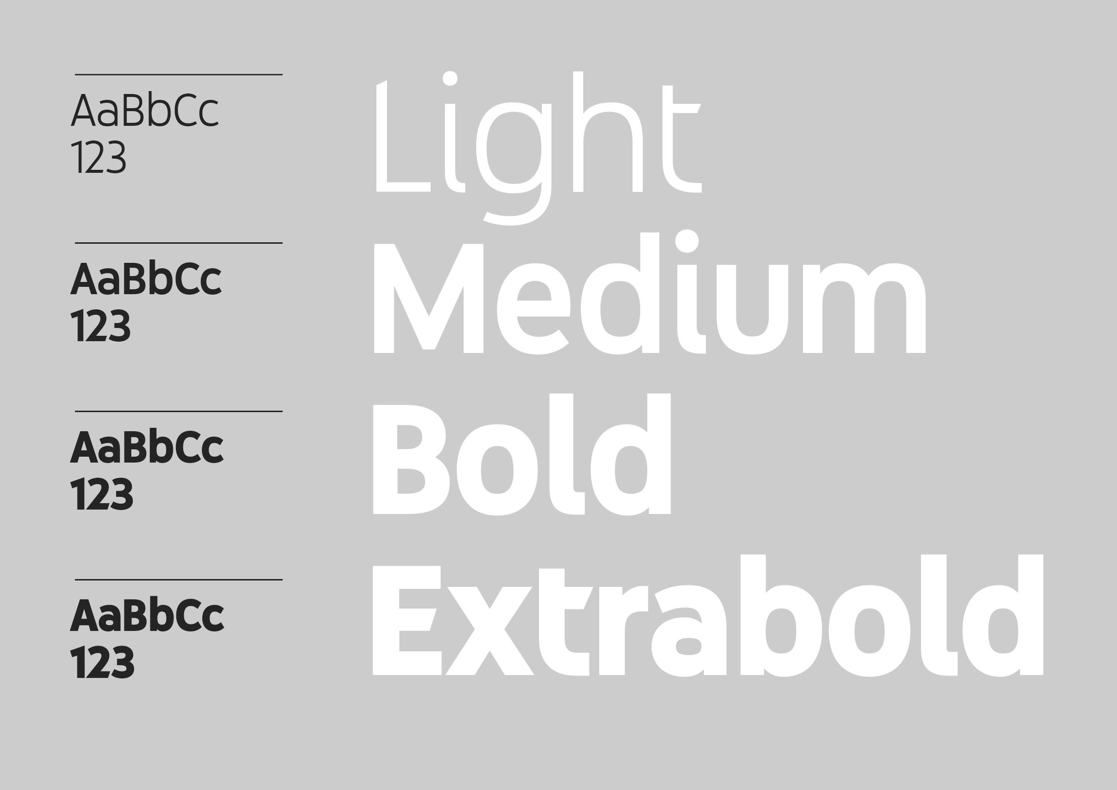
But all this marketing talk aside, what about the type design itself? Currently YouTube Sans comes in several upright weights. The overall look of the design isn’t anything spectacular. A modern sans-serif design leaning towards geometric designs, which are very popular currently. So its not really a bold choice, but the execution does have a subtle uniqueness, which could certainly be sufficient to serve the branding requirements of a custom font.
But type designers have critizized the execution of the design.
Both looking at the details, like how arcs and stems meet, as well as how letters work together, the design doesn’t feel as consistent and professional as it could be. Its easy to point to successful retail typefaces in the same general sans-serif category with much better execution and visual consistency.
But the biggest flaw of the design is certainly the use of another branding cliché: randomly cutting off corners of letters. A trend so big, that has its own Tumblr feed as a “hall of shame”.
Yes, its lazy and there is never an acceptable justification for it. Just because its so easy to do in your vector design app, doesn’t make it desirable. Stroke endings can take on many different shapes, but in the end (or on the end in this case), consistency is key. It goes back to the roots of typefaces in writing, where the stroke endings were a result of the writing tool and the angle one would hold this tool. Rounding or cutting off corners arbitrarily can only lead to an inconsistent and distracting appearance. Explaining it through the angles of the YouTube play button triangle might be a nice gimmick in a pitch, but it doesn’t do anything useful in the real-world use of the type family.
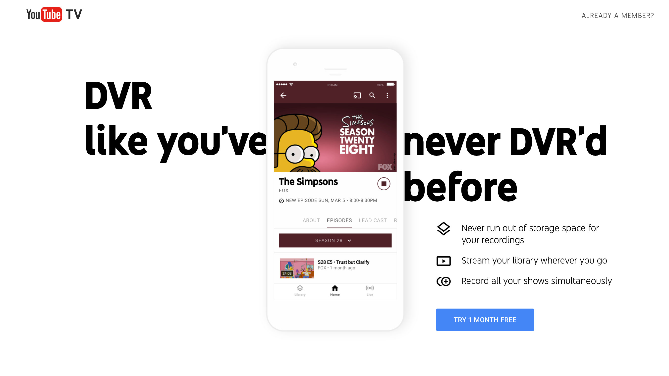
YouTube Sans on the YouTube TV welcome page
You can see YouTube Sans in use here. The bold headlines do their job quite nicely. This is where your custom (display) font can shine. The legibility of the smaller text isn’t as good though. Google’s Roboto, recently rolled out on youtube.com works much better in such cases. It will be interesting to see how these different typefaces will be used and possibly combined in the future.
What’s your opinion on YouTube Sans? Feel free to share your thoughts in the comment section below.
Links:
-
 3
3


Recommended Comments
There are no comments to display.
Create an account or sign in to comment
You need to be a member in order to leave a comment
Create an account
Sign up for a new account in our community. It's easy!
Register a new accountSign in
Already have an account? Sign in here.
Sign In Now