


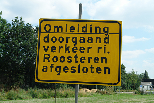
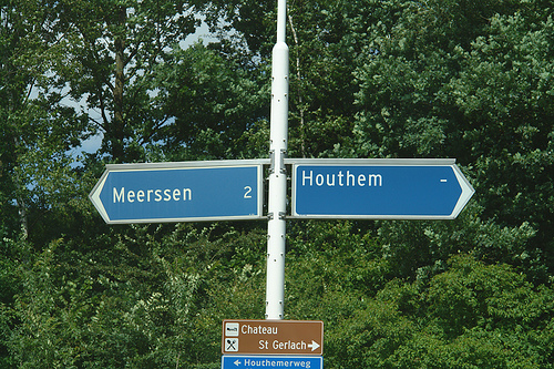
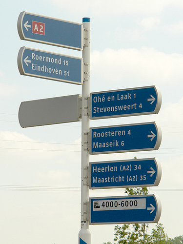
The Netherlands are a special case when it comes to traffic signs… Until recently the organization being in charge of the traffic signs was the ANWB. It was founded as a Dutch bikers(!) society (“Algemeene Nederlandsche Wielrijders Bond”) in 1883 and later became the royal tourist society. In my opinion these roots are still visible in the design of the traffic signs. On local roads you will see a lot of these sign posts, which are certainly based on the old finger-post signs, used long before the invention of the automobile.
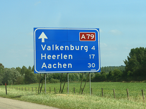
The typeface used since the 1960s is called ANWB-Ee (also RWS-Ee) and it is based on FHWA series E (Modified) from the United States. A condensed version (ANWB-Cc) is also available and it is based on the FHWA series C design.
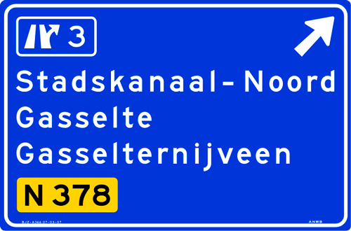
In the late 1990s Gerard Unger was commissioned to design a new typeface called ANWB-Uu. (source: designworkplan.com)

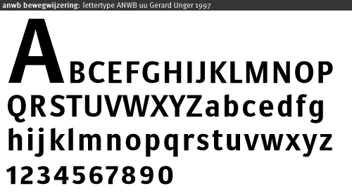
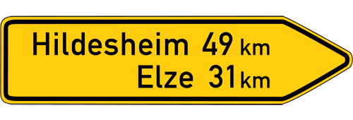
Mr. Unger's task was to create a font which needs less space to fit the text on the smaller fixed-size direction signs. He achieved this goal. But in my opinion the the briefing itself was wrong. The size of a direction sign must be based on the content, not the other way around! What do you do, if you need to set Gasselterboerveenschemond on such a sign? On top of that, I found these sign posts often mounted at the most unfortunate places, for example behind traffic lights or far away and too high above the ground in the middle of a large roundabout, impossible to read. By contrast on a local direction sign in Germany the type size is based on the maximum speed of the traffic at this point and the width of the sign will grow according to the content.
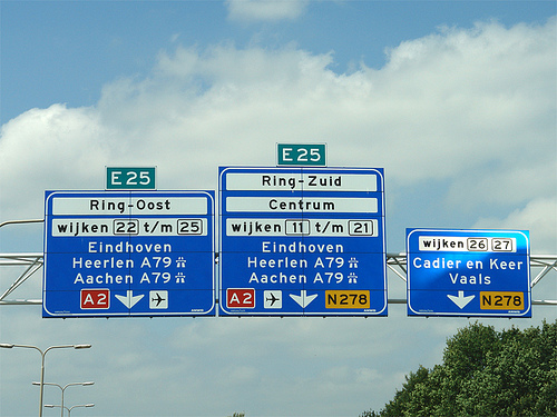
Recently the ANWB-Uu typeface is also appearing on the larger motorway (“autosnelwegen”) signs in the Netherlands, but using only a rather condensed typeface on large signs is usually not appropriate. It would at least need a corresponding version that is not condensed and can be used whenever there is enough space.

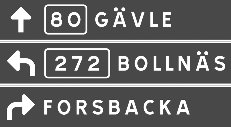
The layout of the signs could also be improved. The signs sometimes appear way too crammed …
… or simple but pretty ineffective:


Recommended Comments
There are no comments to display.
Create an account or sign in to comment
You need to be a member in order to leave a comment
Create an account
Sign up for a new account in our community. It's easy!
Register a new accountSign in
Already have an account? Sign in here.
Sign In Now