Jump to content
The latest typography links delivered straight to your inbox.
  • Type Directory

    2,863 views

    (1 review)

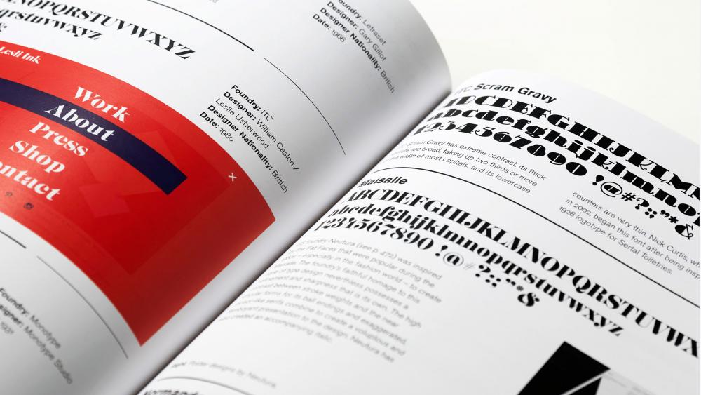
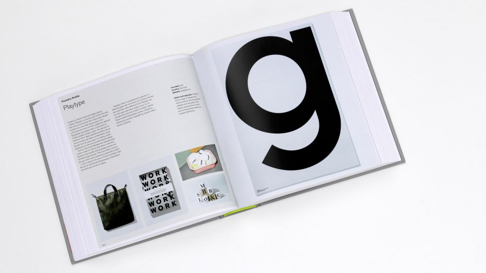
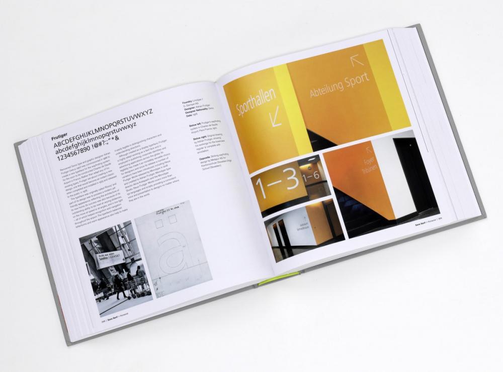
    Type Directory shows 1,500 typefaces are organized by category – Serif, Sans Serif, Display, Script and Symbols & Dingbats – and subsequently arranged by recognized sub-categories. This allows the reader to make a direct comparison of typefaces with a similar appearance, thus facilitating a deeper understanding of the design and selection process. A visual celebration of the craft, innovation and beauty of these letterforms is presented throughout, from classic typefaces like Garamond, Bodoni and Times through to the contemporary Bliss, Gotham and Meta.

    Author Peter Dawson co-founded his design practice, Grade, in 2000. He is a fellow and a former chair and board member of the International Society of Typographic Designers, and has also acted as a visiting typography lecturer at a number of universities. 

    2019
    by: Peter Dawson
    Publisher: Thames & Hudson
    ISBN: 9780500241547
    Amazon search
    Abebook search


    User Feedback

    Create an account or sign in to leave a review

    You need to be a member in order to leave a review

    Create an account

    Sign up for a new account in our community. It's easy!

    Register a new account

    Sign in

    Already have an account? Sign in here.

    Sign In Now

    H James Lucas

       1 of 1 member found this review helpful 1 / 1 member

    Whether approached as a serious directory or an inspiration piece, this book fails at virtually all levels, from its content to its design to its physical construction.

    The content is dominated by entries for 1,800 typefaces, the vast majority of which are presented with so little information or depiction that they’re nearly impossible to comprehend in a meaningful way. An entry for an entire type family includes a sample of the 26‐letter English alphabet in upper‐ and lowercase, the 10 numerals, and a smattering of basic punctuation—at a single size, in a single weight, without italics. Release history is conveyed deftly (with dates for both metal original and digital revival when applicable), but features of the family—weights; supported languages; the presence of small caps, superscript, or tabular numerals—are mentioned only if space permits in the 50-words allotted to commentary. Anything resembling a useful critique—such as an appraisal of the kerning quality—is entirely absent.

    The sequencing of entries further diminishes the chance of Type Directory being functional. Each is placed alphabetically within its determined style—and no exception is made for a typeface prefixed with its foundry name. When my first perusal brought me to a page with Baskerville Classico (1995), Baskerville LT (1923), and Baskerville No 2 (1980), I was more than a little surprised that ITC’s ubiquitous rendition was absent, but the next day I found that, no, it wasn’t absent but instead sorted under ‘I’ for ITC New Baskerville. (Actually absent though, is Storm Type’s wonderful Baskerville Original.) Having had my fill of Transitional serifs, I paged onward for Rational serifs only to find myself staring at Helvetica. Why? Because the styles are alphabetized too! Rational serifs are thus sorted under ‘M’ for “Modern / Didone” and not found subsequent to Transitional despite their being the very thing that the so‑called Transitional types were transitioning into.

    The hundreds of pages of plain directory entries are studded with illustrated entries for typefaces of greater fame and spotlight features on big‐name designers and foundries. The illustrations are well selected, but the text is rife with questionable statements (the essay on Didot claims that advances in paper technology somehow led to improvements in letter cutting) and general sullying of the English language (“more funding was achieved”).

    I bought the book unseen due to the implied endorsement of Tobias Frere‐Jones, who wrote the foreword. His contribution though, is a wan 400‐word nothing, as if he realized too late the nature of the horse he had hitched himself to and fulfilled his obligation in the most expeditious manner. Perhaps the only good news, if we can call it that, is that the binding seems to be as poor as anything else in the book (mine began gaping in places after only a couple hours of perusal), so it seems quite possible that The Essential Type Directory may do us the courtesy of quietly vanishing itself within a few years.

    Link to review
    Share on other sites


The type specimens of the world in one database
×
×
  • Create New...

Important Information

We are placing functional cookies on your device to help make this website better.