Join our typography community!
A friendly online forum for all questions around fonts and typography. Get answers to all your typography questions or help others with your expertise.
Typography Feed (complete)
- Past hour
-
ibbrid joined the community
- Today
-
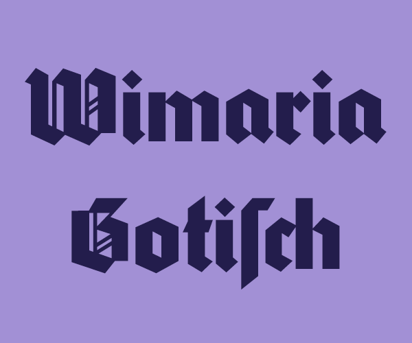
The letterpress original is called Koch-Antiqua ☞ https://fontsinuse.com/typefaces/4646/koch-antiqua
-
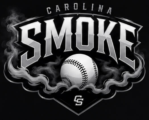
My friends son created this in using ai and I was hoping I could find the actual font so I can recreate it to have uniforms made.
-
Danstheeman joined the community
- Yesterday
-
Sorry, not finding a match. It may be custom, or AI generated (I’m guessing the latter, as the monogram C on the full image is not a match to the C of the logotype and isn’t matching to a typeface either, and given the “AI modified” tag in the lower left of the image). AI doesn’t reach out and pick a typeface, it samples thousands of designs and creates an amalgam—a Frankenfont, if you will. Similar: Brand, Romance Delighter, Daisy Lau, Caden Love, Rosemarrye, Blackbike, Australian Mirages Brand is the closest, in my opinion.
-
It's similar in some ways to Kuenstler 165 but i am unfamiliar with mid-century foundries from this area

.thumb.jpg.f7d56f4fb7403934fb4a855916cd7bce.jpg)
-
C'mon, maybe a little close...
-
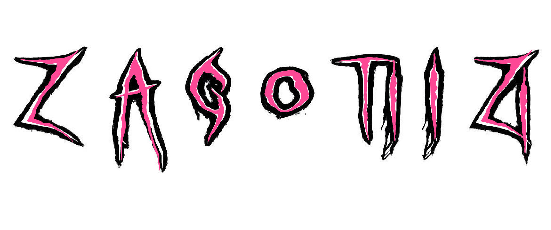
I have found similar fonts but am looking to identify this exact font. I came across this on pintereste while researching fonts for a branding project I am working on. https://pin.it/1zAQ6rUUk
-
StevieG joined the community
-
edvard.lindstrom joined the community
- Last week
-
HoopH0p joined the community
-
xing joined the community
-
Very similar, but not a match—not narrow enough overall, crossbar on the F is too wide and not tall enough, higher-waisted R (and less-curved foot on the R), top of A isn’t flat enough. But definitely mimics the vibe:
-
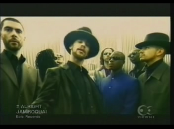
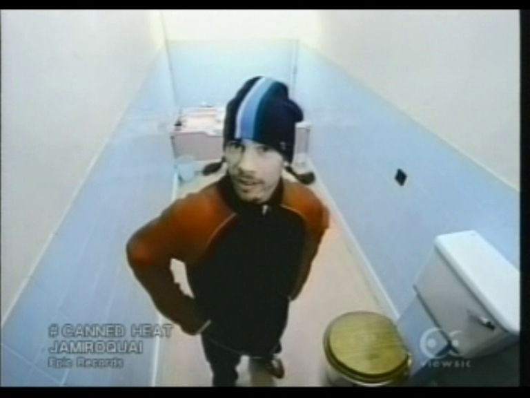
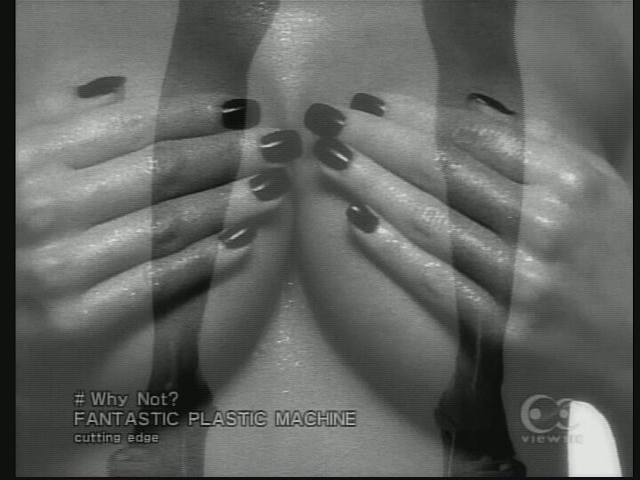
Hello, I'm trying to identify the font used as the music identifier on Viewsic, a Japanese cable network. Here some screenshots with the song name, artist and record label. I'm assuming they just used an already-made font instead of getting an already-commissioned font, especially since it's a Japanese network. Thanks for any help! :D
-
woah!, thanks @Kevin Thompson , amazing works, been looking for this for a while :D
-
WaterModder joined the community
-
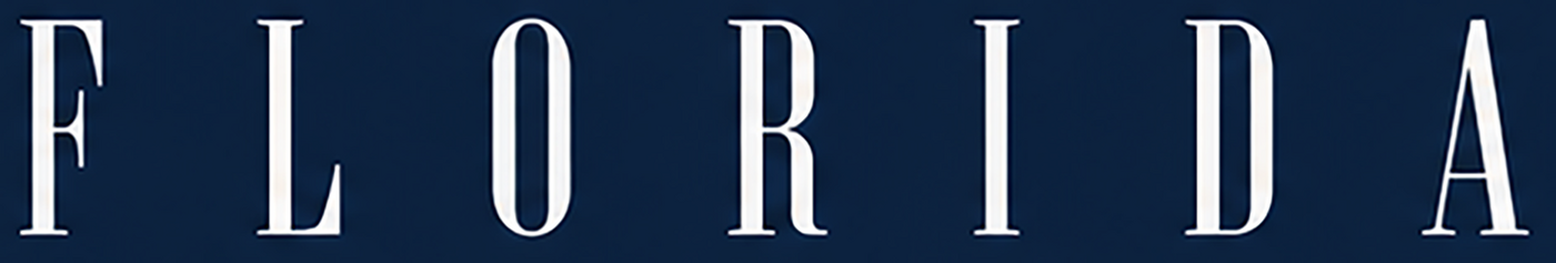
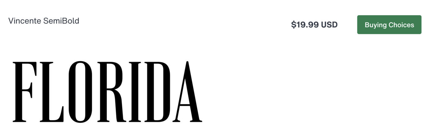
"Florida" looks like Vincente: https://www.myfonts.com/collections/vincente-font-dharma-type
-
Not even close.
-
I think I'll end up redrawing the Cape font so I marked this as solved. Thanks again! I'll be hanging around to help out where I can.
-
Excellent; I think that is the closest we're going to get. Thank you so much!
-
With a bit of surgery to the top of the A, Rawnest comes close for Florida (but isn't a great match for the smaller full alphabet that supposedly is the same typeface).
-
You Work for Them announced earlier this week that their catalog is now available as a connector in Claude, and other foundries or design clearinghouses may follow.
-
Thank you for trying. I was afraid of that. You're right; I should have mentioned that in my original post.
-
Ah, that would have been helpful information to know from the get go. Unfortunately, no—most AI-generated type is an amalgam of many different sources. Most AI engines are not reaching out and pulling in an existing typeface, they are generating something new from multiple sources. Frankenfonts, if you will. I could find no exact match to Cape. Similar: Reynaldista, Silent Noise Font Duo Script Regular While FLORIDA resembles many typefaces (like Spire, Pall Mall, and Niagara), I also could not find a match.
-
I think the branding document I'm going off of was generated using AI, if that helps anybody. I'm hoping that the fonts exist.
-
Looks like the alphabet sample is Great Vibes, thanks. However, I'm looking for the script in the word Cape. Sorry for the confusion. I didn't notice they were different. EDIT: Looks like the alphabet sample under FLORIDA is also different than the word FLORIDA, so please ignore the alphabet samples. I only included them because they were on the branding document but they're not going to be helpful.
-
Just the Cape sample. I didn't notice that, thank you.
-
The script typeface appears to be Great Vibes (narrower)/ Good Vibrations (wider). Your sample appears to be even narrower than Great Vibes.
-
Jason, the Cape sample you posted is not the same typeface pictured directly below it, showing a full alphabet. Do you want us to try to identify both, or just he complete alphabet?
-
Here's 16 Possible Answer worth-testing with translate.google.com 16 Possible Answers worth-testing with translate.google.com.txt
-
It is a brand new company that is in the process of launching. They don't have a website or any collateral designed as of yet, and I'm afraid I'm not able to post the company name because of a confidentiality agreement. I apologize; I know that probably doesn't help very much.
-
What’s the name of the company that brand document belongs to?


.jpg.dd373495d70c0b34c8d18d68976a8d1d.jpg)