
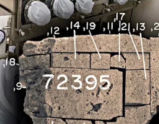
Hi I'm always on the lookout for cool sans-serif typefaces from the early 1900. I recently stumbled upon this (stamped?) typeface used by NASA to catalogue their lunar samples. I really like the curvature of the "7", the closed "4" and the sharp angled "3". Similar typefaces where used by the military for aircraft consoles but they don't exactly match. My guess is that this is a generic font used by some stamp manufacturer or some kind of stencil font. Most of the images contain numbers but the