

A guest article by Pedro Mascarenhas
Introduction
How the General Public relates to fonts. With the entry of personal computers in people’s lives, fonts entered the dictionary and the knowledge of the common mortals. Now, children learn to write both by hand and computer. Any user of text applications knows how to choose the font, thickness, style, size and color. Regarding the thickness of the fonts, everyone knows that there is a normal (regular) and a bold. When CorelDraw and PowerPoint applications appeared, success was immediate because it was so easy to use. In countries where people give less importance to the aesthetics of design, people practiced authentic orgies of letters with gradient colors. Nowadays, users are more experienced, therefore less eccentric when choosing fonts. In general, they know that the sans or serif letters should be used for long texts and very thin, very thick or fancy letters should be used for highlighting. Some font names entered people’s vocabulary, such as Arial, Verdana, Times, Georgia, etc, because they are part of the font menu of the common software applications.
How Professional Consumers relate to fonts. In the world of font nerds, knowledge is much more sophisticated. Since the time of Letraset until today, the font market has become an industry similar to that of music or fashion. Fonts and type designers change from pop stars (remember Neville Brody with The Face or David Carson with Ray Gun) to old-fashioned in the blink of an eye. Revivalism is constantly relaunched. Just like in fashion, there are big vendors that influence trends, alternative and experimental designers and … the rest. With the appearance of the websites to sell fonts, mainly FontShop and MyFonts, fonts have become cheap and accessible to everyone. Like music distribution platforms, these sites have increased the online sales, but above all, they have offered a worldwide stage “artists”, causing an increase in type designers and fonts. Naturally, with this increase in fonts, the new outsiders have shaken the conservative bases because almost everything has become possible.
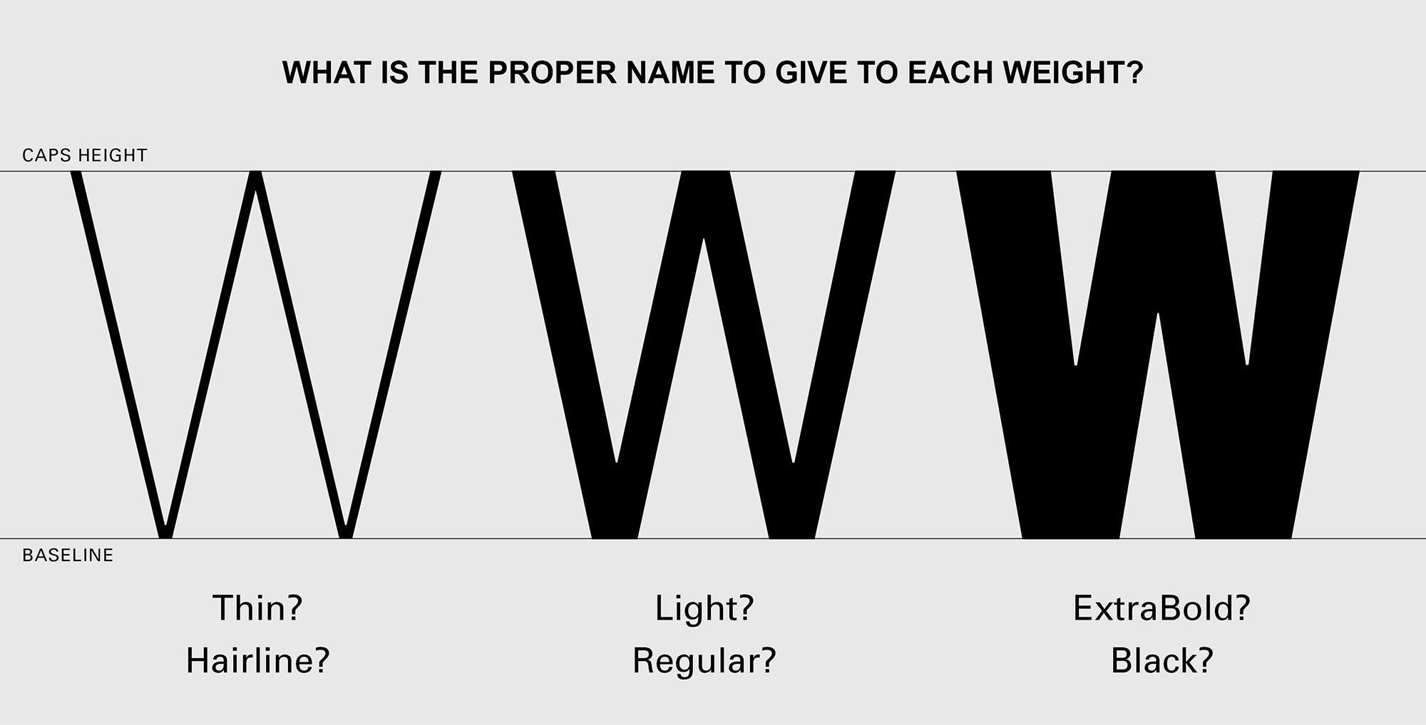
Which brings me to the thesis presented here. What's the correct name for each font weight. How to manage to regulate some procedures so that the final consumer does not feel lost in this unregulated and overcrowded world. How to make the new trends align with the basic rules of the past. How to make the name given to the weight of a font be as consensual and universal as possible. How to know what is the minimum and maximum metric for the thickness of each font weight, and what's the name to give to that weight. Above all, how to ensure that the final consumer don't get confused when searching a font.
When comparing fonts, what do consumers do and what do they expect to see?
For designers, the decision to choose a font is done in stages, with advances and setbacks. After exhaustive search, designers selects two or three fonts to compare them and make the final decision. The final comparison is usually made in the design apps where the final design will be done (like InDesign, Illustrator …).
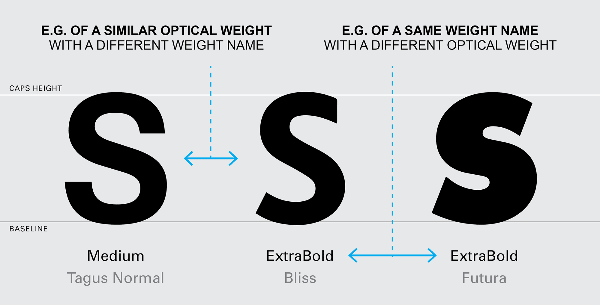
But before opening the design apps, designers plunge into type sites for the search. When designers are doing the search, they expect to see the different fonts about the same size to easily compare the optical result of each font. Unfortunately, this often doesn’t happen because the fonts were built with different sizes.
If these fonts had been built with a size roughly equal it will be easier for the designers to understand the characteristics and thickness of each one of them. In the end, they would just have to make some small adjustments in the body size and leading to make the final decision. But fonts appearing in very different sizes can mislead the designer’s perception of the font’s thickness.
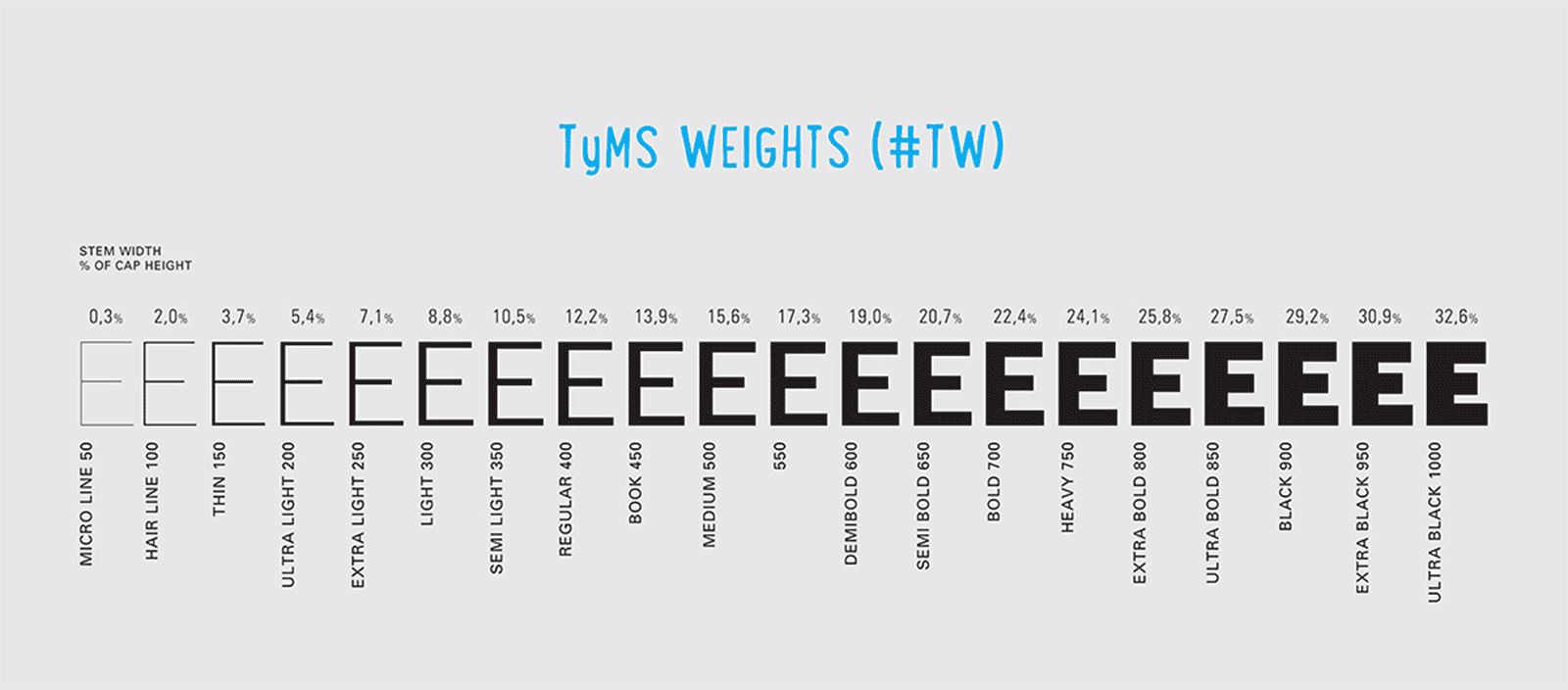
TyMS WEIGHTS (#TW).
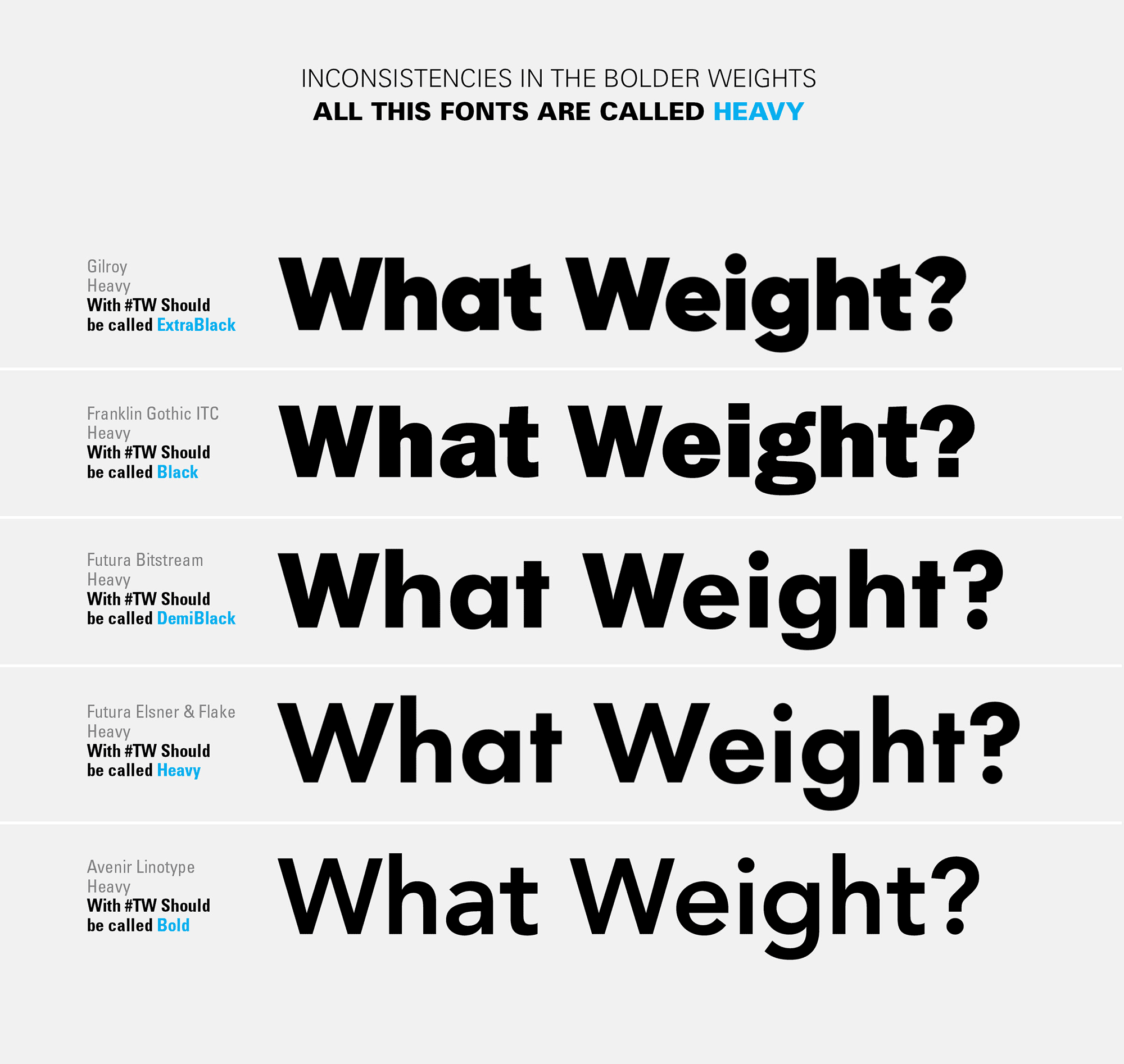
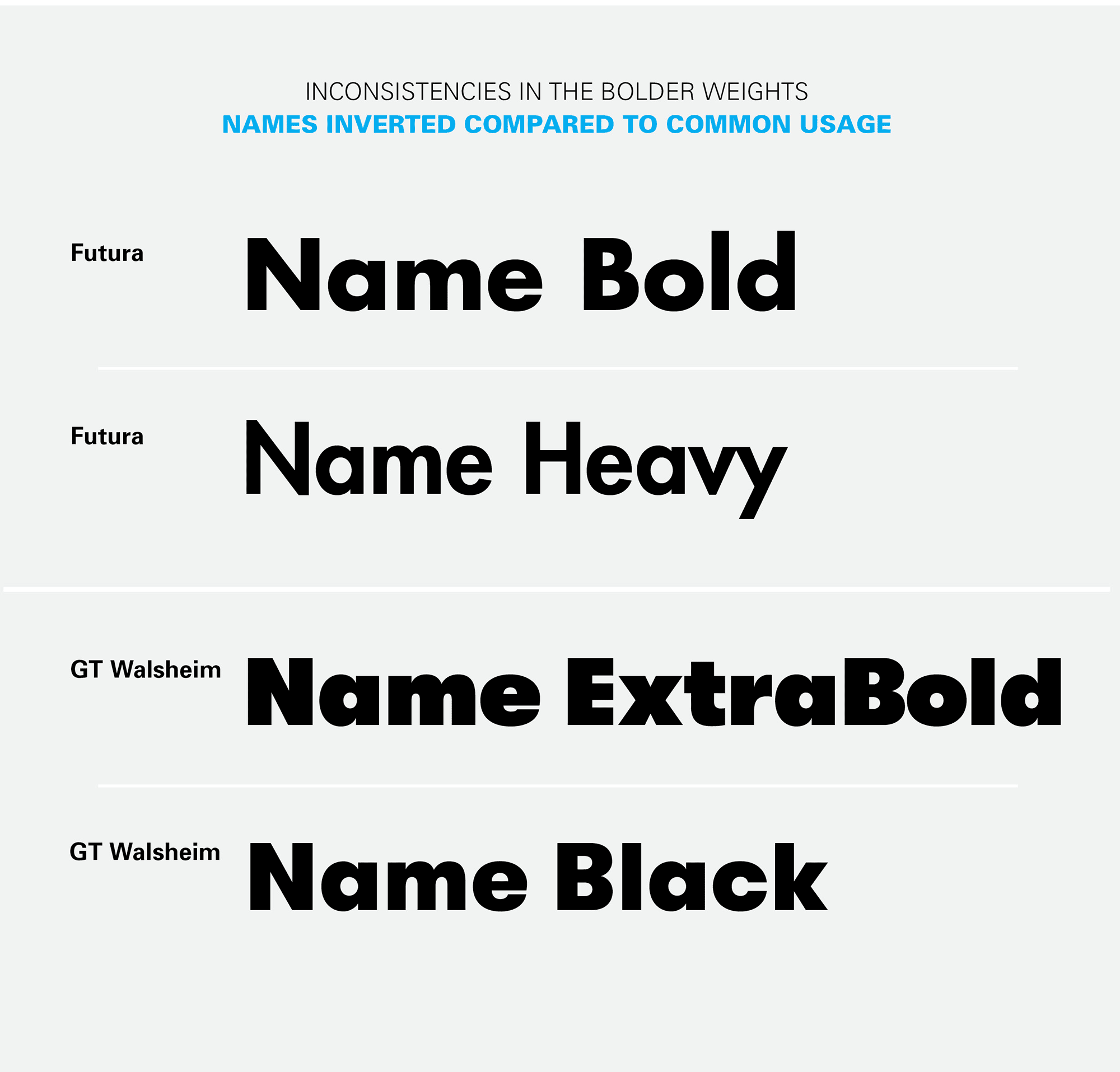
When consumers compare the weights of a typeface family to decide which one to use or buy, they expect to find progressive smoothness between the different weights. But, more important, they also expect to see the same optical thickness, when comparing the same weight name, between different fonts. As we all know, there are many inconsistencies in the market, between the names of fonts weights. Some fonts are called ExtraBold appear Bold, while other called Light appear Regular and so on. #TyMS Weights will allow type designers, foundries, font apps, and typography schools to “speak” the same language and achieve the goals and expectations of type consumers.
In the future, when type designers open the app to built a font, they will know (if they wants to) the correct name to give to the weight they wants to draw. The #TyMS Weights also allows each type designer to maintain their creativity because it only establishes the percentage of the Primary Stem Thickness (see the meaning in the next paragraph).
1.1. The Primary Stem Thickness (#PST).
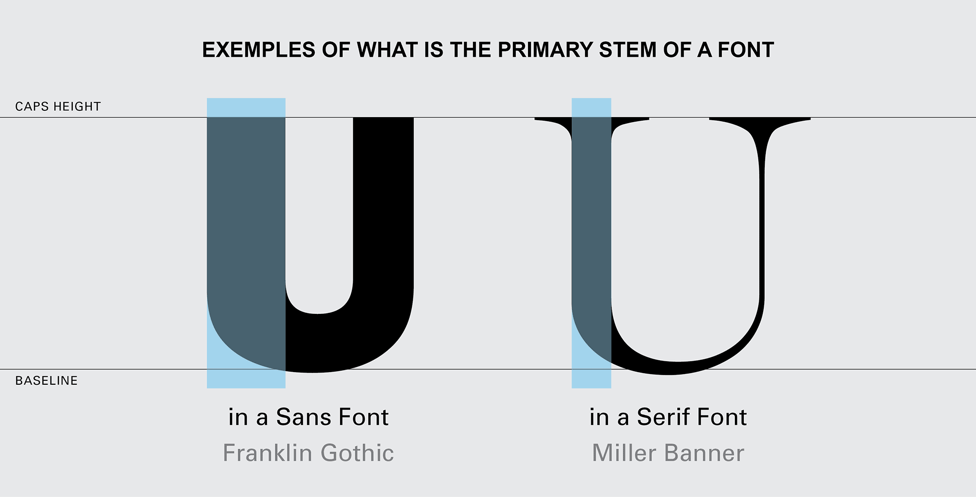
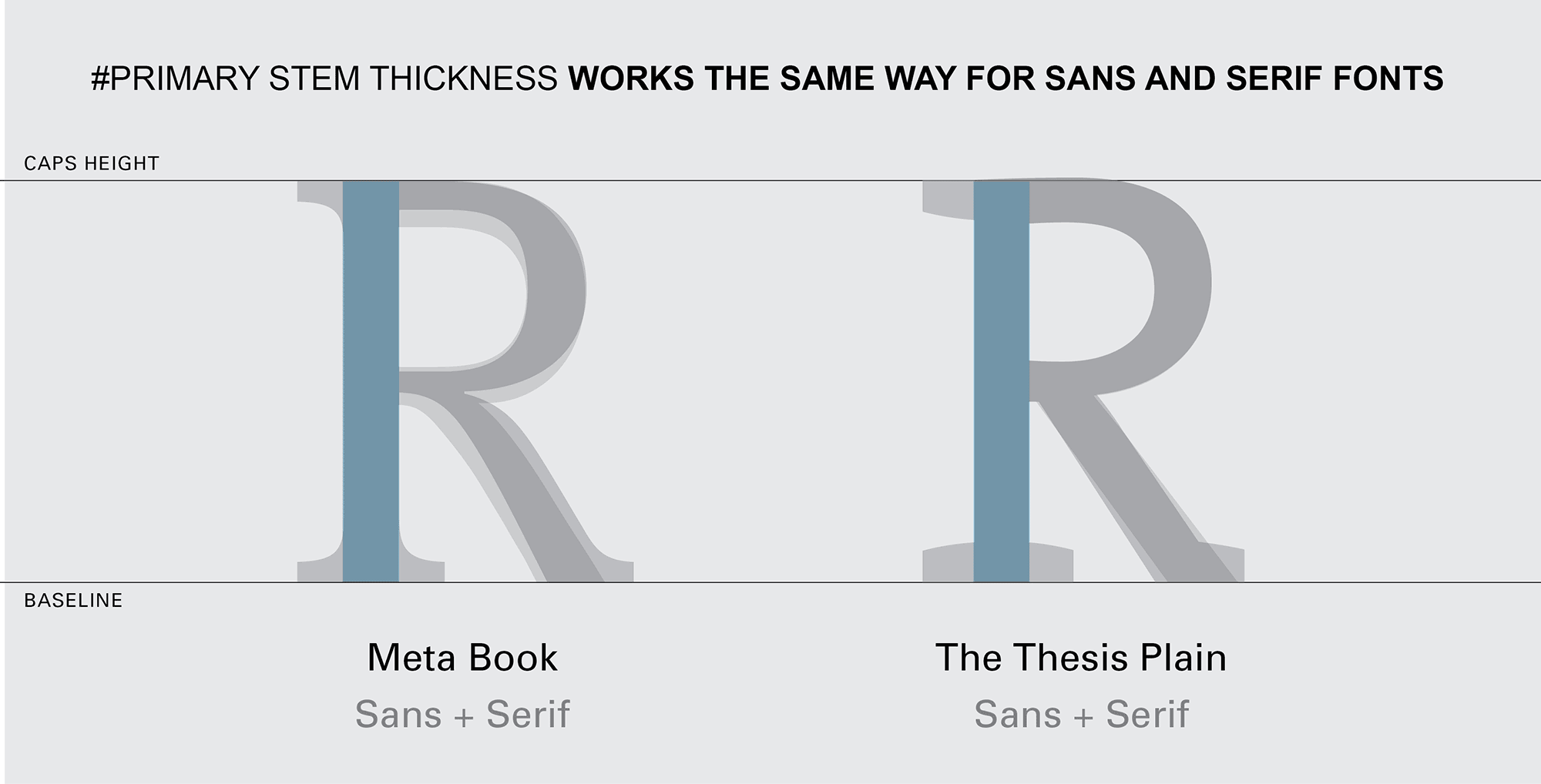
All the consumers are able to distinguish a light, regular, bold or black font. But when it comes to more weight steps it needs an expert eye to identify the name of each weight. In the end, the only characteristic, in a “normal” font, that can help to distinguish her weight is the thickness (width) of the primary stem. So if the community starts using the same system to measure the #Primary Stem Thickness, inconsistencies in the name weights between typefaces can be reduced or even eliminated. The #Primary Stem Thickness functions as a structure for the construction of a building. It defines the skeleton, but it has no influence on creativity and details.
The ratio of the thickness of the stem, in letters like the capitular “I”, to the x-height of the font is one method used by many type designers to measure weights. This is a good method, but it has three big problems: 1. many fonts only have capital letters, which does not allow the use of this method, 2. the bolder weights are not as visually bold as the number indicates, 3. this method might not work well when type designers wants to create a variation with a greater x-height, but maintaining the same stem thickness of the capitals.
What about stripes fonts? The question arises whether the #PST corresponds only to one stroke or to the group of strokes. It seems obvious that the name to be given to the weight of a stripes font must be related to the thickness of one stroke and not to the group of strokes that make the stem. The number of strokes must define the typeface name, not the weight name.
What about experimental fonts? Some fonts do not follow the rules established by the status quo of font design (and fortunately because it is in creativity and breaking the rules that evolution finds its way into the future), so for these fonts, type designer's common sense it's very important to interpret what is the #PST of the font, and then give it the most correct weight name, the name that has the same optical weight as the fonts considered “normal”.
What about unconventional caps height? In this study, it was found that the “normal” ratio between uppercase and lowercase height is 150% (see more details below in the “P.S. What should be the best construction practices”). In cases where this proportion is above 165% or less than 135%, type designers must simulate the #PST of a “normal” caps height, 145% for display fonts and 155% for text fonts. The #PST found will give the correct font weight.
1.2. Weights Names.
The proliferation of font editors – especially the ones with interpolation, supports a deregulation of the weight names. If each type designer continues to be able to name the font weight without strict regulation, the efforts of people like Didot, Frutiger, Charles Bigelow and Kris Holmes, Pablo Impallari or Luc(as) de Groot to bring some clairvoyance to the matter were for nothing. Because type designers and apps are focused on creativity, maybe the regulation must come from distributors like Monotype, Google Fonts, Adobe … because in the end they are the major players in the market and it’s them who have to categorize and list the fonts in the way that best helps consumers in the selection process.
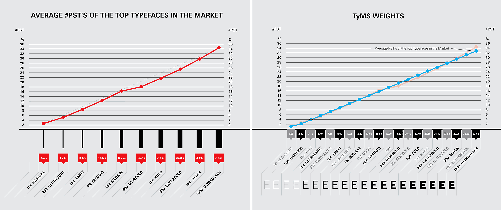
Percentage Proportion. Studying (with the same cap height) the #Primary Stem Thickness of the fonts existing on the market, it’s not possible to find a common value for each weight name due to the inconsistencies found, but it is possible to establish a range measurement for each weight. When we remove the most unsual fonts and the most incongruous names of weights, a percentage proportion system begins to make sense and to achieve the intended objectives.
Based on the analysis of the most prestigious fonts, the largest #Primary Stem Thickness rarely exceeds 33% of the caps height (Interstate UltraBlack has #PST 41%, Gill Sans UltraBold has #PST 44%). Therefore, the interpolation axis to be adopted must stretch until this percentage. Fonts with #PST greater than 33% fall into a category of “unusual”. In addition, the web protocol defines 1000 as the last CSS number, so type designers still have the CSS numbers between 900 and 1000 to design and name their bolder weights without thickness limits.
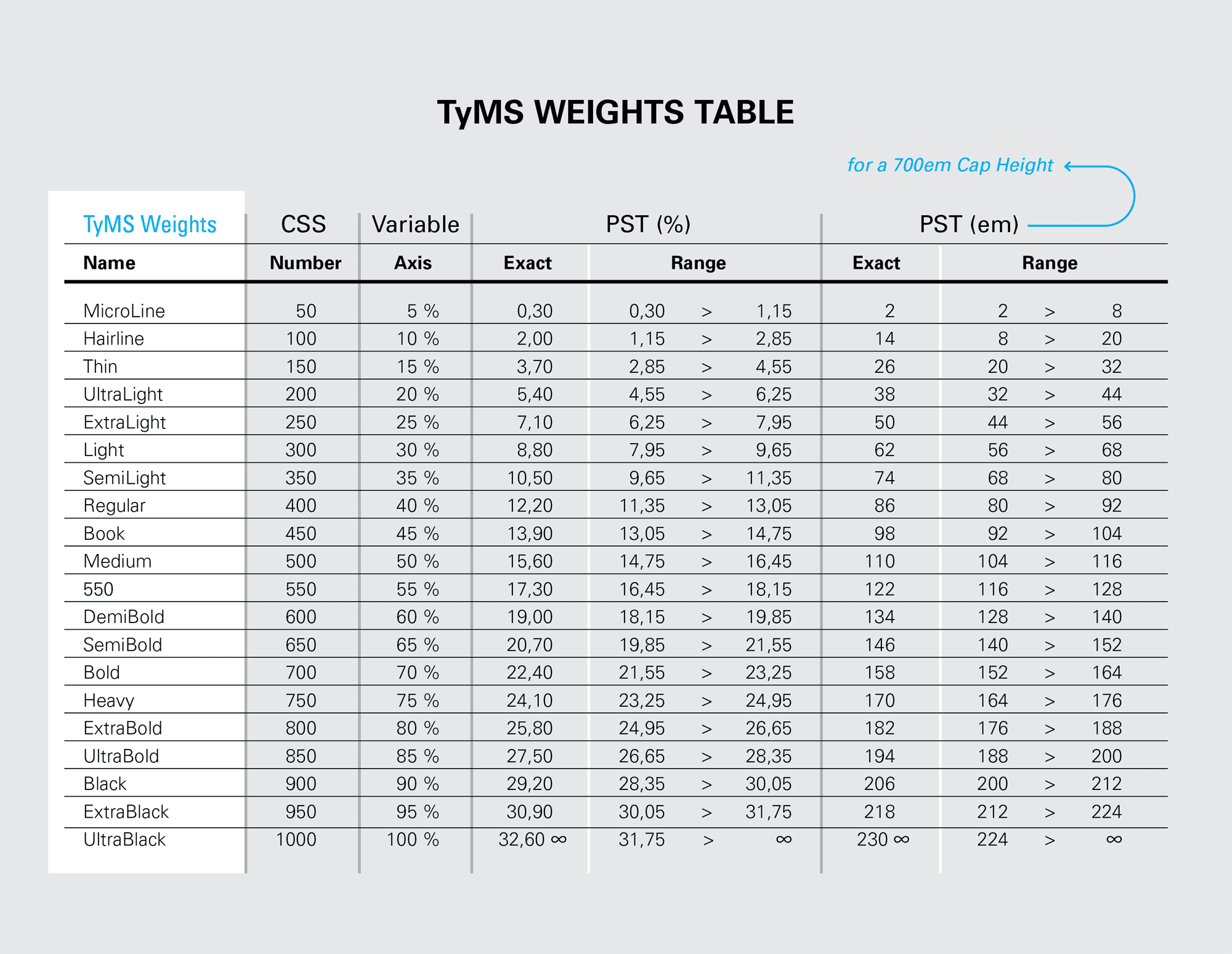
1.3. TyMS Weights - Steps.
#TyMS Weights work regardless of the size that type designer chooses to design the font. It also allows each type designer to maintain a level of creativity, as it only uses the proportional relationship (first as a percentage and then converted to ems) between the height of the caps and the #Primary Stem Thickness, to establish the name of the weight.
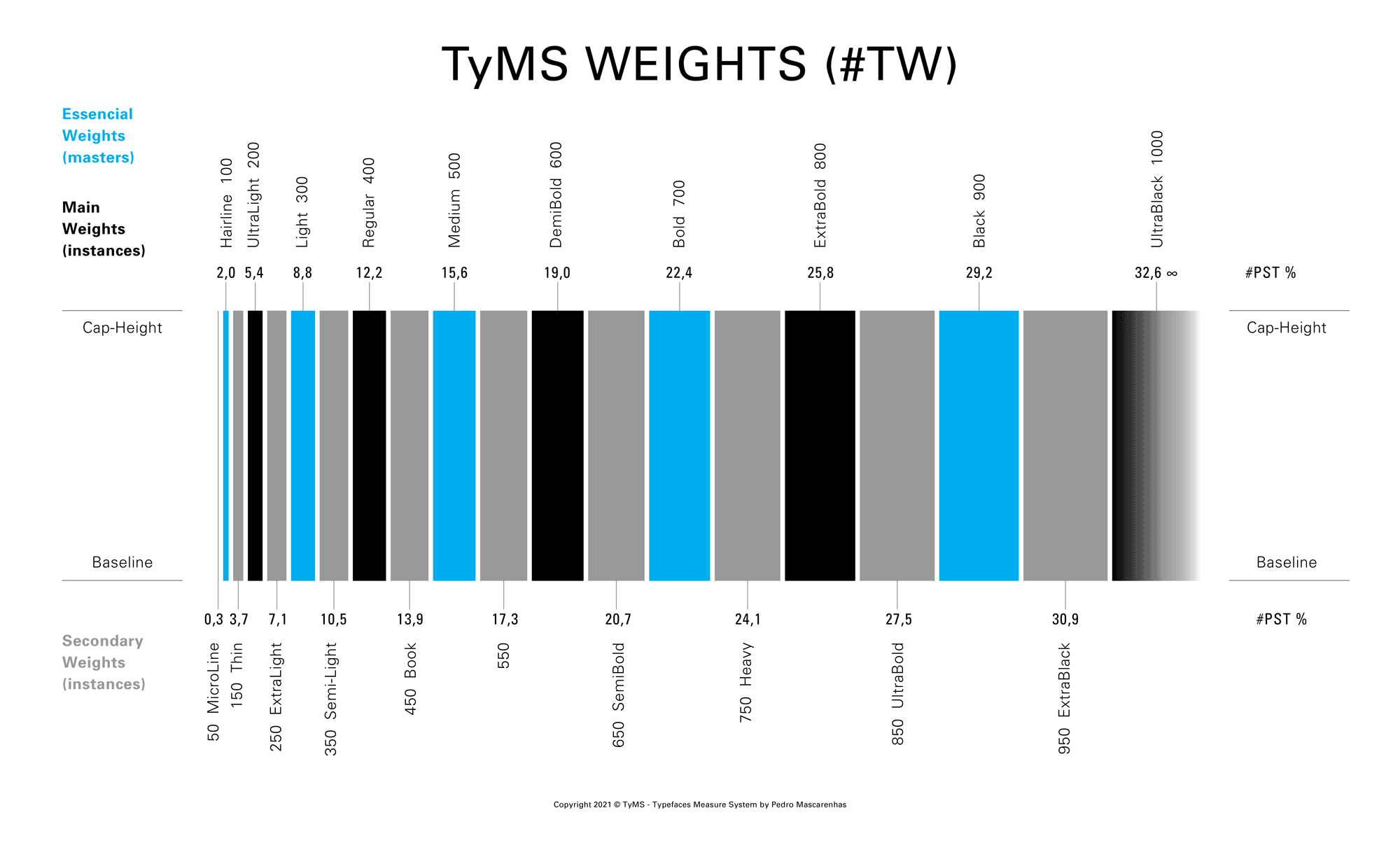
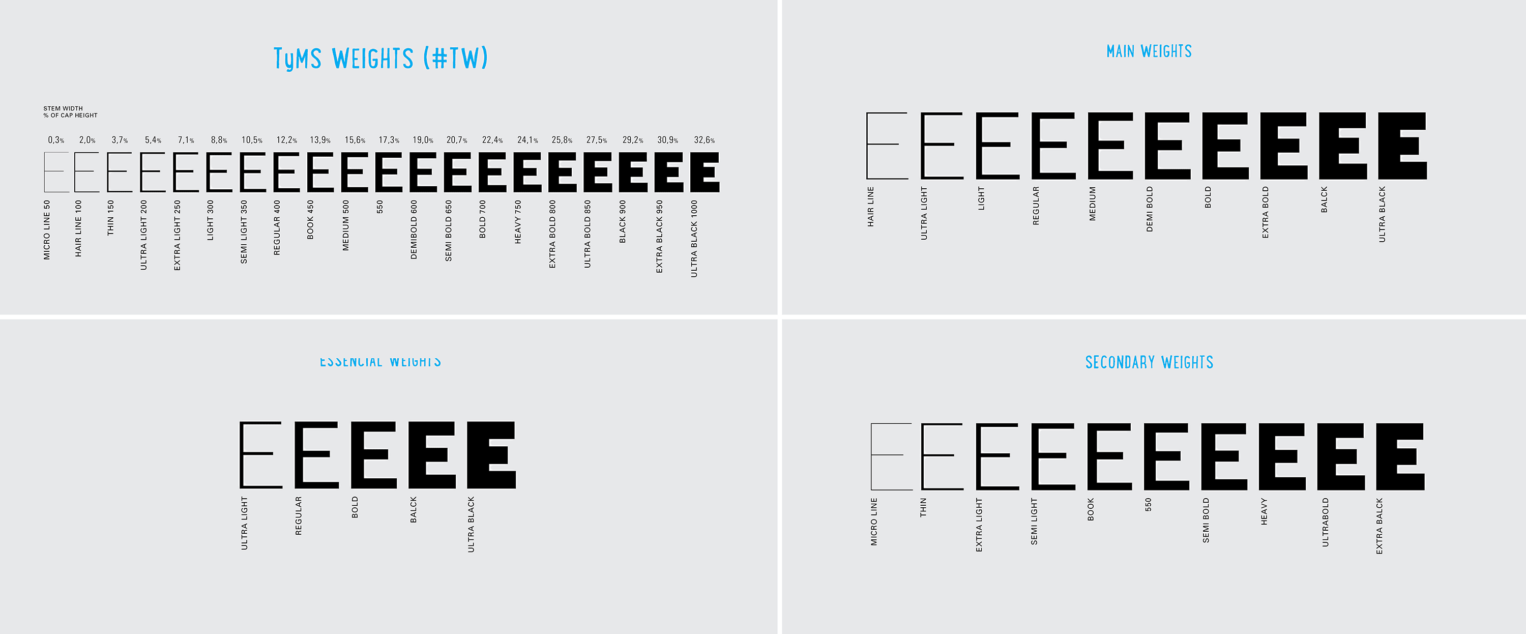
From static to interpolation or vice versa. When we think about interpolation, we can imagine an infinite number of weights … or not. However, the market needs static weights and variable fonts with multiple masters or instances that correspond to the static weights. There are more than 25 known weight names on the market, but many refer to the same optical weight. With the influence of the web, the main steps now used are divided into 10 numbers. In order to achieve a better progressive smoothness and to be congruent with the weights already on the market, the steps to be adopted by TyMS Weights must be somewhere between the 10 CSS numbers. If we insert a step between each CSS number, we get 19 different weights. But to obtain a perfect progressive smoothness of the weights, this system must be linear, instead of following the curve proposed by designers such as Luc(as) de Groot or Pablo Impallari.
Whatever the number of masters that type designers wishes to put on the axis; whatever the number of instances that type designers wish to generate, they can always assign a name for the weight and its css number using #TyMS Weights Ruler.
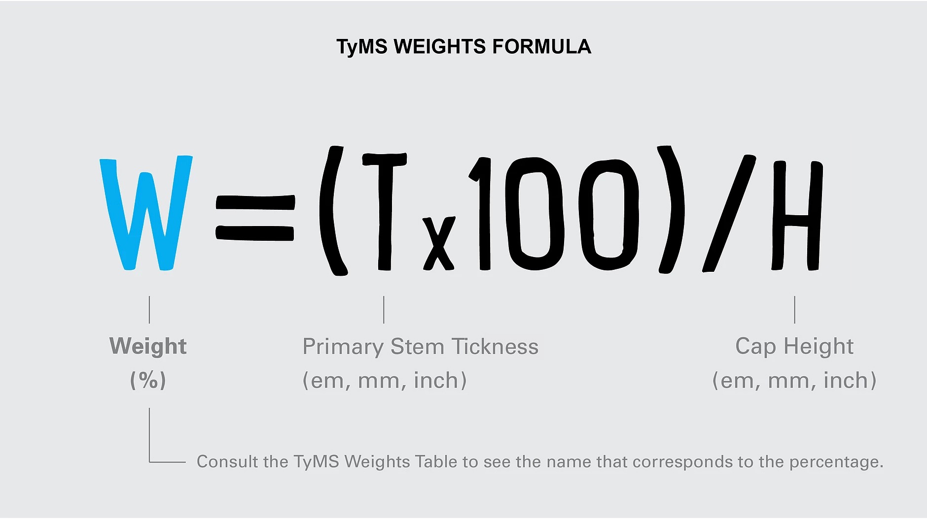
1.4. Simple, Fast and Precise.
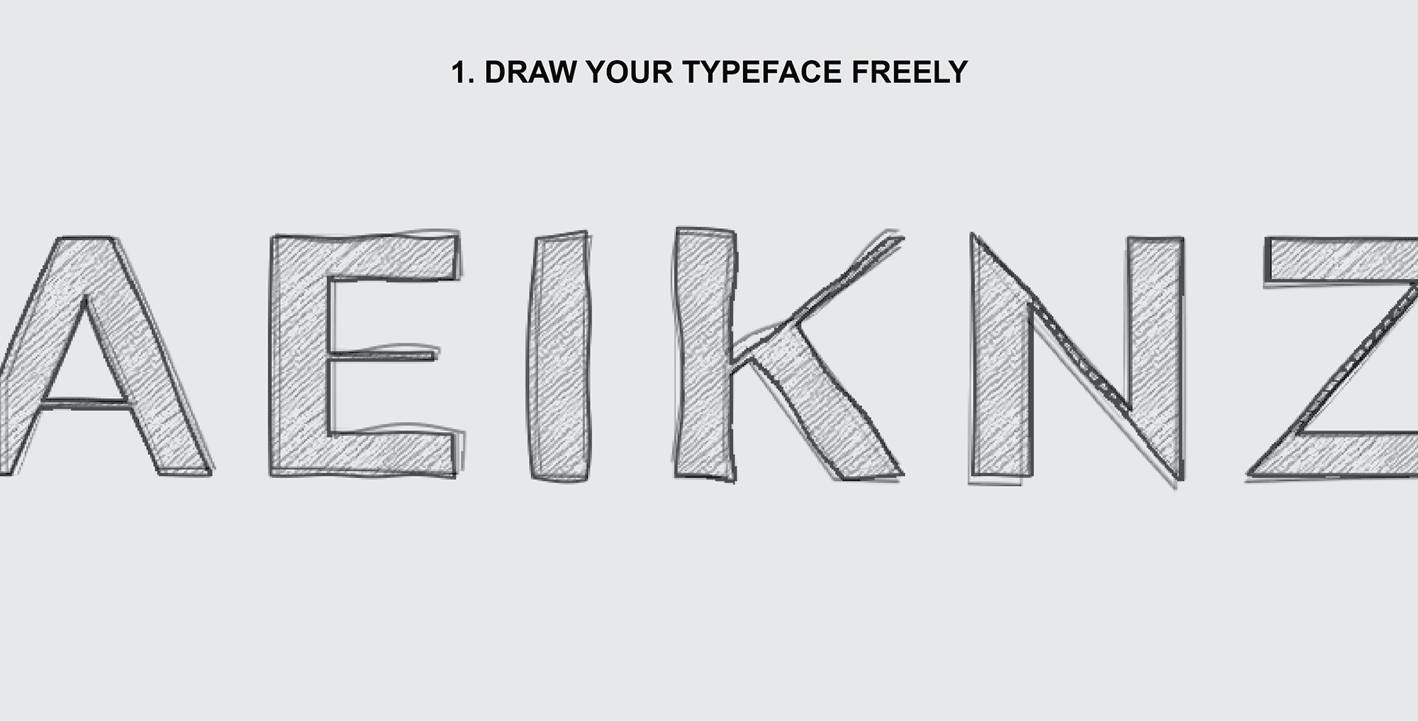
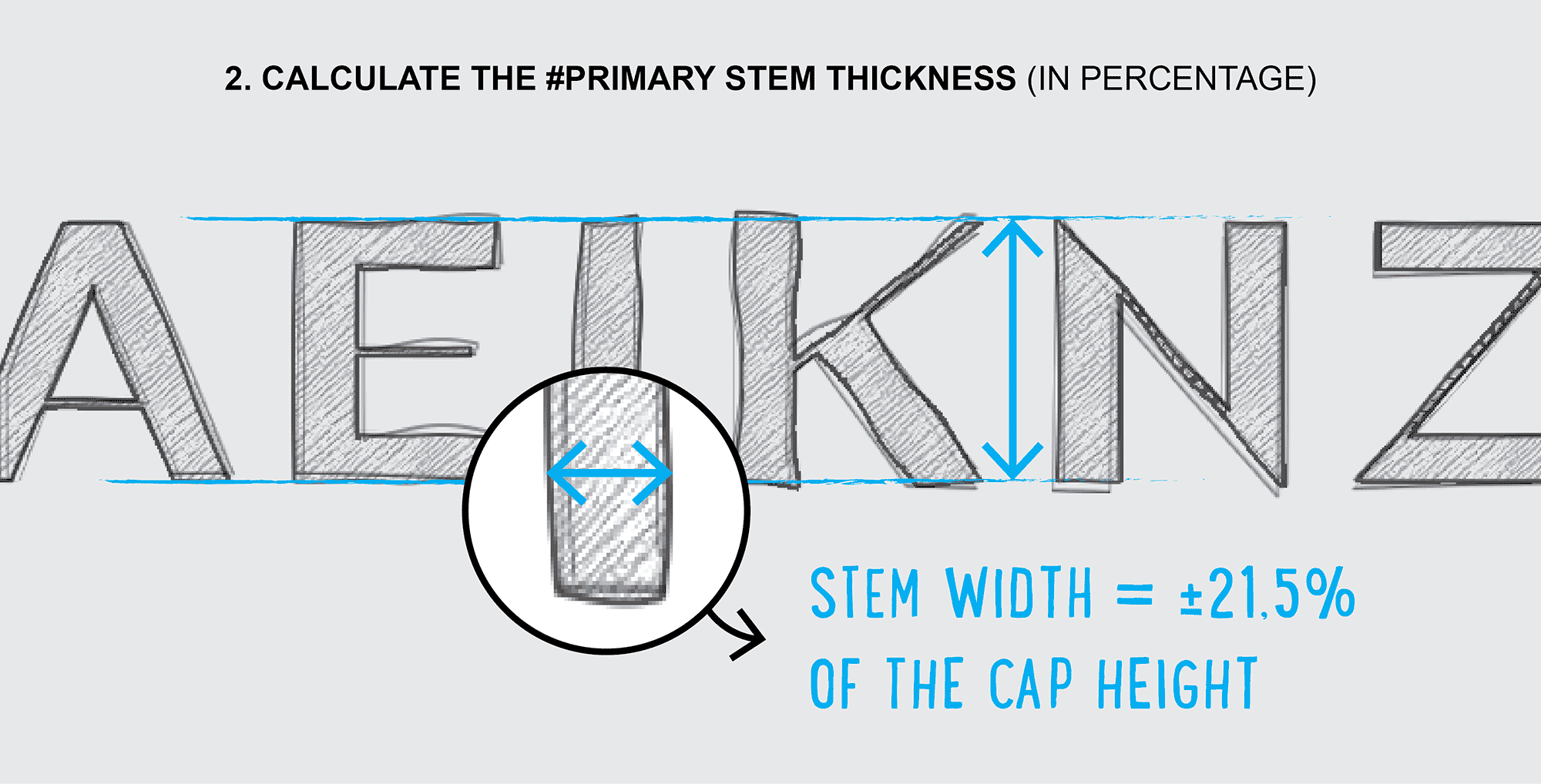
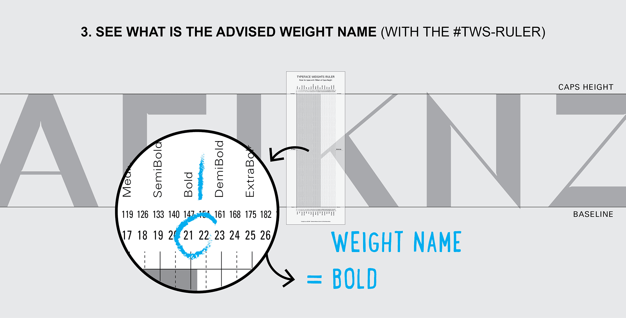
To know what's the best name to give to your weight just need 3 steps:
- Draw your typeface freely.
- Calculate the percentage of the #Primary Stem Thickness with #TW Formula (W=(Tx100)/H).
- See what is the advised weight name in the #TW Table or Ruler.
1.5. Weights and Variations
When type designers compare the weight of the type they are drawing, the #Primary Stem Thickness usually doesn’t have the exact percentage number of one of the weights in the ruler axis. Instead, the #Primary Stem Thickness is in a range between two different weights. Of course, when that happens, #TyMS Weights will not have the audacity to ask type designer to change his masterpiece. Therefore, type designer must choose the closest weight name or create a variation name, a thinner or a bolder. Pay attention, as the variations should not be confused with styles or grades. (See the differences below.)
Weights are the different thicknesses of a typeface family.
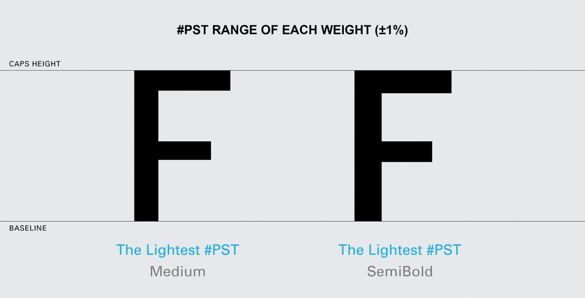
Variations are the two fine adjustments to the thickness of a weight – a lighter version and a darker version. Variations cannot change the width of the original stem by more than 1% or they become another weight. They are designed primarily for text fonts and serve to maintain the visual appearance of the original weight, when used in different ways or on various media. The lightest variation is recommended for coated papers and the darkest variation for negative text. The measurement of the thickness of both variations must be within the gap of two consecutive weights of the same font. The main difference for grades is that variations must maintain the same optical contrast as the original font instead of reducing optical contrast.
Styles – Display, Banner, Finesse … From the point of view of this thesis, try to reduce your knowledge of styles for sans serif and serif fonts to better understand the objectives. These styles are designed for large sizes, such as headlines, rather than for the body of the text. They maintain the #Primary Stem Thickness with the same width as the original weight, but increase the optical contrast by reducing the thickness of the secondary strokes (usually the horizontal strokes). For fonts to be considered a style, and not a variation, it requires that the strokes’ tuning be greater than 1%. Micro works as opposed to the display style.
Grades are subtle changes in the strokes of a weight in order to give a similar impression of the font in different conditions (e.g. different printing technologies or papers). Grades slightly reduce the optical contrast of the original weight. This technique is usually used for text fonts, see for example Jonathan Hoefler’s Mercury and Chronicle.
1.6. Conclusion.
Imagine that a designer presents a green logo to the client. After the work is approved, the designer has to define, in the Brand Guide, what green it is, as there are thousands of variations of green. With fonts it’s the same. The designer can’t just say that the typeface is, for example, Helvetica. They have to define the weight, style, size, etc. A variable font is for fonts what “green” is for colors - just a vague reference. The #TyMS Weights will be for fonts weights what Pantone, CMKY, RGB or Hex are for colors – an exact reference.
P.S. What should be the best construction practices.
When type designers open a font editor to build the font they draw, they have to make two decisions at the outset: 1. Which units-per-em (UPM) they will use. Ninety-nine percent of fonts are built in 1000x1000 units, other units values are allowed, but such situations are rare and should be avoided unless there is a very specific reason to do so; 2. The other decision concerns the size (height) of the design. This decision is very important because it is also directly related to the size that the font is rendered in the applications used by consumers. Typically, fonts are built with caps height close to 700em.
Text Fonts. When integrated into a family, fonts designed for text tend to have a lower proportional relationship, between the height of the capital letters and the lowercase letters, and for this reason type designers tend to build these fonts with a cap height below 700em so that the lowercase letters (x-height) are rendered in a size closer to the letters that are not for text.
Normally the height of the lowercase letters is between 60% and 70% of the height of the capital letters. In text fonts the tendency is to have an x-height, between 65% and 75% of the height of capital letters. Two examples of fonts that are clearly outside these usual range are Amplitude, with 80% and Cochin, with 56%.
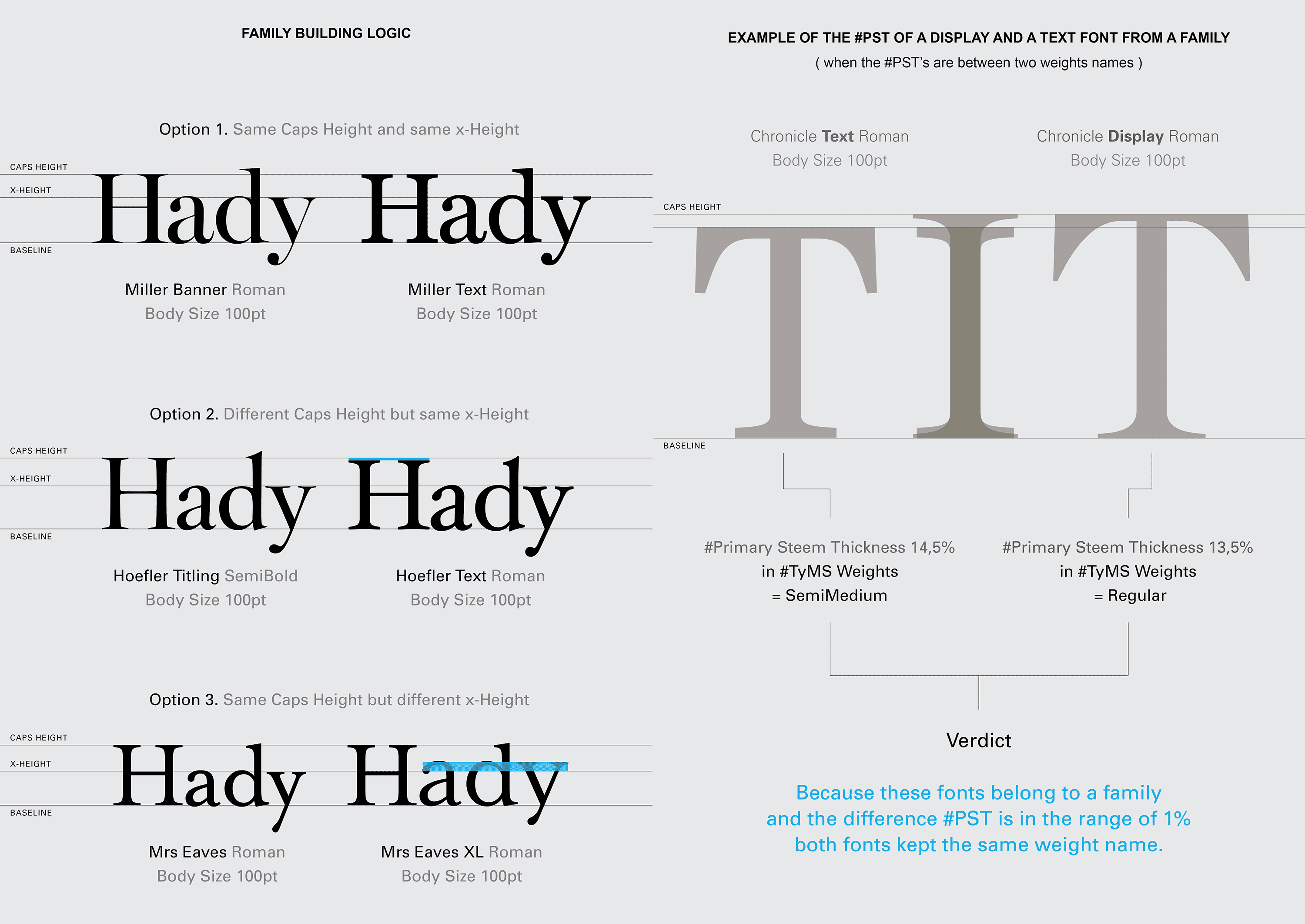
Normally the text fonts are drawn from the height of the lowercase letters of the family, that is, the text fonts have the same lowercase height as the display fonts of the same family, and what varies is the height of the capital letters. Obviously there are examples to the contrary, in which the construction follows the reference of capital letters, but these cases are the exception and not the rule, see the various options in the image below.
#PST options. Many of you are already thinking, so if the capital letters of the different fonts of a family, vary in height, the #PST also varies, so the weight names will be different. It turns out that normally the height variation of the capital letters does not exceed 1% so that height variation remains within the range of #TyMS Weights and therefore the name of the weight does not change despite there being a slight difference in the height of the caps. Of course, there may be cases where this #PST of the fonts are within the range of the two weights, which would imply a weight name of the text font different from the weight name of the font display. But in these limited cases, if the #PST does not exceed 1% difference, type designer must keep two fonts with the same weight name.
Regarding fonts that do not belong to a larger family (with display, text, etc.) the question arises: What option should type designers choose when building the font? If they choose to create them with a cap height of 700em, they can have an exaggerated x-height and a very thick weight name, in relation to the other identical fonts on the market. If they choose an x-height within the normal parameters (between 400em and 500em), they run the risk of having very small capitals and a very thin weight name. Type designer should always think about the consumer — How will they use the font? Will it be used more in text or in display sizes? Will it be used alone or paired with another font?
In conclusion, fonts should always be built with the capitals with 700em, except those with very small lowercase letters. For those, it should be avoided to build them with the lowercase letters above 500em in order not to appear on search sites and in consumers applications with a size out of context.
More details: https://pedromascarenhas.wixsite.com/tyms
Pedro Mascarenhas is an Art Director and a type designer from Lisbon, Portugal.
-
 2
2
-
 3
3
-
 1
1


Recommended Comments
Create an account or sign in to comment
You need to be a member in order to leave a comment
Create an account
Sign up for a new account in our community. It's easy!
Register a new accountSign in
Already have an account? Sign in here.
Sign In Now