


In the German Democratic Republic (GDR) the road traffic regulations were revised in the 1970s. The GDR had signed the treaty of the Vienna Convention on Road Signs and Signals (1969) and in the years 1974 till 1978 the official norm for the design and content of road signs was changed significantly. The new, quite remarkable layout also included a new typeface. In tests with a tachistoscope Gill Sans Bold Condensed supposedly performed better than DIN 1451 and so Gill Sans was used as the standard traffic typeface in East Germany. Because the old road signage typeface was usually just called DIN, the new typeface became the equally short name GIL.
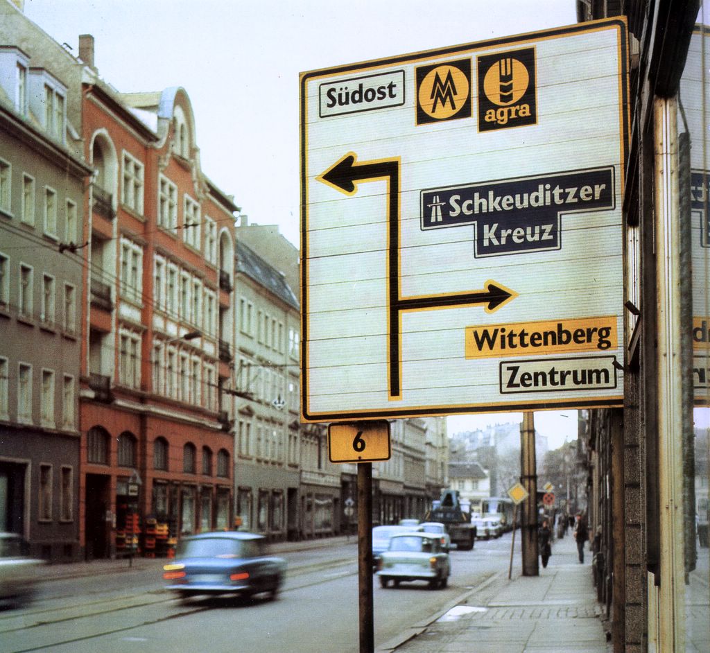
Source: Martin Q., Flickr. Used with permission
They were certainly ahead of their time in choosing a humanistic sans-serif, but it is obvious that the spacing was way too tight for traffic signs. Here is a scan of the official norm papers (TGL 12096/91):
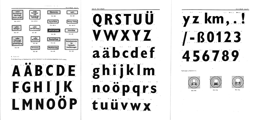
There was just one style in use. The design is pretty close to Eric Gills original design for Monotype. The figure 1 got a hook to differentiate it from the I and the crossbar on the f seems to be wider on the right side (but still appears too short on the left side). They even took over the ridiculously small dots on the lowercase umlauts ä,ö and ü. Dear international type designers, take it from a German reader: the dots on umlauts need to look like the dots in the character i and j! So what about legibility? The GIL and DIN typeface can be easily compared. Even though the GIL typeface is actually a condensed typeface, it only uses just a little bit less space the the regular DIN 1451 (“Mittelschrift”) and the x-heights are also similar. At close range, GIL looks slightly superior. In this example, the design of a, g and r appears just more distinct.
But if we simulate a greater distance, DIN 1451 actually takes the lead. Its very clear and basic design with the smaller stroke width makes it more legible under difficult viewing conditions. As you can see, the umlaut dots even disappear completely in GIL.

So I find it hard to nominate a winner in this competition, but it probably safe to say that both typefaces performed rather well in those days. Other countries at the time were still using geometric designs with poor legibility that were drawn by engineers. The new design came into effect in 1977 with the new road traffic regulations.
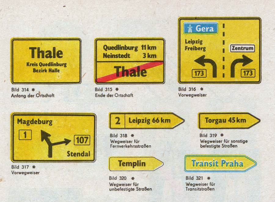
On top are signs used on regular roads and the next image shows examples of motor way (“Autobahn”) signs.
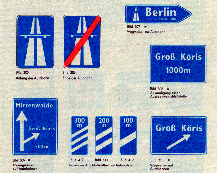
Even though the new typeface was supposed to be used for all signs throughout East Germany, Autobahn signs seemed to have remained in a very old version of DIN 1451 (see next image). This was probably due to financial problems. East Germany always struggled to purchase or develop the materials they needed. That’s why most of the signs were either made from plastic or mounted on wooden plates. The majority of the signs was also retroreflective, but the GDR couldn’t effort to buy the Scotchlite materials from the USA, so they developed their own, but less effective retroreflective sheeting which was called Mikrolux.
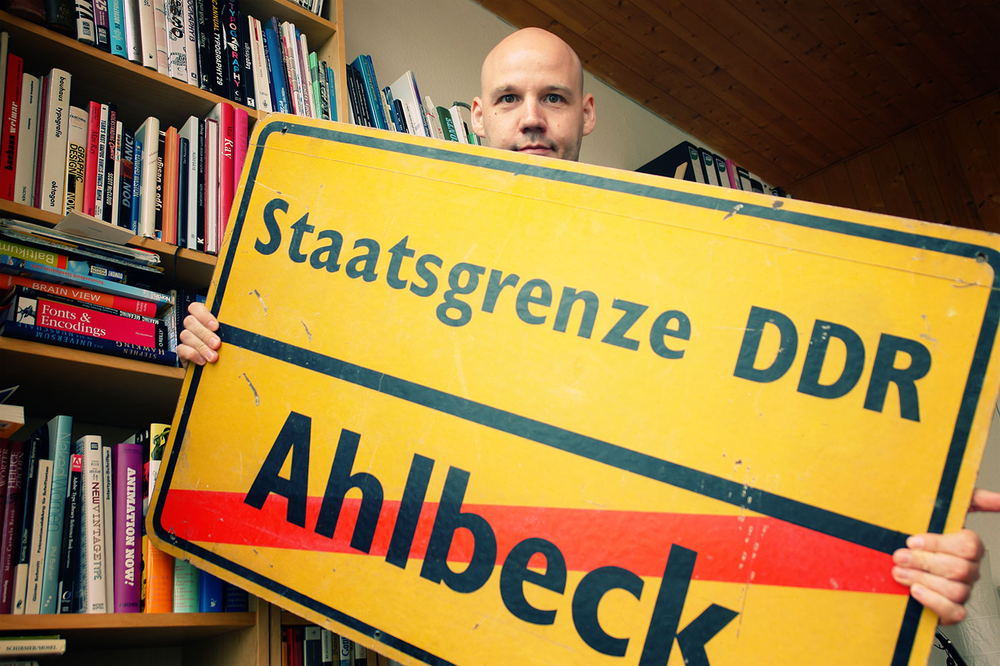
When Germany was reunited in 1990 almost all signs in GIL were quickly replaced with new signs using DIN 1451. Only some signs in rural areas remained unchanged – or ended up in my living room.


Recommended Comments
Create an account or sign in to comment
You need to be a member in order to leave a comment
Create an account
Sign up for a new account in our community. It's easy!
Register a new accountSign in
Already have an account? Sign in here.
Sign In Now