

Search the Community
Showing results for tags '7questions'.
Found 7 results
-

A Smart Blackletter Font: 7 Questions for Gerrit Ansmann
Ralf Herrmann posted a journal article in Journal
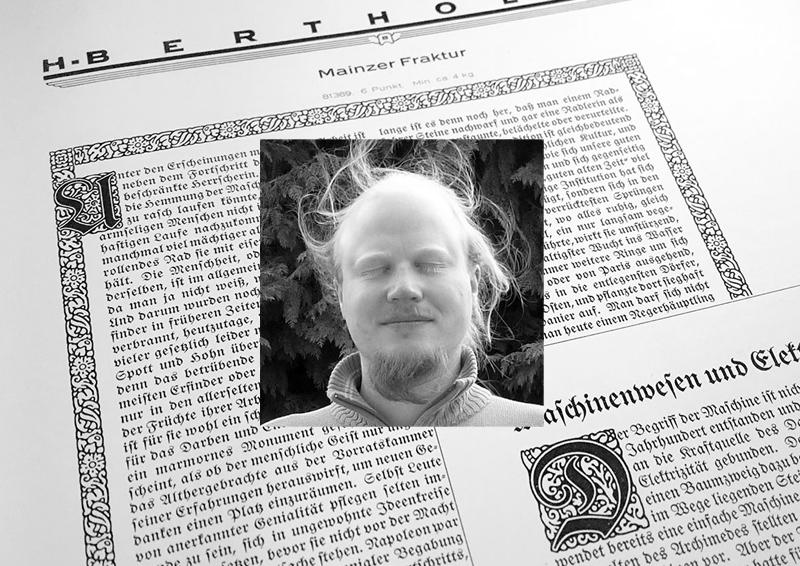 Gerrit Ansmann is a physicist from Germany, who worked on the freely available blackletter font Unifraktur Maguntia, which now has a large character set and makes extensive use of smart font technologies such as OpenType. In this interview he gives us some background information about this project. 1. As a physicist, what fascinates you about typography and type design? And what was your motivation to create such a feature-rich blackletter font? I always had an interest in computer graphics, which was intensified when it became useful for creating scientific illustrations and when Bézier curves, splines and similar were part of my elective numerics courses. Moreover, type design is an appealing art form to me due to its mathematical nature. But that’s not what actually lead me to working on blackletter fonts. As a physicist, I naturally belong to the target audience of roleplaying games, and my roleplaying game of choice was Call of Cthulhu, whose main arena is our world in the 1920s and which features a lot of investigations. Thus people like me who want to create scenarios for this game often need to create fictive newspaper clippings and similar from that period and older. Being somewhat perfectionistic, I learnt a bit about blackletter typesetting and produced texts reproducing historical typesetting, in particular the long s and blackletter ligatures. Unfortunately, most blackletter fonts that allowed for such an authentic typesetting did not support Unicode or OpenType, and so I had to find out where special characters were located for each font and manually insert them into the texts. Unifraktur Maguntia was an exception to this, but—like most blackletter fonts—was based on a dissatisfying digitalisation, e.g., words like Luftfahrt featured bars of f and t at three different heights, and the J and I were just scaled versions of each other. As the font was open, I began with fixing some prominent issues, discovered more issues, fixed them, decided to throw away everything and to re-digitialise the historic source, and so on. In the beginning, my motivation was that I could eventually create a brief guideline for historic blackletter typesetting, which would not require the user to use some esoterically placed special characters, but rely on OpenType features or similar. Soon, another motivation arose: Almost all creators of blackletter fonts seemed to go for quantity rather than quality, and I wanted the world to have at least one good and free blackletter font that allowed to do everything that one could reasonably want to do with it. 2. On which historical sources is the font based? How much of it is kept close to the original(s) and how much was reinterpreted or created new? The primary historical source is Mainzer Fraktur by Carl Albert Fahrenwaldt from 1901. It provides most letters (and ligatures) of the standard German alphabet, except J, Ä, Ö, and Ü, which were only beginning to emerge for blackletter typsetting when it was created. From the few remaining glyphs of the original typeface, I adapted a few and redesigned the others—in particular the numerals and some basic punctuation characters—as their style was roman and not blackletter. For reasons that still elude me, this was typical for historic blackletter fonts, which is why I later added numerals in the style of roman typefaces as an alternative. All other elements were newly designed, based on the existing glyphs, if possible, and inspired by the original Maguntia and other blackletter typefaces. This redesign includes the modern variants, numerals, diacritical marks, and several special characters. 3. Legibility vs. Tradition: Is the font made for traditional and/or modern blackletter typesetting and how do you deal with the legibility problems of today’s readers regarding Fraktur fonts? On the one hand, many glyphs and features only exist for the purpose of reproducing historical typesetting—allowing a user to render an equivalent to every fraktur text is one of the main goals I was striving at. On the other hand, I created modern variants of ten letters that are typically misread by readers unfamiliar with blackletter as well as a round s without a swash for use in the beginning or middle of a word, where historically a long s was used in most cases. However, when creating the modern variants, I tried to adhere to the design principles of the original typeface and therefore, for example, I did not create a modern T (as I could not come up with a satisfying design) and the modern N is still very far from a roman-type N. So the modern variants are a trade-off between readability and preserving the blackletter style, hopefully a good one. A paragraph using the traditional and modernized glyph designs 4. Traditionalists want to keep blackletter designs and their typesetting rules for German to stay the way they were in the first half of the 20th century, while others would argue that modernizations are a good way to keep the blackletter style alive. What is your opinion on modernized blackletter designs and typesetting rules? I do not think that anybody should design or use a certain typeface just to keep some style alive. Use a typeface if it fits your needs; design one, if you enjoy the process or if you think that somebody else needs it—in which case it would be this need that would be actually keeping the style alive. That being said, I think that both, modernised and traditional approaches, have their place: If you just want the typeface to say “traditional” or “German”, and readability is a valid concern, modernisations are fine; if you want the typeface to say “historical” or “old”, and you can trust your audience to decypher the text in a reasonable time, use the long s, the traditional letter forms, ligatures, and so on. However, I have no sympathy for pointlessly bizarre mixtures or failed attempts at being historical that could have been avoided with one minute of Internet research. The most common of these mistakes is plainly replacing every s with a long one, but there are also things like the new Warsteiner logo, whose t looks like a blackletter k, if anything, but neither like a blackletter nor a roman t. 5. Today, Fraktur fonts are rarely used for typesetting German and when they are, there is often an intentional or unintentional connotation with Nazi Germany. Is that something we can even overcome? What uses do you have in mind for Unifraktur Maguntia or how would you like to see it used? In my experience, fraktur has its niches in Germany where it isn’t automatically associated with Nazis, for example in the contexts of tradition, history, or ceremony. Outside Germany, it can have similar niches, in particular in countries who used fraktur historically—e.g., I observed a considerable amount of fraktur in Prague. For the rest of the world, there are at least some people to whom fraktur just says “German” (which alone unfortunately makes for a Nazi connotation), but again the context and also the location is crucial. However, for other uses, I do not think we will or need to overcome a certain Nazi connotation—for instance, “historical” or “old” are not labels that one would normally see attached to one’s political views. Ironically and hopefully much to the Nazis’ dismay, one of the Maguntia’s features is a wide support of “international” characters and thus the capability of writing names of non-German origin in blackletter, e.g., for the needs of a German folklore society—I would really enjoy seeing the Maguntia being used to write the name of, say, a carnival princess of Turkish origin. Also, many features and glyphs are not aimed at reproducing historical German typesetting but that of other languages such as Latvian, Czech, Slovak, and Sorbian. That being said, I did not focus on a single type of application, but rather hope that the Maguntia gives users the freedom to do what they want for their application—be it creating a menu for an Austrian restaurant in Portugal, a facsimile of some historic text, the Polish translation of Asterix and the Goths, or even a political cartoon. 6. Can you highlight some of the smartfont features of Unifraktur Maguntia? The smartest feature is arguably the heuristics for the long s which uses the surrounding letters to decide whether an s is long or round and changes it accordingly. This isn’t perfect, but if you aren’t happy with the results, you can correct them with a zero-width non-joiner and still leave the majority of the work to the automatism. I should mention there are fonts out there that go further and implemented an entire dictionary (which are however not free and do not work in all applications). A similar automatism is implemented for the round r, a variant that can be found in very old typesetting. We also separately implemented the two types of ligatures distinguished by historical blackletter typesetting—required and typographical ones—, which facilitates the implementation of letterspacing, which dissolved the latter type of ligatures but not the former. Mainly for modern typesetting, I implemented a feature that removes the—in my opinion disturbing—swashes from round s that do not occur at the end of the word. The majority of the remaining features are not that smart, i.e., just simple substitutions, in particular the aforementioned modern forms, historic variants, and four kinds of numerals: blackletter and roman as well as proportional and monospace. 7. In which apps and situations will the font work? What are the requirements and where are the limits? Little surprisingly, a program that fully supports OpenType with feature selection is the best and allows you to quickly tune the font to your needs. If you have OpenType, but cannot or do not want to select features, there are ready-to-use variants which correspond to the activation of certain feature sets and try to emulate German historic typesetting at a specific time or cater modern readers, respectively. If possible those features are hard-coded and thus work, if there is no OpenType support at all. As a last resort, all special characters can be accessed through Unicode’s Private Use Area. On another note, if you go to small resolutions, you will notice that hinting technology isn’t really made for most blackletter typefaces. I put some effort in this direction, harmonising line widths, positions, and manually marking a lot of stems, but I am not willing to perform hinting on the bitmap level.
 -
Making Equitan Sans and Slab: 7 Questions for Diana Ovezea
Ralf Herrmann posted a journal article in Journal
 1. To begin with, please tell us a little bit about yourself! I was born in Romania, in a small town called Medgidia, about 50 km from the coast of the Black Sea. When I as 12, my family moved to Vienna, where I attended the American International School. I feel like I got the best of both Eastern and Western Europe, and I consider myself to be an “international.” When I was in high school, I wanted to be a lawyer (to be able to argue my point of view in front of a judge), an artist (I had always loved drawing and painting), or a psychologist (to analyze people’s thoughts and behaviors, then help them come to a solution). However, there did not seem to be a job that combined all of these … until I discovered graphic design. Practicing graphic design and working for clients is pretty much like being a creative psychologist lawyer. Later, while studying graphic design, I developed a love for typography, calligraphy, and type design. When I work on type design projects, it is more than art (I never liked creating for the sake of art), it is a system that is dictated by a series of rules, traditions, and historical implications. It gives just enough room for creativity while allowing me to do what I do best: analyze, test, and systematize. 2. How did you get to work with a type foundry from India, which has its roots in the developments of fonts with Indian scripts? The Indian Type Foundry has been doing extremely well with Indian scripts, but they aim to become a global distributor of quality typefaces, so they have been expanding their font library with Latin script type families and more. They recently released their first Arabic type family. Satya Rajpurohit, the co-founder of ITF, contacted me at the end of 2013, knowing that I had just graduated from Type and Media at KABK. He proposed that I design a slab serif family for ITF, which was something I never had designed before. I love a good challenge and, after some back and forth emailing, we agreed to create a bigger family including sans and slab, as well as italics, so that it could be used in all kinds of editorial projects, branding, and packaging. This was going to be one of the biggest ITF families so far and my most complex project yet. I couldn’t wait to start. 3. What was the idea or inspiration for Equitan? Is it based on historical typefaces? Knowing I had to make a slab serif design, I did my research and was not very inspired with what I could find. There were flavorful slab serifs that were a bit old-school looking (Clarendon, Century Schoolbook), where the slabs seemed well integrated in the letter shapes; and there were modern designs (Museo, Neutraface), where the slabs were just sort of slapped onto existing sans serif letters, which made them seem a bit too static. I generally appreciate the approach of typefaces like Eames Century (designed by Erik van Blokland), Maple (designed by Eric Olson), where it seems as though the designers just created their own path, without being influenced by related designs, and it works! These designs are usable, yet full of life. While browsing through the old specimen book of Palmer and Rey’s from 1844, the skeleton forms of their typefaces really spoke to me. They had some typefaces called Antique, some Clarendons, and some Gothics that looked very related with each other in their basic shapes and proportions. Without forming a family, they were obviously following the same logic. I was fascinated by the skeleton forms and general character of these Antiques, with very long serifs and closed apertures. Although the letters seemed clumsy for today’s standards—the shapes were overcorrected, and the caps were much to heavy— it seemed that these letters were hiding a secret elegance that I could possibly tap into by creating a modern family. So this is what I started doing. 4. How did you approach the development of so many styles from different sub-families? Which styles came first or were they developed all at the same time? I started by shaping the slab serif, because this has the most personality so it would help me to define the family. My first attempts were quite literal replicas of the shapes I saw in the book from 1844, but slowly the design progressed into a family with its own merit. I knew that the sooner I introduce other weights and styles, the better I will be able to make decisions about the family as a whole. I see the whole type family as a system where members have to work with each other, support each other, and yet share the same DNA. That is why I start working on a few “strategic” weights from the early phases. Within the first month, I gave the Sans a try, which would inform me if the skeleton shapes of the slab are transferable. Then I started the Slab Black weight, where I knew that I could pump up the personality even more. The Slab Thin weight would tell me whether the proportions of the letters were fitting well with each other and whether the skeleton shapes were interesting on their own, without contrast. With each development, the type family took shape. The masters for each of the sub-families were Thin, Regular, and Black. When I added the italics, I felt like a machine, working on 12 masters at once. I bought a new 27 inch computer screen (I can recommend this conveniently priced monitor for any design work: Dell Ultrasharp U2715H), rotated the old 23 inch screen by 90° and placed it on the right hand-side. This helped divide my screen real-estate wisely and work more productively. I love this part of the process, when I am juggling dozens of numbers in my head, remembering decisions I made the day before, applying changes in all the masters at once. I had the privilege to be working on this almost full-time, so I could keep all the details fresh in mind. This helps a lot for being efficient! I ran many checks and tests, designed many editorial-like pages to see how the weights played together, how the numerals and other symbols fit in. After 6 months of work, in August, I handed over the final files to the Indian Type Foundry. They were not yet kerned and the character sets were still rather small. In January of 2016, I was asked to add kerning and expand the character sets of the Equitan family. This was a great opportunity to see the typeface one last time, and I ended up making, once again, all kinds of small corrections. After this, we generated and tested all the interpolated weights. 5. What typical uses did you have in mind while designing the family? Is there a specific application you would love to see your typeface used in? Equitan is a multi-purpose family, generally for use that requires typographic richness. The Thin and Black weights are great for headlines. The other weights offer the designer a lot of freedom for text use. Equitan would be great as the in-house type family for a larger company, because the Slab is very recognizable, yet the Sans can be a trusty replacement for Helvetica in office use. Secretly, I would love to see Equitan Slab be used on some meat packaging. The all-caps deliver such BBQ-awesomeness! But, honestly, I would be excited if my typefaces are used in any way. That would mean I did my job right. 6. Which tools did you use and which challenges did you face while designing the type family? Like most designers who grew up with a computer in front of their face, I designed most of this family on-screen (rather than sketching whole alphabets by hand). However, and this is very important to me, I checked every weight in print so many times, and optically adjusted what looked strange. The result is a typeface that is not entirely “perfect.” Some things are measured, others are judged by eye. If you look at the “o” shapes for a long time, you will notice that they are … potatoes. Not all circles are really circles. I think this is something that helped the typeface retain some of that dynamic quality that the original 1844 letters had. I used RoboFont to design this family. I used MetricsMachine to kern it. I used Prepolator & Superpolator to make some test interpolations and extrapolations (The final interpolations were made in-house at ITF, and I don’t know what software they use). Inside RoboFont, I use a bunch of extensions that help make life easier when designing a family: Overlay UFO: shows an overlap of the same glyph in multiple weights. This helps you see if the details match in those weights, compare angles in italics, control if the heights of your ascender or oldstyle numerals are the same in all weights. Ramsay St: shows related characters left and right of the one you are currently designing. This helps you design in context, and you can even define the neighbors yourself. AdjustMetrics: makes sidebearing adjustments in batch Word-o-mat: generates very customizable strings of real words. This is great for testing words when your character set is not yet complete. ScalingEditTool: also known as interpolated nudge, helps you make small changes to letters quicker by proportionally adjusting the length of the handles while you are moving a point or group of points. TestInstallAllOpen: test installs all open font files. I must have clicked this a thousand times. I use custom scripts for generating anchors and accented glyphs and making character set overviews. I design using InDesign and I use an HP LaserJet Pro 400 M401 to print tests, which gives a sharp print for a good value. I use either 80 or 90 gsm off-white paper for testing type, because the lower contrast of type-to-paper not only resembles real books, but is also a bit nicer for your eyes. The beginning of the type design process is always the hardest part for me. I want to make something new and relevant, yet without copying previous work. The best advice I got about this was from someone who told me, “It is unique because YOU are making it for the first time.” That takes away part of the pressure; the second thing is to just keep working on it, shaping it until it becomes yours. In my hope of making something very unique, I had added slabs even to the bottoms of capital V and W. These looked totally strange for a text type. I knew the usual story would unfold: I would at some point realize that most of these details are irrelevant and I chopped everything off. Yet, like with most things that you fall in love with, you cannot just say “Goodbye.” You need to get angry, you need to be pushed into letting go! To speed up this process, I asked for feedback from a ruthless friend, whose opinion I respect very much; and she told me to my face what I already knew: that the shapes still looked very dated, that I was not supposed to be making a revival, and that I had to bring my own voice to the design. Bingo! I immediately fell out of love with the letters. Working so long on one project, it becomes personal. This can often be an issue because your emotions get in the way of progress. The fact that the timeline was rather short helped me not to get lost in iterations and details. My best advice here would be to work as if you are working on someone else's typeface. That way, you can keep rational about decisions and progress much faster. If you cannot do that, have a friend help you with an honest and critical opinion once a month. Of course, there are also design challenges. Some shapes were harder to pull off and took days of tweaking and testing. It was difficult to design the Q, R and k in such a way that they stay interesting, legible in small sizes, and that their sans versions retain some queues from the quirky slab shapes. Although this was my most complex project yet, it was not overwhelming to be working on so many styles at the same time. Because I was able to dedicate large chunks of time to this project, my short-term memory helped keep all the details together, and I was able to work effectively. 7. Are there plans to extend the typeface even further with more families or scripts? Or what other type projects will you work on next? At the moment, I am not planning to extend Equitan. If ever, I would like to add an even fatter slab weight, for crazy display use; and maybe an impossibly thin version, the kind that Lucas de Groot would work on. For now, I am working on my 10,000 hours (which apparently is the number of hours of practice you need to become a master at something). I have been commissioned to create another type family for ITF: a sharp, not-so-strictly geometric sans serif for text use. This is turning out to be a bit more challenging than I thought: striking the balance between quasi-geometry and text-appeal inside a multiple-weight family. This year, I want to finally finish up my Type and Media graduation typeface, Editura, which will be released with Bold Monday. This is a type family for “serious” publications, possibly with the phonetic alphabet and other goodies that linguists need included in it.
 -
 1. To begin with, please tell our readers a little bit about what you do, and how you came to the field of web typography. I’m Bram Stein and I work at Adobe Typekit on web font serving. Like many people in the type world I kind of stumbled into it. Because something was not right and I wanted to fix it. About 10 years ago I had an idea to build a web-based book reader. I mostly went with web technologies because that’s what I was used to as a web developer. After making a basic layout, I started noticing all sorts of discrepancies between printed books and what I saw in my web browser. Things like hyphenation, justification, and high quality typefaces were not supported on the web and I needed them to meet my quality expectations. So I set out to improve things. The first thing I did was to implement the Knuth and Plass line breaking algorithm, which improves on the justification algorithm used by all web browsers. Of course that is useless without good hyphenation so I ended up implementing Hypher, a hyphenation engine. Then I turned my attention to web fonts and several other type and typography tools. I never got around to actually building that book reader, but I hope to get back to the idea some day. 2. Browser support for fonts was originally built with the available system fonts in mind, i.e. 4 styles (regular/italic/bold/bold-italic) and not more, no true small caps, no OpenType features and so on. When web fonts emerged, the limitations became quickly obvious. What’s the situation now? What has been fixed? What is still missing regarding the font support? Are there still many browser problems, Typekit needs to work around with specific tricks? Luckily, most obvious things have been fixed. I think the most obvious limitation is “font-stretch” which isn’t supported by all browsers. This means fonts can only be classified using “font-style” and “font-weight”. This limits your @font-face descriptions to only 27 possibilities: “font-style” with its three values (normal, italic, and oblique) and “font-weight” with its nine possible values. While this sounds like a lot, it isn’t sufficient for many typefaces which often come in more weights and styles. Hopefully “font-stretch” will be supported by more browsers as it will give web developers a total of 243 variations. It would be even better if the rules for both “font-weight” and “font-stretch” were relaxed. The 100 to 900 range for font weight is arbitrary. There are many type families that can not be mapped to these nine values. The same applies to “font-stretch”. It is hard — or even impossible — to map every typeface to those nine predefined values. Ideally, both properties would accept percentages between 0 and 100. This will open up the possibility of font interpolation, where two or more master fonts are used to create an infinite number of combinations. Now that we’re talking about that, a new font web format for font interpolation would be nice as well. Another problem I’m struggling with is the lack of support for OpenType features in Safari. All modern browsers support OpenType features except for Safari. There really isn’t a good work-around for it, so we’ll have to wait for Apple to implement support. Luckily, they’ve said it is on their roadmap. At Typekit focus has shifted from problems with web font formats to web font performance: how do we get the smallest possible font to your visitors as fast as possible. This involves optimising web font delivery, improving compression, etc. We are also trying to support more languages and scripts. This is particularly challenging for Asian fonts which are usually very large (even when subset). To solve this we have built a font streaming solution where a font is dynamically constructed on the client-side based on what is needed for that page. The OpenType format isn’t very suited for streaming and adding glyphs on the client-side, so ideally a new format should support this use-case as well. 3. At The State of Web Type you document the browser support for things like OpenType features. An intentionally provoking question: Do they matter much? Or are the “decadent” and just slow down page rendering, as some claim? OpenType features matter. While some are stylistic there are many that are required to render text correctly (for example in Arabic). There are also ligatures that improve the legibility of the text. I don’t really want to be too negative about that article, but their methodology is not correct. The article appears to be measuring something else and blames the difference in performance on OpenType features. This is nonsense. A better test would only measure the rendering impact of OpenType features. While it is true that there is a small cost to enabling OpenType features (after all, the text rendering engine has to do some extra work), it is insignificant to, for example, making a network request. As a general rule, you should enable the OpenType features you need to make your text legible and look great. 4. In 2008, when the topic of web fonts emerged after Safari started to support them, I made a web fonts survey. Almost half of the participants didn’t want external font hosting and only 5% could imagine to use a subscription-based service. With your insights at Typekit, how have things changed since then? What, in your opinion, are the current trends regarding the different license models for (web) fonts? The problem most web designers and developers run into is restrictive licensing. You can buy a typeface (they’re really quite affordable) but you can’t do much with it. Want to create a new web font format? You can’t. Want to subset it? You can’t. Want to embed it in a CSS file? You can’t. I think this is an area web font services handle really well. They let you use a web font without having to worry about licensing. Some web services even let you sync fonts to your devices so you can use them in your design applications. Most services also give you access to their entire library, so all in all, I think font services are still an attractive option for most people. 5. Another concern when web fonts were new was the render quality of web fonts in contrast to the highly screen-optimized system fonts like Georgia and Verdana. How do you judge this problem now, several years later and how does Typekit deal with the differences of render engines? This is becoming less and less of a problem. A couple years ago we had to make sure web fonts worked great on GDI and DirectWrite on Windows, Core Text on OS X and iOS, and FreeType on Linux and Android. Nowadays, all modern browsers on Windows use DirectWrite, so the horrible rendering of GDI is much less of an issue. This has interesting consequences for type designers as well. Because DirectWrite (and Core Text and FreeType) renders CFF based fonts really well, the need for extensive TrueType hinting is becoming a thing of the past. At Typekit we used to serve specific outline formats to certain browsers and operating systems to make sure the type rendered as good as possible. We even manually hinted some typefaces. Luckily, the usage of browsers and platforms that required such extensive hinting is now below a point where it no longer makes sense to invest so much time in hinting. We’re moving to a model where we primarily serve CFF-based outlines with minimal hinting. This drastically simplifies our processing and font serving. 6. Web type isn’t just fonts, it’s also text layout—automatic hyphenation, grids and line-spacing, effects like drop-caps build on those grids, text flow through columns or even arbitrary shapes, widows and orphans and much more. What’s the state of web type in this regard? We’re in a pretty good place with web fonts. The same can not be said about other web type features. Justification is supported by every browser using “text-align: justify”, but it is of very low quality. It doesn’t look like browsers will ever adopt the advanced justification algorithms used in TeX and InDesign. This is a shame because it really improves the quality of fully justified text (and to a lesser degree the quality of left, center and right justification). In fact, fully justified text is pretty useless because we don’t have good browser support for hyphenation (remember, never justify text without hyphenation). While CSS hyphenation is supported by most browsers, it is not on Chrome. You’ll need to do your hyphenation on the server or using a client-side library for now. CSS columns are supported by pretty much all modern browsers, but you don’t see them used very often. I think this is because columns have horrible usability if the canvas (viewport) doesn’t have a fixed size — it is rather annoying to scroll up and down a page to go from the end of one column to the start of another. I’m more excited about CSS shapes and regions which lets you flow text from one element to another and define arbitrary shapes. Unfortunately, there isn’t much browser support for either. There is many other features that would benefit designers but are not implemented. Drop-caps can only be achieved by using a JavaScript library. Math typesetting is useless (though there are decent JavaScript solutions). Widows and orphans are not supported. Colour font support is all over the place (with each browser implementing their own favourite format). We still have a long way to go before we reach the same quality as print typesetting. 7. In an article you suggested that browser should by default show fallback fonts instantly and then switch to the web fonts once they are loaded. Can you elaborate on why you propose that? Personally, I often find a text reflow while reading more annoying than waiting. What it comes down to is that your visitors come for the content on your site and not for the web fonts. It is fine for your visitors to have to wait for web fonts to enhance the experience, but this should be be less than a second. Anything more than that is unacceptable, especially when it becomes more than 3 seconds. This is particularly bad on Safari, which has an infinite timeout for loading fonts. So if your fonts load very slowly (or do not load at all), you’ll be staring at a blank screen until you give up. This is not a good user experience. Web developers often overlook these problems because they work on fast machines with high speed internet connections. To get a feel for how bad this is, use Chrome’s network throttling and set it to 2G or 3G speeds for a day. It’s painful. Showing fallback fonts right away solves this problem. The browser can show the content as soon as possible and web fonts can load afterwards and enhance the experience. You are right that the switch from fallback font to web font is very distracting. You can minimise this by selecting fallback fonts that roughly match the metrics of your web font, but a small amount of visible reflow will almost always happen. This is can very bad if you already started reading the content and the web fonts come in after several seconds. This is not what I’m proposing. Showing fallback fonts as the default behaviour does not excuse bad font loading performance. You should still aim to to load your fonts in less than a second. If you do that it is likely the page hasn’t even started rendering yet and any reflow is less likely to be distracting. This can be combined with a cut-off: if the fonts do not load within a certain amount of time don’t bother showing them. It is too distracting to show them once the user has already engaged with the content. What this all comes down to is that the current browser behaviour is inconsistent and very hard to control. The default timeout is too high; waiting three seconds for a web to load is unacceptable. We need to standardise the default behaviour, and showing the fallback fonts first is a good default. It works well with the basic ideas behind HTML and CSS: progressive enhancement. Make the content work in all browsers and devices and enhance it for the smart ones. What we need is a way to control the display behaviour (i.e. show fallback fonts first, or block rendering, etc.) and a way to control when a font is loaded. Luckily, both are being specified. The “font-display” property will let you control the display behaviour and the CSS font loading API will let you control when and how fonts are loaded. So we’re getting there and I hope that as part of standardising these features we’ll also standardise the default behaviour.
 -
Making the Trianon type family: 7 Questions for Loïc Sander
Ralf Herrmann posted a journal article in Journal
 1. To begin with, please tell our readers a little bit about yourself and how you came to the field of type design. I came to type design through graphic and editorial design. My training was first and foremost focused on the design of printed objects. I later got into digital techniques because the first thing that matters to me is content, not so much the medium you use. Before studying applied arts, I trained in science and engineering but was never very proficient at it, so I decided to leave that behind when I started doing graphic design. But a couple of years later, doing something entirely different highlighted the fact that it wasn’t science engineering I had wished to leave behind, but school … So my scientific and technical curiosity caught up with me and I soon realized I actually loved science as much as design. That’s when I had an epiphany about designing type—also because I’m never happier than when I can design ‘basic’ stuff, and by that I don’t mean that type is a simple thing but rather that it is essential to many—if not all–aspects of communication; the foundation of content. As for how I came to really designing type—that was a long process. I’m only starting to think I’m any good at it, although I drew my first letter in 2007 if my memory serves me well. I love to learn and I’m not afraid by the idea of doing the same thing over and over again until I’m happy with the result, I’m very stubborn this way. So I kept on designing typefaces for my own use, mostly for the books I was paid to design. They weren’t perfect but that is what kept me trying to make them better, all the time. I later came to realize I’ll never be satisfied, but I try not to retain frustration from that fact. I rather use it to drive me. 2. How did the Trianon font project start? What made you interested in exploring that area of modern fonts? This project started like many others that are still on-going, I fell in love with an idea, which in itself sounds like a bad idea. One day, I received a cheap, badly printed, book from the end of the 1950s. It was a manual aimed at learning how to play chess and the copy I was given must have been the 5th or 6th edition of a title that apparently had some sort of success in France from the 1930s onward. This book was in fact quite unremarkable but I was baffled by the fact that reading it felt a lot nicer than a lot of the books one can read today. The most surprising part to me was that the type used seemed to be a sort of Didone with moderate contrast. I was quite a newbie at that time so I thought—as I had been told—that you could not use a Didone to set text because the appearance was too stark and resulted in uncomfortable reading. While it is true for a lot of the Didones you can get your hands on today, this book offered a nice counter-example. That’s how I set my mind to designing a Didone typeface for text. It was the starting point of a long journey through modern typefaces, which ultimately lead me to look into the works of the Didot family. 3. Tell us a little bit more about the sources you used. Which typefaces or books did you use as a reference? And how much of the Trianon design and its styles is directly inspired by specific sources and how much basically “invented” as an extension of the design. The first drafts for the typeface that would become Trianon were based on the chess-learning book that got me started, so it was a slightly sturdy and not very delicate Didone. At the beginning, I was still a bit new to drawing type so a lot ofit was pretty clumsy and remained so for quite a while. Over the years, as I was learning more and more about the design and history of type, my interest began leaning towards the more classical Didot forms of which my initial reference was a distant interpretation. This tension, or distance, has always been the defining element of the design of Trianon, oscillating somewhere between the quintessential Didot sources—the accomplished punchcutting of Firmin Didot—and the later and numerous versions of Didot faces that were produced by French foundries for more than a hundred years after that. Among my most expected sources, I have type cut by Firmin Didot in books printed by his sons between 1823 and 1833. During that ten year span, it would seem that Firmin wasn’t very active anymore but it is very likely that the type used by his sons were still of his making. That’s for the classical sources in which I took a lot of inspiration for the italics, a bit less for the upright styles. And among the later sources, there are type speciments from the first half of the 20th century, from the Fonderies Bertrand, Latouche & Buffet, or Deberny (and later Deberny &Peignot), which where useful especially for the heavier weights. In the end, the design is really a loose interpretation of a lot of different sources—all French though—and spanning approximately 150 years. As such, it is really a eulogy of French modern types. 4. You made this family with 4 optical sizes—a feature which is still pretty rare with digital fonts and sometimes even confuses graphic designers because of the amount of styles. What was the importance of making this family with so many optical sizes? The optical sizes where a by-product of my work. Initially, my design was really the text version and it was mere curiosity that lead me to make a more contrasted version of the text face, just to see what it would produce. As I was happy with the result, I started considering having two sizes. Later on, I stumbled upon examples of small type among Didot faces, down to 5 or 6 points and I loved what was happening with those tiny letters, which definitely had a Didot feel but didn’t have much of the contrast that is generally considered the basic trait of a Didot typeface. That’s when I started experimenting in the other direction—less contrast—which lead to the Caption style. While I was designing this small optical size, I was growingly intrigued by the fact that the more contrast I took away, the more these letters started showing similarities with some slab serif faces, and that encouraged me to keep on working on this optical size in a way that it could also be used independently as a style on its own, and not just as the low contrast counterpart of the other styles in the type family. 5. What is the name of the font family based on? The name is a contribution by Jean-Baptiste Levée, head of Production Type. For more than five years, the working title of the typeface was Bréviaire. I simply took the title of the book that got me started: Bréviaire des Échecs. When I started to discuss the possibility of releasing the typeface with various people, it became obvious that this name was not good enough—too specific, a slightly bit too french (é) and not sounding very good. The name Trianon was actually found in a street of Strasbourg, the city I live and work in. I was strolling along with Jean-Baptiste and we were thinking of names. I think he’s the one who suggested Trianon, and I loved it right away; short, nice sounding syllables and a little French touch (we wanted that) but still internationally relevant. Once we had made the decision, I gave it a second thought and realized some things weren’t quite right about that name, specifically historical accuracy. The name refers to a number of things that are slightly anachronistic with the development of modern faces. Most French people have heard the name Trianon at least once in their life. It is strongly associated with the former French monarchy. Originally, Trianon is the name of a landmark in the vicinity of Paris. Its name came to be known because of two buildings bearing the name of the location the first one was built on; they were commissionned by two French kings, Louis XIV and Louis XV. Those two buildings are called Le Grand Trianon and Le Petit Trianon. The latter is mostly known for having been given to Marie-Antoinette by Louis XVI as a gift. So in fact, the name refers to historical and cultural details preceeding the golden age of the Didot dynasty. Still, I wanted to make this name work because it felt quite right for this typeface. I eventually solved this conundrum and found a way to be satisfied with this slight achronism: the Petit Trianon (1762–1769) was built around the years of Firmin Didot’s birth (1764). It’s a completely arbitrary symbol but I’m very happy with it. 6. Which type design tools did you use to design and handle this complex family? I worked mainly with UFO-based tools: Robofont, Prepolator, Superpolator. The family was finalized in close collaboration with Production Type’s team which was of great help because I could benefit from Jean-Baptiste Levée’s extensive experience in designing and producing huge font families. The Trianon typeface is also a project that lead me to start building my own tools—from little scripts that would do specific tasks (transferring batches of glyphs from a roman master to an italic one and automatically slanting glyphs on the fly) to more complex tools to handle the peculiarities of interpolation for instance. Along the way, I think I wrote more than 40 little scripts and around 3 or 4 tools which I later released on Github. 7. What type of uses is the font family aimed at? Has it been used already? Yes, the family has been used already. A travel magazine in New York City (Travel+Leisure) is using it as part of its new design, and in France, the typeface has been used for this year’s issue of Graphisme en France, a yearly publication which sums up the current state of a specific branch of graphic design each year. There seems to be a pattern in uses for this type family this far, and in fact, the initial intent was that it should serve editorial design, be it books or periodicals. What I’m really looking forward to is a lot of uses of Trianon as a text face, but I’m really not sure that it’ll be what I’ll see the most … But I also hope for variety. The family can handle a lot of uses, so let’s have them all!
 -
Type and its legibility: 7 Questions for Sofie Beier
Ralf Herrmann posted a journal article in Journal
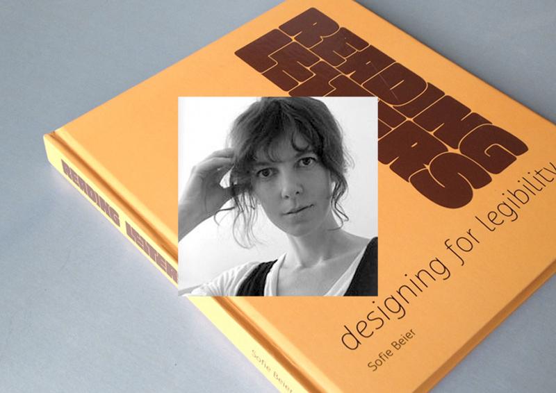 There are two groups who deal with typographic legibility: On the one hand, there are scientist, usually from the field of psychology, who carry out scientific tests to study how we read texts and which parameters influence the legibility of type. On the other hand there are graphic designers and type designers which base their opinions about legibility on the conventions of hundreds of years of type setting and their personal experience. Unfortunately, until recently both sides rarely talked to each other, resulting in designer’s opinions about legibility which contradict the current state of scientific legibility research and scientists doing research with insufficient test set-ups and questionable interpretations of their studies. Luckily, this is currently changing. More and more research is done, where scientists and designers work together—designers like Sofie Beier. For her dissertation she researched the effects of type familiarity. Her new book Reading letters is in parts based on this work. It combines scientific theories and findings with typographic and historic background knowledge about the design principles of type for certain applications. You can take a look at the table of contents here. The purpose of the book is to support type designers in creating legible typefaces and help graphic designers to determine the optimal typeface for a given project. But the book doesn’t work like a “manual”. It does not list the most legible typefaces or will tell you settings for font-sizes, line-heights and so on. It’s all about understanding the principles of legibility. Definitive answers about the fundamental parameters of legibility are yet to be found and Sofie Beier was certainly well advised, not to speculate too much in this book. But still, even though this book cannot answer every question about legibility — if you are interested in legibility research from a typographic point of view, this is the book you need to read. 1. How did you became interested in the scientific research of legibility in the first place? Many years ago, I was looking for a book on the subject. I wanted to expand my knowledge on typeface legibility in relation to my own type design. I couldn’t find such a book, so I started a more systematic collection of what various writers had put forward on the topic. This eventually led to me taking up a PhD at the Royal College of Art in London. 2. The design of print typefaces has evolved for over 500 years without any scientific research of legibility. Do you think we can still improve our designs through science or is the purpose of the current research more about understanding reading & legibility instead of actually applying the findings to new type designs? I have no doubt that scientific legibility investigations can improve the design of new typefaces. Until the industrial revolution, typefaces were solely applied in printed books. Contemporary typefaces have to meet a range of new demands. Sometimes they are 2 meters high on a billboard, sometimes 10 pixels high on a computer display. Legibility varies depending on the situation the typeface is presented in. Scientific legibility investigations can help us understand these differences. 3. Has your research influenced your own type designs? Yes, three of my typefaces (Ovink, Pyke, Spencer) all came out of a study on the individual letter shape that I ran in collaboration with Kevin Larson. Within each typeface we looked at the shapes of those lowercase letters that are known to be misread most often. The three typefaces are based on these findings. On top of that, I also added other legibility improving elements related to their individual usages. Ovink is a signage typeface, Pyke is a text typeface, and Spencer is more an allround typeface. 4. In your study together with Kevin Larson you proved that certain letters designs (like the one-storey a) are much more likely to be confused with other letters. Why do you think such typefaces (like Futura) are still used so often in situations where legibility is crucial? Many designers do not care much about legibility; the focus is often on other things. That being said, it depends on the circumstances. Research shows that we are quite capable of reading words even when some of the letters are illegible. We simply use the surrounding letters and our knowledge of possible letter combinations to guess what letter it is. So in some situations, the one-storey a might not be a problem. 5. The typeface legibility comparison done for the new Heathrow Airport terminal suggested that condensed typefaces perform worse than wider typefaces set smaller. Do you agree? And if yes: why do you think that is? Everything indicates that it is the case. I have no idea why. It is an interesting topic, which I hope to run experiments on in the nearest future. 6. What was the most surprising result from all of your legibility research? The issue mentioned above, of character proportions in distance viewing might be the biggest surprise. When we know more, it can end up having a large implication on the design of new signage systems. 7. Serifs or no serifs? Do they play a role in terms of legibility? Throughout the history of legibility research, this has been the most popular question to investigate. I believe serifs play a role, sometimes good and sometimes bad.
-
- 1
-

-
- 7questions
- interview
- (and 3 more)
-
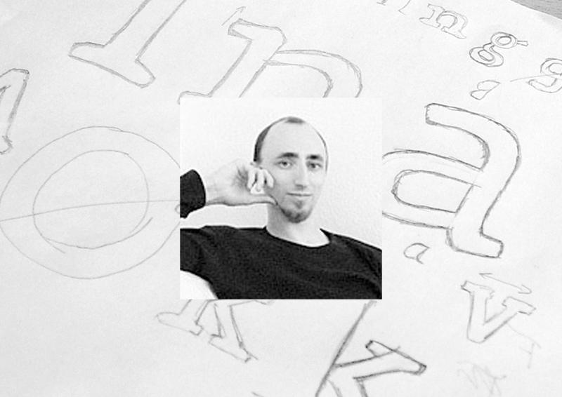 1. How did you become a type designer? I once bought one of those CD packages with 10,000 typefaces for 10 bucks in a local supermarket—the quality of those typefaces was of course miserable but the versatility of type and type use started to fascinate me. And during my study at the university my interest in typography and type design grew even more. I just loved the balance between freedom and convention that typography and type design requires. Some of my teachers probably found this approach to boring, but luckily I also had some teachers who supported me in my rather slow and analytical design approach. 2. Which role do traditional and digital tools play in your work as a type designer? As much as I would like to answer, that I do extensive calligraphic experiments, the truth is that I usually just sketch out some basic characters on paper and then quickly move the design to the computer screen, where can I can play and experiment with all the tiny details until they match my original ideas. When the basic alphabet is drawn I also do a lot of testing in design application. Even when the font is targeted to print use, working with the font on screen in a design application is where the user “feels” the font for the first time—in terms of proper spacing, the behavior of OpenType features and so on. Many problems with a font appear at this stage and can be corrected instantly in the font editor. After several proof runs and corrections I also do a lot of print-outs—both in the targeted sizes but also much larger. This helps to find tiny errors and inconsistent proportions, stroke widths, angles and so on. When the design of the letters is close to getting finished I am trying to use them in real-world projects with high-quality printing methods. Just before the release I usually completely start over with the design of the PDF type specimen. It’s like the final proof, where I am trying to use the font without any manual corrections of spacing. The quality you see in the type specimen represents the fonts you would get. 3. Your Iwan Reschniev typeface emerged from a forum discussion and you have presented you work in progress on sites like Typophile.com and Typografie.info. How important is that kind of feedback to you? When I was a beginner, such internet forums provided an excellent way to receive feedback, discuss design details and to compare my work and my way of working with those of other established type designers. But I don’t believe the internet provides a very efficient way of learning to draw type. The feedback is of very mixed quality and everyone has its own opinion. But what I do find extremely helpful are the ongoing discussion about design details, such as a recent discussion about the perfect placement of the @-sign compared to the baseline. Such discussions raise my awareness about certain design details and when I later design a typeface I am more familiar with all the possible options and the needs of the type users. 4. What is your opinion about the role of classical type-setting techniques in the education of today’s graphic designers? I consider collecting, exploring and understanding of the historical methods and point of views as valuable and inspiring. Design, typography and type as part of the human culture and the current state of knowledge and methodology are the product of what we have perceived as right and useful. But our task is to build on that treasure trove of experience and to find new solutions, where the old methods are not adequate any more. Just sticking to the past, will not get us any further. You cannot blame a graphic designer of the 21st century, never to have worked with metal type-setting. Much of the old techniques and terms are of very little practical use today and will slowly disappear. That’s an inevitable development—which we shouldn’t try to speed up, but there is nothing to regret about it either. 5. Your most elaborate type design project so far was the creation of the Tierra Nueva type family. What did fascinate you about this project? I simply love old maps. The are a testament of how people imagined the world around them. When I came across the map of America from Diego Gutierrez from the year 1562 I was blown away by the richness of detail. I especially like the type which was entirely made as copperplate engravings and consisted of several alphabets, including a Roman, a title-case version and a delicate italic. 6. What were the challenges in creating Tierra Nueva? The look of the typeface is of course heavily influenced by the copper engraving tools, which don’t permit the flowing movements of writing with a quill. Instead each stroke is carved individually, usually without the possibility to change the direction while carving. This gives the typeface it’s chiseled and sturdy appearance. The character set of the type family grew to over 1000 glyphs in the final upright versions: Small caps, title case, eight sets of figures, astrological and astronomical symbols, arrows, ornaments and a huge set of standard and discretionary ligatures. Without the intelligent OpenType feature replacements, the fonts would consist of 13 fonts instead of 4. 7. What other type design projects are you working on? I am currently working on my biggest release so far: A friendly type family, which consists of a sans and slab serif and two alternative italics. I hope to finish it in 2012 or 2013.
 -
Type design today: 7 Questions for František Štorm
Ralf Herrmann posted a journal article in Journal
 1. On which project are you currently working on? My students will open their exhibition next week on Bitov castle in south Moravia (in Czech Rep.), I’m organizing lots of things around it. Teaching is my strongest interest since 2003. Now I’m cooperating with students Tomas Brousil, Radana Lencova and Radek Sidun on a project of new typeface system for schools — all degrees from primary to universities. We have already designed 8 OpenType fonts, serif/sans families suitable for primers and scientific books at the same time. 2. What are you reading at the moment? Do you have a favourite book? I’m reading texts of my students, besides that I have to read books when designing them, I read lots of czech fiction literature. I've so may books so I move them slowly to my cottage from my Prague’s studio in believe that I’ll read them quietly in future far from civilization and stress. I love to red alone, among woods and ponds. Authors? Jaroslav Hasek, Jan Kresadlo, A. Schopenhauer, R. Feynmann, D. H. Thoreau, and yes, I read some poetry, too. 3. How do you proceed when you design a typeface? I shouldn’t say it among students, but I don’t begin with handdrawing, my computer is my sketchbook. Recently I bought a second-hand Psion Revo with Sketch application which produces funny rough pixel images made with pen on touchscreen. But seriously, everything starts with specific order or insufficiency. If I need some typeface for my layout, I simply design it. 4. Where do you find inspiration for your type design? In history and in individual experiment. first I need to know the roots, than I need to express myself. 5. How do you find the names for you fonts? It is getting harder, many good names are already occupied in the industry, I experienced twice an unwanted collision so I had to change my naming. I assume a good name of font should always reflect something from the soul or atmosphere, the story behind specific type. Sometimes it is just the name of inspiration source, Walbaum for example — obvious and simple. My “Sebastian” is different, because it shares my personal crisis in 2002–2003, I expressed my pain with type … 6. The 20th century has seen many stylistic changes in type design. Do you currently see a trend for the new century? New century is a clichee expression and so is the scene in graphic design. Fashinable, boring, aggresive and, above all, copying and borrowing already proven methods. I believe in “less is more”. And graphic design is not everything. As I’m getting older, I ask for the subject, the meaning of designed thing. There are many interesting innovative styles in non-commercial area of type design, I believe in the generation of my students, they can bring refreshing ideas based on a broad social dialogue, not narrowly focused on design only. 7. Nowadays digital type designs can spread around the world in seconds. Do you think local styles of type design will become more or less important in this time of globalization? In terms of availability of fonts, small foundries are more flexible than big ones. You won’t see anything new from big companies (you know them) except for merging libraries and confusing users. Local designers can sway the global scene more effectively than ever before. That's what Erik Spiekermann said ten years ago, and nowadays it becomes true for good. In my country, many clients believe in strong identity through logo and its repeated exposure. I advise them rather to show their products and ideas with the use of original font adjusted for their purposes. It can carry the identity by verbal interaction instead of “building an image” which may be unfaithful.

