Search the Community
Showing results for tags 'blackletter'.
Found 11 results
-
 Curated list of recommendable blackletter fonts with a sufficient quality and character set.
 -

On Kickstarter: Deutschmeister blackletter revival project
Ralf Herrmann posted a news entry in Typography Weekly #109
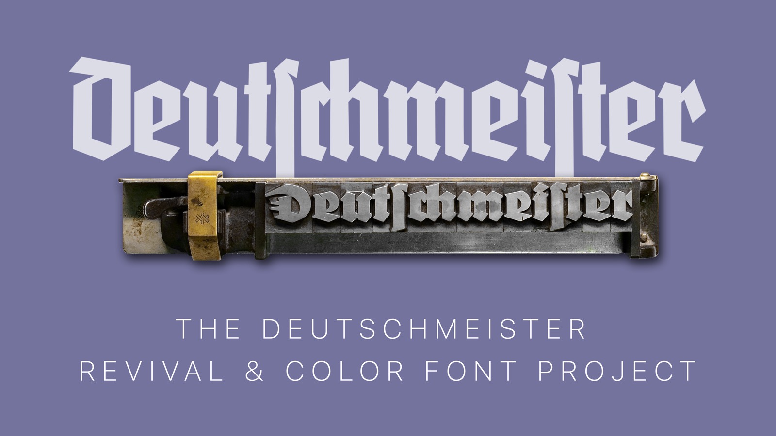 Six carefully crafted blackletter revival fonts that even let you type with the look of real metal and wood type letters.
 -
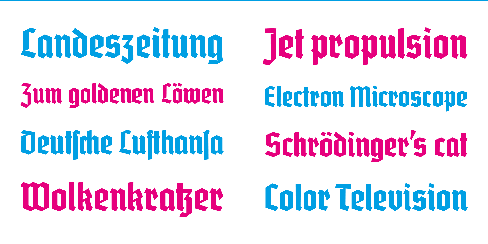
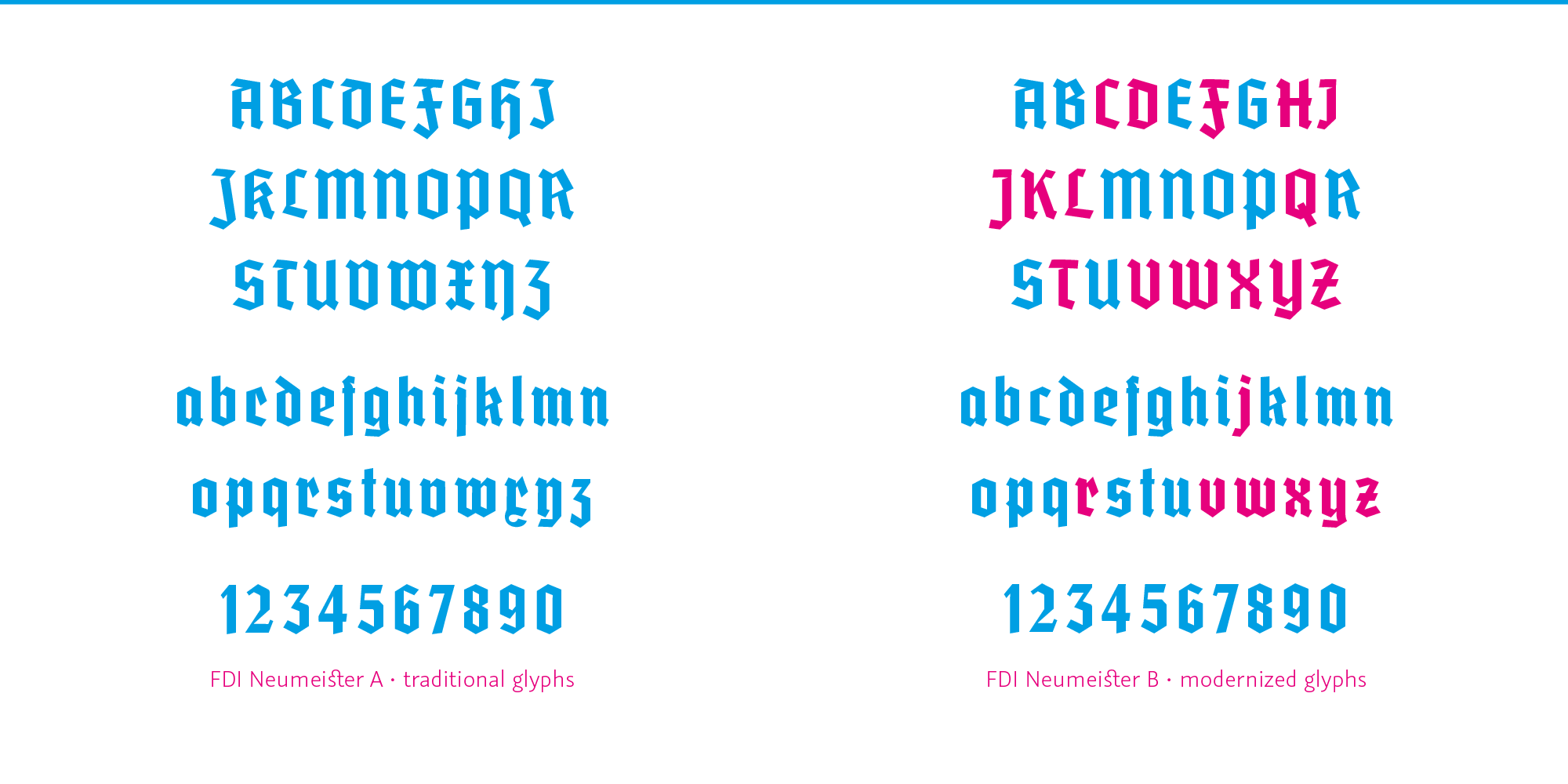
All information about the font: https://fdi-type.de/fonts/neumeister/ The font can be downloaded for free by all Typography.Guru members. Guests need to register so the download in this post becomes available. neumeister-1000.zip


-
- 2
-

-
- blackletter
- fditype
- (and 1 more)
-
Free blackletter revival FDI Wiking released
Ralf Herrmann posted a news entry in Typography Weekly #103
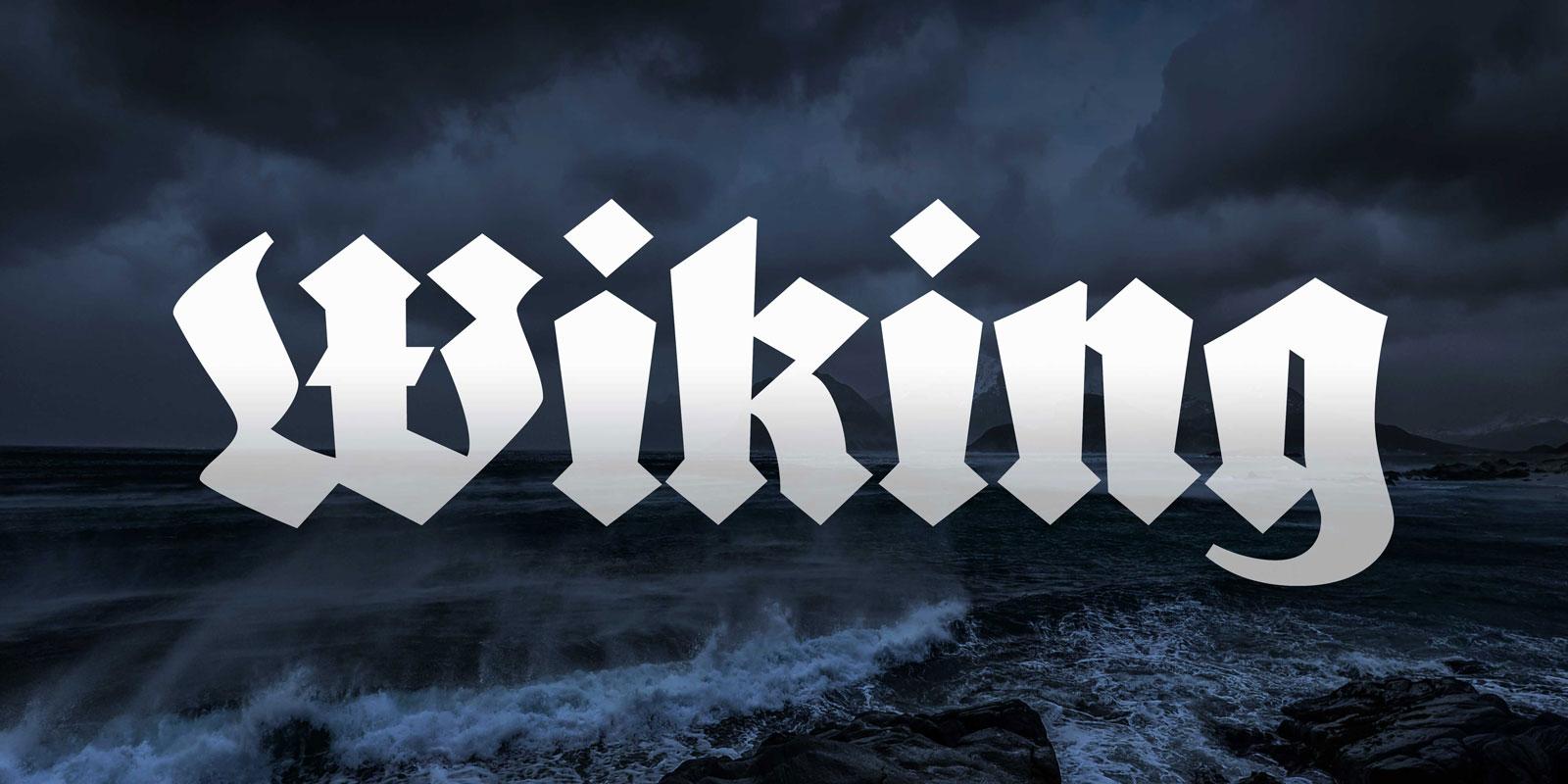 After the successful Kickstarter campaign, the revival of the blackletter font Wiking was now finished and is available for free to anyone under the Open Font License.
-
- 4
-
-
- blackletter
- fditype
- (and 1 more)
-
Kickstarter: Reviving the blackletter font Wiking
Ralf Herrmann posted a news entry in Typography Weekly #99
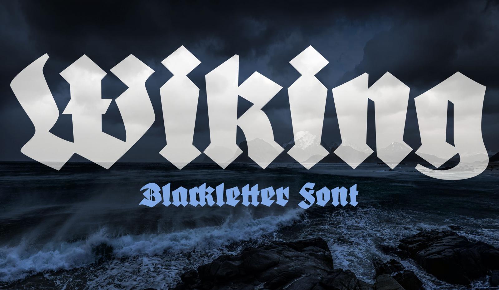 “The Wiking font was designed by Heinz König and published in 1925 by the type foundry J. D. Trennert & Sohn in Hamburg. This unique and contemporary blackletter design has never been professionally revived. But you can help make it happen. If this campaign reaches it funding goal, a careful and complete digitization of the font will be created from the original letterpress font and offered for free under the Open Font License.”
-
- 1
-

-
- kickstarter
- blackletter
- (and 1 more)
-
Reviving a blackletter font from a museum’s archive
Ralf Herrmann posted a journal article in Journal
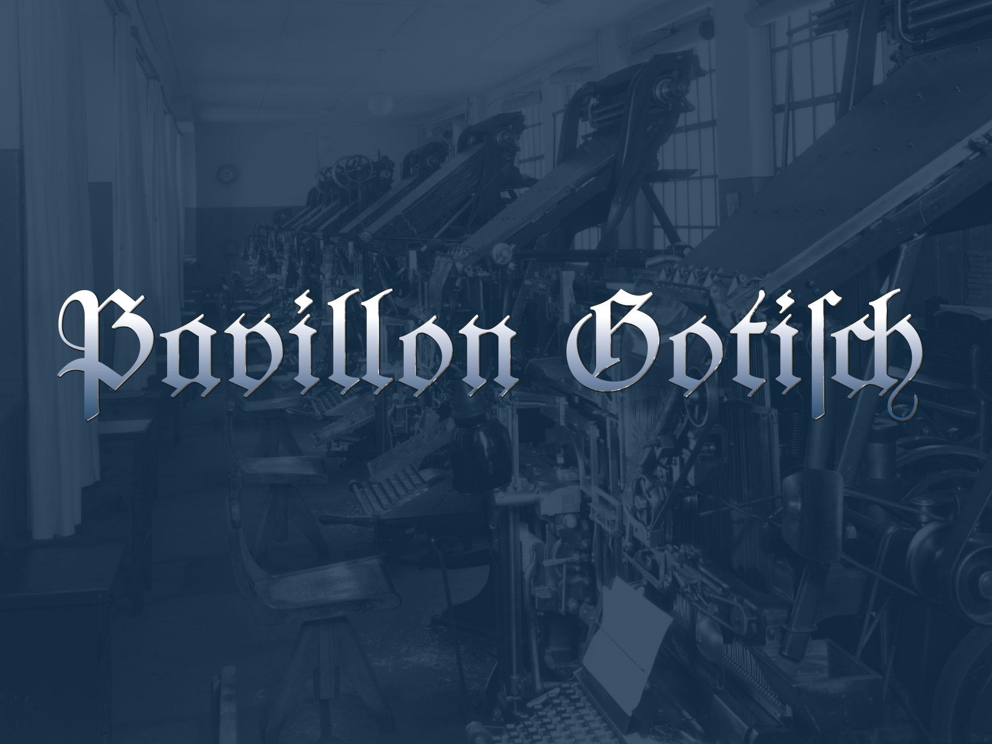 The font in use in the printing museum Pavillon-Presse Many of today’s revivals of letterpress fonts are created from original type specimen prints. Scanning and digitizing the letterforms is easy to do, but it also has its limits. For one, the technique of letterpress printing doesn’t create an exact representation of the original face on the letterpress letters. The way the letters press into the paper makes the ink spread out. The outline of the letters gets larger and softer and the ink might even close gaps or create unwanted blobs. The smaller the type, the stronger the impact of those effects. Type designers of digital type always need to make a choice about how they want to deal with this. Do they want to keep those letterpress effects or do they try to guess the original design of the face on the letterpress letters? Original type specimen print And there is another problem when typefaces are digitized from printed type specimens: The prints don’t reveal the actual size of the letters, so setting the sidebearings of each letter is usually guesswork. But with access to the original font, there was a way to overcome this problem. Not by trying to measure the tiny distances with a ruler, but by revealing them in a print. So the alphabet was set in a way, where all letters are enclosed in brass borders. Things got a little bit more complicated than originally expected—as you can see in the picture above. Some letters had overhanging parts (a.k.a. “kerns”), so a full brass line in the type size pressed against the letters would have easily broken off the kerns. So a matching combination of brass rules and spacing material was used for certain letters. But in the end, this process proved to be successful. From the print of this form specifically made for digitization, vectorizing the font using the original metrics was rather easy. The design was carefully digitized and extended to a complete Latin 1 character set. The font is called “Pavillon Gotisch” after the museum. Version A contains the original design with all the ligatures and swash characters, which can be accessed easily through OpenType. A second style (“B”) was added, which contains romanized letter variations, so the font can be more legible for people not trained in reading German blackletter texts. The fonts cannot be licensed directly. They are exclusively available to supporters of the museum or the Schriftkontor community websites Typography.Guru and Typografie.info. You can become a Typography.Guru now and get instant access to Pavillon Gotisch A and B with a full desktop license for up to 5 users. About becoming a patron
 -
 Modern blackletter typefaces or reinterpretations with a contemporary feel.
- 4 comments
-
- 1
-
-
- list
- blackletter
- (and 2 more)
-
A Smart Blackletter Font: 7 Questions for Gerrit Ansmann
Ralf Herrmann posted a journal article in Journal
 Gerrit Ansmann is a physicist from Germany, who worked on the freely available blackletter font Unifraktur Maguntia, which now has a large character set and makes extensive use of smart font technologies such as OpenType. In this interview he gives us some background information about this project. 1. As a physicist, what fascinates you about typography and type design? And what was your motivation to create such a feature-rich blackletter font? I always had an interest in computer graphics, which was intensified when it became useful for creating scientific illustrations and when Bézier curves, splines and similar were part of my elective numerics courses. Moreover, type design is an appealing art form to me due to its mathematical nature. But that’s not what actually lead me to working on blackletter fonts. As a physicist, I naturally belong to the target audience of roleplaying games, and my roleplaying game of choice was Call of Cthulhu, whose main arena is our world in the 1920s and which features a lot of investigations. Thus people like me who want to create scenarios for this game often need to create fictive newspaper clippings and similar from that period and older. Being somewhat perfectionistic, I learnt a bit about blackletter typesetting and produced texts reproducing historical typesetting, in particular the long s and blackletter ligatures. Unfortunately, most blackletter fonts that allowed for such an authentic typesetting did not support Unicode or OpenType, and so I had to find out where special characters were located for each font and manually insert them into the texts. Unifraktur Maguntia was an exception to this, but—like most blackletter fonts—was based on a dissatisfying digitalisation, e.g., words like Luftfahrt featured bars of f and t at three different heights, and the J and I were just scaled versions of each other. As the font was open, I began with fixing some prominent issues, discovered more issues, fixed them, decided to throw away everything and to re-digitialise the historic source, and so on. In the beginning, my motivation was that I could eventually create a brief guideline for historic blackletter typesetting, which would not require the user to use some esoterically placed special characters, but rely on OpenType features or similar. Soon, another motivation arose: Almost all creators of blackletter fonts seemed to go for quantity rather than quality, and I wanted the world to have at least one good and free blackletter font that allowed to do everything that one could reasonably want to do with it. 2. On which historical sources is the font based? How much of it is kept close to the original(s) and how much was reinterpreted or created new? The primary historical source is Mainzer Fraktur by Carl Albert Fahrenwaldt from 1901. It provides most letters (and ligatures) of the standard German alphabet, except J, Ä, Ö, and Ü, which were only beginning to emerge for blackletter typsetting when it was created. From the few remaining glyphs of the original typeface, I adapted a few and redesigned the others—in particular the numerals and some basic punctuation characters—as their style was roman and not blackletter. For reasons that still elude me, this was typical for historic blackletter fonts, which is why I later added numerals in the style of roman typefaces as an alternative. All other elements were newly designed, based on the existing glyphs, if possible, and inspired by the original Maguntia and other blackletter typefaces. This redesign includes the modern variants, numerals, diacritical marks, and several special characters. 3. Legibility vs. Tradition: Is the font made for traditional and/or modern blackletter typesetting and how do you deal with the legibility problems of today’s readers regarding Fraktur fonts? On the one hand, many glyphs and features only exist for the purpose of reproducing historical typesetting—allowing a user to render an equivalent to every fraktur text is one of the main goals I was striving at. On the other hand, I created modern variants of ten letters that are typically misread by readers unfamiliar with blackletter as well as a round s without a swash for use in the beginning or middle of a word, where historically a long s was used in most cases. However, when creating the modern variants, I tried to adhere to the design principles of the original typeface and therefore, for example, I did not create a modern T (as I could not come up with a satisfying design) and the modern N is still very far from a roman-type N. So the modern variants are a trade-off between readability and preserving the blackletter style, hopefully a good one. A paragraph using the traditional and modernized glyph designs 4. Traditionalists want to keep blackletter designs and their typesetting rules for German to stay the way they were in the first half of the 20th century, while others would argue that modernizations are a good way to keep the blackletter style alive. What is your opinion on modernized blackletter designs and typesetting rules? I do not think that anybody should design or use a certain typeface just to keep some style alive. Use a typeface if it fits your needs; design one, if you enjoy the process or if you think that somebody else needs it—in which case it would be this need that would be actually keeping the style alive. That being said, I think that both, modernised and traditional approaches, have their place: If you just want the typeface to say “traditional” or “German”, and readability is a valid concern, modernisations are fine; if you want the typeface to say “historical” or “old”, and you can trust your audience to decypher the text in a reasonable time, use the long s, the traditional letter forms, ligatures, and so on. However, I have no sympathy for pointlessly bizarre mixtures or failed attempts at being historical that could have been avoided with one minute of Internet research. The most common of these mistakes is plainly replacing every s with a long one, but there are also things like the new Warsteiner logo, whose t looks like a blackletter k, if anything, but neither like a blackletter nor a roman t. 5. Today, Fraktur fonts are rarely used for typesetting German and when they are, there is often an intentional or unintentional connotation with Nazi Germany. Is that something we can even overcome? What uses do you have in mind for Unifraktur Maguntia or how would you like to see it used? In my experience, fraktur has its niches in Germany where it isn’t automatically associated with Nazis, for example in the contexts of tradition, history, or ceremony. Outside Germany, it can have similar niches, in particular in countries who used fraktur historically—e.g., I observed a considerable amount of fraktur in Prague. For the rest of the world, there are at least some people to whom fraktur just says “German” (which alone unfortunately makes for a Nazi connotation), but again the context and also the location is crucial. However, for other uses, I do not think we will or need to overcome a certain Nazi connotation—for instance, “historical” or “old” are not labels that one would normally see attached to one’s political views. Ironically and hopefully much to the Nazis’ dismay, one of the Maguntia’s features is a wide support of “international” characters and thus the capability of writing names of non-German origin in blackletter, e.g., for the needs of a German folklore society—I would really enjoy seeing the Maguntia being used to write the name of, say, a carnival princess of Turkish origin. Also, many features and glyphs are not aimed at reproducing historical German typesetting but that of other languages such as Latvian, Czech, Slovak, and Sorbian. That being said, I did not focus on a single type of application, but rather hope that the Maguntia gives users the freedom to do what they want for their application—be it creating a menu for an Austrian restaurant in Portugal, a facsimile of some historic text, the Polish translation of Asterix and the Goths, or even a political cartoon. 6. Can you highlight some of the smartfont features of Unifraktur Maguntia? The smartest feature is arguably the heuristics for the long s which uses the surrounding letters to decide whether an s is long or round and changes it accordingly. This isn’t perfect, but if you aren’t happy with the results, you can correct them with a zero-width non-joiner and still leave the majority of the work to the automatism. I should mention there are fonts out there that go further and implemented an entire dictionary (which are however not free and do not work in all applications). A similar automatism is implemented for the round r, a variant that can be found in very old typesetting. We also separately implemented the two types of ligatures distinguished by historical blackletter typesetting—required and typographical ones—, which facilitates the implementation of letterspacing, which dissolved the latter type of ligatures but not the former. Mainly for modern typesetting, I implemented a feature that removes the—in my opinion disturbing—swashes from round s that do not occur at the end of the word. The majority of the remaining features are not that smart, i.e., just simple substitutions, in particular the aforementioned modern forms, historic variants, and four kinds of numerals: blackletter and roman as well as proportional and monospace. 7. In which apps and situations will the font work? What are the requirements and where are the limits? Little surprisingly, a program that fully supports OpenType with feature selection is the best and allows you to quickly tune the font to your needs. If you have OpenType, but cannot or do not want to select features, there are ready-to-use variants which correspond to the activation of certain feature sets and try to emulate German historic typesetting at a specific time or cater modern readers, respectively. If possible those features are hard-coded and thus work, if there is no OpenType support at all. As a last resort, all special characters can be accessed through Unicode’s Private Use Area. On another note, if you go to small resolutions, you will notice that hinting technology isn’t really made for most blackletter typefaces. I put some effort in this direction, harmonising line widths, positions, and manually marking a lot of stems, but I am not willing to perform hinting on the bitmap level.
 -
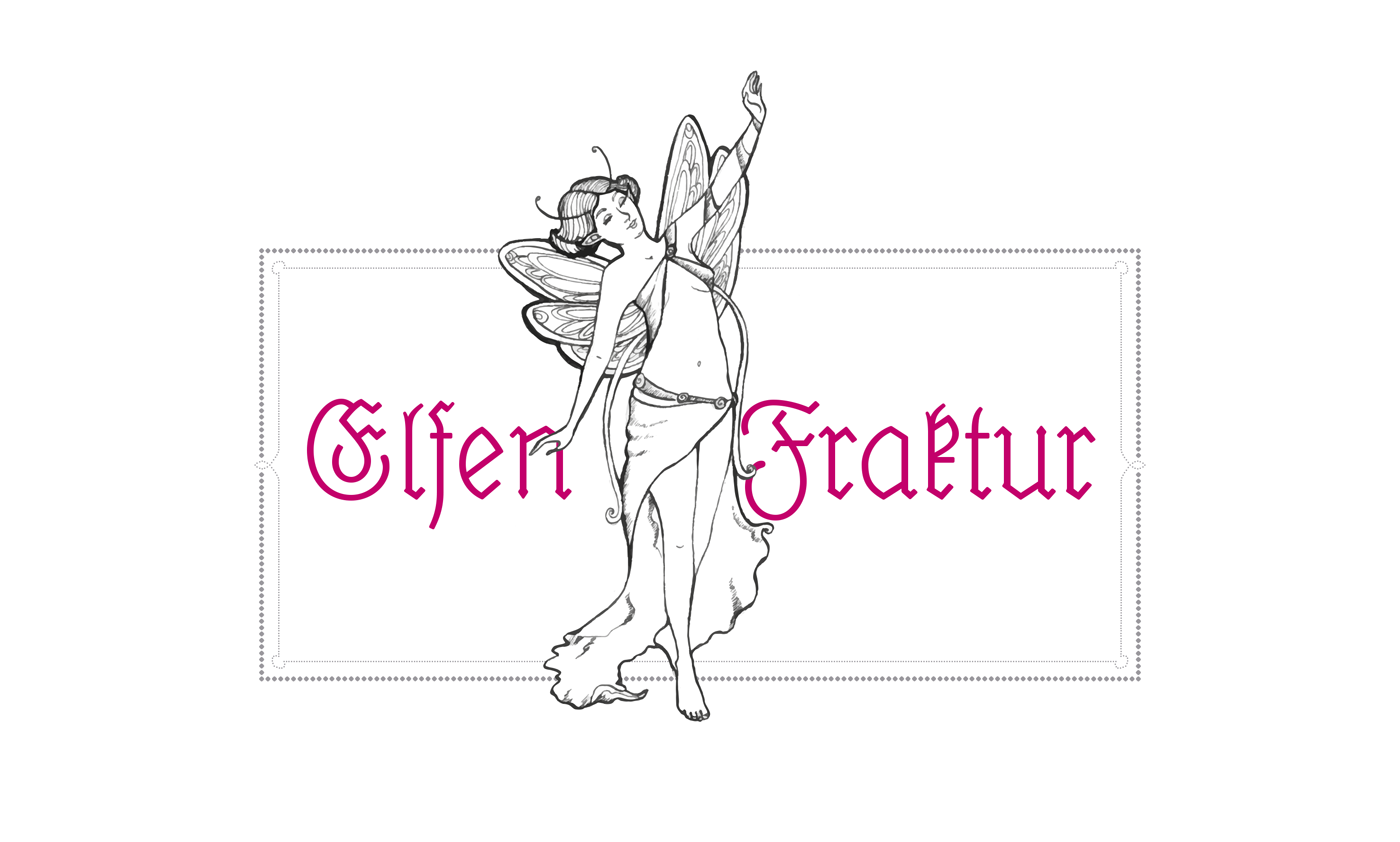 The “black” in the English term blackletter refers to usually very dark appearance of these kind of typefaces. But this appearance isn’t really the defining characteristic. The German term “Gebrochene Schrift” (broken script) says it much better. In blackletter fonts, elements which used to be rounded in preceding Latin designs were broken down to individual line segments with emphasised sharp corners. And since this type style developed somewhat independently of the Roman type style we use until today, blackletter developed some letter skeletons, which greatly differ from the Roman design and make them hard to read for many today. In Germany blackletter fonts were in broad use until the middle of the 20th century. The most used category of blackletter fonts was Fraktur—a much more open and legible design than the original dark and narrow blackletter fonts in medieval books. Fraktur fonts were available in a great variety of designs—from thin and delicate calligraphic typefaces to bold and geometric. But they all shared one characteristic: the typical change of weight caused by the use of a broad-nip pen. This feature could almost be understood as a necessity to make blackletter fonts work. Experimental monolinear blackletter fonts appeared occasionally like in this booklet for sign painters from a German pen maker who also sold pens for monolinear writing. But such designs rarely made it into typefaces. The only two know designs appeared around 1920: The wobbly Lehmann-Fraktur and Elfen-Fraktur from an otherwise unknown designer listed as M Beck. Elfen-Fraktur was originally published by the foundry H. Hoffmeister, which was later absorbed by D. Stempel, one of the largest type foundries in Europe at that time. The typeface then appeared in Stempel’s catalogue of 1925—with around 1200 pages one of the biggest type specimen book ever produced. Elfen-Fraktur in the 1925 Stempel catalog When I got my copy of this book and browsed through it, Elfen-Fraktur was the one design that fascinated me the most—but more for it’s uniqueness and peculiarities than its quality. It was by no means a perfect design. It’s easy to see how the designer struggled with the design concept. While it has a monolinear look, it actually can’t be written. The designer has added little corners and weight changes throughout the design to make it work as a blackletter typefaces. An ad in Elfen-Fraktur, published in a German newspaper in 1928 Even with the huge market share of Stempel, the typeface wasn’t used very often and is almost forgotten today. So a while ago I began to digitize and revamp it. The new version of Elfen-Fraktur is now available via FDI Type. But I didn’t actually trace the outlines to make a perfect copy of the original. Instead, I used the specialty of the original design and drew all letter from scratch as monolinear letters and then refined the details. The FDI version of Elfen-Fraktur comes in two versions. Style A sticks rather close to the original letter skeletons. In combination with the discretionary ligatures it is perfect for setting German texts according to traditional blackletter and orthography rules. Style B contains alternative letters which make the typeface more legible for readers, who don’t have experience in reading Fraktur. Both sets are otherwise identical and contain the full Western character set (Win1252/Mac Roman). A free bonus is a set of 22 decorative border elements, which can be used in combination with Elfen-Fraktur or any other typeface. The border elements can directly be typed on the keyboard (letters a to v). The size of the elements (including the space character) is based on the em-square. So by keeping the tracking to zero and the line height identical to the font size the border elements will always connect seamlessly. Related links: Elfen-Fraktur at FDI Type Elfen-Fraktur at MyFonts
 -
Discussion split from here on request In older swedish official print Blackletter Fraktur and Roman are combined i peculiar ways. Here are samples from The Instrument of Government from 1634 by Meurer and 1772 by Salvius. Fraktur was body text and Roman accent.
-
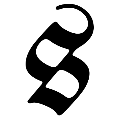 A writing/type style within the Latin script with characteristic “broken strokes” used since the 12th century.