Search the Community
Showing results for tags 'book'.
-
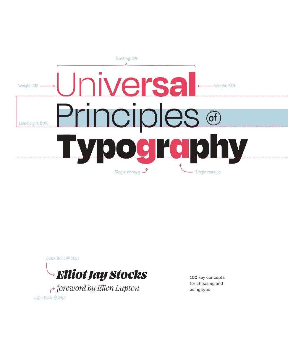
Explore 100 key concepts, theories, and guidelines that are critical for choosing and using type. We communicate with text every single day, but what does it mean to really understandtype—to use it with clear intent and purpose? The art and science of typography combines subtle tweaks to line lengths with harmonious combinations of weights and styles; considered typeface pairings with a robust set of alternate characters; exciting technological advances with the realities of font licensing. There are so many ways designers can optimize how text is read and influence the way its message is understood—and yet so many designers miscommunicate without even realizing it. Richly illustrated and easy to navigate, Universal Principles of Typographypairs clear explanations of each principle with visual examples of it applied in practice. By considering these concepts and examples, you can learn to make more informed, and ultimately better, typography decisions. Building upon tried-and-tested principles from the world of print through to the very latest advances in browser technology, this book will equip you with everything you need to make the most informed typographic decisions in your design work today.
-

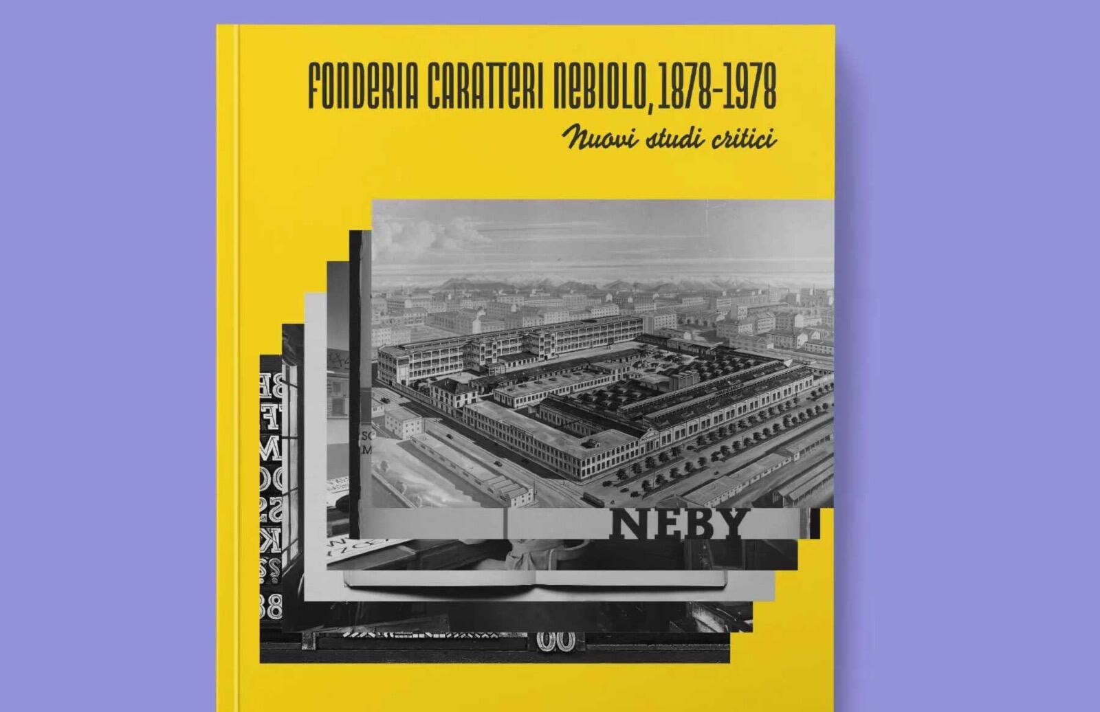
Pre-order: The Nebiolo Typefoundry, 1878-1978. New critical assessments
Ralf Herrmann posted a news entry in Typography Weekly #128
-

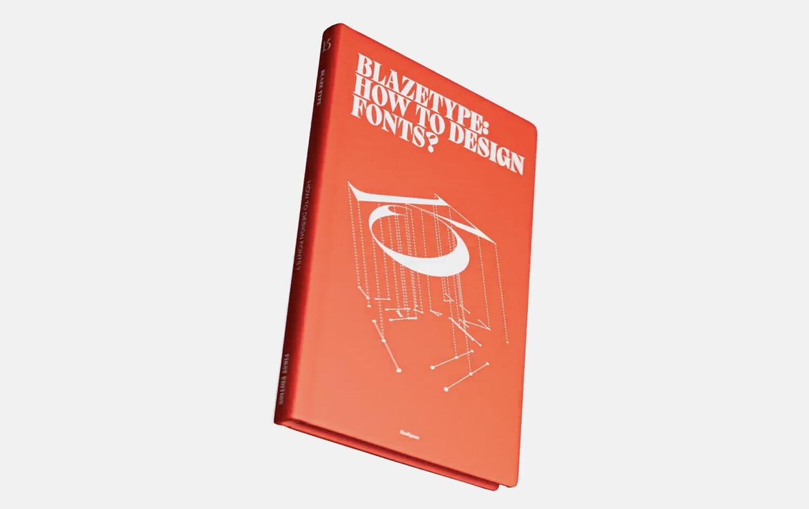
How to design fonts. A new book from Blaze Type
Ralf Herrmann posted a news entry in Typography Weekly #127
-
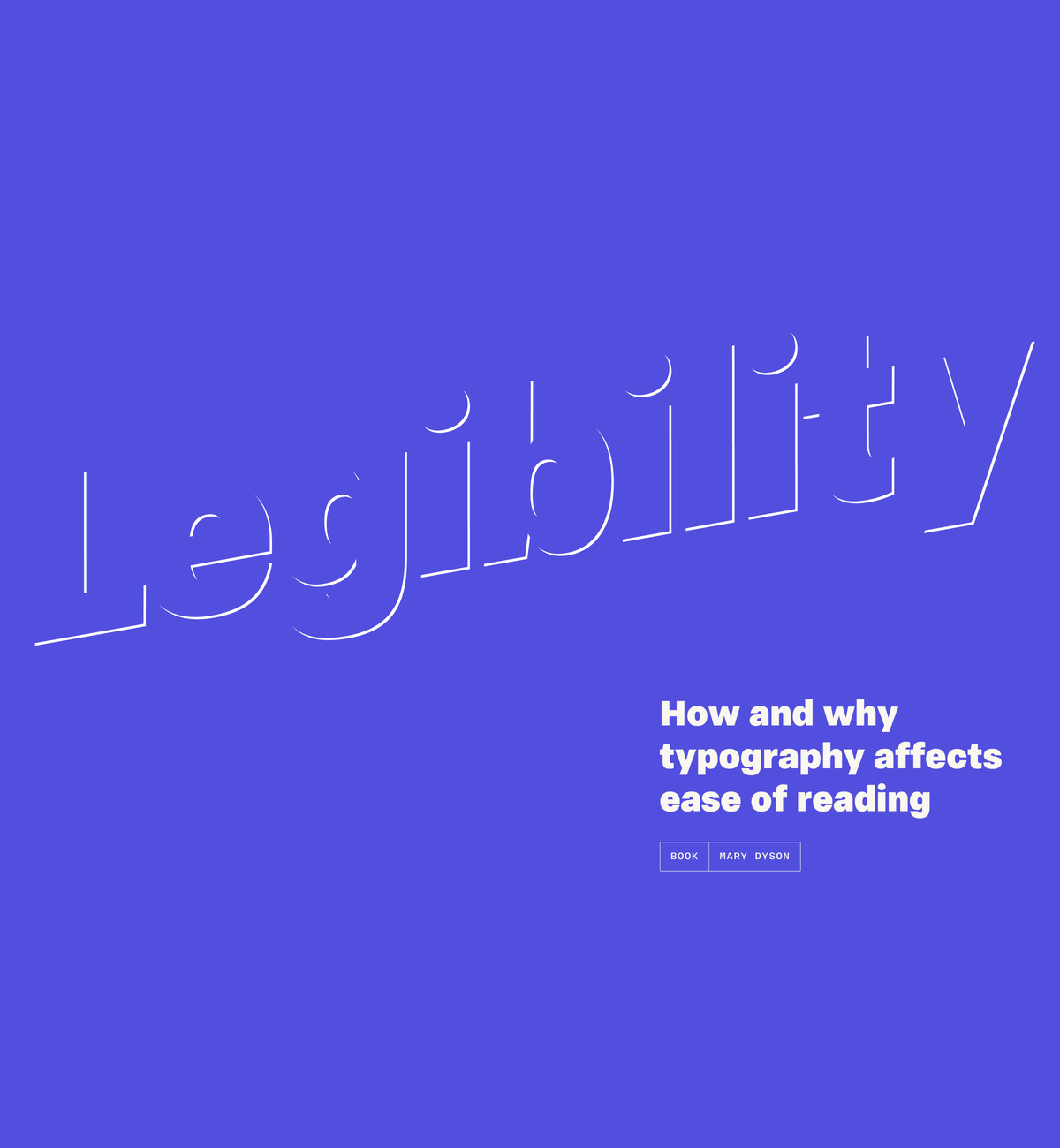
Legibility: how and why typography affects ease of reading
Member Ric… posted a news entry in Typography Weekly #126
-
- book
- legibility
-
(and 1 more)
Tagged with:
-

Adrian Frutiger - Typefaces: Complete Works
Member rke… posted a directory entry in Typography Books
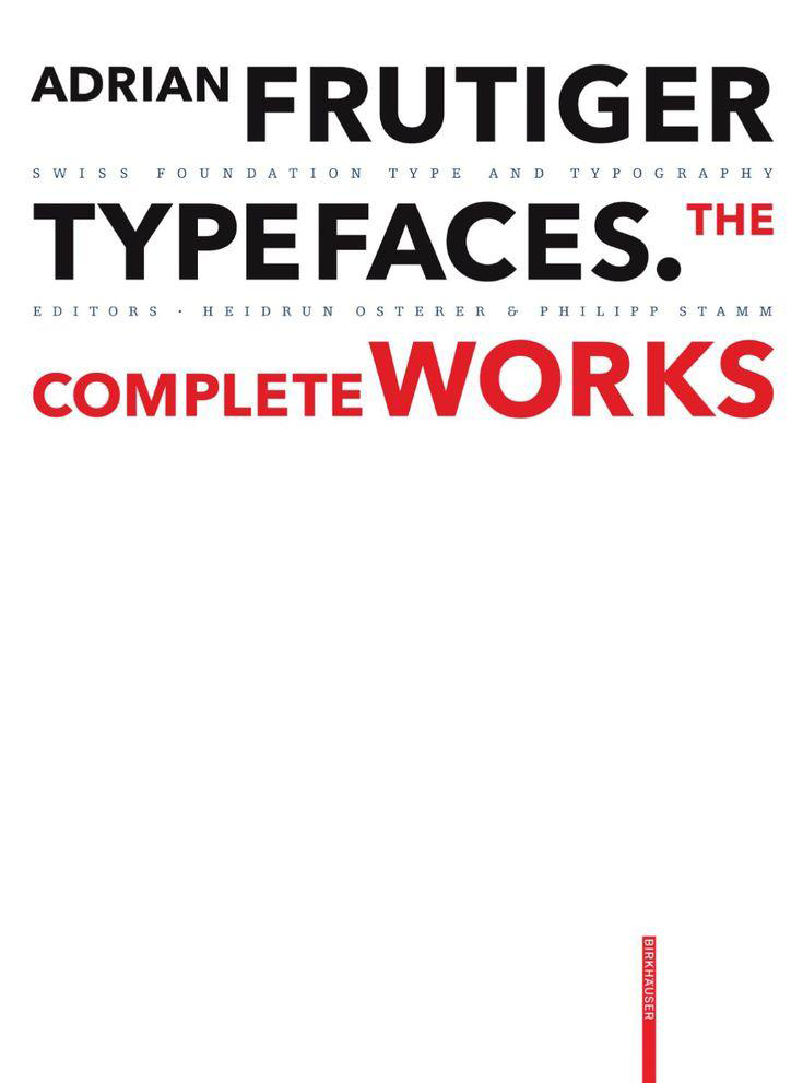
The Swiss type designer Adrian Frutiger decisively influenced the international creation of typefaces after 1950. His Univers typeface and the machine-readable font OCR-B are milestones, as is his type for the Paris airports, which evolved into the Frutiger typeface. All set new standards for signage types. In all, he created some fifty types, including Ondine, Méridien, Avenir, and Vectora. Based on conversations with Frutiger himself and on extensive research, this publication provides a highly detailed and accurate account of the type designer's artistic development. All of his types - from the design phase to the marketing stage - are illustrated and analyzed with reference to the technology and related types. Hitherto unpublished types that were never realized and more than one hundred logos complete the picture. This publication provides a highly detailed and accurate account of the type designer's artistic development. -
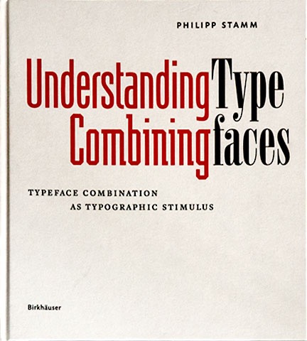
Combining typefaces is one of the great challenges and, at the same time, a continuing allure for typographers and designers: is it meant to be extravagant or should it only be carried out to a limited degree or, ideally, not at all? Which fonts harmonize with each other, and which don't? Which ones complement each other or even enhance each other? There are few answers to be found in the professional literature. This handbook demonstrates that it is possible to determine criteria for the combining of typefaces. By looking at the shape of typefaces in detail and creating a revised classification of fonts, it conveys a deeper understanding of the diversity of typefaces and, based on a systematic analysis of analogy and contrast, it establishes the urgently necessary findings required for combining typefaces. An indispensable standard work for typographers and graphic designers.
-
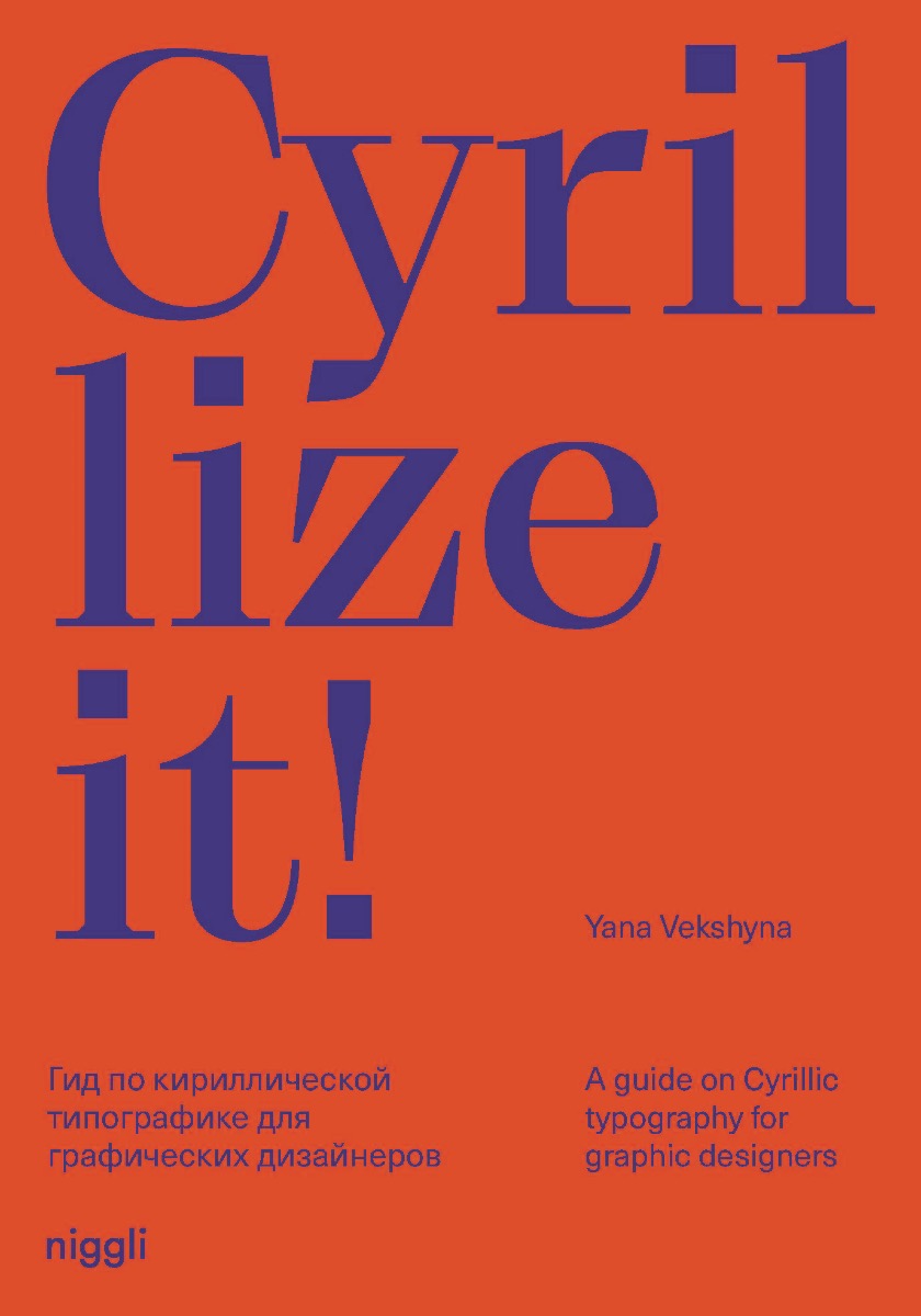
Cyrillic is a script used in numerous primarily eastern and southern Slavic languages in Europe and Asia. “Cyrillize it!” is an introductory work for graphic designers who are not native to the Cyrillic script, and cannot read Cyrillic-based languages. The book offers a method of dealing meaningfully and successfully with writing systems other than your own. The approach is based on constantly drawing parallels between Latin and Cyrillic, thus making a foreign script more familiar to non-native users. The author reflects about the relevance of Cyrillic in the modern world, looks at the history and currrent design trends, provides an overview of the typographic rules, and provides examples of Cyrillic graphic design works. With a playful and esthetically appealing design, the publication is also of interest to non-designers who are generally curious about the topic of Cyrillic script and related cultures. Author: Yana Vekshyna Language: English Pages: 160 Size: 17,5 × 25 cm, Hardcover ISBN: 978-3-7212-1018-7
-
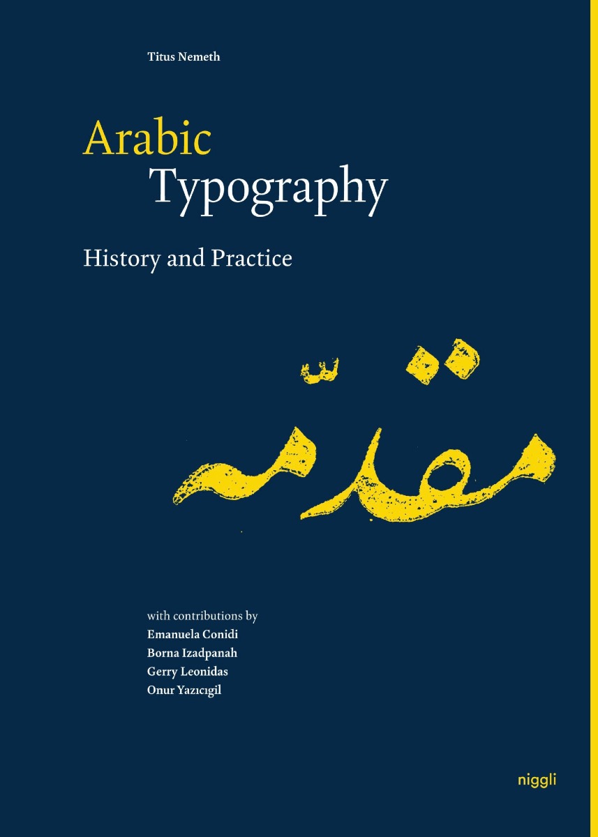
Although Arabic is the third-most widely used script in the world, there is a lack of sound typographic literature. This publication is a multi-disciplinary reference work that combines the latest academic research with applied typography. The focus on elements that pertain specifically to Arabic typography prevents overlapping with the comprehensive literature on Latin script typography, making the book relevant and accessible to the widest possible audience. The first part provides an in-depth synthesis on the typographic history and development of the Arabic script, bringing together a cohort of young scholars who are breaking new grounds in pursuing research excellence. In the more extensive second part, these historical foundations are complemented by a concise guide to Arabic typography through the lens of a design practitioner. Inspired by Jost Hochuli’s standard work “Detail in Typography”, the author vividly addresses all relevant micro-typographic parameters. Language: English Pages: 304 Size: 17,5 × 25 cm, Hardcover ISBN: 978-3-7212-1017-0
-
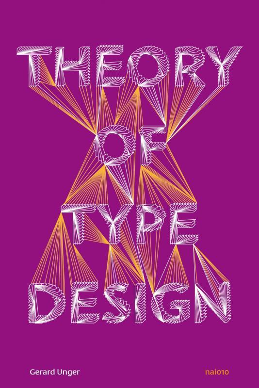
Theory of Type Design by type designer Gerard Unger is a comprehensive theory of typeface design. This volume consists of 24 chapters, each describing a different aspect of type design, from the influence of language to today’s digital developments, from how our eyes and brain process letterforms to their power of expression. This book includes more than 200 illustrations and practical examples that illuminate the theoretical material. The terminology is explained in the volume’s extensive glossary. The theory is internationally orientated and relevant for typography courses, professionals and those with a general interest in text and reading all over the world.
- 1 review
-
- type design
- book
-
(and 1 more)
Tagged with:
-
Thinking with Type is the definitive guide to using typography in visual communication, from the printed page to the computer screen. This revised edition includes forty-eight pages of new content, including the latest information on style sheets for print and the web, the use of ornaments and captions, lining and non-lining numerals, the use of small caps and enlarged capitals, as well as information on captions, font licensing, mixing typefaces, and hand lettering. Throughout the book, visual examples show how to be inventive within systems of typographic form—what the rules are and how to break them. Thinking with Type is a type book for everyone: designers, writers, editors, students, and anyone else who works with words. The popular online companion to Thinking with Type (www.thinkingwithtype.com) has been revised to reflect the new material in the second edition.
-
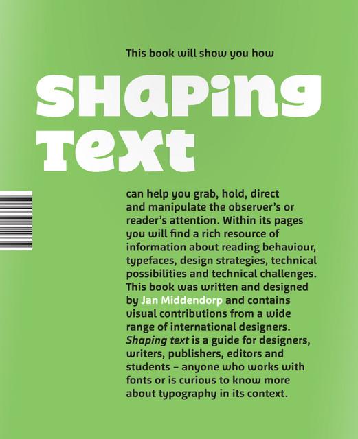
Shaping Text takes a practical and broad approach to typography. It is aimed at design students and graphic designers, and also at those who are concerned with content: writers, editors, and publishers. Showing a wide range of examples from first-rate designers across the world, the book examines why and how typographic designs work well in a given context. Particular attention is given to the team play between the text itself—written language—and the design—the shaping of the text—to form a new, multilevel visual message with a complex content. Jan Middendorp is a freelance editor, writer and designer working in Berlin. He is the author of such reference books as Dutch Type (2004), Type Navigator (2011, with TwoPoints.net), Shaping Text (2012) and Hand to Type (2012). Since 2007 he has been the editor of MyFonts' bi-monthly newsletters, which reach an audience of over a million users. He has written about type, typography, performance and media for a variety of magazines including Eye (London), Typo (Prague), Etapes (Paris), tipoGrafica (Buenos Aires) and Items (Amsterdam).
-
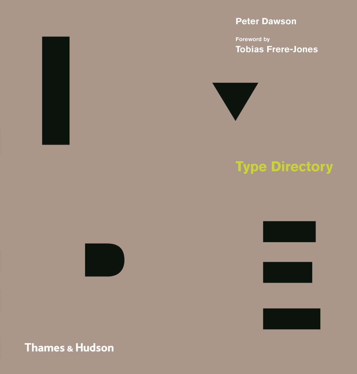
Type Directory shows 1,500 typefaces are organized by category – Serif, Sans Serif, Display, Script and Symbols & Dingbats – and subsequently arranged by recognized sub-categories. This allows the reader to make a direct comparison of typefaces with a similar appearance, thus facilitating a deeper understanding of the design and selection process. A visual celebration of the craft, innovation and beauty of these letterforms is presented throughout, from classic typefaces like Garamond, Bodoni and Times through to the contemporary Bliss, Gotham and Meta. Author Peter Dawson co-founded his design practice, Grade, in 2000. He is a fellow and a former chair and board member of the International Society of Typographic Designers, and has also acted as a visiting typography lecturer at a number of universities.
-
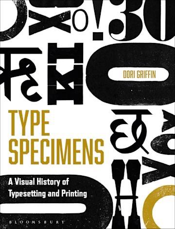
Type Specimens introduces readers to the history of typography and printing through a chronological visual tour of the books, posters, and ephemera designed to sell fonts to printers, publishers, and eventually graphic designers. This richly illustrated book guides design educators, advanced design students, design practitioners, and type aficionados through four centuries of visual and trade history, equipping them to contextualize the aesthetics and production of type in a way that is practical, engaging, and relevant to their practice. Fully illustrated throughout with 200 color images of type specimens and related ephemera, the book illuminates the broader history of typography and printing, showing how letterforms and their technologies have evolved over time, inspiring and guiding designers of today.
-
- 1
-

-
- typespecimen
- book
-
(and 1 more)
Tagged with:
-
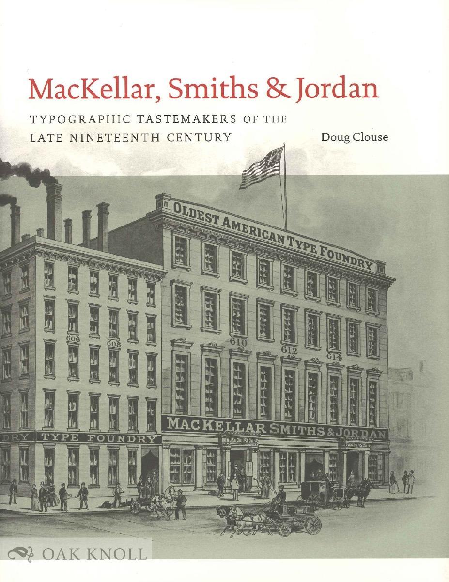
This study of America’s leading type foundry of the nineteenth century, MacKellar, Smiths & Jordan, emphasizes the design of the hundreds of typefaces that were produced by the foundry, from its inception in the 1860s until its merger with most other American foundries at the end of the century. The author describes how changing business conditions and technical improvements in type founding interacted with changes in public taste over the decades to modify the appearance of American typefaces. While MacKellar, Smiths & Jordan is only one of many American foundries, it can stand as an exemplar of the rest. It was the descendant of the first successful American type foundry, Binny and Ronaldson, started in Philadelphia in 1796, and set many industry standards in business practice, manufacturing, and design. When taste turned away from ornamented type styles at the end of the nineteenth century, MacKellar, Smiths & Jordan’s output fell into obscurity. This study proposes that the earlier styles were very successful in their own time and should be judged on that basis. A completely illustrated appendix showing MS&J’s original typeface designs accompanies the text.
-
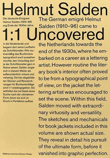
Helmut Salden Uncovered 1:1 is the first international monograph on Helmut Salden (1910–96), exploring his original sketches and working drawings. The material spans the years 1939 through 1970. In those years, Salden was the most celebrated Dutch lettering artist. All drawings are reproduced at actual size and reveal in detail his pursuit of the ultimate form. Helmut Salden Uncovered 1:1 by Mathieu Lommen & Karen Polder Language: English/German Pages: 80 Size: 16,3×23,4×1,9 cm Print run: 750 ISBN: 978-90-9033531-5 The book can be ordered directly from the publisher via email or from Typotheque: https://www.typotheque.com/books/helmut_salden_uncovered
-
- 1
-

-
- helmutsalden
- salden
-
(and 1 more)
Tagged with:
-
-

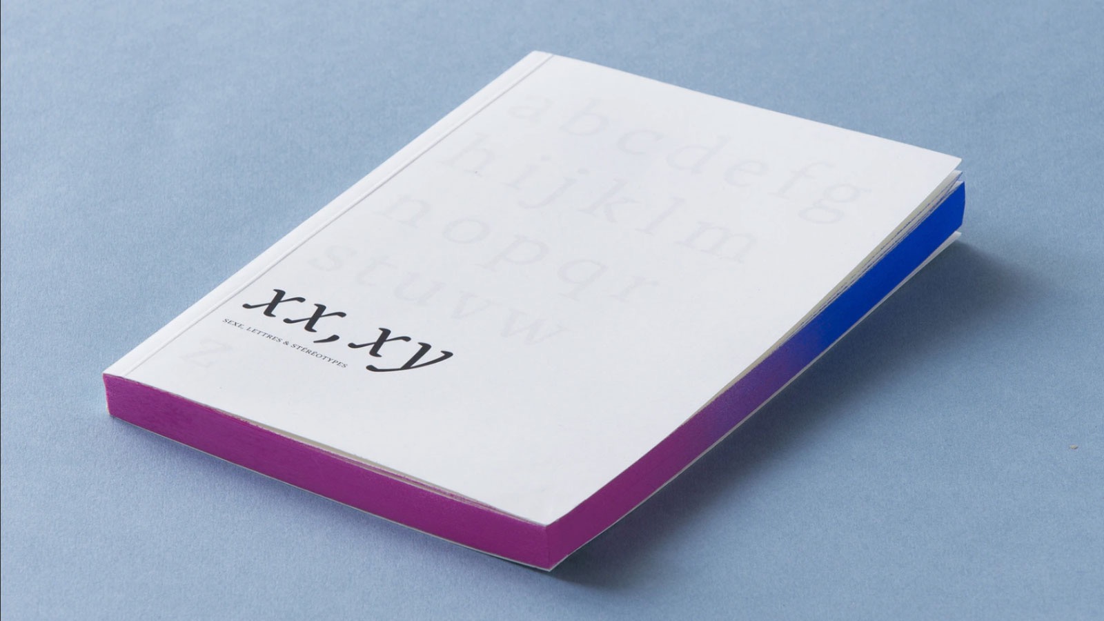
On Kickstarter: XX, XY : Sex, Letters and Stereotypes
Member Ric… posted a news entry in Typography Weekly #112
-
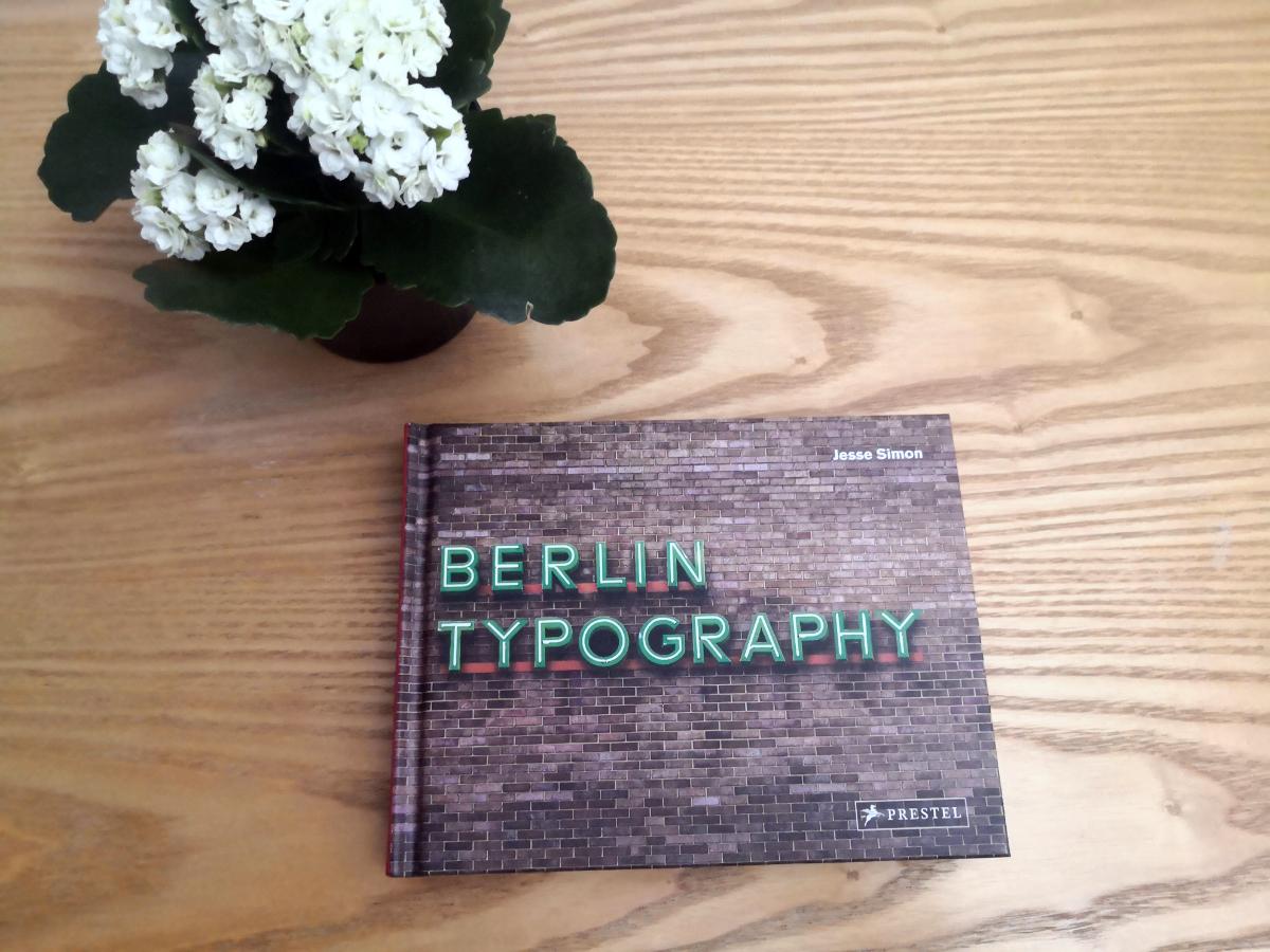
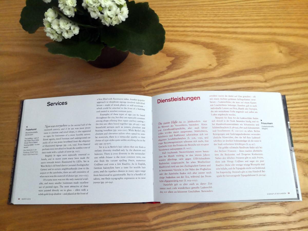
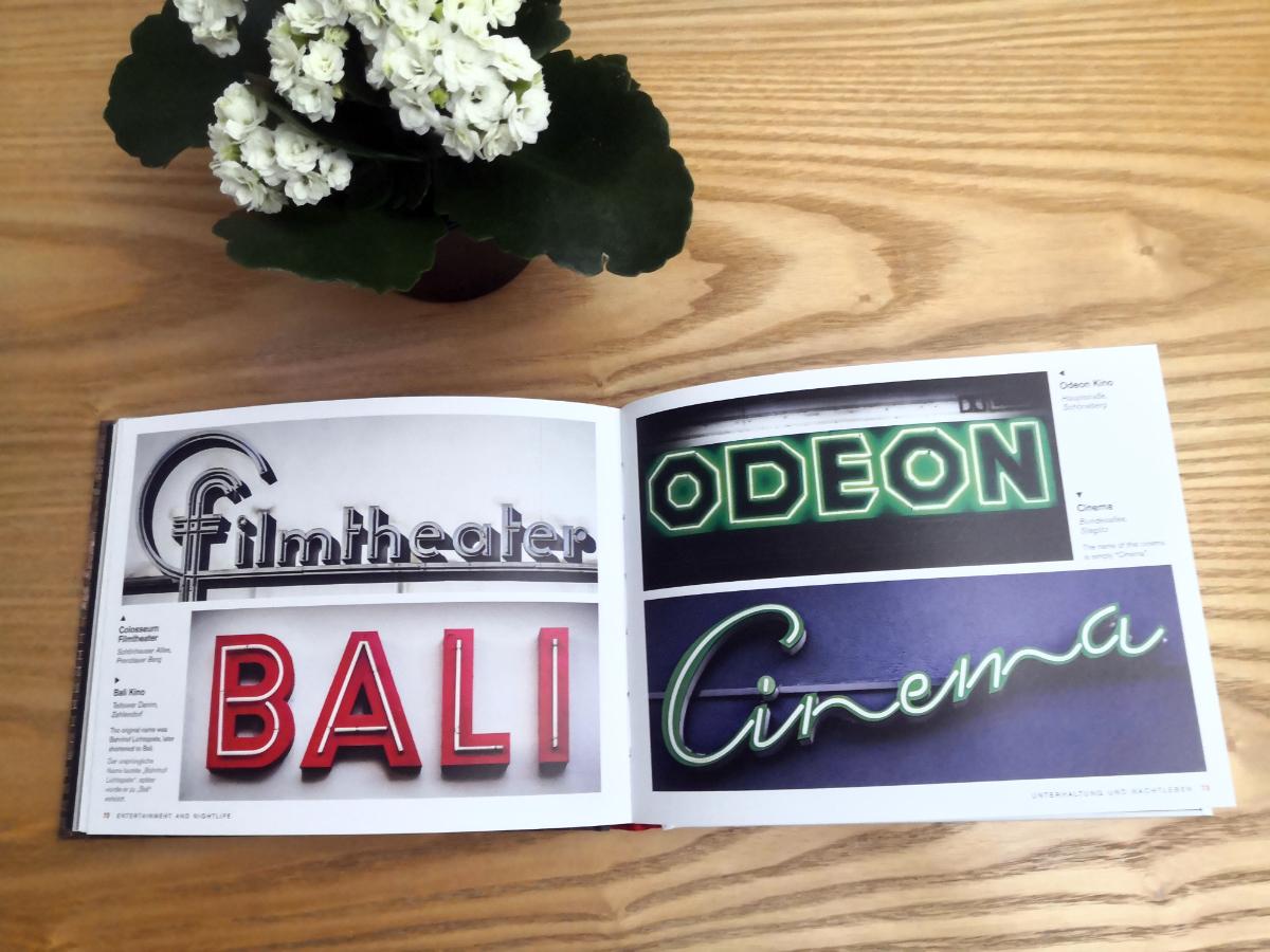
One of reasons I love Berlin is typography. From its neon shopfronts to its distinctive U-Bahn signs, Berlin is filled with stunning typography and letterforms. I just received a book by Jesse Simon “Berlin typography”. Lovely published, with hundreds of photos, and text in both English and German. I pre-ordered it a year ago and completely forgot, so it is a really nice surprise. Publisher: https://www.penguinrandomhouse.de/Buch/Berlin-Typography-dt-engl-/Jesse-Simon/Prestel/e575253.rhd Twitter: https://twitter.com/Berlin_Type It’s available on Amazon
-
-
- book
- kickstarter
-
(and 5 more)
Tagged with:
-

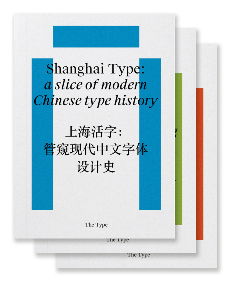
Collection of Research on Chinese Typography
Member Ric… posted a directory entry in Typography Books
“Chinese typography is not easy to tackle, but we believe that, by more self-initiated and open research, we are able to address our challenges under a global perspective and invite more discussions and breakthroughs to the field. So here is a three-volume collection of our on-going research and dialogues about typography and design in China, including its history and development, conventions and contemporary practice, and working in transcultural contexts.” Shanghai Type: a slice of modern Chinese type history Transcultural Type Design: a dialogue from China Kǒngquè: restoring the mindset of Chinese typesetting-
- chinese
- typography
- (and 5 more)
-

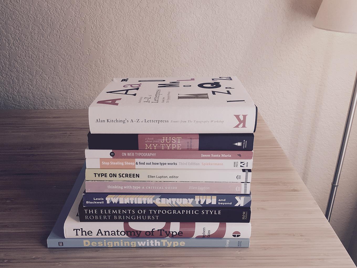
Typewolf: A Review of the Best Typography Books for Designers
Member jer… posted a news entry in Typography Weekly #97
-

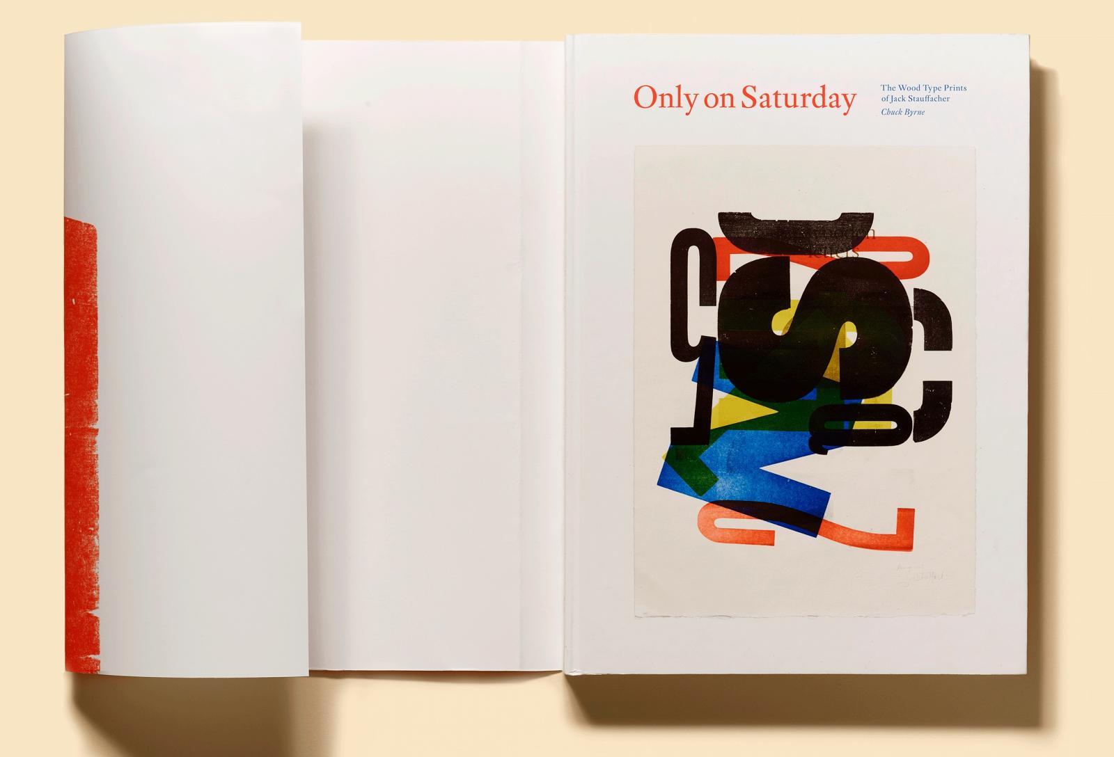
Only on Saturday: The Wood Type Prints of Jack Stauffacher
Member Ric… posted a news entry in Typography Weekly #96
-
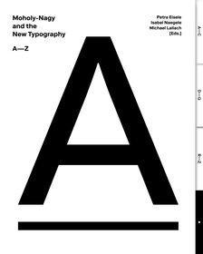
In 1929, ten years after the Bauhaus was founded, Berlin’s Martin-Gropius-Bau launched the exhibition “New Typography.” László Moholy-Nagy, who had left Dessau the previous year and had earned a reputation as a designer in Berlin, was invited to exhibit his work together with other artists. He designed a room—entitled “Wohin geht die typografische Entwicklung?” (“Where is typography headed?”)—where he presented 78 wall charts illustrating the development of the “New Typography” since the turn of the century and extrapolating its possible future. To create these charts, he not only used his own designs, but also included advertising prints by colleagues associated with the Bauhaus. The functional graphic design, initiated by the “New Typography” movement in the 1920s, broke with tradition and established a new advertising design based on artistic criteria. It aimed to achieve a modern look with standardized typefaces, industrial DIN norms, and adherence to such ideals as legibility, lucidity, and straightforwardness, in line with the key principles of constructivist art. This book showcases Moholy-Nagy’s wall charts which have recently been rediscovered in Berlin’s Kunstbibliothek. Renowned authors provide insights into this treasure trove by each contributing to this alphabetized compilation starting with “A” for “Asymmetry” and ending with “Z” for “Zukunftsvision” (“vision of the future”). By perusing through the pages and allowing a free flow of association, the typographical world of ideas of the 1920s avant-garde is once again brought back to life.
-
- 1
-

-
- moholy-nagy
- newtypography
-
(and 4 more)
Tagged with:
-

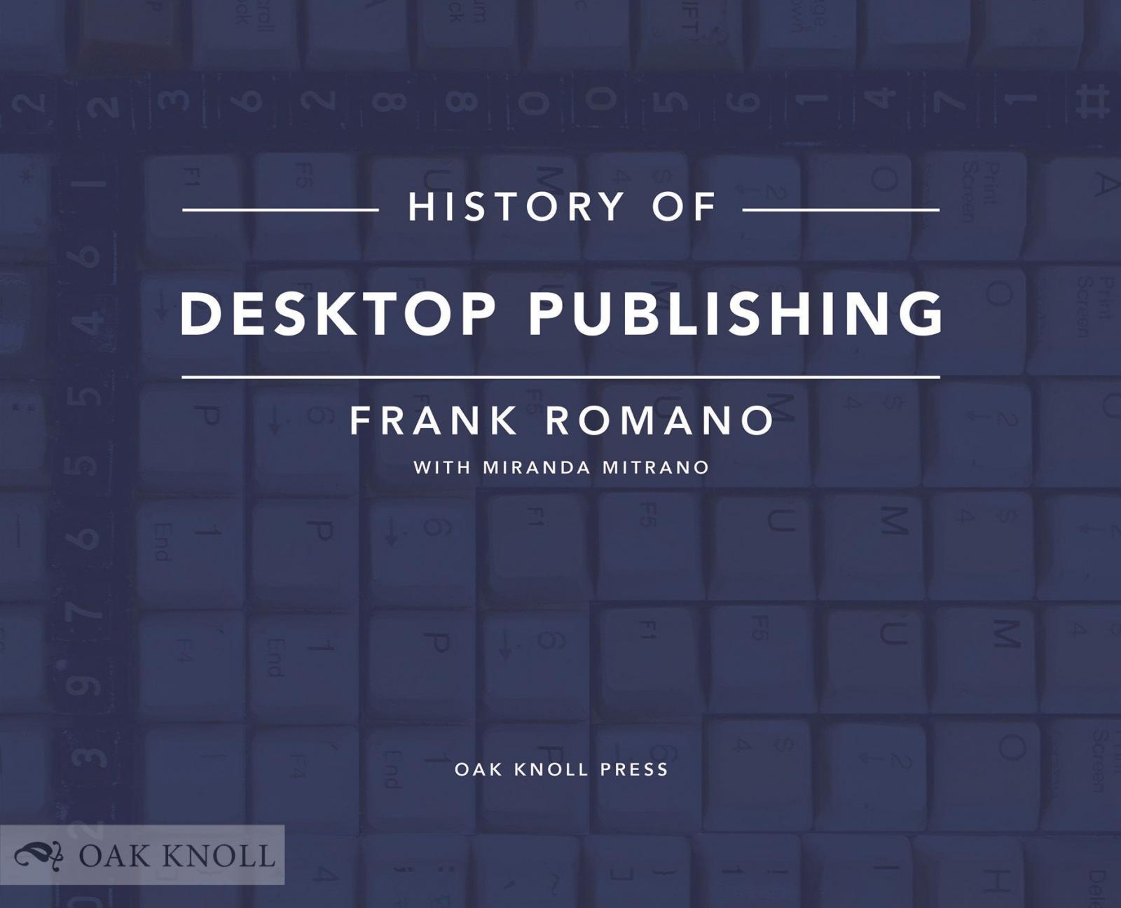
Pre-order History of Desktop Publishing by Frank Romano
Ralf Herrmann posted a news entry in Typography Weekly #95
“History of Desktop Publishing is a personal and encyclopedic story of how the personal computer, unique applications, and many colorful people changed the creative and print communities. Author Frank Romano has documented the histories of hot metal and phototypesetting and continues the tale of document production in this book. This installment ends as the Internet becomes a primary focus.” -
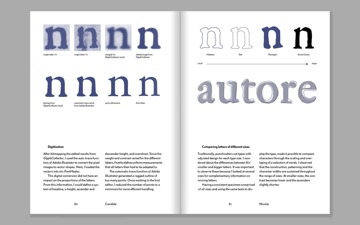
“Two studies, that started as a university course assignment and developed into an independent design-research, are woven together into one volume: one about the Renaissance letters of Garamont and Granjon, the other about the Baroque types of Nicholas Kis. The publication guides the reader from finding original sources in archives, through historical investigation and design process to the finished type.”


