Search the Community
Showing results for tags 'canada'.
-
-
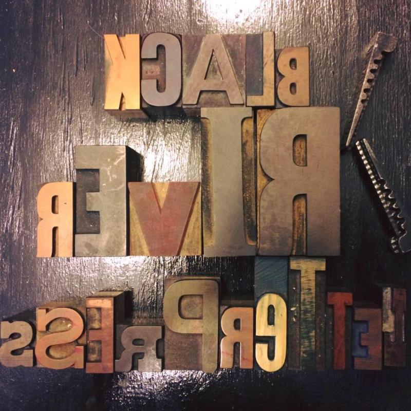
Black River Letterpress and Paper company is a design and letterpress studio. They specialize in wedding invitations and corporate event branding. As well as offering greeting cards and stationery products for retail outlets. The studio combines computer added design blended with the centuries old craft of letterpress printing. They have several vintage and antique printing presses including a Golding Jobber No.6 from 1887. The studio also offers training and letterpress workshops for those who are interested.
-
- letterpress
- printing
-
(and 2 more)
Tagged with:
-
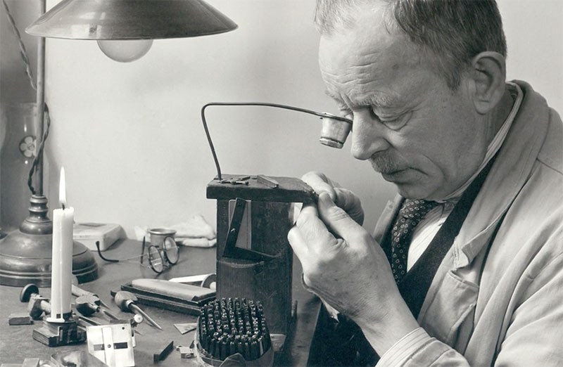
Canadian designer Carl Dair’s film on the lost art of type punch cutting. Initiated by Rod McDonald and Sheridan College in Canada, and narrated by Matthew Carter, this 45-minute film was made in 1957 when Carl Dair studied type making under master letter-engraver P. H. Rädisch at the Joh. Enschedé en Zonen Type Foundry in Holland. After Dair’s death, the film was archived for almost 60 years before Carter and McDonald became aware of it and agreed that it was an important part of typographic history and should be restored.
- 5 comments
-
- 1
-

-
- punchcutting
- enschede
- (and 5 more)
-
-
- letterpress
- printing
-
(and 2 more)
Tagged with:
-
-
- letterpress
- printing
-
(and 2 more)
Tagged with:
-
Impressus is a small letterpress studio located in Ottawa, Ontario, Canada. Karolina’s fascination with letterpress printing began in 2013 while planning her wedding. During her search for a perfect wedding invitation, she stumbled upon numerous examples of letterpress printed ones. The beauty and elegance of letterpress was so captivating that all she started thinking about was learning how to print herself. She ended up making her wedding invitations using beautiful handmade papers, and although they were not letterpress printed, her love of letterpress only grew stronger since that first encounter. She took a letterpress workshop in March 2014 and the hands-on experience ignited an even brighter spark. And in June 2014 Karolina acquired the stunning Golding Pearl Improved No.11. The Golding presses were manufactured in Boston in the early 1900s.
-
- letterpress
- printing
-
(and 2 more)
Tagged with:
-
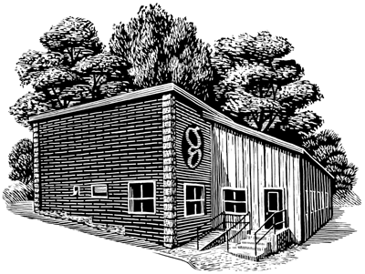
Gaspereau Press was founded in 1997 by Gary Dunfield & Andrew Steeves. It’s books—Smyth-sewn trade paperbacks, cloth-bound hardcovers and letterpress-printed limited edition—are produced in Gaspereau’s own printing works, located in the sleepy shiretown of Kentville, Nova Scotia. The press employs an unusual mixture of techniques & technologies in its book production, ranging from traditional letterpress printing using metal type and photopolymer plates to modern offset lithographic printing using customized digital type. Trade paperbacks are Smyth-sewn for strength and flexibility and often sport handprinted jackets on handmade paper; hardcovers are case-bound by hand. From editing, typesetting and production to sales and promotion, this hands-on approach carries through every aspect of a book’s creation, resulting in a process which is as culturally enriching as the books it fosters. In February 1997, Gaspereau Press was established in Wolfville, Nova Scotia, as a registered partnership by Andrew Steeves and Gary Dunfield. That year, Gaspereau Press launched the first issue of its literary quarterly, The Gaspereau Review, and published three trade titles. By 2000, the company’s publishing activities had expanded to eight titles annually. Gaspereau Press relocated to Kentville, Nova Scotia, where a printing press and bindery equipment were installed, allowing the company to undertake the production of its own books and to maintain better control of both the cost and the quality of book production. That year the Press received its first grant from the Canada Council for the Arts, joined the Literary Press Group of Canada and expanded from four to six full-time employees. In 2001, Gaspereau Press discontinued publication of The Gaspereau Review in order to focus its resources on book publishing and printing. It also won its first of many national literary awards—the Governor General’s Literary Award for poetry for George Elliott Clarke’s Execution Poems. By the start of 2004, Gaspereau Press had nine full-time employees and was publishing a dozen titles annually. That summer the company moved its shop and offices a few paces up the street 47 Church Avenue, where it is located today. In 2009, faced with financial pressures, Gaspereau Press decreased it overheads, reduced its full-time staff and returned the size of its list to between eight and ten books annually, realizing that discovering the proper scale of operation would be critical to its ongoing success. Gaspereau’s publishing program stresses the importance of quality across the entire process, from editorial and design to the manufacturing stage. At the core of its philosophy is a commitment to making books that reinstate the importance of the book as a physical object, reuniting publishing and the book arts. Many of Gaspereau’s book jackets are letterpress-printed, feature original artwork by artists like Wesley Bates, and are printed on fine paper—in some cases even handmade. Most of its books are smyth-sewn, bound into paper covers and enfolded in letterpress-printed jackets. Its house paper is the Canadian-made Rolland’s Zephyr Antique Laid, a creamy, sensual book paper. Overall, the result is strong, flexible, attractive books that are comfortable, attractive and durable. In addition to the trade titles, Gaspereau Press occasionally releases letterpress books, broadsides, and chapbooks. Gaspereau Press plays an important role in the culture, both by publishing contemporary literature by both emerging and established Canadian authors and as one of the few Canadian publishers that continue to print and bind its own books in-house. Like Coach House Books and The Porcupine’s Quill in Ontario, Gaspereau Press offers an alternative publishing model to that of the contemporary trade, one which reunites printing and publishing together under one roof.
-
-
- letterpress
- printing
-
(and 2 more)
Tagged with:
-
-
The Lettering Studio is a Toronto based calligraphy studio. Written with a dip pen and ink, we specialize in modern calligraphy handwritten the old fashioned way. Barbara Kua is the hand behind the calligraphy. Calligraphy literally means beautiful writing and stems from ancient roots. In today's age, computer generated fonts are widely accessible, but something hand written always has a warmth a computer just can't compare with. Barbara Kua takes a contemporary approach to the ancient art of calligraphy, offering fresh and modern styles. Her work has been featured in multiple print and online publications. She is based in the Greater Toronto Area, and works with clients world wide. Common services include: Envelope addressing, seating cards, table numbers, menus, monograms, invitation design, signage, rubber stamps, poems, quotes and chalk art.


