

Search the Community
Showing results for tags 'germany'.
Found 21 results
-
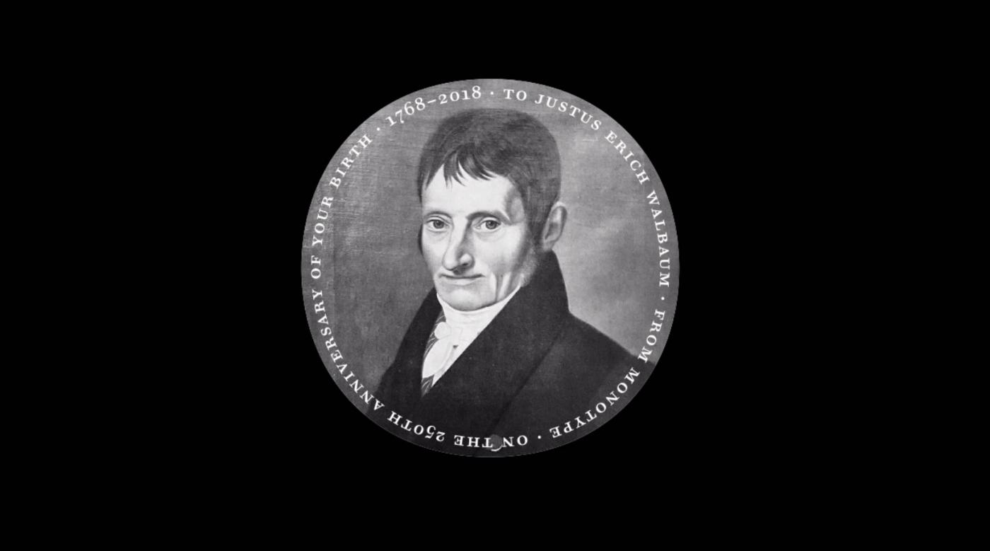 Charles Nix provides an extensive look at Justus Erich Walbaum—the 250-year-old Modern man! Charles Nix is a designer, typographer, and educator. He is a Type Director at Monotype, where he, Carl Crossgrove, and Juan Villanueva designed the 69-font Walbaum family, released in June 2018.
 -
- 2 comments
-
- 3
-

-
- germany
- tschichold
- (and 1 more)
-
Dear * I wonder which Antiqua font was commonly used in Germany during the latter half of the 19th century for printing books (or news papers). Thank you very much sws
-
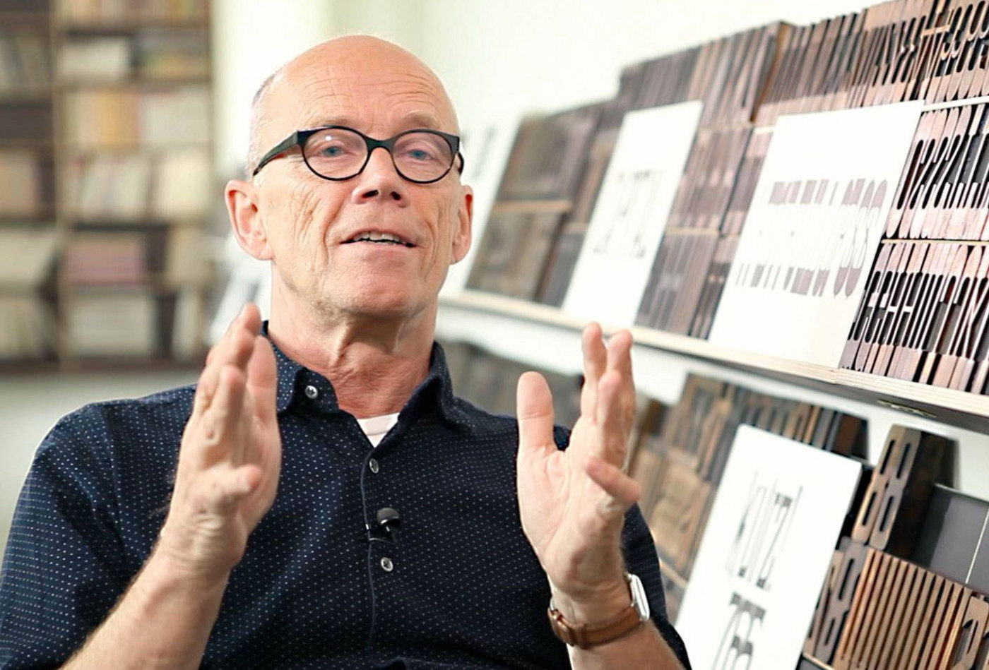
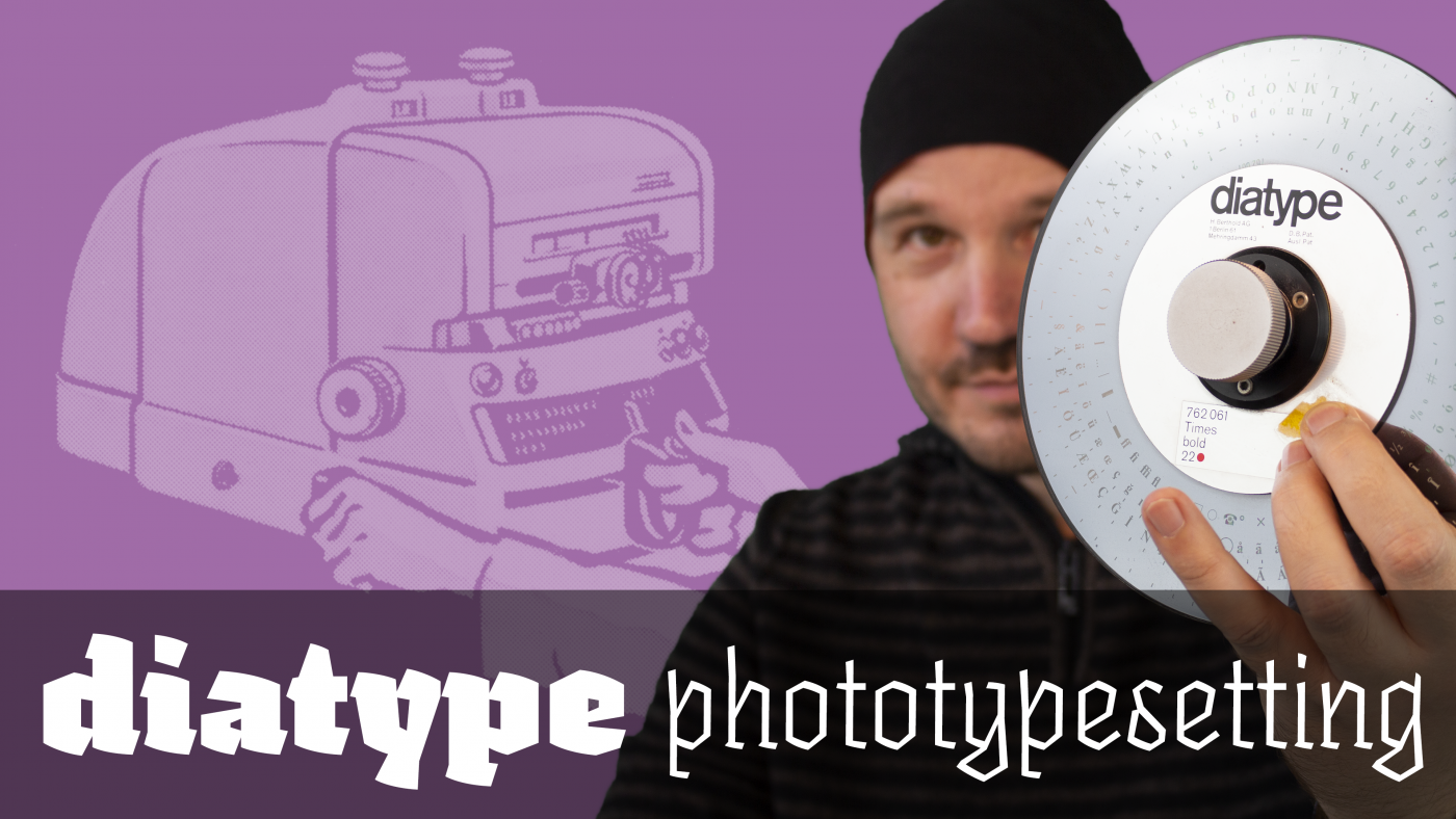 The Berthold ‹diatype› was a phototypesetting machine introduced around 1960. This video, shot at the printing museum Pavillon-Presse in Weimar, Germany explains how this device works.
 -
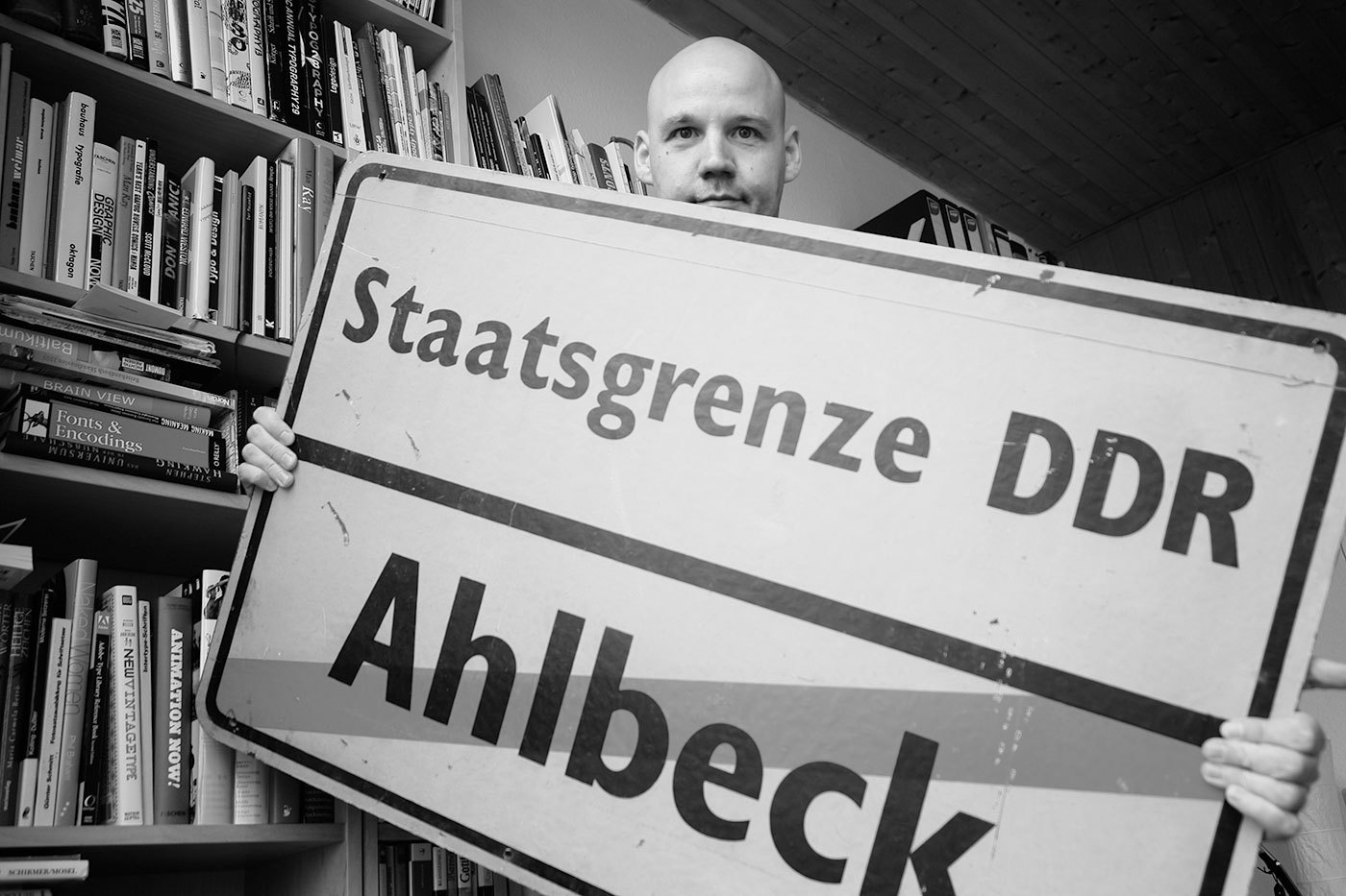 In the German Democratic Republic (GDR) the road traffic regulations were revised in the 1970s. The GDR had signed the treaty of the Vienna Convention on Road Signs and Signals (1969) and in the years 1974 till 1978 the official norm for the design and content of road signs was changed significantly. The new, quite remarkable layout also included a new typeface. In tests with a tachistoscope Gill Sans Bold Condensed supposedly performed better than DIN 1451 and so Gill Sans was used as the standard traffic typeface in East Germany. Because the old road signage typeface was usually just called DIN, the new typeface became the equally short name GIL. Source: Martin Q., Flickr. Used with permission They were certainly ahead of their time in choosing a humanistic sans-serif, but it is obvious that the spacing was way too tight for traffic signs. Here is a scan of the official norm papers (TGL 12096/91): There was just one style in use. The design is pretty close to Eric Gills original design for Monotype. The figure 1 got a hook to differentiate it from the I and the crossbar on the f seems to be wider on the right side (but still appears too short on the left side). They even took over the ridiculously small dots on the lowercase umlauts ä,ö and ü. Dear international type designers, take it from a German reader: the dots on umlauts need to look like the dots in the character i and j! So what about legibility? The GIL and DIN typeface can be easily compared. Even though the GIL typeface is actually a condensed typeface, it only uses just a little bit less space the the regular DIN 1451 (“Mittelschrift”) and the x-heights are also similar. At close range, GIL looks slightly superior. In this example, the design of a, g and r appears just more distinct. But if we simulate a greater distance, DIN 1451 actually takes the lead. Its very clear and basic design with the smaller stroke width makes it more legible under difficult viewing conditions. As you can see, the umlaut dots even disappear completely in GIL. So I find it hard to nominate a winner in this competition, but it probably safe to say that both typefaces performed rather well in those days. Other countries at the time were still using geometric designs with poor legibility that were drawn by engineers. The new design came into effect in 1977 with the new road traffic regulations. On top are signs used on regular roads and the next image shows examples of motor way (“Autobahn”) signs. Even though the new typeface was supposed to be used for all signs throughout East Germany, Autobahn signs seemed to have remained in a very old version of DIN 1451 (see next image). This was probably due to financial problems. East Germany always struggled to purchase or develop the materials they needed. That’s why most of the signs were either made from plastic or mounted on wooden plates. The majority of the signs was also retroreflective, but the GDR couldn’t effort to buy the Scotchlite materials from the USA, so they developed their own, but less effective retroreflective sheeting which was called Mikrolux. When Germany was reunited in 1990 almost all signs in GIL were quickly replaced with new signs using DIN 1451. Only some signs in rural areas remained unchanged – or ended up in my living room.
 -
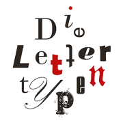 Die Lettertypen is a letterpress workshop in Berlin run by Ralf Fischer.
 -
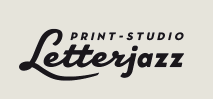 Letterjazz is a letterpress print studio in the city of Essen, Germany. They make letterpress prints, but also offer silkscreen printing and various techniques like hot foil stamping for custom print jobs.
 -
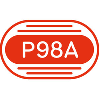 p98a is an experimental letterpress workshop in Berlin dedicated to letters, printing and paper. A group of multi-disciplined designers is exploring how letterpress can be redefined in the 21st century through research, printing, collecting, publishing and making things. They work with hot metal- and wood-type, several proof presses, a Heidelberg “Windmill” platen and other traditional analogue equipment, and combine those with digital technologies.
 -
 The Hochschule für Grafik und Buchkunst (HGB) in Leipzig (Academy of Visual Arts Leipzig) is one of the oldest art schools in Germany, dating back to 1764. The school has four colleges specialising in fine arts, graphic design, photography and new media art with around 500 students. The class for type-design at the Acdemy of Visual Arts Leipzig is run by Fred Smeijers and Stephan Müller and currently the only class with its main focus on typefaces taught at a German art academy. The academy upholds its tradition for teaching typefaces established in 1904, with the positioning of the typeface designer in today’s world as its primary concern. Work in the class for type-design will deal with “production possibilities” of typefaces, as well as research and consider current typeface usage, thereby covering typefaces used in publications and on the screen. Here the history of typography is also important. Research and analysis of historical models, the study of typeface history, typeface designers and typography illustrate the link between typeface usage and society, highlighting production possibilities and helping to determine the positioning of typefaces in today’s world. Study is divided into weekly general lessons spread over two days, in which smaller exercises, accompanying tasks and a key semester project are the main focus. Appointments for individual and group consultations can be made. In addition to the general lessons, each student chooses his/her own project on which he/she working and researching throughout the whole semester. Subject-specific excursions and workshops will also take place outside of the academy. (Image: Leander Seige, 2006, GNU FDL)
 -
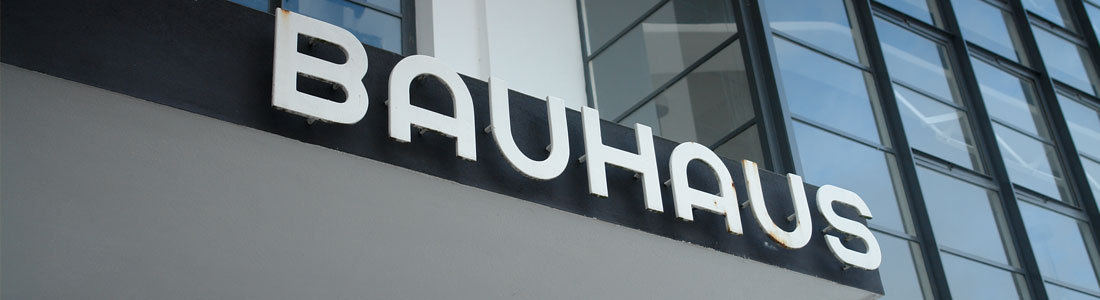 Typefaces such as ITC Bauhaus, Blippo or Pump are geometric, but they are not really related to the Bauhaus school. This lists collects typefaces, which are actually connected to the Bauhaus, either because they were used there (such as Scheltersche Grotesk/FF Bau) or are modern interpretations based on work done at the Bauhaus.
 -
 Martin Z. Schröder is a letterpress printer in Berlin.
 -

German Museum of Books and Writing (Leipzig)
Ralf Herrmann posted a directory entry in Museums & Libraries
 The book has shaped our culture and civilisation like no other medium. For centuries our knowledge about the world and its peoples has been stored, handed down and updated in books. The task of the German Museum of Books and Writing (Deutsches Buch- und Schriftmuseum) is to collect, exhibit and process evidence of book and media history. Founded in 1884 as the Deutsches Buchgewerbemuseum (German Book Trade Museum), it was integrated in the Deutsche Bücherei in 1950 following the loss of its building and some of its stock in World War 2. It is the oldest book culture museum in the world, and also one of the most important with regard to the scope and quality of its collection. The main focus of the museum’s work today is on the book and its myriad aspects: as an ingenious invention and as the product of economic and technical processes, as a social icon and the most important vehicle of culture, as a work of art and as a censored and burned repository of ideas. Even after the transition to the era of digital networks, the museum has two main functions. It is a museum which acts as an academic documentation centre for book and media history. But it is also an inviting and vibrant place of cultural education, aimed at bringing culture to a wider audience and attracting visitors with its exhibitions and educational programmes. The opening of the 4th annex building of the German National Library in Leipzig sees the German Museum of Books and Writing enter a new era. Air-conditioned store rooms, expanded work areas and generously proportioned public areas provide optimum conditions for the long-term storage and use of the collection. A modern reading room houses the specialist library and more than one million museum objects for research, study and practical use. The new display vault features a small selection of special collection items, ranging from medieval manuscripts and early Bible prints through to unique artists' books. The museum gallery is aimed at younger users aged between 6 and 16 in particular, and provides them with an opportunity to learn all about writing, books and paper in a more informal environment. Serving as a showcase for the German National Library, the museum’s new permanent exhibition provides an insight into 5000 years of media history. Entitled “Characters—Books—Networks: From Cuneiform to Binary Code”, it spans everything from the rise of early writing systems via bookprinting with movable type through to the digital online world, and also offers a light-hearted overview of the future of the information society. As a supplement to the permanent exhibition, the virtual exhibition features trenchant histories, pictures, films and sound recordings related to 5000 years of human and media history. Holdings A network of collections which have developed gradually over a long period of time forms the basis of the museum’s function as a scientific archive and centre for research into the history of writing, books and paper and as a vibrant location for exhibitions and information on book and media culture. The State of Saxony laid the foundations for the collection of prints in 1886 when it purchased the 3,000 historical copies of the Dresden tailor, publisher and book collector Heinrich Klemm's extensive collection. Numerous, and in some cases substantial, donations of major collections played an important role in the systematic expansion of the holdings (see Chronicle). The museum suffered heavy losses in the Second World War. The most valuable items of the Klemm collection were in storage elsewhere at the time (manuscripts, incunabula including a 42-line Gutenberg Bible and a valuable collection of book cover and cloth prints) and were confiscated by the Soviet occupying force in September 1945. These holdings have been held ever since by the Russian State Library in Moscow. Today the museum's stocks encompass over a million exhibits, safeguarded in the ideal environment of the modern stores in the annex building of the German National Library. Historical prints and modern book art, individual graphic sheets and series, watermarks, decorated paper, paper samples and sample books, records and documents on the history of books and paper, early writing surfaces and book forms, writing instruments, small graphic utensils and machines for the manufacture of fonts, books and paper are at the heart of the highly informative collection of samples. In their specifics and interconnected content, the collections and the reference library provide an extraordinarily complex and interdisciplinary insight into book, writing and paper-related issues which also takes into account the historical contexts in terms of culture, media and communication.
 -
 The Klingspor-Museum Offenbach is a museum for Modern International Book Art, Typography and Calligraphy. On 7. November 1953 the Klingspor-Museum opened its doors to visitors the first time. During the post-war years the City of Offenbach am Main founded a small museum for the art of modern book production and typography. The basis of the museum was the valuable collection of books of Dr. h.c. Karl Klingspor (1868–1950), who together with his brother Wilhelm operated a typefoundry in the first half of the 20th century in Offenbach am Main. Notable artists like Otto Eckmann, Peter Behrens, Rudolf Koch, Walter Tiemann, Rudo Spemann, Imre Reiner, Hans Bohn and Karlgeorg Hoefer designed typefaces for the company. The firm’s high artistic typesettings were exported to printers around the globe from its location in the Offenbacher Ludwigstrasse; the Gebrüder Klingspor type foundry was world reknowned. In 1927 at the International Book Art Fair in Leipzig, the private book collection of Dr. Karl Klingspor was exhibited as the “Room of a bibliophile” and much admired. To this day his collection of 100 books bound in leather by the bookbinder Ignatz Wiemeler is an invaluable gem of the Klingspor-Museum. Shortly after establishment of the museum, the first important donations arrived. The families of Rudolf Koch (1876–1934) and Rudo Spemann (1905–1947) gave entire collections inherited from their estates, and the young museum soon became the central collecting point for modern typographic art. The expressive calligraphy, tapestries with types and book production of Rudolf Koch and his former students are evidence of a lively Offenbach School of Calligraphy of the 20th century. The Klingspor-Museum owns a large part of the work of Ernst Schneidler (1882–1956), who founded the Stuttgart School. His students are also present, with works of Rudo Spemann, Werner Bunz, Georg Trump and Eva Aschoff. Vienna is represented by the unique collection of Rudolf von Larisch. The Klingspor Museum in Offenbach holds the largest collection outside of the Netherlands of work of the greatest Dutch printer and typographer Hendrik Nikolaas Werkman (1882–1945); with his experimental periodical “The Next Call” from 1923 to 1926 he was one of the most influential avant-garde typographer of the century. Permanent and changing exhibitions with valuable items from the museum's own collections, as well as loans from artists and collectors, show the variety of the 20th century book and printing art on an international level Visitors from all over the world come to Offenbach to see the exhibitions and the extensive collections of the modern book and typographical art. The library of the museum also boasts a number of tables where the collections can be worked with.
 -
Founded in Berlin in 1995, Gestalten is best known for our more than 500 books that document and anticipate vital movements in design, illustration, architecture, and typography as well as urban and contemporary art. We generate the topics for the vast majority of the books that we publish ourselves and compile, edit, and design each publication to be both inspirational and user-oriented. Gestalten publications are sold in almost 100 countries through bookstores and museum shops as well as specialty and concept stores. Because our books are locally available in so many markets, we come into direct communication with creatives throughout the world. Our books have found resonance not only among a global professional agency and design audience, but also among students, architects, directors, trend scouts, and anyone interested in visual codes. In addition to documenting creativity through our publications, Gestalten has established an international reputation as a think tank and impulse generator for innovative design. Our clients include Design Hotels, Diesel, Distanz, Hatje Cantz, MTV, Nokia, Redbull, Smart, Uniqlo, Volkswagen, and Zumtobel.
-
 Leipzig is a city with rich traditions of bookmaking and publishing. The Druckkunst-Museum (“Museum of the Printing Arts”) is unique for the scope and diversity of its exhibits. The outstanding feature of this museum is that all appliances, tools and machines are not presented as mute testimonies to their time, but as vivid working demonstrations of a wide range of techniques. Hands-on experimentation plays a major role, making the museum ideal as a platform for courses and workshops. A further dimension is added by independent artists, who are invited to use the facilities for their work. And as a museum open to the public, the Museum of the Printing Arts Leipzig welcomes everyone interested in the art of printing, gives room to temporary exhibitions and provides a venue for lectures and symposia.
 -
 The Pavillon-Presse is a museum of the printing arts in the city of Weimar, Germany. In the 2017 the museum opened a library with a focus on typography and type specimens.
 -
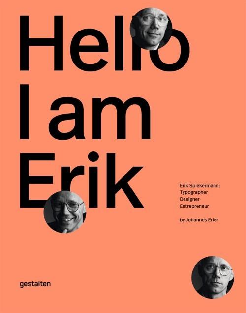 Erik Spiekermann is the epitome of a typographer. With his typefaces, commercial projects, and enterprises, he has shaped the world of graphic design like no other. This comprehensive book is the first to showcase his body of work and tell the story of his life. Hello, I am Erik is the first-ever visual biography of Erik Spiekermann s work. The book documents his projects, traces milestones in his life, and offers his personal perspectives on design. Essays by notable designers and authors provide a framework and further context for this vivid presentation of his body of work.
 -
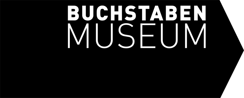 The Buchstabenmuseum (“Museum of Letters”) was founded in 2005. It is a non-profit organization and devoted to preserving and documenting letterforms. Hundreds of signs have alredy been rescued from decay and the scrap heap. They are now on display in Berlin. The current address is Holzmarktstraße 66, near Alexanderplatz.
 -
-
- 1
-
-
- spiekermann
- berlin
- (and 3 more)
-
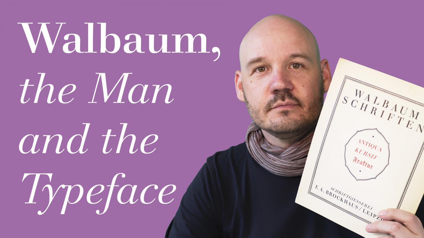 German type designer Justus Erich Walbaum created the typeface Walbaum-Antiqua around 1800. This video tells his story.
 -
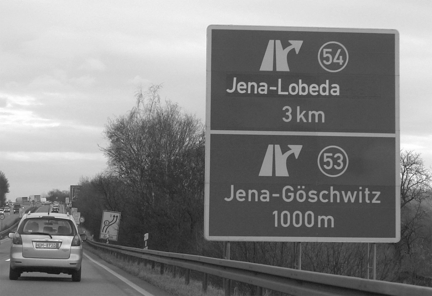 The official traffic typeface in Germany is called DIN 1451 and has a very long history. It goes back to the beginning of the 20. century when the Royal Prussian Railways (Königliche Preußische Eisenbahn) defined a new master drawing for the lettering for the description of freight cars, The typeface was later adapted for all kinds of signages of the German railways. In the 1920s major German industrial companies met to agree on all sorts of technical standardization including type standards. The result was called DIN 1451 and was based on the railway typeface. The typefaces were created on a very simple grid system and with a continuous stroke width. The type norm was published in 1936 and became a standard for traffic signs, road signs, street names, house numbers and license plates. Over the next decades the typeface also appeared on all kinds of goods and household articles, making it THE German typeface. You can read the full story of the history of the DIN typeface in a series of articles by Albert-Jan Pool (designer of FF DIN) in the issues 13, 14, 15, 17 and 18 of the encore magazine. East Germany In East Germany the use of DIN 1451 was reviewed in the 70s. In tests with a tachistoscope Gill Sans performed better than DIN 1451 and so Gill Sans was used as the stadard traffic typeface in East Germany. They were certainly ahead of their time in choosing a humanistic sans-serif, but it is obvious that the spacing was way too tight for traffic signs. (But then again, East German cars couln’t go very fast.) When Germany was reunited in 1990 all signs in Gill Sans were replaced with new signs using DIN 1451. DIN 1451 today Today two revised styles with typographic adjustments are used. DIN 1451 Mittelschrift is the main typeface: The condensed style (DIN 1451 Engschrift) should only be used when there is not enough space to use Mittelschrift. Even in this improved design it is still apparent, that these fonts were never made for traffic signs and reading at high-speed in the first place. The weight and the tight spacing is only working well at a close distance. Several foundries (e.g. FSI, Linotype Parachute) have developed font families based on DIN 1451. download at MyFonts download at MyFonts


