Search the Community
Showing results for tags 'italy'.
-

A matter of taste: Typographic modernism in Italy under fascism
Ralf Herrmann posted a news entry in Typography Weekly #122
In the 1930s, graphic designers found in fascist propaganda exhibitions and industrial advertising new spaces where an “Italian”-modernist visual language could be developed. -
-

Letterink Letterpress Design Studio
Ralf Herrmann posted a directory entry in Artisanal workshops & studios
-
- letterpress
- printing
-
(and 1 more)
Tagged with:
-
The DoppioFondo arts and culture association was founded in Venice in 2011. As a fine art print studio and independent publishing house, they specialise in workshops, artist-in-residence programmes and art projects. They also open up their studio to other artists to share our space and equipment. The name of our association—doppio fondo—literally means false bottom. It was inspired by their first studio location, a secret room on the ground floor of a 17th century building. The owner of the building kept its existence a secret for decades thanks to the hidden door that perfectly concealed the room. Because of this, they decided to call this room the “false bottom.” Inside, there is a safe recessed in a column, and a door that opens onto the canal, a porta d’acqua in Italian, typical to Venice. Edizioni DoppioFondo, among others, is one of their main projects and it aims to foster artists’ books, interpreting them as the expressions of a personal work or the final result of an artistic partnership. Their goal in this project is to promote books in a contemporary context, highlighting the importance of tradition-inspired printmaking techniques. This is the reason they choose to hand-print their books in limited edition, using tradition-inspired and non-toxic printmaking techniques.
-
Archivio Tipografico is an active and collaborative space for the preservation, the study and the practice of typographic arts. The aims are to preserve, to keep alive and to reinvent in a contemporary way the craftsmanship knowledge for movable types composition and high quality letterpress printing. Archivio Tipografico was born in 2003 as a private collection of materials from several closing northern Italy print-shops. Today it counts 2.000 fonts of lead, wood and plastic movable types, a variety of functioning printing presses including platens and flatbeds, and several typographic tools of every kind. It’s a collaborative working space, where new and old generation of printers, typographers and designers meet to develop artistic and commercial printing projects. Archivio Tipografico offers integrated and personalized graphic design, letterpress and movable types printing, hot-foil printing, edge coloring, scoring and die-cutting over different kind of printing goods: books, greetings card, business cards, posters, wedding and stationary sets, art editions.
- 1 review
-
- italy
- letterpress
-
(and 1 more)
Tagged with:
-
-
- punchcutting
- nibiolo
-
(and 1 more)
Tagged with:
-

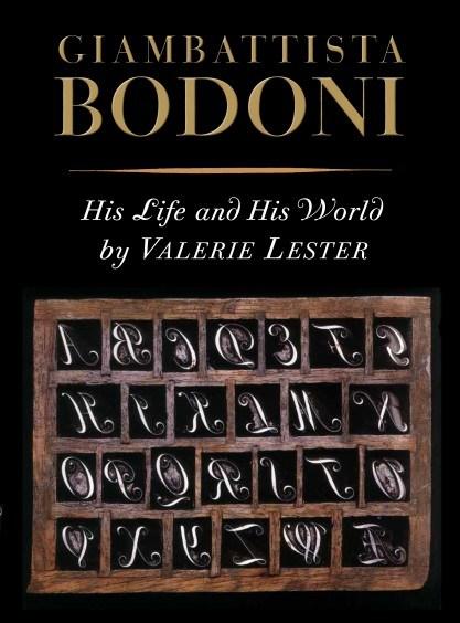
Giambattista Bodoni: His Life and His World
Ralf Herrmann posted a directory entry in Typography Books
This is the first English-language biography of the relentlessly ambitious and incomparably talented printer Giambattista Bodoni (1740–1813). Born to a printing family in the small foothill town of Saluzzo, he left his comfortable life to travel to Rome in 1758 where he served as an apprentice of Cardinal Spinelli at the Propaganda Fide press. There, under the sponsorship of Ruggieri, his close friend, mentor, and protector, he learned all aspects of the printing craft. Even then, his real talent, indeed his genius, lay in type design and punchcutting, especially of the exotic foreign alphabets needed by the papal office to spread the faith. His life changed when in 1768 at age 28 he was invited by the young Duke of Parma to abandon Rome for that very French city to establish and direct the ducal press. He remained in Parma, overseeing a vast variety of printing, some of it pedestrian, but much of it glorious. And all of it making use of the typefaces he personally designed and engraved. This book goes beyond Bodoni’s capacity as a printer; it examines the life and times in which he lived, the turbulent and always fragile political climate, the fascinating cast of characters that enlivened the ducal court, the impressive list of visitors making the pilgrim- age to Parma, and the unique position Parma occupied, politically Italian but very much French in terms of taste and culture. Even the food gets its due (and in savory detail). The illustrations—of the city, of the press, of the types and matrices—are compelling enough, but most striking are the pages from the books he designed. And especially, pages from his typo- graphic masterpiece, the Manuale Tipografico, painstakingly prepared by his wife Ghitta, posthumously published in two volumes, and displaying the myriad typefaces in multiple sizes that Bodoni had designed and engraved over a long and prolific career. Intriguing, scholarly, visually arresting, and designed and printed to Bodoni’s standards, this title belongs on the shelf of any self-respecting bibliophile. It not only makes for compelling reading, it will be considered the biography of record of a great printer for years to come. Complete with numerous color plates of the personalities, type specimens, and related illustrations, the book satisfies the cravings of the biography lover while serving as eye candy for the typophile, bibliophile, and Italophile. No less would be expected from Boston-based publisher David R. Godine, the independent press with a reputation for fine design and vision of books as works of art. With Lester’s refreshingly disarming tone distinguishing the book from many dull biographies or condescending art history tomes, this is the perfect marriage of project and publisher. -
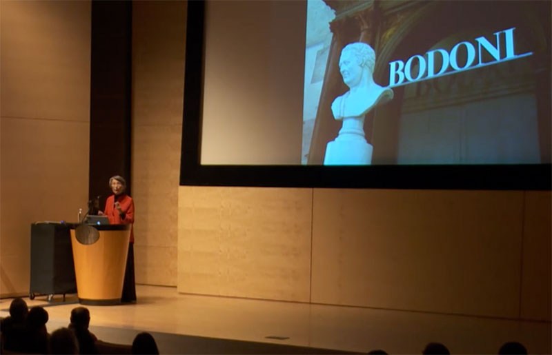
In her slide presentation, Valerie Lester sets Bodoni in the context of the places and the era in which he lived, and presents some rarely-seen images of his work. She introduces the people with whom he worked and who influenced him, paying special attention to his father in Saluzzo; to Cardinal Spinelli in Rome; to Fournier; to his employers, the duke and duchess of Parma; to Guillaume du Tillot, the prime minister of Parma; to the Amoretti family of printers; to his talented and loving wife, Margherita Dall’Aglio; to the Didots; and to his two great patrons, Nicolás de Azara and Joachim Murat (Napoleon’s brother-in-law). And of course, she does not forget to describe the food he ate and the wine he drank. Valerie Lester is the author of Giambattista Bodoni: His Life and His World, the biography of Giambattista Bodoni (Godine, Spring 2014). She is also the author of Phiz, the Man Who Drew Dickens (Chatto & Windus, 2004), a biography of her great-great- grandfather, Hablot Knight Browne, Dickens's principal illustrator; and Fasten Your Seat Belts! History and Heroism in the Pan Am Cabin (Paladwr Press, 1995), which is a history of Pan American World Airways told from the point of view of its cabin crew. Her translation of Le Grand Meaulnes (The Magnificent Meaulnes) was published by Vintage Press in 2009.
-
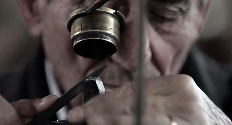
The Museo Bodiano is dedicated to the work of Giambattista Bodoni, who founded la Stamperia Reale (the Royal Printing-house) in 1768. The museum features a thousand Bodoni editions, over 12,000 letters, and an extraordinary set of punches, dies and tools from the Stamperia Reale. (Photo: Antonio Tombolini CC BY-NC-SA 2.0)
-
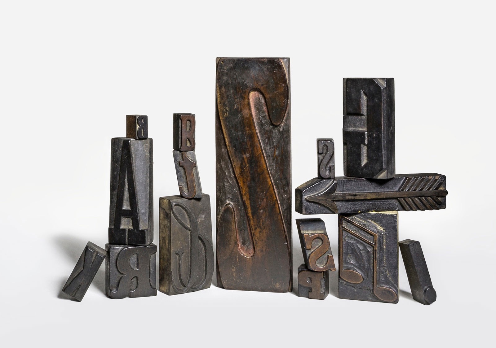
Tipoteca Italiana was established in 1995 to preserve and foster the arts of letterpress printing and handset typography. Its goal is to highlight the rich history and significant contributions of Italian type designers from the earliest days of printing, through the Industrial Revolution, to the present time. Tipoteca houses not only an extraordinary collection of metal and hand-cut wood typefaces, but also maintains an archive, a printing museum, a functioning print studio, and an extensive library—all in one efficiently designed, multipurpose building. Tipoteca is housed on the premises of the Canapificio Veneto, next to the Brentella canal. Built at the end of 19th century, the Canapificio was a hemp mill and today is a significant historical site, and provides an excellent example of the traditional importance of industry in this region of Italy. Tipoteca’s showrooms are in the former St. Teresa church, built in 1886, and in the adjacent workers premises.
-
- letterpress
- museum
-
(and 2 more)
Tagged with:


