Search the Community
Showing results for tags 'monotype'.
-

Monotype Acquires type collection from Sharp Type
Ralf Herrmann posted a news entry in Typography Weekly #131
-
- sharp type
- monotype
-
(and 1 more)
Tagged with:
-

HGGC Explores $4 Billion Sale of Typeface Firm Monotype
Ralf Herrmann posted a news entry in Typography Weekly #130
-

Monotype discontinues Fontshop.com, Linotype.com and Fonts.com
Ralf Herrmann posted a news entry in Typography Weekly #129
-

Monotype announces deal to acquire Japanese foundry Fontworks
Ralf Herrmann posted a news entry in Typography Weekly #128
-

Monotype inks deal with The Font Bureau to acquire collection of type designer David Berlow’s typefaces
Ralf Herrmann posted a news entry in Typography Weekly #127
-

Monotype acquires fonts from Milieu Grotesque and Paulo Goode
Ralf Herrmann posted a news entry in Typography Weekly #126
-
“One of the world’s first widely used sans-serif typefaces, Akzidenz-Grotesk, joins the Monotype family along with more than 700 historic typefaces from the Berthold library.”
- 2 comments
-
- 1
-

-
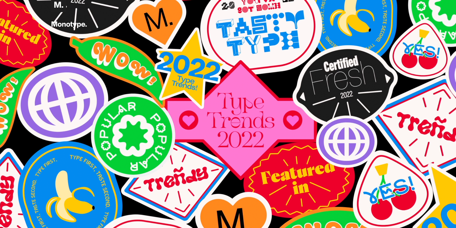
Type Trends Report 2022, by the Monotype Studio
Member Ric… posted a news entry in Typography Weekly #117
-

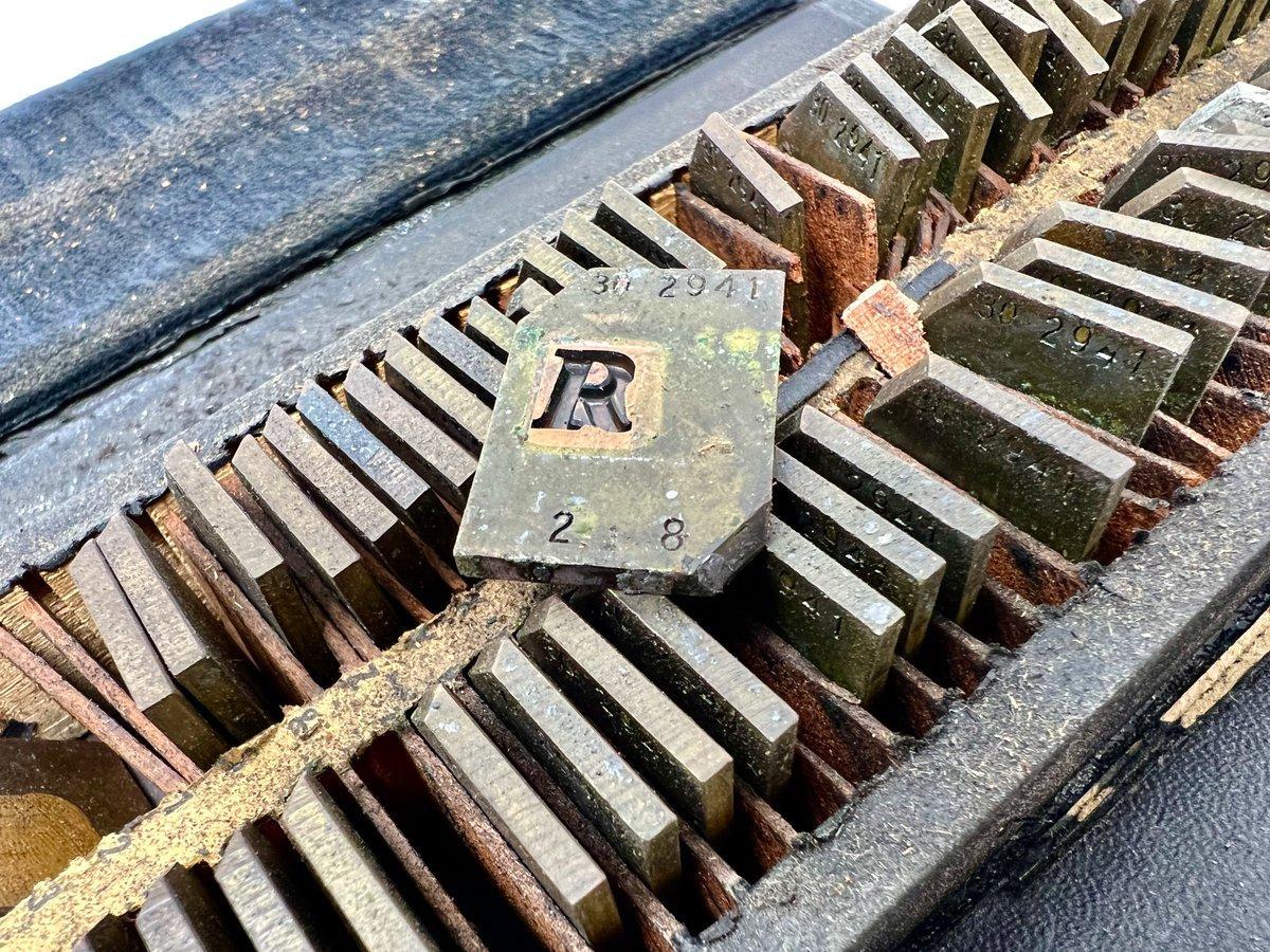
On Kickstarter, Monotype Electro Type Matrix: 3D Model and 3D Print
Member Ric… posted a news entry in Typography Weekly #116
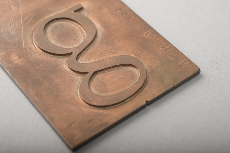
“The Monotype Electro Display Matrix [was] developed by the Monotype Company in the early 1900s to cast large multiples of individual pieces of type. The funds raised by the campaign cover the cost of producing an accurate 3D model of a single matrix, suitable for 3D output, and making 3D prints to fulfil campaign rewards.” -

A famous type foundry’s sale to a PE-backed giant has rattled the font industry
Ralf Herrmann posted a news entry in Typography Weekly #115
-
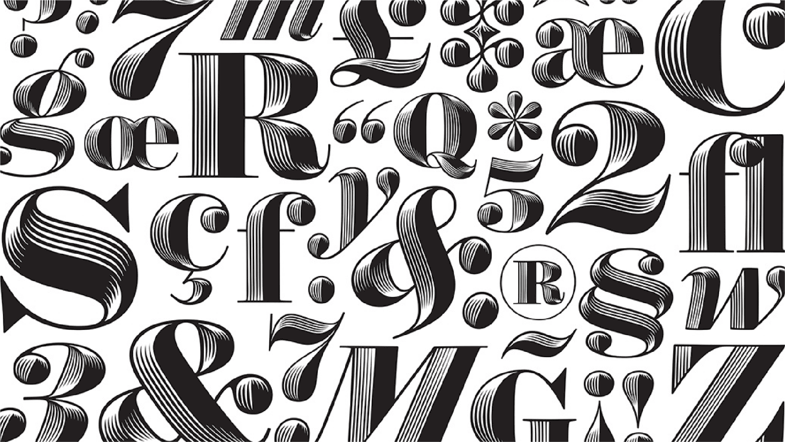
“In the world of type design, there are few names as well-regarded as Hoefler&Co,” said Monotype CEO, Ninan Chacko. “By adding Hoefler&Co’s premier library and design expertise, we can better serve the creative community through Monotype Fonts, while expanding on our mission to elevate the value of typography in driving commerce and culture.”
-
-

Behind the font: Jessica McCarty of Magpie Paper Works
Ralf Herrmann posted a news entry in Typography Weekly #94
“This installment of Behind the Font features Jessica McCarty, an award-winning designer of handwritten and calligraphic fonts. McCarty founded Magpie Paper Works, a boutique typographic foundry specializing in hand-drawn fonts and custom lettering. She also co-founded Rare Bird Foundry in 2017, where she transforms select artists’ calligraphy into premium OpenType fonts.”-
- calligraphy
- monotype
-
(and 1 more)
Tagged with:
-
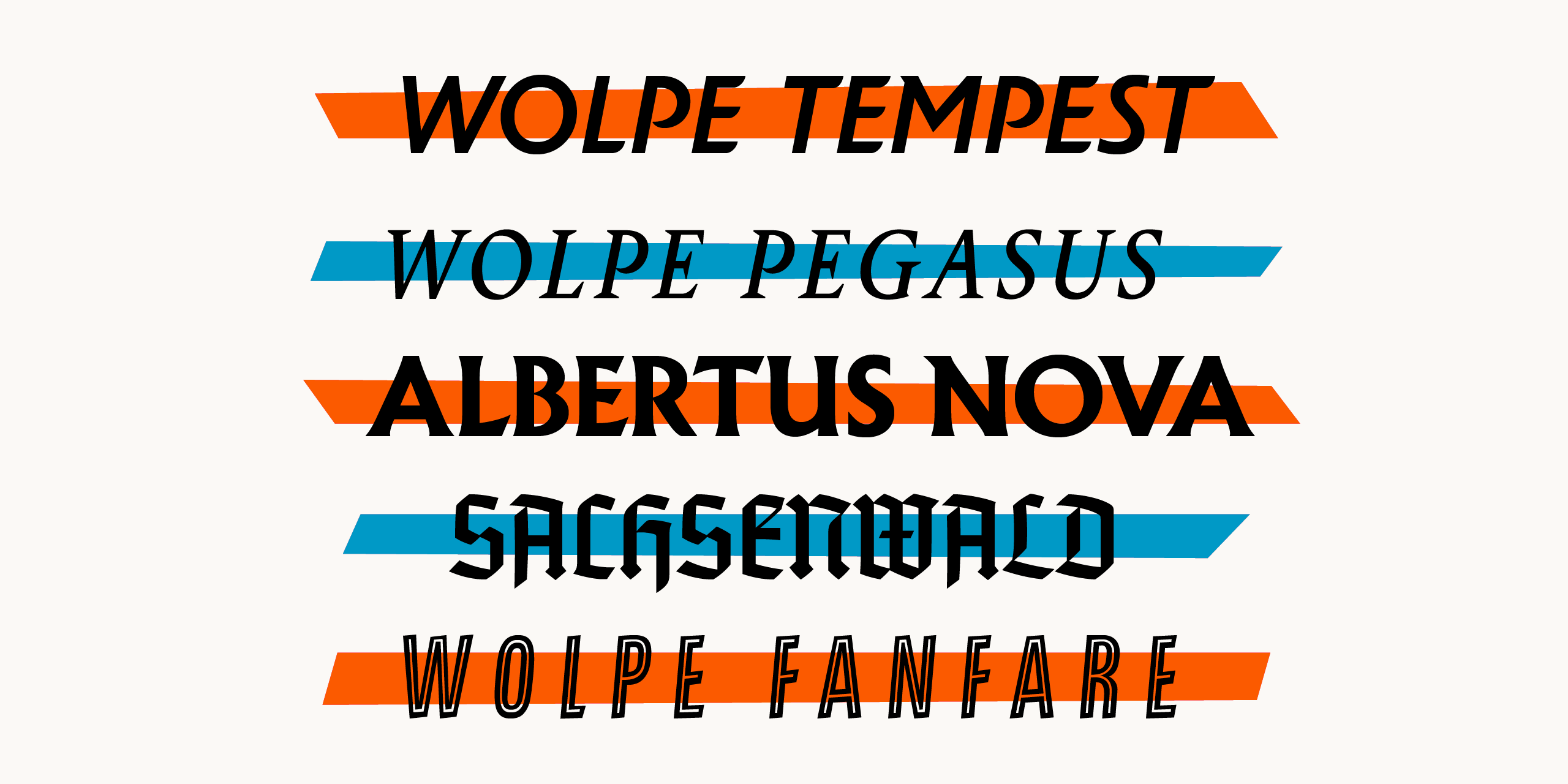
The typefaces were modeled around Wolpe’s original Albertus, Fanfare, Pegasus, Tempest and Sachsenwald designs, embracing their collective quirks and deliberate inconsistencies. “The inconsistencies in Wolpe’s designs were freeing in the sense that it taught me to challenge conventional design and rethink how typefaces should be constructed,” said Toshi Omagari, Type Designer at Monotype. “Wolpe made compromises in his designs due to the limitations of typesetting in his time. However, the modern digital environment means that typefaces can be revised to capture his original design vision and applied across a wide range of offline and online media.” Wolpe’s designs achieved varying levels of popularity when they were first created, but weren’t meant to be used exclusively in their era. And while the Albertus typeface has been used in some modern applications, the others were never digitized, and as a result, faded from view. Monotype saw the opportunity to revive these designs with contemporary appeal and flair. Albertus Nova has been expanded to include a set of small capitals and five weights. The fonts incorporate original designs including a new capital J and Q and fixing different proportions and lost details of characters. The Albertus Nova typeface also reintroduces a number of alternate capital letters originally created by Wolpe, including an unusual M with a lower apex and a slanted left stroke, a W with crossing center strokes, a 2 with a closed loop, and an open ampersand. Monotype has also added new designs including an A with a top bar, a lunar-shaped lower and upper E and a long-tailed Q and R. The Fanfare typeface was built for Fanfare Press in 1935 and has graced hundreds of book covers. The sharp resolution of digital media makes the Wolpe Fanfare typeface great for display use. It is available now in six weights. Building off the original Pegasus typeface commissioned by Monotype in 1937 as the text companion to the Albertus design, the Wolpe Pegasus design takes advantage of its predecessors’ inconsistencies. For example, characters that would conventionally share details, such as b, d, p and q, don’t share them in this set. Additionally, some serifs in the uppercase alphabet of the Pegasus typeface are different. This was a conscious effort by Wolpe to create individual letterforms. Wolpe Pegasus keeps every convention-defying detail of the original character set and adds Regular and Bold weights (with italics) as well as small caps and various sets of numerals. The Tempest typeface was originally created exclusively for use on book jackets by Fanfare Press and, despite being designed in the mid-1930s. The revived Wolpe Tempest design continues on its original path to set itself apart from the formal and static sans serif italic typefaces of that era and offers three weights, including Regular, Bold and Black, preserving Tempest’s unmistakable profile and skeleton. It also offers alternates for the A, B, D, E, L, M, N, P, R, X, Y and Z characters which sport flourishes on entry and exit strokes, and are great for adding extra embellishments to book titles, logotypes and headlines. Monotype has digitized the original Sachsenwald typeface for the first time, adding an alternate X character to the original set to make it more legible. Wolpe first created the Sachsenwald design for a German publisher, who abandoned the order just before World War II. Wolpe then tried to make the Sachsenwald typeface suitable for use in the general public, with the hope that it would ignite the interest of “horizon-scanning advertisers” and create a “passing vogue” for blackletter type. The letterforms are softer and less decorative than traditional blackletter script. However, the use of blackletter type declined in favor of more legible Roman type within Germany and was not popular in other regions of the world – keeping the Sachsenwald typeface from achieving wider adoption at that time. Monotype saw the opportunity to revive and preserve a beautiful design and bring it into the modern era – as blackletter usage becomes more commonplace in areas such as publishing, fashion and album covers. The Wolpe Collection is available now. The Albertus Nova, Wolpe Fanfare and Wolpe Tempest designs are available in Latin, Greek and Cyrillic. The Wolpe Pegasus and Sachsenwald designs are available in Latin, only.
-
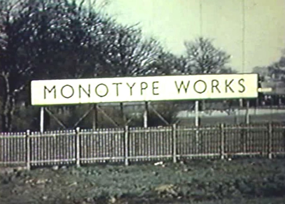
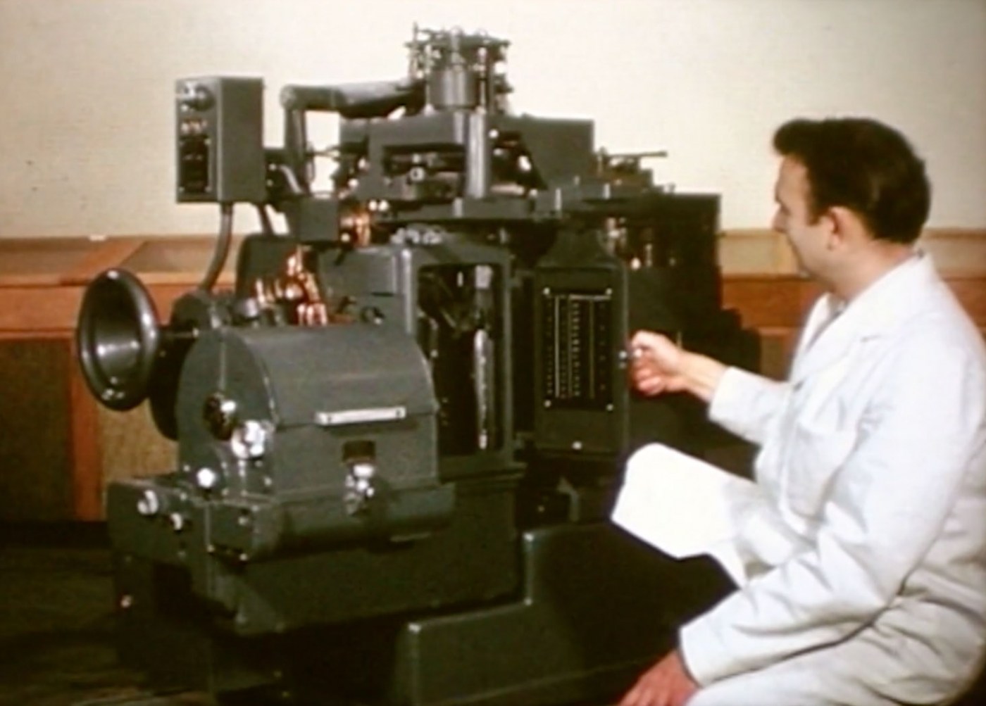
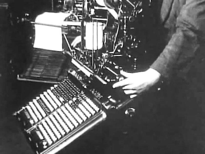
The Monotype is a wonder of mechanics and engineering and in this film you will see the process of manufacturing the Monotype from beginning to end. The film starts by showing the Salfords, UK train station and entrance into the Monotype factory, then shows all of the milling, drilling, cutting, and casting required to make the casting machine. After that, we see the keyboard and paper-punch apparatus being constructed. The film ends with footage of testing and calibrating the machine and images of the Monotypes being shipped all over the world.
-
Learn all about the ‘Monophoto’ Filmsetter from Monotype. This machine attempts to bridge the gap in typesetting from the hot metal machines to the “new and exciting” world of photo typesetting. The Monophoto machine is a casting machine that uses a photographic process to set type instead of the old, hot-metal process from the past. Using light-sensitive paper, a photographic lens, and photo type matrices, the Monotype casts type that can be used for offset printing.
-
This silent film was restored from a print sent from the U.K. to New Zealand in 1925. The film starts with a brief overview of the Monotype Works buildings as well as the company homes for workers. See hundreds of Monotypes being built in the factory from raw materials to the casting machine and keyboards. Around 17:00, we watch the process of making a letter mould from drawing, to wax mould, to punch, to final matrix including using a Benton Engraving Machine. At 28:00, you can see the perforated punch paper being produced. At 30:00, you can see the factory canteen where the labor force eats lunch as well as the end of the day when everyone leaves by foot or bicycle. At 33:25 minutes, His Majesty the King, Duke of York (whom "The King's Speech" was based on) visits the Monotype factory, which was obviously a very big deal. He inspects the workers and factory and then learns how to type on a Monotype keyboard. A hearty farewell is given as he leaves the factory. At 38:30 you see a 15 minute detailed explination of how a Monotype works from keyboard to casting. Finally at 53:10 the Monotype Schools for teaching keyboarding and casting as well as displays of Monotype batteries in various print shops in London. See more printing, journalism, and typographic-related films at: printingfilms.com
-
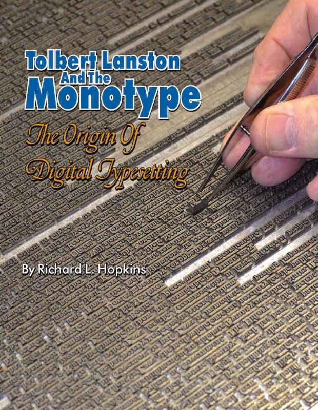
This special hardback edition is limited to 300 copies. It includes a 24-page Monotype letterpress keepsake booklet, Going with Goudy to Philadelphia, composed, printed in several colors, and signed by Richard Hopkins. Tolbert Lanston and the Monotype is printed in full color, with more than three hundred photos and illustrations, 232 pages, plus several appendices and index. Tolbert Lanston, at the end of the nineteenth century, was a man obsessed with the idea of creating a machine which would provide automated typesetting yet preserve all the nuances of excellence in typography and fine printing. This also is the story of the man and the company that created and manufactured Monotypes for three-quarters of a century. An American Civil War veteran, Lanston has remained a poorly documented hero of the typographic revolution. His Monotype System was the very first digital concept put into daily use in typesetting plants across the globe. The Monotype was a groundbreaking precursor to the computer revolution in the typesetting industry, though it was introduced over seventy years before computerized typesetting systems were developed. The book can be purchased here.
-
Many typefaces available to us today are not stand-alone designs, but were introduced as inventive solutions to very specific problems of type manufacture, typesetting restrictions, or printing issues. As those designs become part of the overall typographic landscape, it’s easy to forget how closely connected they are to the original problem, or how much potential there may be to explore solutions to a new problem. Looking at some now-classic typefaces, we’ll see how they turned out the way they did, and hopefully encourage some fresh responses to newer challenges. Dan Rhatigan worked as a designer and typographer for 15 years in Boston and New York before moving to England in 2006 for graduate school at the University of Reading. After receiving his MA in Typeface Design, he spent 7 seven years working with Monotype as researcher, type designer, and eventually Type Director. He now lives in New York City again, where he works as an independent type designer and consultant.
-
- talk
- type design
-
(and 5 more)
Tagged with:
-
Original drawings by Eric Gill from 1932 Gill Sans Nova was created by George Ryan. The update comes in a coordinated range of weights in regular and condensed weights, each with italics. The family has grown from 18 to 43 styles. Several new display fonts with inline and shadow effects were added, including Gill Sans Nova Deco – based on a typeface previously withdrawn from Monotype Library. Gill Sans Nova Joanna Nova by Ben Jones is based on Eric Gill’s Joanna and now has 18 styles with added support for Greek and Cyrillic. It also has small caps in both upright and italics, several numeral options and contextual ligatures. Ink drawings by Eric Gill for Joanna from 1939 Joanna Nova Joanna Sans Nova by Terrance Weinzierl is a new typeface design, a Gill-inspired sans serif version of Joanna. According to Monotype this addition to the Gill family was designed specifically for the age of screen-based reading. The type family contains 16 fonts, from thin to black with accompanying italics and more than 1000 glyphs per style. The fonts from the Eric Gill Series are available on MyFonts.com, Fonts.com, and Linotype.com.
-
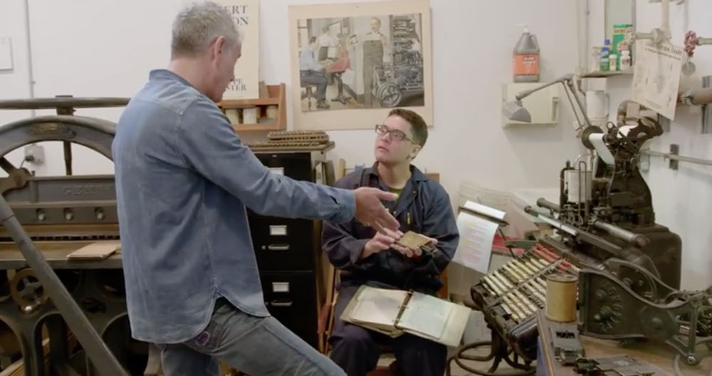
“Anthony Bourdain & The Balvenie head to San Francisco, California to meet with Andrew Hoyem, master typographer and printer of Arion Press. One of the last of its kind, Arion Press has only a handful of members on its staff, all fellow craftsmen dedicated to this age old process. Each works meticulously to create the books in multiple parts, from the typecasters, to the proofreaders, to the printers and the bookbinders. All of these hands build a work of art through a process that must be seen to be believed, and can only, truly, be described as magic.”
-
- letterpress
- printing
-
(and 3 more)
Tagged with:
-
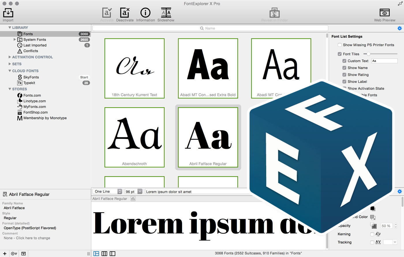
left: old version; right: FontExplorer X Pro 5 The colorful icons of the previous version were replaced by black ones. The font list can now also be presented in a tile view with custom text. The auto-activation plugin were updated and now also support the 2015 version of Adobe’ Creative Cloud and QuarkXPress. The glyph views were updated to show the all characters of Unicode version 7. Viewing and organizing webfonts was updated to also support the WOFF 2 format. Fonts from the web services Skyfonts and Typekit can be viewed and managed within FontExplorer X Pro. The web shops/services fonts.com, linotype.com, myfonts.com, fontshop.com and Monotype Membership can be directly accessed within the app. Font downloads are then intercepted and taken over into the app. FontExplorer X Pro 5 can be bought at fontexplorerx.com. Updates from version 4.x are available at a reduced price and free when bought after April 1, 2015.
- 3 comments
-
- fex
- font manager
-
(and 1 more)
Tagged with:
-
-
- book binding
- monotype
-
(and 2 more)
Tagged with:


_171.png.8c860e610463803e9e9eeed151114333.png)
_200.webp.f649d71ea2db0645aec0860b24bf3b5b.webp)
