

Search the Community
Showing results for tags 'netherlands'.
Found 14 results
-

Fontstand International Typography Conference
Ralf Herrmann posted a news entry in Typography Weekly #119
The Fontstand conference will be hosting a series of presentations and speakers that have a visible impact on the world around us.-
- 1
-

-
- fonstand
- conference
- (and 1 more)
-
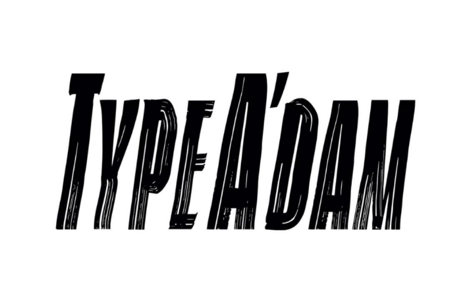 On Wednesday 11 May 2022 at the Allard Pierson of the UvA, the conference TypeA’dam will take place, a long afternoon about current type and lettering issues.
 -
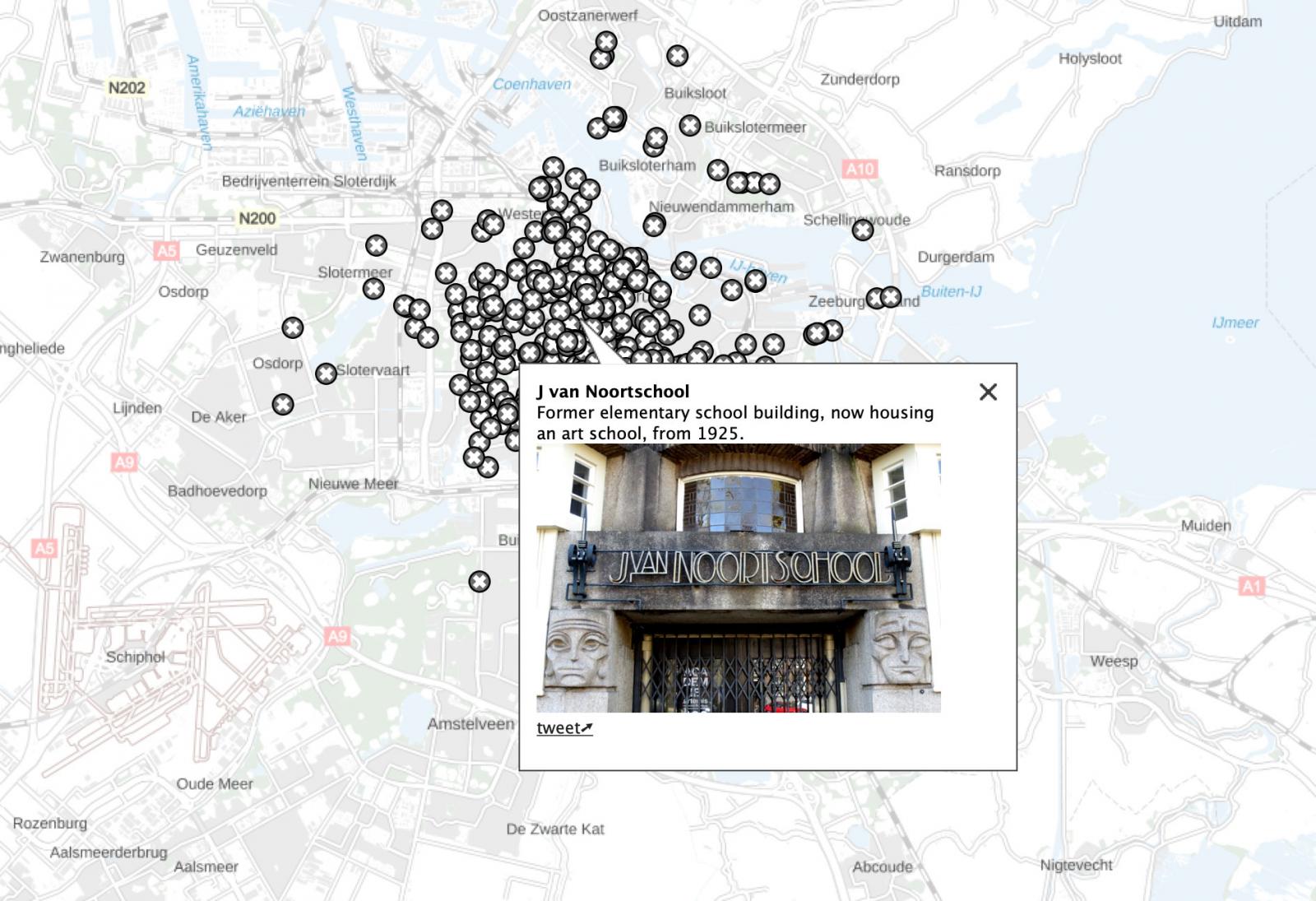 “Amsterdam Typography is a project by Arno Verweij that explores Amsterdam through the lens of typography. The project sprung from a longtime interest in the typography that can be found throughout the city …”
 -
 This Museum of the Art of Printing is situated in the centre of Maastricht. It is located in a 19th-century house with an inner courtyard and a chapel building. Here you will find a unique historic printing establishment dating from 1900. The museum offers a historic overview of the art of printing, with the help of various materials and tools, ranging from the first bookblocks to etchings by Rembrandt and litho prints by de Toulouse-Lautrec. Several old printing presses are still operational. The chapel shows various exhibitions focusing on the art of printing. Besides the historical art of printing, the museum has an exclusive collection of modern art, that consists of graphic art, drawings and objects in the characteristic style of artist and initiator of the museum, René Glaser. The museum is open: for individuals from March till July and Sept. till Nov. each Saturday from 13-17 hrs. The museum is closed for individual visits in August. Guided tours for groups are possible throughout the year and on a daily bases, but by appointment only!
 -
 MoetMoet Dutch Letterpress in Maastrich (The Netherlands) offers letterpress products like business, wedding invitations and so on. It was started in 2010 and is run by Youri Penders.
 -
 The museum is located in the attractive former residence of the Baron Van Westreenen van Tiellandt (1783-1848) and is devoted to the hand-written and printed book of the past and present. The external aspects of the book and the development of book design are the main focus. The museum organizes three to four temporary exhibitions a year on themes related to both the old and modern book. The history of the book since the sixth century The museum maintains an extensive collection of books from all periods of Western book history, starting with medieval manuscripts that are entirely written and illuminated by hand. An overview of the development of writing, layout and decoration of manuscripts can be seen in the distinctive book room where a selection of these superb volumes can be seen. The book room itself is a unique example of nineteenth-century museum design and its original style remains entirely intact. In addition to medieval manuscripts, there are also examples of the earliest form of the printed book, known as incunabula. The house of a collector The name Meermanno-Westreenianum refers to two individuals who were associated with the museum from the very beginning. The most important is Baron W.H.J.van Westreenen van Tiellandt (1783-1848) who built up his vast collection in this house, which was his residence. His second cousin and important source of inspiration, Johan Meerman (1751-1815), also owned an impressive collection of books, a part of which was taken up into the collection of Van Westreenen. After the death of Van Westreenen, the house and his entire collection became the property of the state. In 1852, the house was opened to the public as a museum. Van Westreenen was a typical nineteenth-century collector who was very interested in the history of ancient cultures. He not only collected books, but also antiquities from, among other places, Greece, Rome and Egypt. He was successful in obtaining some extraordinary objects. In addition, family portraits and souvenirs from his extensive travels can be seen in the museum. Modern books As an extension of Van Westreenen’s collection, the museum actively collects books dating from 1850 to the present. The form and design of the book remain the criteria for selection. In the permanent installation, “From lead to LED,” the development of the modern book is presented, accompanied by a changing selection from the museum’s fine modern collection. In addition, the museum has a permanent display devoted to unusual book forms. An important part of this is the Bibliotheca Thurkowiana Minor, a miniature library with 1515 tiny books. Ex libris, printed bookplates identifying the owner of the book, are regularly shown in small changing displays. The museum has one of the largest collection of ex libris in the Netherlands.
 -
 The Nederlands Drukkerij Museum (Dutch Printing Museum) is situated in Etten-Leur and presents the history of printing and book making. Exhibitions and printing and bookbinding workshops are also offered.
 -
Den Haag got a new typographic logo made by graduates from the Royal Academy of Art. How do you like it?

-
-
Amsterdam University Special Collections
Ralf Herrmann posted a directory entry in Museums & Libraries
 The Amsterdam University holds several special collections (“bijzondere collecties”) including one for graphic design and typography. This collection domain relates primarily to the industrial era, i.e. the period from circa 1830 onwards. It covers writing (calligraphy and type design) and the production and design of books, posters and other printing. The collection is internationally oriented collection and also includes secondary literature. The basis for this collection domain was laid in 1958 with the acquisition of the Library of the Book Trade (Bibliotheek van het Boekenvak), an extremely broad collection on the history of the book focusing, among other things, on design and production. A major acquisition, in 1971, was the Typografische Bibliotheek (Typographical Library) of Lettergieterij Amsterdam, voorheen N. Tetterode (Type Foundry Amsterdam, formerly N. Tetterode). The core theme of this collection is the design and production of printed material, but it also contains archive material relating to fonts designed by Tetterode, including drawings by S.H. de Roos and Jan Tschichold. Besides specialist literature, the Typografische Bibliotheek also houses numerous unusual specimens: from woodcut to heliogravure and from Bodoni’s Manuale tipografico to illustrated corporate books. Since the 1950s, the library has actively sought to acquire the archives of various designers and organisations. The acquisition of the archive of Jan van Krimpen was followed by those of Charles Jongejans, Atie Siegenbeek van Heukelom, Harry N. Sierman, Jan van Toorn and Irma Boom. This material covers a period of over a century. Important collections: Collection Tetterode Collection Stichting De Best Verzorgde Boeken Collection calligraphy Collection Dutch industrial bindings of A.S.A. Struik Collection English book art 1750–1850 of Fons van der Linden Archive Irma Boom Archive Jan van Krimpen Archive Otto Treumann Archive Jurriaan Schrofer Collection Gerrit Noordzij Collection Bram de Does Collection Rijksoverheidletter (Peter Verheul) NAGO archives
 -
The Letterpress Winkel is a design studio and letterpress workshop in the Dutch city of Montfoort. They create letterpress products like greeting cards, business cards and posters.
-
BIS Publishers is the founder and publisher of Graphic magazine and is also founder of Frame Magazine which has developed into a publishing company of its own (www.framemag.com). BIS Publishers is an independent company founded in 1986 by the present director and publisher Rudolf van Wezel. Familiar subjects of BIS Publishers include graphic design, fashion, architecture, product design and advertising. BIS has earned a national and international reputation for prizewinning books for creative professionals and their clients. Well known is the prestigious series of Dutch Design books, which BIS has published every two years since 1990 in collaboration with the Association of Dutch Designers BNO.
-
 In September 2002 the Royal Academy of Art in The Hague started its post-graduate course in Type and Media, formerly the course in Type Design and Typography. It is a full-time one year course that gives participants the possibility of delving deeper in type design for different media: not only type for print, but also for film, television, video and interactive media. At Type and Media, students work intensively in small groups of no more than twelve persons. They work under the guidance of expert and enthusiastic teachers from the permanent and visiting faculty. Although the student’s personal motivation is given primary place, collaboration with other students is of fundamental importance. The many aspects of type design in relation to typography for different media are covered in various assignments. Assignments are both practical and theoretical and in some cases in co-operation with the media industry. Discussions with a number of leading graphic designers provide theoretical depth. The various excursions and conferences, like the yearly conferences of ATypI — Association Typographique Internationale — and Typo Berlin, are also worth mentioning. The master course also organizes different activities in the field of type design, like the three-yearly Gerrit Noordzij Award. Students Type and Media play an important role in the activities concerning this Award.
 -
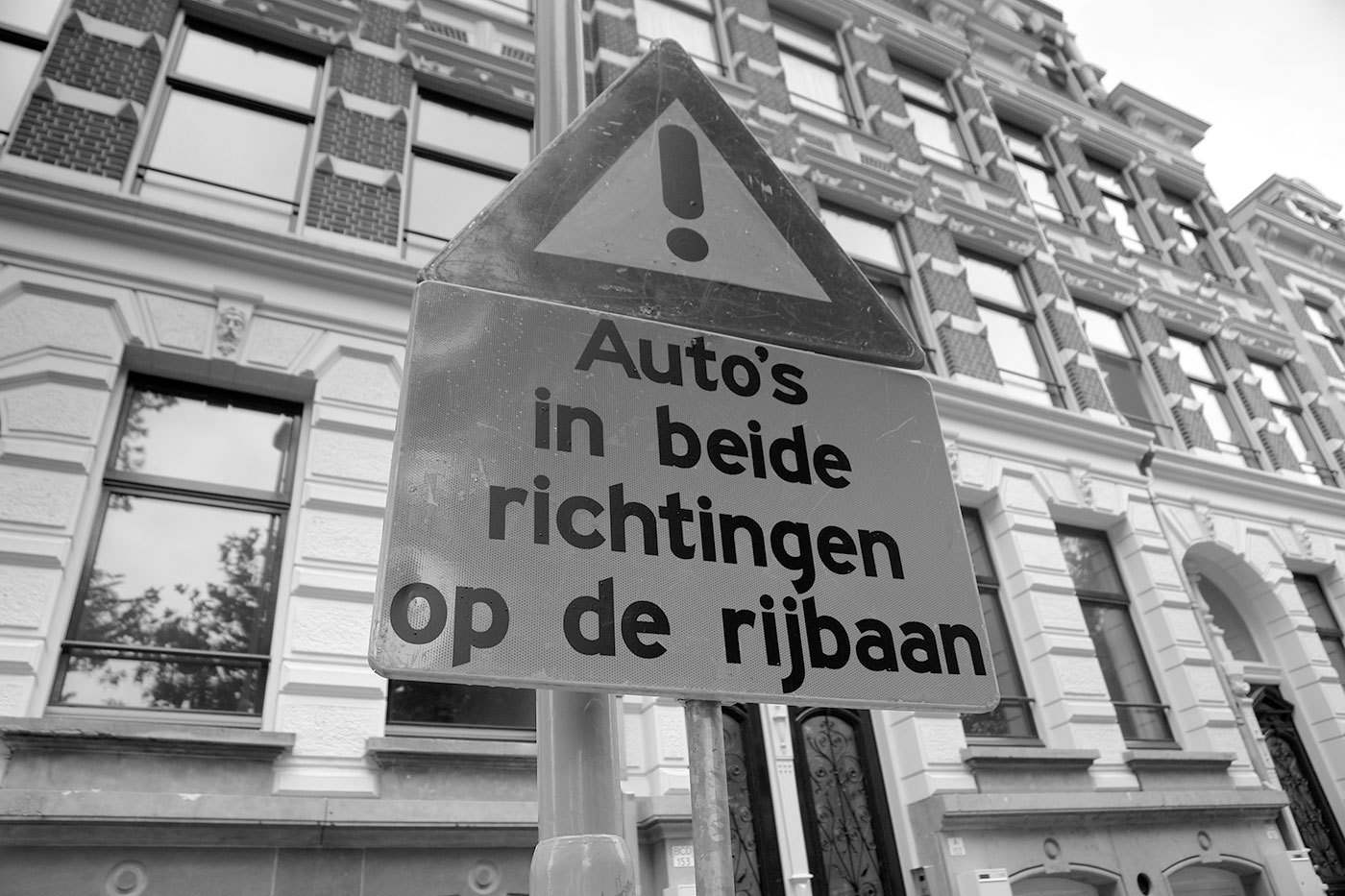 The Netherlands are a special case when it comes to traffic signs… Until recently the organization being in charge of the traffic signs was the ANWB. It was founded as a Dutch bikers(!) society (“Algemeene Nederlandsche Wielrijders Bond”) in 1883 and later became the royal tourist society. In my opinion these roots are still visible in the design of the traffic signs. On local roads you will see a lot of these sign posts, which are certainly based on the old finger-post signs, used long before the invention of the automobile. The typeface used since the 1960s is called ANWB-Ee (also RWS-Ee) and it is based on FHWA series E (Modified) from the United States. A condensed version (ANWB-Cc) is also available and it is based on the FHWA series C design. In the late 1990s Gerard Unger was commissioned to design a new typeface called ANWB-Uu. (source: designworkplan.com) Mr. Unger's task was to create a font which needs less space to fit the text on the smaller fixed-size direction signs. He achieved this goal. But in my opinion the the briefing itself was wrong. The size of a direction sign must be based on the content, not the other way around! What do you do, if you need to set Gasselterboerveenschemond on such a sign? On top of that, I found these sign posts often mounted at the most unfortunate places, for example behind traffic lights or far away and too high above the ground in the middle of a large roundabout, impossible to read. By contrast on a local direction sign in Germany the type size is based on the maximum speed of the traffic at this point and the width of the sign will grow according to the content. Recently the ANWB-Uu typeface is also appearing on the larger motorway (“autosnelwegen”) signs in the Netherlands, but using only a rather condensed typeface on large signs is usually not appropriate. It would at least need a corresponding version that is not condensed and can be used whenever there is enough space. The layout of the signs could also be improved. The signs sometimes appear way too crammed … … or simple but pretty ineffective:

