Search the Community
Showing results for tags 'roman'.
-
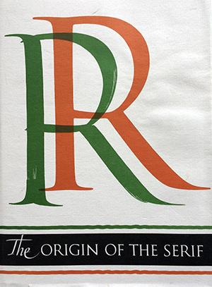
The Serif is the short cross stroke at the beginning and end of letter parts. Its origin in Roman inscription letters is one of the uncharted areas of paleography. In this book the author questions accepted theories as to the serif’s origin, and his own theory with skillful reasoning, detailed illustration, and epigraphic proof. Demand for copies of The Origin of the Serif has been constant since Fr. Catich published it in 1968. The information found there is not available elsewhere, and Catich’s theory on serif origins is not only original but persuasive. He connects it with a development of the Roman alphabet. Since the edition has been exhausted, Mary W. Gilroy, the Curator of the Catich Gallem', has prepared this new edition for publication.
- 1 review
-
- roman
- inscription
-
(and 1 more)
Tagged with:
-
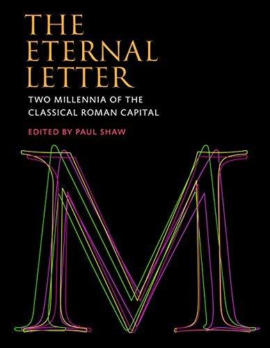
The fiftieth anniversary of Helvetica, the most famous of all sans serif typefaces, was celebrated with an excitement unusual in the staid world of typography and culminated in the release of the first movie ever made starring a typeface. Yet Helvetica’s fifty-year milestone pales in comparison with the two thousandth anniversary in 2014 of Trajan’s Column and its famous inscription — the preeminent illustration of the classical Roman capital letter. For, despite the modern ascendance of the sans serif, serif typefaces, most notably Times Roman, still dominate printed matter and retain a strong presence in screen-based communication. The Eternal Letter is a lavishly illustrated examination of the enduring influence of, and many variations on, the classical Roman capital letter. The Eternal Letter offers a series of essays by some of the most highly regarded practitioners in the fields of typography, lettering, and stone carving. They discuss the subtleties of the classical Roman capital letter itself, different iterations of it over the years, and the work of famous typographers and craftsmen. The essays cover such topics as efforts to calculate a geometric formulation of the Trajan letters; the recalculation of their proportions by early typefounders; the development and astonishing popularity of Adobe Trajan; type and letter designs by Father Edward M. Catich, Frederic W. Goudy, Eric Gill, Jan van Krimpen, Hermann Zapf, Matthew Carter, and others; the influence of Trajan in Russia; and three generations of lettercarvers at the John Stevens Shop in Newport, Rhode Island. Essays about modern typefaces — including Matinia, Senatus, and Penumbra -- are contributed by the designers of these typefaces. Contributors John and Nicholas Benson, Frank E. Blokland, Matthew Carter, Ewan Clayton, Lance Hidy, Jost Hochuli, Jonathan Hoefler, Richard Kindersley, Scott-Martin Kosofsky, Gerry Leonidas, Martin Majoor, Steve Matteson, Gregory MacNaughton, James Mosley, Tom Perkins, Yves Peters, Ryan L. Roth, Werner Schneider, Paul Shaw, Julian Waters, Maxim Zhukov.


