Search the Community
Showing results for tags 'shaw'.
-
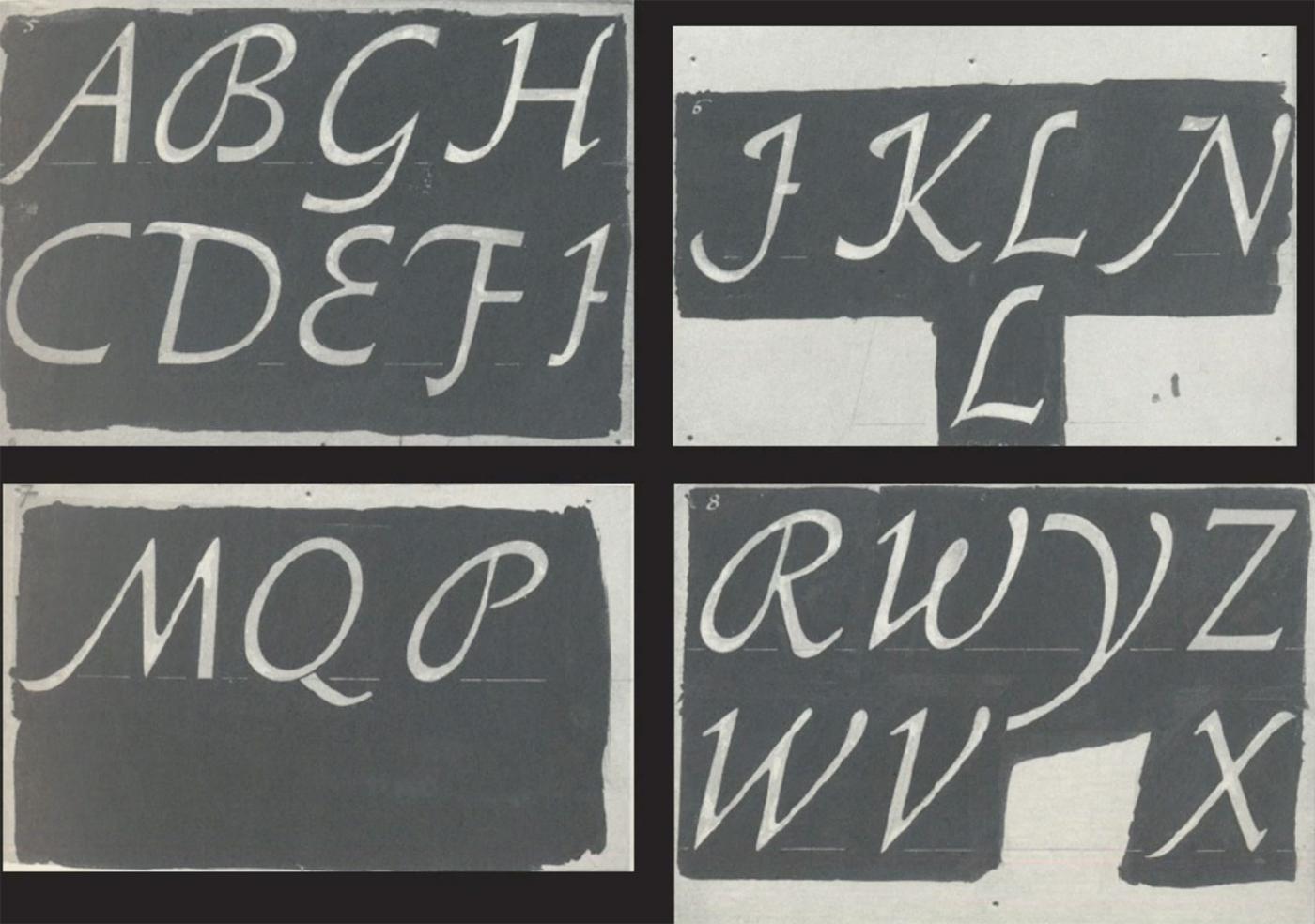
This talk took place on April 3, 2018 in the Rose Auditorium at The Cooper Union as part of Type@Cooper's Herb Lubalin Lecture Series. We are grateful to Hoefler & Co. for their generous support to archive this lecture series. The world of German typefaces in the first half of the 20th century was incomparably rich, though not as widely known as it deserves. Most of the focus has been on the work of Rudolf Koch and the raft of geometric sans serifs that proliferated in the 1920s in the wake of the Bauhaus. Of the many schriftkunstlers—Georg Belwe, F.H. Ehmcke, F.W. Kleukens, Walter Tiemann, and E.R. Weiss—whose work dominated German typography and book design at the time, the one most deserving of rediscovery is F.H. Ernst Schneidler (1882–1956). Schneidler studied architecture at the Kunstgewerbeschule Düsseldorf under Peter Behrens and was later a student of Ehmcke’s. From 1920 until 1949 he was the director of the Department of Graphic Arts and Book Design at the Württembergische Staatliche Kunstgewerbeschule in Stuttgart. The program that he created provided an alternative to the crafts expressionism of Koch’s Offenbacher Werkstatt and the modernism of the Bauhaus, emphasizing a broad experimentation that encompassed calligraphy, typography, title page design, monogram and logo design, and book illustration. A sampling of the work that Schneidler and his students did between 1922 and 1935 was gathered into a four-volume portfolio entitled Der Wassermann (1945). His teaching was influential with a number of his students going on to become noted calligraphers and/or type designers in their own right, chief among them Georg Trump, Imre Reiner, Walter Brudi and Albert Kapr. Schneidler’s output as a type designer is not only varied, but fascinating for its reinterpretation of traditional forms. His twenty-one typefaces include a range of blackletters as well as several romans, a script and some designs that are hard to classify. His most famous design is undoubtedly Legende, though Schneidler Initials and Schneidler Mediaeval have had their adherents. This talk will survey all of Schneidler’s type designs, both issued and unissued, in the context of their time.
-
- schneidler
- shaw
-
(and 1 more)
Tagged with:
-
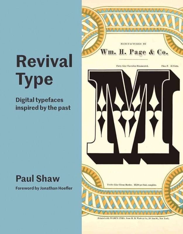
A wide-ranging survey of revival typefaces focusing on digital fonts with roots in the past Examples in 'Revival Type' include direct revivals of metal and wood typefaces, while others are looser interpretations of older typefaces. Among the fonts are interpretations of classic designs by Nicolas Jenson, Claude Garamont, Robert Granjon, William Caslon, John Baskerville, Giambattista Bodoni, Firmin Didot and other iconic names. Alongside them are typefaces rooted in the work of important, though lesser known, names such as Eudald Pradell, Philippe Grandjean and Richard Austin. Finally, there are updates and revisions of 20th-century classics like Palatino, Meridien, DIN, Metro and Neue Haas Grotesk (the original name of Helvetica). Some designs are not revivals of typefaces but of letterforms, from inscriptions to calligraphic manuals to letters in posters and bookjackets. Some revivals are aesthetic extensions of 20th-century typefaces that have been updated technologically. Others are actually reinterpretations or variations on typefaces from the past necessitated by having to make types that function in the 21st century and not in the distant past. Re:Type looks at type ‘revivals’ in this broad manner. 24.60 x 19.00 cm Quarterbound (no jacket) 256pp Illustrated in colour throughout
-
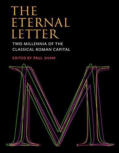
The fiftieth anniversary of Helvetica, the most famous of all sans serif typefaces, was celebrated with an excitement unusual in the staid world of typography and culminated in the release of the first movie ever made starring a typeface. Yet Helvetica’s fifty-year milestone pales in comparison with the two thousandth anniversary in 2014 of Trajan’s Column and its famous inscription — the preeminent illustration of the classical Roman capital letter. For, despite the modern ascendance of the sans serif, serif typefaces, most notably Times Roman, still dominate printed matter and retain a strong presence in screen-based communication. The Eternal Letter is a lavishly illustrated examination of the enduring influence of, and many variations on, the classical Roman capital letter. The Eternal Letter offers a series of essays by some of the most highly regarded practitioners in the fields of typography, lettering, and stone carving. They discuss the subtleties of the classical Roman capital letter itself, different iterations of it over the years, and the work of famous typographers and craftsmen. The essays cover such topics as efforts to calculate a geometric formulation of the Trajan letters; the recalculation of their proportions by early typefounders; the development and astonishing popularity of Adobe Trajan; type and letter designs by Father Edward M. Catich, Frederic W. Goudy, Eric Gill, Jan van Krimpen, Hermann Zapf, Matthew Carter, and others; the influence of Trajan in Russia; and three generations of lettercarvers at the John Stevens Shop in Newport, Rhode Island. Essays about modern typefaces — including Matinia, Senatus, and Penumbra -- are contributed by the designers of these typefaces. Contributors John and Nicholas Benson, Frank E. Blokland, Matthew Carter, Ewan Clayton, Lance Hidy, Jost Hochuli, Jonathan Hoefler, Richard Kindersley, Scott-Martin Kosofsky, Gerry Leonidas, Martin Majoor, Steve Matteson, Gregory MacNaughton, James Mosley, Tom Perkins, Yves Peters, Ryan L. Roth, Werner Schneider, Paul Shaw, Julian Waters, Maxim Zhukov.


