


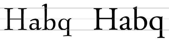
Here are Bernhard Modern (left) and Adobe Garamond (right) set at the same cap height:
Adobe Garamond is certainly more legible, isn’t it? And this is even more important for signage. So here is the old FHWA E-modified font (left) and Clearview HWY (right) in comparison set at the same cap height. (Sample made using the free Roadgeek versions)
It’s pretty obvious how the larger x-height increases the legibility, right? So case closed? Well, I don’t think so. There are several problem with such comparisons. First: comparing fonts set at the same cap height will only tell you how fonts perform when set at the same cap height. But who says that fonts should be compared this way? In mixed case setting most of the characters will be lowercase and one could also argue, that the size of the lowercase characters should be the basis for legibility comparisons. So in our first example, Bernhard Modern might not be less legible, it might just be set too small—because the letters that matter are simply displayed larger in Adobe Garamond. When both typefaces are set at the same x-height, the legibility difference might disappear. The only difference is, that Bernhard Modern would probably need more vertical space to achieve the same legibility. But that doesn’t mean that it is less legible per se, does it?

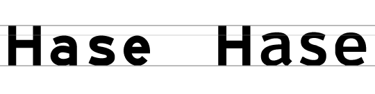
But there is more. It is easy to construct examples like “Hase” where an increased x-height gives the appearance of increased legibility. This is based on the fact, that the lowercase letters in this example are enclosed within the base-line and the x-height and that they have three horizontal strokes within that area. So increasing the x-height will open the counters and apertures and therefore reveal a more legible letter. But is that really a fair comparison? We need to look at all the letters in the alphabet of the language we are setting. Those three letters are special because they have three horizontal strokes within the x-height. If there are two horizontal strokes (like in o, z, b, d, q, p) an increased x-height will not necessarily mean a significant improvement. And for certain character pairs an increased x-height will even decrease the distinguishability and therefore also decrease the legibility. Just look at this comparison:
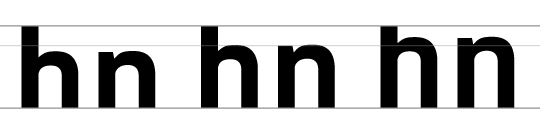
The letters h and n can only be differentiated by the existence and height of the ascender. But the more one increases the x-height, the more this differentiation will disappear. And recent legibility studies also stress the importance of such letter parts in the process of reading. So there is an ideal value somewhere, but as soon as we increase the x-height any further, the legibility can also decrease again. And don’t forget that in many countries using the Latin script we also need the space above the x-height for placing diacritical marks. The smaller this space gets, the less legible these marks will appear.
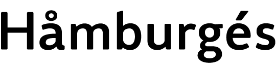
So I actually consider it a myth, that a large x-height means better legibility per se. The x-height doesn’t have to be large—it has to appropriate. But what does that mean? In terms of regular print typefaces there is certainly a wide range of possibilities. But when it comes to signage typefaces this aspect can certainly become crucial. I believe the best approach is to understand the stroke width and the x-height as two connected parameters which should be chosen together to create the best legibility. The x-height needs to be large enough so the crucial characters like a, e, and s appear clear and distinct when set in boldest style of the type family. On the other hand, the ascenders and descenders need to be large enough to make letters like b, d, q, p, y, and j as legible as possible. This also gives room for diacritical marks and forms characteristic word shapes, which makes mixed-case text more pleasant to read. So it’s all about balancing out the crucial parameters. As an example, here is a test word using Wayfinding Sans Pro set in the boldest available version. Making it bolder would not increase the legibility. Instead, letters such as a and e would become less legible, because the strokes would get too close together and the letter skeletons would be harder to recognize. But since there is no bolder style than this one, increasing the x-height further is neither necessary nor recommendable.
In contrast, here is the the road signage typeface used in Spain and Italy. It’s way too bold for the chosen x-height—especially when used with today’s retroflective sign sheetings, which cause halation effects when lit by the headlights of cars.

So, what are typical values for a perfectly balanced cap height to x-height ratio? In a recent legibility study different typefaces where tested, one time scaled to the same cap height and once scaled to the same x-height. (Click on the image to see a larger version. The green line shows the maximum reading distance in the test with the same x-height, the pink line shows the results using the same cap height.)

When set at the same cap height, Wayfinding Sans Pro won the test, followed by Frutiger Roman and Johnston Underground. When all typefaces where scaled to the same x-height—surprisingly—Futura performed very well, but of course only by taking up very much more horizontal and vertical space than all other typefaces. The most efficient typefaces with the best ratio of x-height and cap height seem to be Wayfinding Sans Pro and Johnston Underground with an x-height between 67 to 69 percent of the cap height.
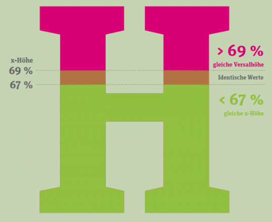
Using typefaces with a significantly higher x-height will probably not increase the legibility any further. Typefaces with a significantly smaller x-height should not be considered less legible. They can perform equally well, but they might need much more space to achieve this.


Recommended Comments
Create an account or sign in to comment