Join our typography community!
A friendly online forum for all questions around fonts and typography. Get answers to all your typography questions or help others with your expertise.
Typography Feed (complete)
Today
-
Hi everyone, I'm trying to identify the serif typeface used for the "DIGITAL BLOOM" title in this poster template from Magnific: https://www.magnific.com/premium-psd/poster-template-with-abstract-gradient-waves_427618982.htm?utm_source=Pinterest&utm_medium=organic#fromView=author&page=1&position=4&uuid=80208357-129d-480f-b2f9-ecf5d963d203 I've attached a cropped image showing just the typography. I'm looking for the exact typeface, if possible. If it's a custom or modified wordmark, I'd also appreciate suggestions for the closest commercial or free alternatives. My goal isn't to recreate this design, but to achieve a similar typographic style for branding a technology conference. Thanks in advance!
-
KUD joined the community
-
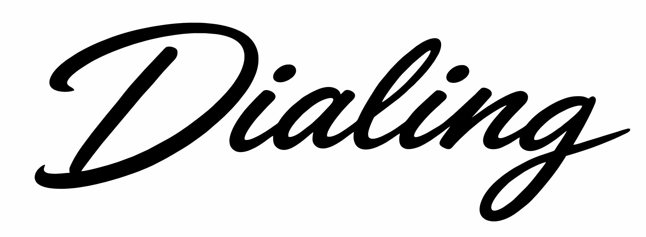
Hi Folks, A customer is asking for this font for his boat name, but only has a jpg. Any help identifying it would be sincerely appreciated.

-
Midnight Oil Workshop joined the community
-
It closest seems to be some slightly modified version of Kreature Kombat at Iconian (commercial use conditions).

-
SampathG12 joined the community
Yesterday
-
hadley joined the community
-
Abdur Rahman Rafi joined the community
Last week
-
N8MAD joined the community
-
lovefindingshizz joined the community
-
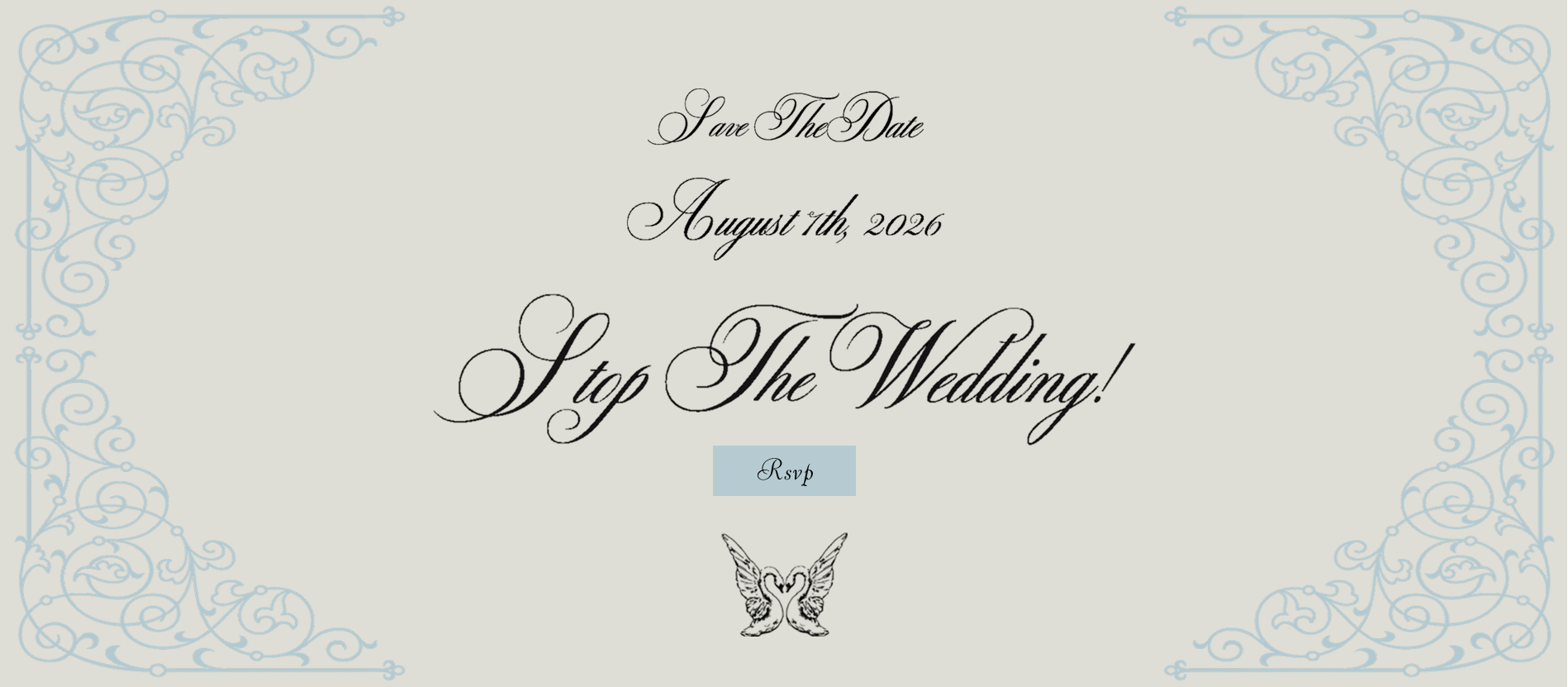
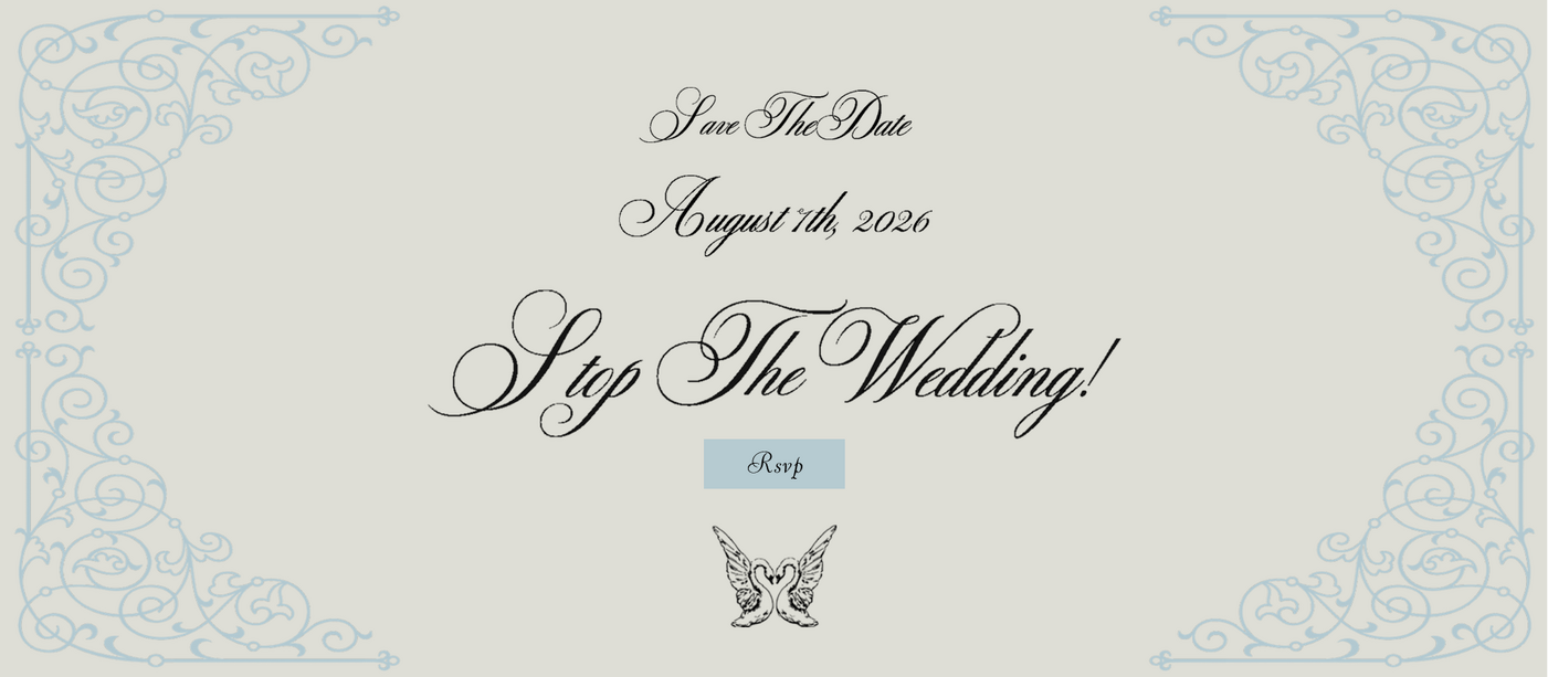
https://www.ashe-music.com/ The attached image was taken from the website above. Only looking for the text script, the RSVP button is Viant-MN. Commercial font is great, free is fine too.
-
VistaPrint’s Logomaker seems to be powered by AI. While some AI text to image generators link to collections of actual typefaces via specific prompts, many do not. The latter seems to be the case here. This particular AI model didn’t choose an existing typeface, it created one of its own—an amalgam derived from multiple sources.
-
Hi Kevin, Looking into it further, it might have been created using Vista's online Logo Maker tool. Kind regards Barry
-
Hi Kevin, Thanks for getting back to me. I've been told by the client it was created by a designer at Vista Print. You could be right that it's just been mocked up in AI. I'll do some more Scooby Doo investigation. Kind regards Barry
Earlier
-
Thank you for your help!
-
Hey, all. I'm trying to make my own custom logo and eventually printable cover artwork for this game (nonprofit only). I can't seem to find whatever typeface (if any) that WB used for the "Komplete Edition" subline in the official logo, but it's a very cool design. If anyone from here can help me identify it, and direct me toward a download, I'd appreciate it. Thanks!

-
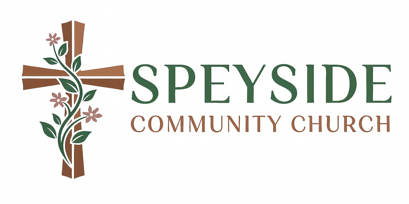
Barry, is there any chance that what you posted was created using Generative AI? I ask because 1) I also cannot find a match in any database and 2) I see subtle differences in repeating letters (The three Cs and two Us in COMMUNITY CHURCH).
-
spacegirl joined the community
-
Hello, I'm trying to identify the attached font, I've tried a few font identification sites but to no avail. Any help would be fantastic. Many thanks in advance. Barry
-
Barry Christian Wink joined the community
-
Channain joined the community
-
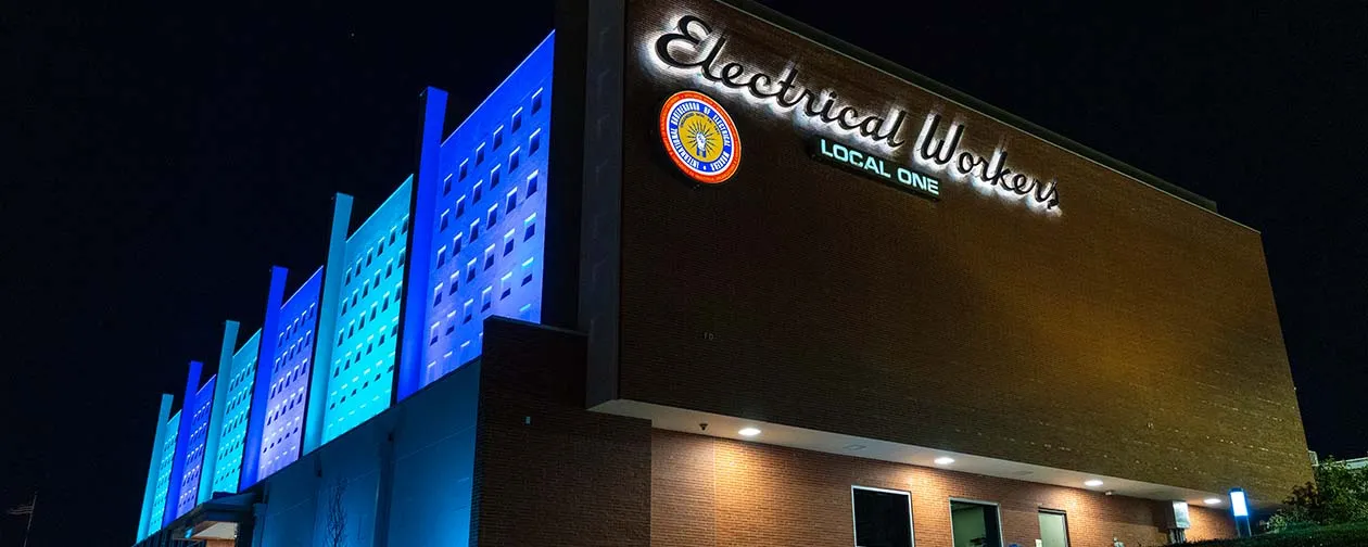
The building appears to be in St. Louis, Missouri, and dates from 1960. If the sign is contemporary with that date, then it may very well have started with custom lettering. Only finding similar: Minetto, Bright Larch
-
Trying to match the font used for the "Electrical Workers" letters. I believe this location is in Chicago. Commercial fonts are fine.
-
 Lipi.ai is an online platform for: identifying typefaces from images or screenshots, detecting a font's copyright and licensing status, generating new typefaces with AI, and Font Studio for hands-on customization. Available as a web app or an API for teams embedding typography workflows into their own products.
 -
Thank you Kevin!
-
Strike that sans serif ID—it is very similar to an older version of Rules Gothic, but not a match to the version currently sold. Anybody ExtraExpanded ExtraBold is also similar.
-
For anyone who might be wondering what the sans serif is, it appears to be Rules Gothic Expanded Extra Bold, by Blaze Type
-
Appears to be custom. Similar: Mr Stalwart, Porongo (which seems to be based on the same Blumlein Script source)
-
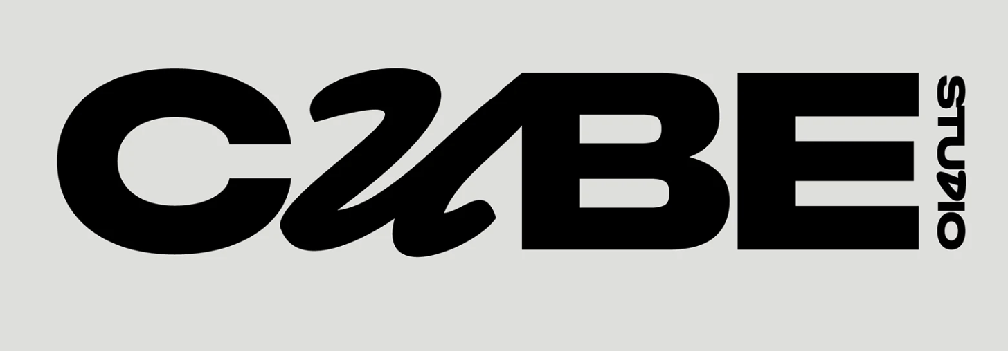
I'm trying to identify the font used for the "u" in this design (and perhaps it is the same as the one used for the "D" in Studio). This is from a Behance project by Jennie Svartsjö Thank you for your sleuthing !
-
The double vé style of W is most often seen in serif typefaces, not sans serif. It may have to be something you construct yourself from two capital Vs. Equally difficult is finding a sans serif with that degree of calligraphic flare in the terminals. Typefaces similar to your sample (Burneside Grotesk by Atelier Dyakova, custom to its identity for Paper Foundation): Neue Freigeist Agrandir Caslon Doric Classic Grotesque TG Glifko
-
 “Many major graphics/publishing apps have missed the boat with their user interface choices for variable fonts. Given the ongoing steady growth of variable font usage and availability, it seems worth fixing things.”
 -
FF Clan is a solid call, thanks for looking! I am so strict about getting the repro 100 percent right. I know some faces were hand-drawn and there may not be a match but all the letterforms are consistent so I think its got to be a letraset or other, hard to find!
-
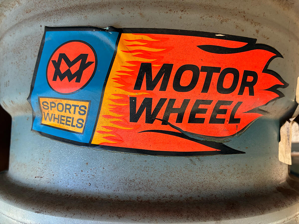
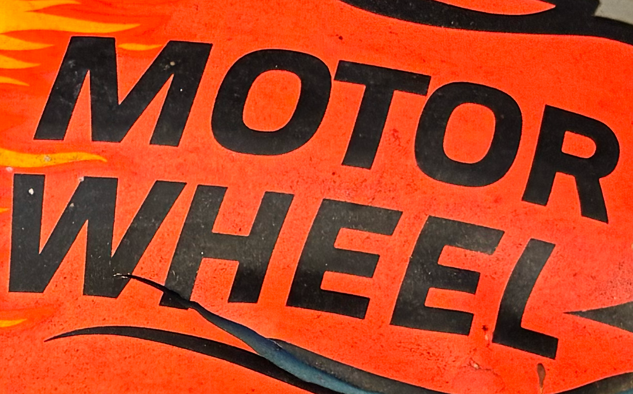
No luck with an ID of the original from the 60s or 70s yet, but one modern digital typeface replicates the look (save for the S): FF Clan Manual Medium, Tofino Wide Bold, Liberation Sans are other modern options that come close.
-
Hi all! I am having a tough time with ID of the typeface on this vintage 60s or 70s mag wheel (US) sticker. Cannot find any other image of it online, so any help appreciated! I am just looking to recreate the sticker for my friend and was looking to be as authentic as possible in terms of design and type. Looking to ID "MOTOR WHEEL" and "SPORTS WHELLS" looks like they are same family, diff weights.
-
BINGO!!!! tHaNk YoU!