Exclusive Content
Downloads, articles and galleries exclusively available to supporters of Typography.guru. Learn more about the membership
26 exclusive entries
-
A digitization of the condensed style of Rudolf Koch’s “Deutsche Schrift” with a complete Western character set and all the original ligatures and swash characters. An exclusive download for supporters.
- Download
- 309 days left
-
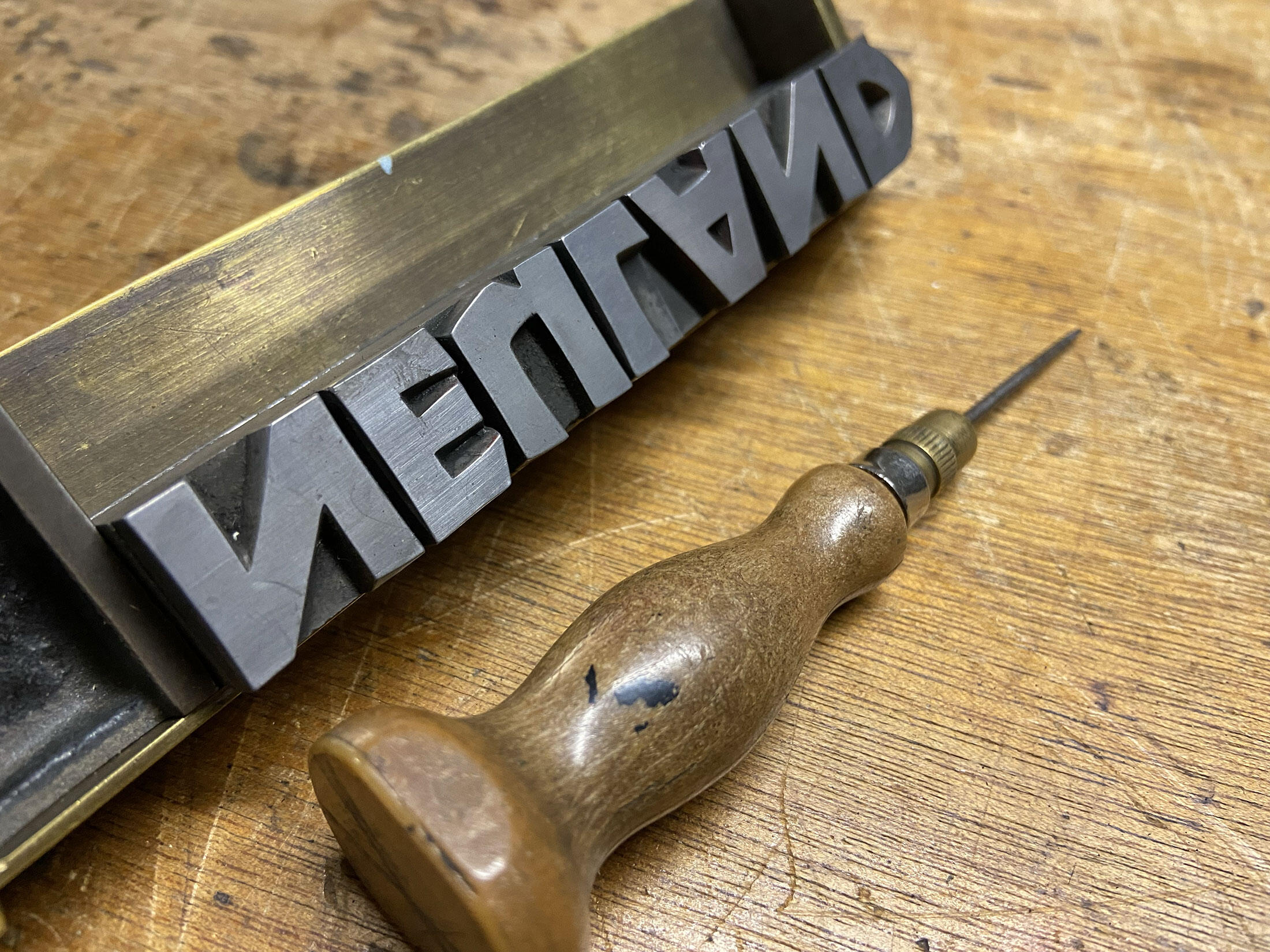
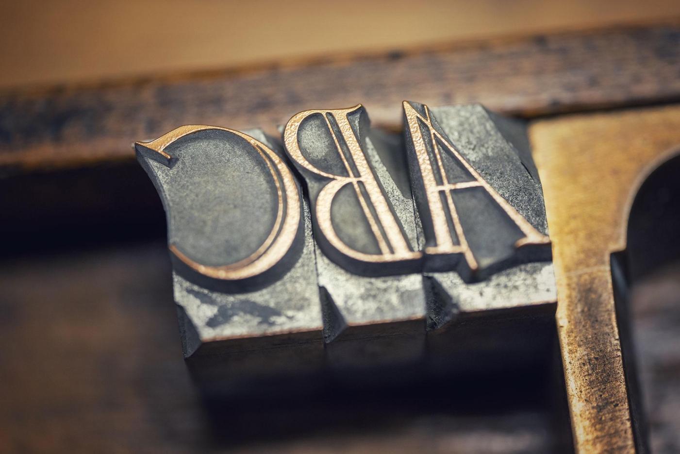
A closer look at the letterpress typeface Neuland, designed by Rudolf Koch and released during the 1920s by the Klingspor Type Foundry.
- Gallery
-
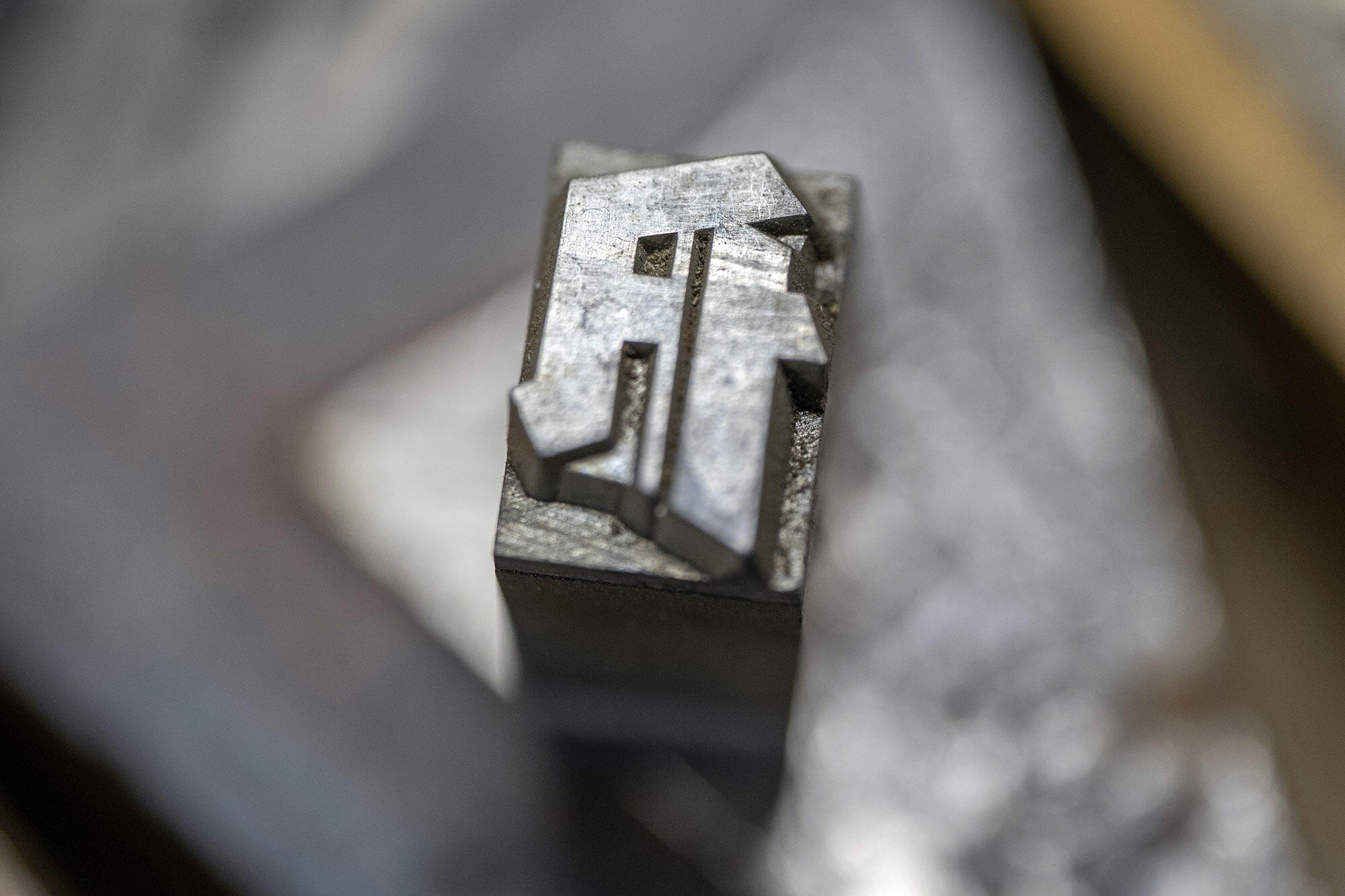
A professional and faithful digitization of one style from the Element blackletter type family, digitized from the original letterpress font.
- Download
- Expired 01/07/2026
-
A closer look at the letterpress typeface Element, released during the 1930s by the Bauer Type Foundry in Frankfurt.
- Gallery
-
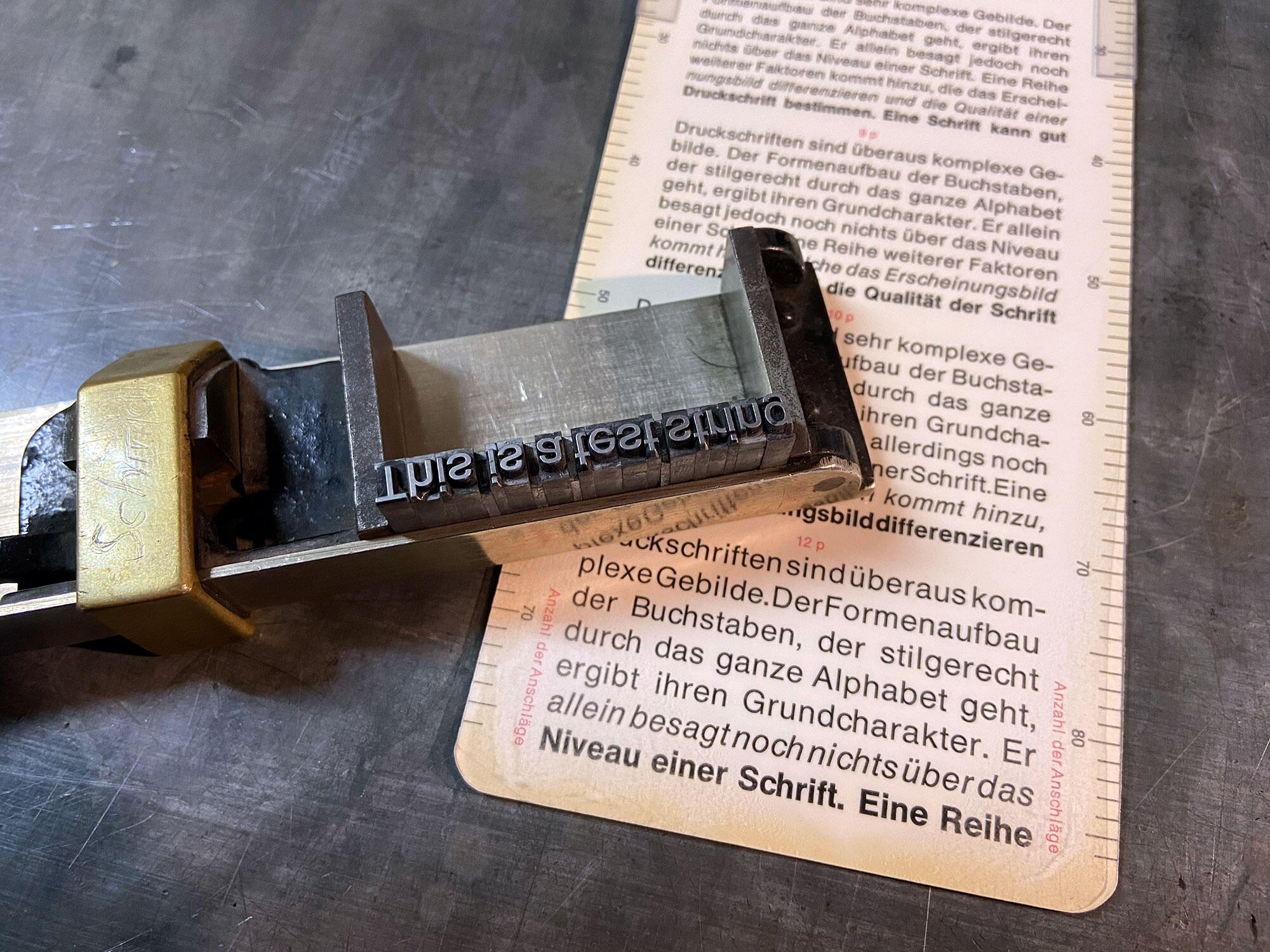
We take a quick look at a forgotten letterpress tool.
- Article
-
A professional and faithful revival of Berthold’s Signal type family originally published in the 1930s.
- Download
-
I recently acquired a set of blackletter fonts for our local printing museum Pavillon-Presse. The fonts clearly belong to the type category of 1930s modern blackletter fonts from Germany, but it doesn’t match any of the known fonts in that style published by the German type foundries of that time. So where does it come from? Was it a work-in-progress design from a foundry that was never released? Was it a custom design? Either way, enjoy this exclusive gallery with hi-resolution images of the my
- Gallery
-
Wunder by FDI Type is based on the typeface Laudahn-Kanzlei originally designed by Heinrich Laudahn and released by Bauer in 1913. FDI Wunder is a carefully crafted revival design based on the original letterpress fonts.
- Download
- Expired 10/26/2024
-
A closer look at Lucian Bernhard’s typefaces Bernhard-Antiqua and Bernhard-Fraktur released in 1911.
- Gallery
-
FDI Triumph is based on a design by Albert Auspurg, originally released in 1929 by the Ludwig Wagner foundry in Leipzig, Germany.
- Download
- Expired 06/23/2024
-
FDI Mainzer Initialen is a set of German blackletter initials in 3 colors. The full packages comes with 10 OpenType SVG fonts and one COLR/CPAL font for web use. Supporters of Typography.guru can download one of the OpenType SVG fonts for free for a limited time.
- Download
- Expired 03/30/2024
-
The sound of the print shop. A video exclusively available to Typography.guru patrons.
- Video
-
Today, in this patron-exclusive article, I introduce yet another favourite typeface from our museum’s collection: Signal, designed by Walter Wege for the Berthold type foundry in Germany.
- Gallery
-
FDI Reklameschrift is a digitization of “Reklameschrift Bombe” (1908) by the German type foundry Ludwig & Mayer. For one year after the release, the fonts cannot be purchases directly. Instead they are exclusively available to patrons of Schriftkontor typography communities.
- Download
- Expired 08/17/2023
-
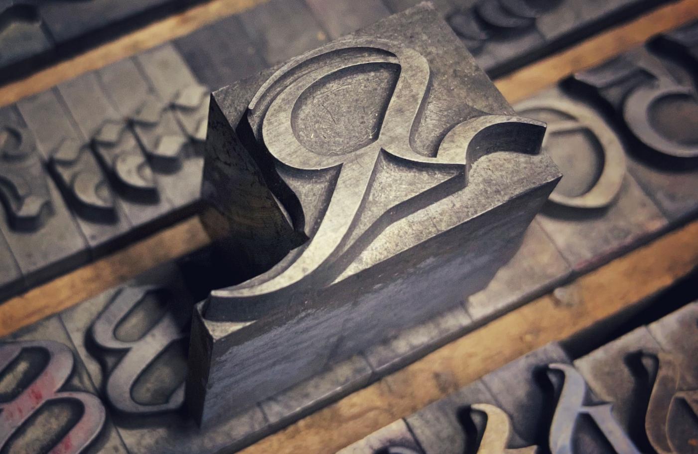
Koch-Antiqua is a type family by Rudolf Koch released during the 1920s. This entry contains type specimen scans and close-up pictures from the letterpress fonts.
- Gallery
-
I am currently in the process of cataloging and scanning the collection of dry-transfer sheets we have at the printing museum Pavillon-Presse. It’s a fascinating look back—both in regards to the type styles of the 1960s to 1980s, as well as in regards to the technique itself …
- Gallery
-
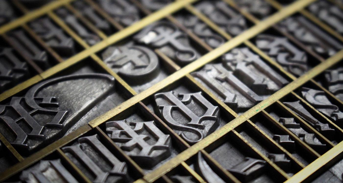
The German capital “umlaut” characters were added fairly late to the German character set. Did you know that this posed a problem to the way German letterpress fonts were cast?
- Article Gallery
-
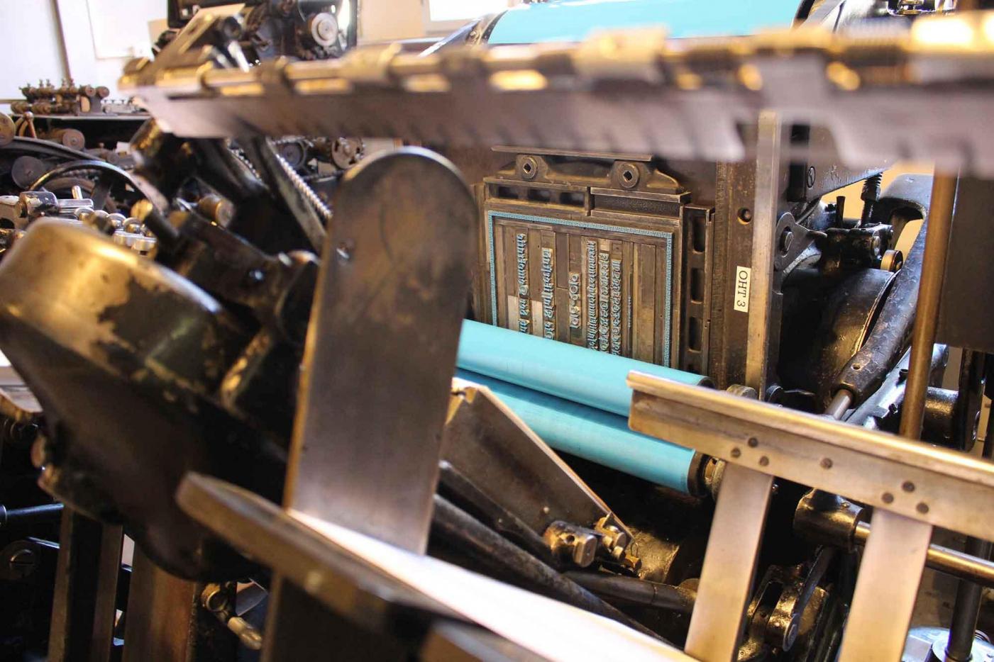
At the printing museum Pavillon-Presse in Weimar we have around 1000 letterpress fonts. While some may admire some of the well-known classics in our font collection, I am always more interested in the forgotten designs—the letterpress fonts, which were never properly adopted for phototypesetting or digital typesetting. In this series, exclusive to patrons, I am going to show you some of my favorites. In this entry, we take a look at my one of my favorite woodtype fonts from our local printing mu
- Article Gallery
-
If I had to list my favourite type treasures from the collection of our museum, it wouldn’t take me long to arrive at Delitsch-Antiqua. It was designed—or maybe I should say written by Hermann Delitsch, who was born in 1869 Leipzig.
- Gallery
-
At the printing museum Pavillon-Presse in Weimar we have around 1000 letterpress fonts. While some may admire some of the well-known classics in our font collection, I am always more interested in the forgotten designs—the letterpress fonts, which were never properly adopted for phototypesetting or digital typesetting. In this series, exclusive to patrons, I am going to show you some of my favorites. Today, we are taking a closer look at Laudahn-Kanzlei.
- Gallery
-
At the printing museum Pavillon-Presse in Weimar we have around 1000 letterpress fonts. While some may admire some of the well-known classics in our font collection, I am always more interested in the forgotten designs—the letterpress fonts, which were never properly adopted for phototypesetting or digital typesetting. In this series, exclusive to patrons, I am going to show you some of my favorites. We start with Orient-Antiqua.
- Article Gallery
-
Last week I announced a new font release—an OpenType font based on a blackletter font originally released in 1916. It’s exclusively available to my patrons and supporters of the printing museum Pavillon-Presse in Weimar. Along with the font release we also created a type specimen poster and in this patron-exclusive article we take a look at how this was done.
- Article
-
I just couldn’t help myself: after Elfen-Fraktur and Krimhilde I started yet another blackletter revival project. While people still enjoy their designs, there is hardly any use for many German Fraktur typefaces nowadays. Their letter shapes are often just not legible enough for a broad use. So again, this revival is more a cultural project than a commercial endeavour.
- Article Download
-
Why I started a unique, weird little photography collection of people posing in front of traffic signs …
- Gallery
-
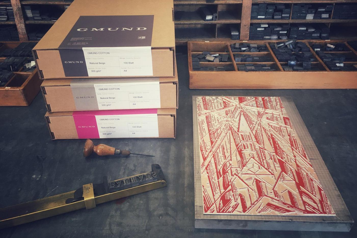
100 years ago, on April 1st 1919, the famous Bauhaus school was founded in Weimar. The new school was announced with a leaflet. It contained a woodcut by Lyonel Feininger on the title page, a Bauhaus manifest by Walter Gropius and a description of the concept and content of the Bauhaus curriculum. Printed on rather cheap paper, very few of the original prints survived …
- Article