Skip to content

Typography Journal

Articles from the field of typography.
By Vicki Tinnel.
This research paper sets out to study the evolution of western-influenced Japanese typography from the turn of the twentieth century to the modern digital age. The last one hundred years have seen more changes in script and typography than the previous four hundred years combined. Not since the kana scripts (hiragana and katakana) were developed in the fifth and sixth centuries has there been so much reform and growth in Japan’s written forms. This is due in part to the demands for reform in response to becoming a more globally minded nation, emerging even before the dramatic effects of World Wars I and II. Now, being a worldwide leader technology and commerce, there is both a beautiful tension and mindful balance that Japan is striking between honoring their ancient traditions and appealing to modern sensibilities.
Edo, Meiji, and Showa
To begin, we will observe multiple time periods that shaped Japanese typographic evolution. The Edo period, which has its origin in the seventeenth century, beautifully encapsulates the artistic influence of Japan’s Arts and Crafts movement. It was during this time that Japan rejected international contact for over a hundred years during its period of isolation (1603-1716). In the 18th century, the shogun Yoshimune (ruled 1716-1845) restored some links to the rest of the world. However, even by the mid-nineteenth century, Japan refused to trade with the West. In the Treaty of Kanagawa, Japan restored trade with the United States by opening up two ports to American ships. Not long afterward, the Japanese also negotiated peaceful trading agreements with Great Britain, the Netherlands, and Russia. In 1868, warlords in western Japan deposed the last shogun, Yoshinoby, and replaced him with the fifteen-year-old emperor, Mutsuhito, who took the name Emperor Meiji. Meiji sent Japanese students abroad to study, welcomed foreigners to Japan, outlawed the caste system, abolished the samurai and initiated a forty-year period of rapid modernization in Japan (Classical Conversations, 124).
Prior to this period of restoration with foreign interactions, tradition was paramount. Researcher Ory Bartal asserts:


“In Japan, the shape of a letter has held great importance from a very early time. Traditional Japanese calligraphy has several writing styles: tansho, reisho, and sosho. Each letter can be written differently, each having its own meaning. In other words, the writing style is not just decorative, but a meaningful tool that builds the visual shape of the language and influences the textual content, just as much as the words themselves” (57).
Ellen Lupton dissects the preliminary changes that began to occur with the newly shifting focus during this time: “Traditionally, Japanese people wrote in vertical lines with a brush, but with the spread of imported books written in Western languages after the Meiji Restoration, people began writing in horizontal lines with a pen as well” (190).
Lupton goes on to highlight the Tsukiji Type Foundry which appeared in the 1860s and had a profound effect on how the Japanese approached typography. Its creator, Motogi Shozo (born 1824), is credited as Japan’s Father of Typography. He came from a long line of language interpreters and grew up in the maritime trade industry of Nagasaki. Learning everything from the importance of printable communication to the ins and outs of steel type-casting, he set out to make a mark in print publication. Motogi invited Irish printing expert William Gamble to spend four months with him in Japan. Within that time, they created The Center of Teaching Typography. After Gamble left, Motogi opened a printing shop named Shinmachi. This foundation is what later became known as the first type foundry in Japan, the Tsukiji Foundry, established in 1873.

“After years of toil and experiment, Motogi invented types for Japanese characters and for the first time, made printing a business. We owe, indeed, to him alone the success and prosperity of Japanese typography in modern times. He is, therefore, most deserving of our esteem, as the Father of Japanese Typography. – Mataga Shiqeri” (DesignCultureNow).
In the compilation work by Silbergeld, Bridges to Heaven, Duke professor Gennifer Weisenfeld, contributed her work, Japanese Typography and the Art of Letterform, where she illuminates some of the dynamics that followed Motogi’s work:


“Despite its repeated introduction to Japan from China, Korea, and Europe over many centuries, movable type (letterpress printing) was not widely adopted in Japan until the late nineteenth century due to the high cost and relative inconvenience of casting individual types for thousands of characters. Because of the difficulty and expense of developing type, as well as the inability of type to simulate adequately the dynamism of calligraphy, the majority of innovative and expressive letterform designs in Japan, until the inauguration of digital fonts in the computer age, has been hand-designed printed lettering rather than actual cast typefaces, what Kawahata has termed kaki moji” (830-831).
Public interest began to take notice as more and more print publications became available to the general populace during this time. This was due, in no small part, to the contribution of local bookstores that aspired to make a greater mark in their individual communities. This priority has only grown over time. In The Typographic Imagination, Nathan Shockney writes of one such pioneering establishment:

“At the vanguard of Japan’s modern book trade was the iconic Nihonbashi shop Maruzen, which was founded in 1869 and remains one of the country’s best-known bookstores. At Maruzen, Western books were media that heralded new forms of knowledge, and the store’s original stock consisted of reference texts like Noah Webster’s American Dictionary of the English Language and other foreign textbooks and encyclopedias. The store’s mission to bring Western knowledge to the Japanese public was evident in the shop’s original name, Maruya, written with the character for “sphere” and chosen to evoke the globe and the wide world. Maruzen’s mission to procure foreign literary and philosophical texts made the store a site for authors and intellectuals seeking new ideas from abroad; in addition to reading material, Maruzen also provided the necessary tools for writing modern literature, including imported European paper, ink, and pens. Maruzen thus furnished both the possibility to consume modern literature and the media by which to produce it” (95-96).
This produced a symbiotic cycle where, as Shockney describes, “Interest in Edo (era) fiction helped drive the used-book trade, as woodblock-printed, string-bound wahon were distinct from cheap mass-market editions, and illustrated early modern genres like kibyōshi could not easily be reproduced through typography alone” (108). Later, he illustrates how the reading population of local communities exploded between 1912-1923, going from approximately 3.6 million library users to nearly 21 million (115).
The Edo period of typography, while culminating to its height after the Meiji Restoration, began to see its end in a very physically dramatic way. History records a massive 7.9 magnitude earthquake in Japan, which has come to be known as the Great Kanto Earthquake. Not only were cities decimated and hundreds of thousands of people perished, but also firestorms consumed more volumes of material than we have record for. Tokyo Imperial University Library alone saw the destruction of 760,000 volumes (Shockey, pg. 116). Such a nationwide loss could seem too insurmountable to overcome. Instead, however, it became the dawn of a new typographic era, known as the Showa period, lasting from 1926-1989. Hope and determination gave birth to innovation like never before. Shockey quotes designer Chihiro Otsuki explaining,

“We can leverage new printing technology to create a new archive, with photographic reproduction and metal-plate technology, allowing the reprinting of woodblock or script editions in their full visual splendor, rather than simply transferring the textual content into type and losing the specificity of their format” (113-144). Tokyo Imperial University professor Takeda Goichi made a call for ‘new letterforms to fit modern commodities,’ stating that “beautiful typography is the most effective way of promoting the worth of a commodity” (Silbergeld, 831).
Here, Weisenfeld eloquently addresses the results of this phoenix-like emergence and resilience that mark the Showa period. She teaches:

“The 1920s and 1930s mark the emergence of a modern professional design field in Japan. An increasing division of labor in the visual arts (particularly between fine artists and those in applied arts) led to a broad-based systematization of specialized knowledge. A new professional self-awareness among designers took place concurrently with the rapid expansion of the consumer market, and the mass media ignited a widespread interest in the communicative potential of letterforms for national and commercial purposes. Japanese designers transmitted artistic, subjective, and ideological meaning through the skillful orchestration of the linguistic multivalence of the Japanese language” (846-847).
So, what changes emerged out of this Showa chrysalis? The answer can be found in three dimensions: Letterform, Character Sets, and Directionality. It begins with the first element of typographic change, letterform. “Calligraphy was said to have bones (authority and size), meat (the proportion of the characters), blood (the texture of the fluid ink), and muscle (spirit and vital force)” (Purvis, 181). To understand the letterforms’ evolution, Weisenfeld advises observers to look at the calls for reform taking place at this time from multiple sectors:

“Japanese debates on language reform in the late nineteenth and early twentieth centuries are …critical to understanding the status and development of written language in the modern period. Standardization, legibility, and access were pressing concerns for both politicians and commercial entrepreneurs in Japan’s rapidly emerging national public culture. Contentious debates over what should constitute a national written language, which bear witness to the immense social and political significance of visible language, formed the ideological backdrop to the development of modern letterforms. These debates, while unresolved, merit discussion as a preface to an analysis of specific design programs. The hybridization of the Japanese language signifies the process of Japan’s transculturation” (828).
Letterforms, Directionality, Character Set
In 2019 a presentation was given by Florence Fu of ATypI in San Francisco, a nonprofit dedicated to the preservation of Japan’s typographic history. She presents that before the twentieth century (during the Edo period), letterforms were based on calligraphy and handwriting, also referred to as edomoji or edoscripts. What was utilized before the 1920s-1930s was referred to as ‘traditional’ and included Sumomoji, Kagomoji (thick, dense scripts) and whiskered Higomoji script. During the 1920s-1930s, there was a boom in trade publishing that produced many blends of traditional scripts with more modern lettering. Therein lied a respect for tradition in the face of innovation. Modern lettering moved away from calligraphy, with Flourish Kanji and Kana conveying luxury and a nod to Art Nouveau, which had its roots in the Japanese Arts & Crafts period. Geometric-based circles, half-circles, and dots started to replace calligraphic brush strokes. The Art Deco movement was happening concurrently… and influenced with its thick strokes & thin stems. Characters were reminiscent of the ‘Broadway’ typeface and utilized shading and contrast for emphasis using line and color. Another example of geometric lettering appeared in the use of stencils. Modular stencils mimicked Latin lettering and worked well for Katakana’s angular form (Fu, 2019). Even Weisenfeld refers to this phenomena: “As Art Nouveau was itself deeply influenced by Japanese aesthetics and the movement of Japonism, designers were in effect drawn to an already familiar decorative sensibility. Whisker characters are still widely used in the commercial sphere for everything from the shaved ice dessert signs that dot city street in the summer to the backs of Happi coats” (Silbergeld, 834, 836).

To gain a better understanding of this, one must dive into the elements of Japanese character sets. “The Japanese written language is a distinct amalgam of Chinese-derived logo/ideographic characters (kanji ), native syllabaries (kana, hiragana, and katakana), and Romanized letters (rōmaji ) and numbers, offering designers an unparalleled and uniquely challenging range of expressive possibilities” (Silbergeld, 827-828). Ellen Lupton, in Thinking with Type, explains,

“The majority of characters in Japanese texts are hiragana and katakana. These syllabic characters need to be designed carefully to achieve good readability. Hiragana and Katakana characters are expressed through diverse letterforms, reflecting various typeface styles, and designs, including Mincho, Gothic, Rounded Gothic, and many others. Typical Japanese texts also include Latin characters” (37).
In Japanese Typeface Personalities, by Joshua Caldwell, we dive even deeper into the semantics that make up the typographic elements of a character glyph.

“All Japanese characters are to be the same size, fitting within an imaginary square. Elementary school children often practice penmanship on papers filled with columns of squares. So, each and every character written takes the same amount of space on the page. This standard applies to both written and printed text. However, this standard is often flouted in the more stylized typefaces,” (2).
He goes further to explain that “Hiragana and katakana represent the same sounds. Everything that can be written in hiragana can be written in katakana, and vice versa. Hiragana is used with kanji for everyday writing. Katakana is used primarily for foreign words or names and for emphasis, much like italics in English,” (1-2).
So why are so many distinctions still held onto today? What is the mentality behind retaining the complexity of multiple scripts, instead of streamlining down to a singular writing form? In the compilation, Asia Through Art and Anthropology, Chihiro Minato explains: “Meaning is underpinned by the senses; the interaction between the intellect and the senses forms each era’s typography, producing in turn the characters we use. (Japanese) Characters are also asobi, a form of play or amusement. The Japanese word asobi also means margin or space. One could even say there is an ample margin of space that surrounds the meaning of Japanese characters. Usually, a character’s form and transformation over time have the nature of intellectual play” (116, 118).
Similarly, in her online address, Florence Fu defends that “These complexities are actually what make Japanese typography so compelling and rich. Multiple textures are illuminated because of the very different shapes of Kanji - characters that carry centuries of meaning and culture in each stroke, the softer, more script-like Hiragana syllabary, the squarish and more chiseled Katakana syllabary, and the Latin alphabet, which is based on a completely different structure and design” (Fu, 2019). It is the previously mentioned love for both tradition and modernity, tension and balance, that make Japanese character scripts so compelling in their varied usages.
Finally, to truly understand the typographic metamorphosis that the Showa period produced, one must observe the changes that occurred in the directionality of graphic presentation. Traditionally, Japanese writing is read top-to-bottom, right-to-left. This is how traditional volumes were typeset. Horizontal writing was only used to fill limited spaces, still being read right-to-left (Fu, 2019). Weisenfeld teaches:

“Multidirectionality is inherent in the polyglot nature of the Japanese language and enhances the possibilities of communication through editorial design. When first approaching a page for editorial layout, Japanese designers are confronted with the question of whether the text should read vertically or horizontally, and whether it should be read left to right or right to left. This tremendous personal liberty in making aesthetic choices also causes designers no end of difficulty, as each design decision was, and still is, freighted with ideological as well as aesthetic import. Despite repeated attempts at standardization throughout the twentieth century, directionality is still an open issue, with most textbooks written horizontally and most popular magazines and newspapers written vertically. In Japan, horizontal writing was associated with the West and was therefore a symbol of modernity. During the postwar period, advocates of horizontal writing made a spurious biological argument based on the side-by-side position of the human eyes” (Silbergeld, 841-842).
The blend of multiple directions is, to this day, common practice and can be seen everywhere from physical store signage to digital media graphic advertisements. It is, in true Japanese fashion, a reflection of their ancient, artistic priority and modern, forward-thinking creative nature.
Post-modern Globalization
Tatsuno Yutaka (1888-1964) declared, “As any sake is good so long as it’s drinkable … any book is good so long as it’s readable” (Shockey, 105). Today, Japan is now deeply entrenched in a polyglot print culture that has seen post-WW2 consumerism boom, the advent of computers and the digital age, and a global interface unlike it has ever experienced in its long, rich history. Designers have stepped to the forefront of artistic innovation and have had to pioneer a market that is as diverse and varied as its internationally reputed food culture.

“Eye-catching letterforms were already crucial to visual communication in the Edo period, and modern design proponents sought to expand and diversify these expressive possibilities to encourage increased consumption of new products. In the process, they reinforced the important role of the designer as a creative mediator in communicating product identity to an expanding consumer public” (Silbergeld, 832).
In Postmodern Advertising in Japan, Ory Bartal unpacks how this current economy has undergone significant changes, even incorporating global social issues (162). This sentiment is echoed in the journal article, From Edo Period to Present: Tracing the Development of Japanese Graphic Design in Posters: “Each historical period and its sociological setting from propaganda operations during World Wars I & II to post-war reconstruction, and the advent of digital technology, have permanently impacted Japanese poster design” (Lin, Che Cob, 91). Minato builds on this theory by highlighting:

“In Japan, the advent of computers has brought about drastic changes to the environment in which written characters are used, in everything from typography through to printing, but a sense of handwriting has not been altogether lost. The multitude of calligraphic styles adopted for digital fonts is one example of this, and font designers tend to show a strong inclination toward handwritten styles. More than a few of them practice Japanese calligraphy. Touch-screen devices such as the iPad are now commonly used, and some designers create characters by drawing or writing directly onto the screen with their fingers. The beauty of a written character lies not only in its appearance but also in the order of its strokes when written and the space between them; it is also tactile. Hence, in the beauty of the Japanese script, touch remains a crucial sense” (117-118).
Designers at this time had to understand this. In order to distinguish themselves and their companies, visible use of varied letterforms and graphic layout was paramount to articulating not just an advertising message, but a veritable identity that could capture consumer confidence. One such artist was Shuichi Nogami (b. 1954), who combined letterforms and stretched their shapes into a wooden sculpture floating in space. “Nogami often takes surprising letters and photographic images and combines, overlaps, merges, and stretches them into experimental letterforms that float as three-dimensional objects on the page. The designs of Shinnosuke Sugisaki (b. 1953), both elegant and poetic, display a unique blend of Western and Japanese features,” (Meggs, 760).

Suzuki Hachiro (graphic designer) explained that “The writing style comes from the lifestyle, so when we want to say something clearly to the target audience, we use Gothic font, but when we wish to enhance text with emotions, …we use handwriting. In the absence of someone to do the writing, the closest calligraphy would be sosho (‘grass’ writing). We choose the font closest to the emotions that we want to express” (Bartal, 57).
An occurrence from recent memory took place less than thirty years ago. Gen X’ers and millennials may have witnessed firsthand what type of marketing was produced when the Olympics were held in Nagano, Japan: “The ongoing cultural consequences of these design choices are exemplified by a more recent crisis over promotional materials for the 1998 Olympics, when the Japanese committee could not decide whether to print the multilingual promotional material, which included kanji and rōmaji, vertically or horizontally. There was an imperative to express the theme of the Nagano Olympics—“internationalism” (kokusaisei )—typographically, with vertical type encoded as Asian. The director of editorial design, Hara Kenya, is said to have suggested to the promotion committee that everything be in horizontal type to underscore the international sentiment.
In the end, while the typeface on the official Nagano poster by Aoba Masuteru was in Roman letters read from left to right, the trilingual official program for the opening ceremony designed by Hara was rendered in a combination of kanji and Roman letters, in vertical and horizontal type, respectively. Hara’s layout balanced the vertical and horizontal texts through a skillful use of the pictorial elements” (Silbergeld, 842).
Conclusion
What a striking example of how all of these dynamics can play out in a real-life, global, modern interaction. That speaks distinctly to how design is so much more than a message on a page or screen. This is undeniably evident, especially in a nation whose typographic history is as multifaceted as Japan’s. One can see at every level of syntax, letterform, and graphic just how profoundly isolation, tradition, trade, shifting regimes, earthquakes, and wars have all left a mark on what Japanese typography looks like today. Gennifer Weisenfeld eloquently concludes, “Just as the Japanese today live a daily life inflected by transcultural culinary practices, they also live in and continue to produce a dynamic visual culture animated by a polyglot language made visible through typography and letterform design” (Silbergeld, 847).


Works Cited
Bartal, Ory. Postmodern Advertising in Japan: Seduction, Visual Culture, and the Tokyo Art Directors Club, University Press of New England, 2015. ProQuest Ebook Central, https://ebookcentral.proquest.com/lib/liberty/detail.action?docID=1882399.
Bartal, Ory. “Text as Image in Japanese Advertising Typography Design.” Design Issues, vol. 29, no. 1, 2013, pp. 51–66. JSTOR, http://www.jstor.org/stable/24267102. Accessed 20 Aug. 2025.
Caldwell, Joshua. “Japanese typeface personalities: Are typeface personalities consistent across culture?” IEEE International Professional Communication 2013 Conference. IEEE, 2013.
Classical Conversations. Classical Acts & Facts History Cards: Age of Industry - Card #124: U.S. Restores Trade with Japan, Classical Conversations Multimedia, 2012.
Fu, Florence. “Japanese Typography, Lettering, and Commercial Art in the Early Twentieth Century.” YouTube, uploaded by @ATypI_org, 6 Sept. 2019, youtu.be/gKj2vdjp-- I?si=wCYEzMXrEWSHfmFO.
Lin, N., and S. A. B. Che Cob. “From Edo Period to Present: Tracing the Development of Japanese Graphic Design in Posters”. Herança, vol. 7, no. 2, Jan. 2024, pp. 82-95, doi:10.52152/heranca.v7i2.822
Lupton, Ellen. Thinking with Type : A Critical Guide for Designers, Writers, Editors, & Students. Third edition., Princeton Architectural Press, 2024.
Matsuda, Yuki. “Script-Switching in Japanese Pop Culture: A Social Semiotic Multimodal Approach.” Visual Communication, vol. 24, no. 1, 2025, pp. 129–147, https://doi.org/10.1177/14703572231155586.
“Meet the Father of Japanese Typography.” YouTube, uploaded by @DesignCultureNow, 27 Oct. 2020, www.youtube.com/watch?v=rXc5xpIln_4
Minato, Chihiro. “8 TYPOLOGIC: INTERACTIONS BETWEEN THE INTELLECT AND THE SENSES.” Asia through Art and Anthropology: Cultural Translation Across Borders (2013): 111.
Shockey, Nathan. The typographic imagination: Reading and writing in Japan’s age of modern print media. Columbia University Press, 2019.
Silbergeld, Jerome, et al. Bridges to Heaven. Princeton University Press, 2011. https://dukespace.lib.duke.edu/server/api/core/bitstreams/4728346e-cb0f-42a9-8dea-35cab51b339b/content
Weisenfeld, Gennifer S. The Fine Art of Persuasion : Corporate Advertising Design, Nation, and Empire in Modern Japan. Duke University Press, 2025.
Purvis, Alston W. Meggs’ History of Graphic Design. 6th ed., Wiley, 2016. https://liberty.alma.exlibrisgroup.com/discovery/openurl?institution=01LIBU_INST&rfr_id=info:sid%2Fsummon&rft_dat=ie%3D51245689990004916,ie%3D51153788360004916,language%3DEN&svc_dat=CTO&u.ignore_date_coverage=true&vid=01LIBU_INST:Services
Images Cited
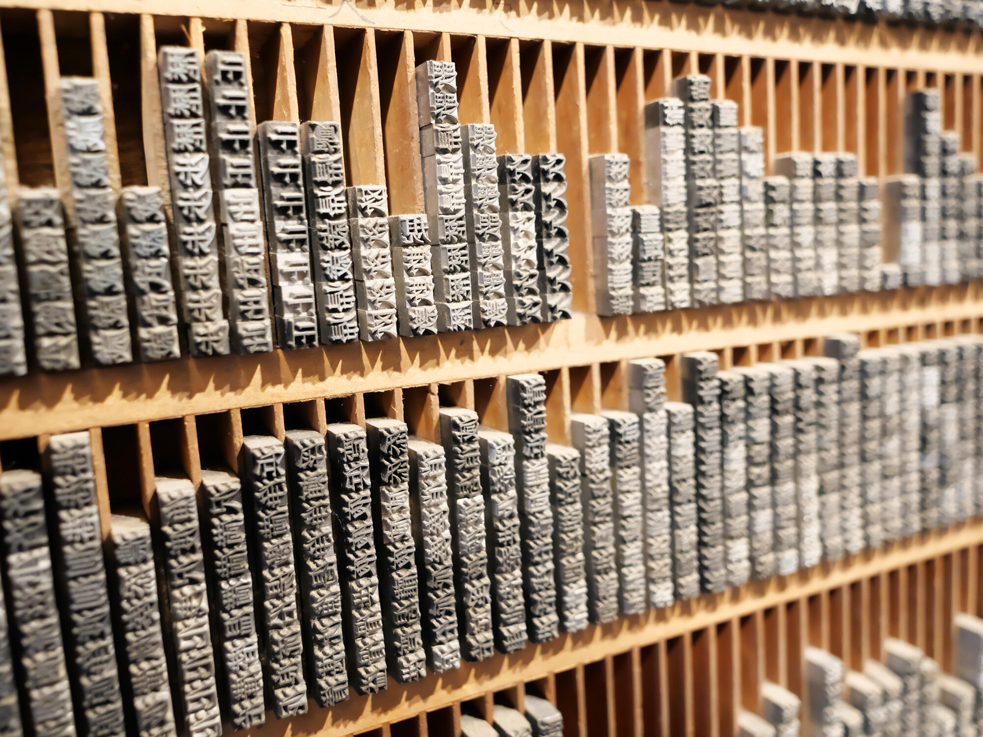
Cover Image: Milmed. “Traditional Japanese Printing Technology.” Adobe Stock: 361648765. Licensed for Typography.guru.
Figure 1: “Emperor Meiji.” commons.wikimedia.org/wiki/File:NSRW_Mutsuhito.png
Figure 2: “Motogi Shozo.” aisforfonts.com/motogi-shozo
Figure 3: Mdesign. Title Unknown. Adobe Stock: 315808120. Licensed for Typography.guru.
Figure 4: “1998 Nagano Olympics Opening Ceremony Program.” www.worthpoint.com/worthopedia/1998-nagano-olympics-opening-ceremony-947077926
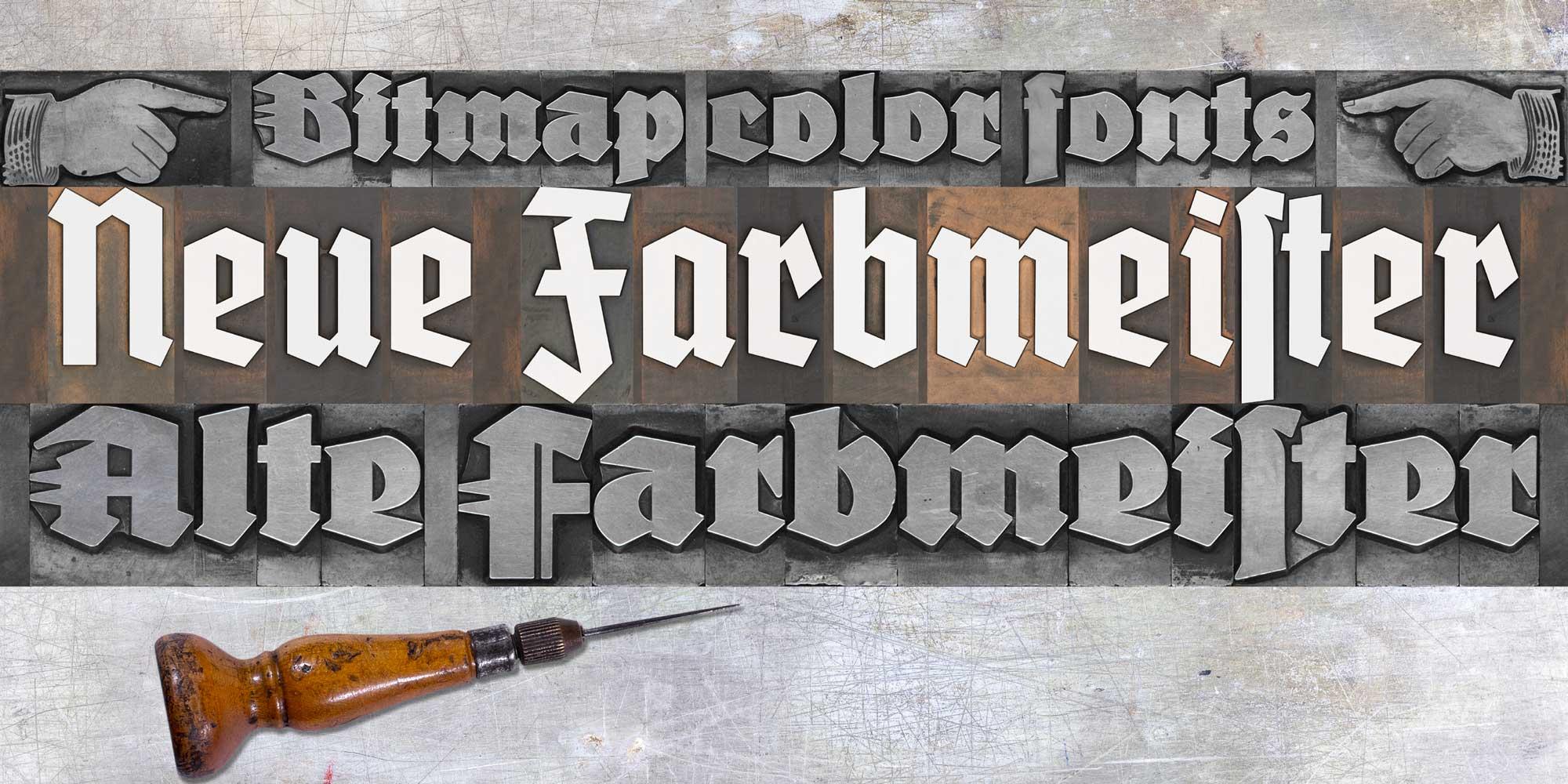
In 2020, I created a Kickstarter campaign to revive the blackletter font Wiking. In 2021 I planned an even more elaborate campaign regarding the blackletter font Deutschmeister. Thanks to the support from people around the world, this project got funded too and the digital fonts FDI Altmeister and FDI Neumeister are now also available for free under the Open Font License. This time, I didn’t digitize the fonts from printed samples, but from the original letterpress letters themselves. After decades of use in different print shops, the appearance of those letters has its own charm. But of course that wouldn’t be visible in a digital vector font.

And that gave me an idea: What if wouldn’t just digitize the outlines, but the appearance of the physical letters as well? The support for bitmap and vector color fonts has increased in recent years and became even part of the OpenType standard with SVG. Well, one year after having the idea, the fonts have now been released and I am really happy with the result, even though there were quite a few challenges along the way. 

The general idea was to create a rectangular bitmap image for each letter using a bird’s eye perspective. That would allow typesetting with the appearance of a real letterpress layout where each letter touches the surrounding letters. But creating these images wasn’t as easy as I originally thought. Parts of the face of the letters extend to the side of the letterpress body. So, from a camera perspective, those parts would extend well over the letterpress body (see image below).

My first attempts with scanners also wasn’t successful, since they will usually distort anything that isn’t directly touching the glass surface. But in the end, I found a suitable scanner using the CCD technology, which would not distort parts of the image. Each letter of the two original letterpress fonts was scanned separately, so I got clear edges for all letters. But the edges were far from being straight and the issue of overlapping letter-parts was also present with scanned images. I solved all this by manually retouching all letters in Photoshop. I slightly increased the size of each letter and with that, the edges got straight and the overlapping parts were now inside the rectangular bitmap image. The result was a “pixel perfect” design. 

The digital letters of FDI Alte Farbmeister connect as they would in a letterpress layout
The PNG glyphs are included in two sizes in the font. A version 256 pixels high for low-resolution previews and a version with a height of 1000 pixels for the full resolution. As a result, even in a size of more than 3 inches, the fonts will appear sharp in print. 
The type size works just like it does with letterpress fonts, because the bitmap images use the full type size. So, if you set the line-height equal to the type size, all lines will connect perfectly. You can even combine different type sizes as you would in a letterpress layout. For example: a drop cap in 36 points can sit next to three lines of text in 12 points. 

Creating the wood type version was also challenging, because I ran into a problem I hadn’t anticipated. Because some letters had been used more than others, there was a significant color contrast between the individual letters of the font, while there was almost no contrast between the face of the letters and the shoulder area. As a result, putting these letters together without ink would just create a series of rectangles with different colors. But the letters weren’t legible. After considering and testing various options, I decided to create “digital ink” in Photoshop in two versions. One version of FDI Neue Farbmeister uses white ink, which creates a sufficient contrast and can be used as is. A second version uses blue ink. I chose blue because there aren’t any blue hues on the wood type letters itself. So, in a photo-editing app like Photoshop it is very easy to target the blue hues and change them to any color you like. 


Using the software tools for kerning and tracking isn’t recommended with these fonts. With increased letter-spacing the background would appear and with decreased letter-spacing, the bitmap images would overlap in a way that wouldn’t look natural. But users of these fonts can still apply spacing changes as a letterpress compositor would do it. For this purpose, the fonts contain a thin space (U+2009) and a hair space (U+200A). 

The fonts use two color font technologies within the same font files: Apple’s SBIX format, which works in many apps on Apple’s operating systems and SVG, which is supported across multiple platforms and already works in many design applications. For more details check out https://www.colorfonts.wtf/
More details about FDI Farbmeister can be found on the foundry website, where there is also a link to a demo font to test the support in the apps you are using. 
☞ https://fdi-type.de/fonts/farbmeister/
A guest article by Pedro Mascarenhas
 

Introduction
How the General Public relates to fonts. With the entry of personal computers in people’s lives, fonts entered the dictionary and the knowledge of the common mortals. Now, children learn to write both by hand and computer. Any user of text applications knows how to choose the font, thickness, style, size and color. Regarding the thickness of the fonts, everyone knows that there is a normal (regular) and a bold. When CorelDraw and PowerPoint applications appeared, success was immediate because it was so easy to use. In countries where people give less importance to the aesthetics of design, people practiced authentic orgies of letters with gradient colors. Nowadays, users are more experienced, therefore less eccentric when choosing fonts. In general, they know that the sans or serif letters should be used for long texts and very thin, very thick or fancy letters should be used for highlighting. Some font names entered people’s vocabulary, such as Arial, Verdana, Times, Georgia, etc, because they are part of the font menu of the common software applications.
How Professional Consumers relate to fonts. In the world of font nerds, knowledge is much more sophisticated. Since the time of Letraset until today, the font market has become an industry similar to that of music or fashion. Fonts and type designers change from pop stars (remember Neville Brody with The Face or David Carson with Ray Gun) to old-fashioned in the blink of an eye. Revivalism is constantly relaunched. Just like in fashion, there are big vendors that influence trends, alternative and experimental designers and … the rest. With the appearance of the websites to sell fonts, mainly FontShop and MyFonts, fonts have become cheap and accessible to everyone. Like music distribution platforms, these sites have increased the online sales, but above all, they have offered a worldwide stage “artists”, causing an increase in type designers and fonts. Naturally, with this increase in fonts, the new outsiders have shaken the conservative bases because almost everything has become possible.
Which brings me to the thesis presented here. What's the correct name for each font weight. How to manage to regulate some procedures so that the final consumer does not feel lost in this unregulated and overcrowded world. How to make the new trends align with the basic rules of the past. How to make the name given to the weight of a font be as consensual and universal as possible. How to know what is the minimum and maximum metric for the thickness of each font weight, and what's the name to give to that weight. Above all, how to ensure that the final consumer don't get confused when searching a font.

When comparing fonts, what do consumers do and what do they expect to see?
For designers, the decision to choose a font is done in stages, with advances and setbacks. After exhaustive search, designers selects two or three fonts to compare them and make the final decision. The final comparison is usually made in the design apps where the final design will be done (like InDesign, Illustrator …).
But before opening the design apps, designers plunge into type sites for the search. When designers are doing the search, they expect to see the different fonts about the same size to easily compare the optical result of each font. Unfortunately, this often doesn’t happen because the fonts were built with different sizes.
If these fonts had been built with a size roughly equal it will be easier for the designers to understand the characteristics and thickness of each one of them. In the end, they would just have to make some small adjustments in the body size and leading to make the final decision. But fonts appearing in very different sizes can mislead the designer’s perception of the font’s thickness.

TyMS WEIGHTS (#TW).
When consumers compare the weights of a typeface family to decide which one to use or buy, they expect to find progressive smoothness between the different weights. But, more important, they also expect to see the same optical thickness, when comparing the same weight name, between different fonts. As we all know, there are many inconsistencies in the market, between the names of fonts weights. Some fonts are called ExtraBold appear Bold, while other called Light appear Regular and so on. #TyMS Weights will allow type designers, foundries, font apps, and typography schools to “speak” the same language and achieve the goals and expectations of type consumers.
In the future, when type designers open the app to built a font, they will know (if they wants to) the correct name to give to the weight they wants to draw. The #TyMS Weights also allows each type designer to maintain their creativity because it only establishes the percentage of the Primary Stem Thickness (see the meaning in the next paragraph).


1.1. The Primary Stem Thickness (#PST).
All the consumers are able to distinguish a light, regular, bold or black font. But when it comes to more weight steps it needs an expert eye to identify the name of each weight. In the end, the only characteristic, in a “normal” font, that can help to distinguish her weight is the thickness (width) of the primary stem. So if the community starts using the same system to measure the #Primary Stem Thickness, inconsistencies in the name weights between typefaces can be reduced or even eliminated. The #Primary Stem Thickness functions as a structure for the construction of a building. It defines the skeleton, but it has no influence on creativity and details.
The ratio of the thickness of the stem, in letters like the capitular “I”, to the x-height of the font is one method used by many type designers to measure weights. This is a good method, but it has three big problems: 1. many fonts only have capital letters, which does not allow the use of this method, 2. the bolder weights are not as visually bold as the number indicates, 3. this method might not work well when type designers wants to create a variation with a greater x-height, but maintaining the same stem thickness of the capitals.


What about stripes fonts? The question arises whether the #PST corresponds only to one stroke or to the group of strokes. It seems obvious that the name to be given to the weight of a stripes font must be related to the thickness of one stroke and not to the group of strokes that make the stem. The number of strokes must define the typeface name, not the weight name.
What about experimental fonts? Some fonts do not follow the rules established by the status quo of font design (and fortunately because it is in creativity and breaking the rules that evolution finds its way into the future), so for these fonts, type designer's common sense it's very important to interpret what is the #PST of the font, and then give it the most correct weight name, the name that has the same optical weight as the fonts considered “normal”. 
What about unconventional caps height? In this study, it was found that the “normal” ratio between uppercase and lowercase height is 150% (see more details below in the “P.S. What should be the best construction practices”). In cases where this proportion is above 165% or less than 135%, type designers must simulate the #PST of a “normal” caps height, 145% for display fonts and 155% for text fonts. The #PST found will give the correct font weight.
1.2. Weights Names.
The proliferation of font editors – especially the ones with interpolation, supports a deregulation of the weight names. If each type designer continues to be able to name the font weight without strict regulation, the efforts of people like Didot, Frutiger, Charles Bigelow and Kris Holmes, Pablo Impallari or Luc(as) de Groot to bring some clairvoyance to the matter were for nothing. Because type designers and apps are focused on creativity, maybe the regulation must come from distributors like Monotype, Google Fonts, Adobe … because in the end they are the major players in the market and it’s them who have to categorize and list the fonts in the way that best helps consumers in the selection process.
Percentage Proportion. Studying (with the same cap height) the #Primary Stem Thickness of the fonts existing on the market, it’s not possible to find a common value for each weight name due to the inconsistencies found, but it is possible to establish a range measurement for each weight. When we remove the most unsual fonts and the most incongruous names of weights, a percentage proportion system begins to make sense and to achieve the intended objectives.
Based on the analysis of the most prestigious fonts, the largest #Primary Stem Thickness rarely exceeds 33% of the caps height (Interstate UltraBlack has #PST 41%, Gill Sans UltraBold has #PST 44%). Therefore, the interpolation axis to be adopted must stretch until this percentage. Fonts with #PST greater than 33% fall into a category of “unusual”. In addition, the web protocol defines 1000 as the last CSS number, so type designers still have the CSS numbers between 900 and 1000 to design and name their bolder weights without thickness limits.

1.3. TyMS Weights - Steps.
#TyMS Weights work regardless of the size that type designer chooses to design the font. It also allows each type designer to maintain a level of creativity, as it only uses the proportional relationship (first as a percentage and then converted to ems) between the height of the caps and the #Primary Stem Thickness, to establish the name of the weight.
From static to interpolation or vice versa. When we think about interpolation, we can imagine an infinite number of weights … or not. However, the market needs static weights and variable fonts with multiple masters or instances that correspond to the static weights. There are more than 25 known weight names on the market, but many refer to the same optical weight. With the influence of the web, the main steps now used are divided into 10 numbers. In order to achieve a better progressive smoothness and to be congruent with the weights already on the market, the steps to be adopted by TyMS Weights must be somewhere between the 10 CSS numbers. If we insert a step between each CSS number, we get 19 different weights. But to obtain a perfect progressive smoothness of the weights, this system must be linear, instead of following the curve proposed by designers such as Luc(as) de Groot or Pablo Impallari.
Whatever the number of masters that type designers wishes to put on the axis; whatever the number of instances that type designers wish to generate, they can always assign a name for the weight and its css number using #TyMS Weights Ruler.


1.4. Simple, Fast and Precise.
To know what's the best name to give to your weight just need 3 steps: 
Draw your typeface freely.
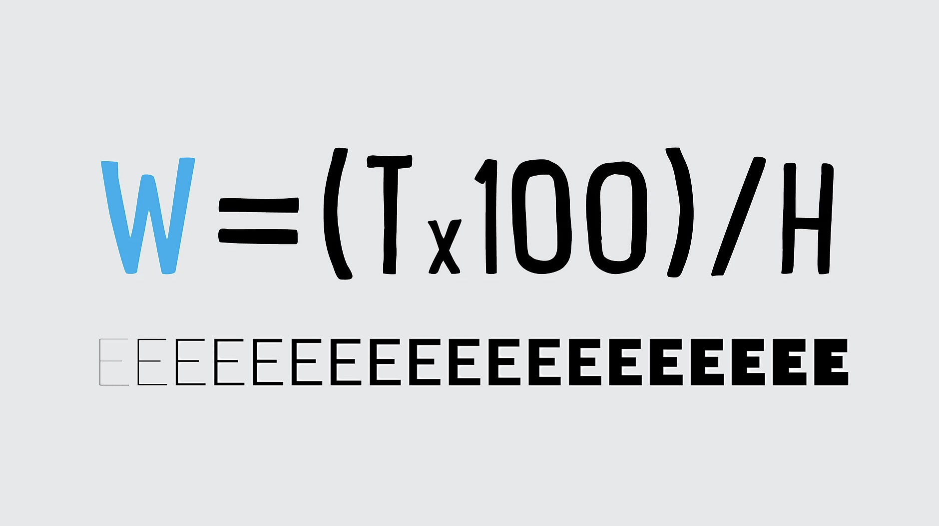
Calculate the percentage of the #Primary Stem Thickness with #TW Formula (W=(Tx100)/H).
See what is the advised weight name in the #TW Table or Ruler.


1.5. Weights and Variations
When type designers compare the weight of the type they are drawing, the #Primary Stem Thickness usually doesn’t have the exact percentage number of one of the weights in the ruler axis. Instead, the #Primary Stem Thickness is in a range between two different weights. Of course, when that happens, #TyMS Weights will not have the audacity to ask type designer to change his masterpiece. Therefore, type designer must choose the closest weight name or create a variation name, a thinner or a bolder. Pay attention, as the variations should not be confused with styles or grades. (See the differences below.)

Weights are the different thicknesses of a typeface family.
Variations are the two fine adjustments to the thickness of a weight – a lighter version and a darker version. Variations cannot change the width of the original stem by more than 1% or they become another weight. They are designed primarily for text fonts and serve to maintain the visual appearance of the original weight, when used in different ways or on various media. The lightest variation is recommended for coated papers and the darkest variation for negative text. The measurement of the thickness of both variations must be within the gap of two consecutive weights of the same font. The main difference for grades is that variations must maintain the same optical contrast as the original font instead of reducing optical contrast.
Styles – Display, Banner, Finesse … From the point of view of this thesis, try to reduce your knowledge of styles for sans serif and serif fonts to better understand the objectives. These styles are designed for large sizes, such as headlines, rather than for the body of the text. They maintain the #Primary Stem Thickness with the same width as the original weight, but increase the optical contrast by reducing the thickness of the secondary strokes (usually the horizontal strokes). For fonts to be considered a style, and not a variation, it requires that the strokes’ tuning be greater than 1%. Micro works as opposed to the display style.
Grades are subtle changes in the strokes of a weight in order to give a similar impression of the font in different conditions (e.g. different printing technologies or papers). Grades slightly reduce the optical contrast of the original weight. This technique is usually used for text fonts, see for example Jonathan Hoefler’s Mercury and Chronicle.
1.6. Conclusion.
Imagine that a designer presents a green logo to the client. After the work is approved, the designer has to define, in the Brand Guide, what green it is, as there are thousands of variations of green. With fonts it’s the same. The designer can’t just say that the typeface is, for example, Helvetica. They have to define the weight, style, size, etc. A variable font is for fonts what “green” is for colors - just a vague reference. The #TyMS Weights will be for fonts weights what Pantone, CMKY, RGB or Hex are for colors – an exact reference.
P.S. What should be the best construction practices.
When type designers open a font editor to build the font they draw, they have to make two decisions at the outset: 1. Which units-per-em (UPM) they will use. Ninety-nine percent of fonts are built in 1000x1000 units, other units values are allowed, but such situations are rare and should be avoided unless there is a very specific reason to do so; 2. The other decision concerns the size (height) of the design. This decision is very important because it is also directly related to the size that the font is rendered in the applications used by consumers. Typically, fonts are built with caps height close to 700em.
Text Fonts. When integrated into a family, fonts designed for text tend to have a lower proportional relationship, between the height of the capital letters and the lowercase letters, and for this reason type designers tend to build these fonts with a cap height below 700em so that the lowercase letters (x-height) are rendered in a size closer to the letters that are not for text.
Normally the height of the lowercase letters is between 60% and 70% of the height of the capital letters. In text fonts the tendency is to have an x-height, between 65% and 75% of the height of capital letters. Two examples of fonts that are clearly outside these usual range are Amplitude, with 80% and Cochin, with 56%.
Normally the text fonts are drawn from the height of the lowercase letters of the family, that is, the text fonts have the same lowercase height as the display fonts of the same family, and what varies is the height of the capital letters. Obviously there are examples to the contrary, in which the construction follows the reference of capital letters, but these cases are the exception and not the rule, see the various options in the image below. 
#PST options. Many of you are already thinking, so if the capital letters of the different fonts of a family, vary in height, the #PST also varies, so the weight names will be different. It turns out that normally the height variation of the capital letters does not exceed 1% so that height variation remains within the range of #TyMS Weights and therefore the name of the weight does not change despite there being a slight difference in the height of the caps. Of course, there may be cases where this #PST of the fonts are within the range of the two weights, which would imply a weight name of the text font different from the weight name of the font display. But in these limited cases, if the #PST does not exceed 1% difference, type designer must keep two fonts with the same weight name. 
Regarding fonts that do not belong to a larger family (with display, text, etc.) the question arises: What option should type designers choose when building the font? If they choose to create them with a cap height of 700em, they can have an exaggerated x-height and a very thick weight name, in relation to the other identical fonts on the market. If they choose an x-height within the normal parameters (between 400em and 500em), they run the risk of having very small capitals and a very thin weight name. Type designer should always think about the consumer — How will they use the font? Will it be used more in text or in display sizes? Will it be used alone or paired with another font?
In conclusion, fonts should always be built with the capitals with 700em, except those with very small lowercase letters. For those, it should be avoided to build them with the lowercase letters above 500em in order not to appear on search sites and in consumers applications with a size out of context.

 
More details: https://pedromascarenhas.wixsite.com/tyms
Pedro Mascarenhas is an Art Director and a type designer from Lisbon, Portugal.
 
 
To see and install these optional fonts, open the FontBook application and switch to “All Fonts”. Browse the font list and you will see lots of font families that are greyed out—either because they were deactivated or they weren’t downloaded yet. If you right-click on a font or font family that wasn’t downloaded yet, you see an option to download the individual font or entire family. 

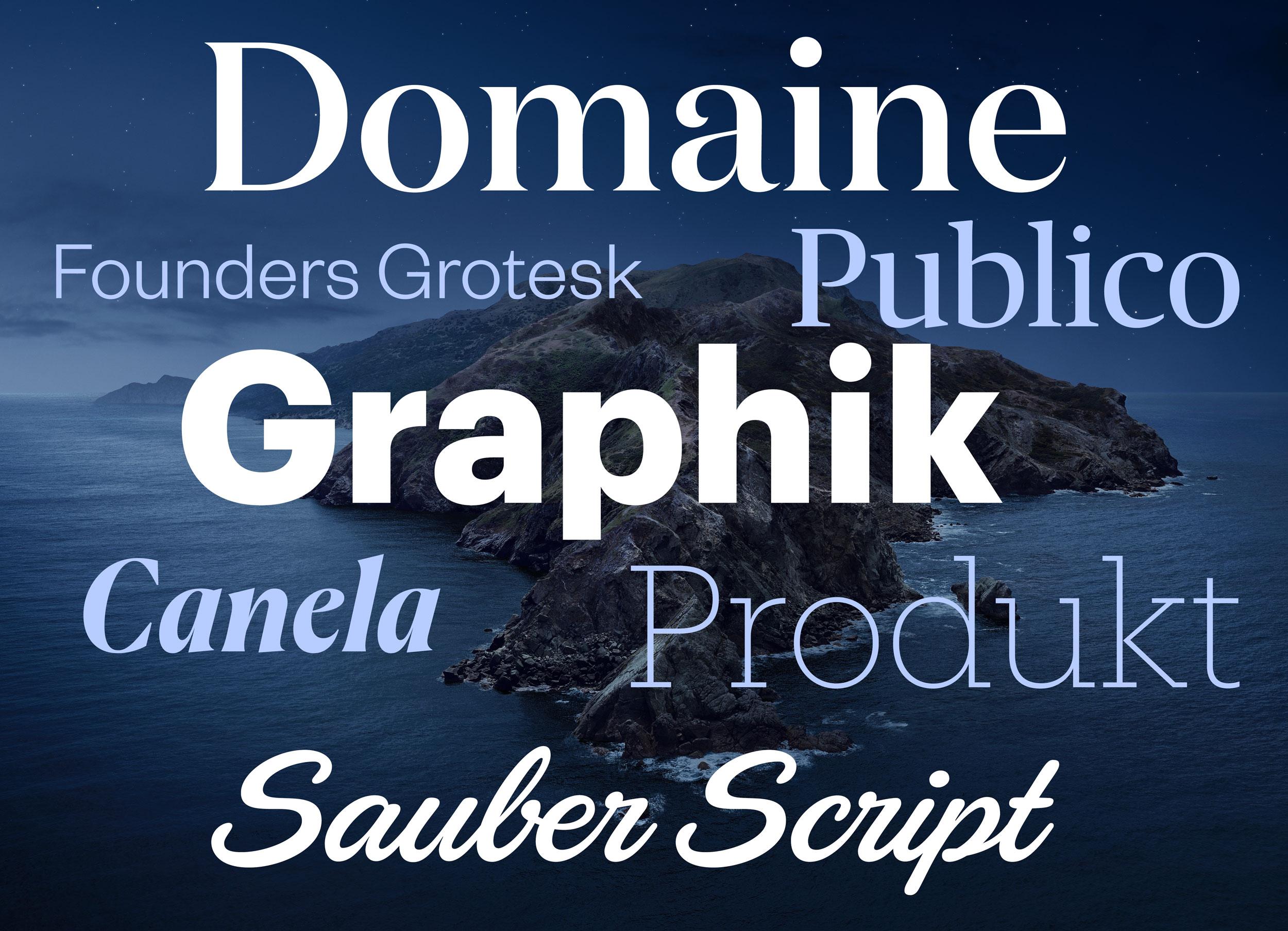
Here are some (Latin) highlights of the available fonts:
Font families: Canela from Commercial Type in 16 styles Domaine Display from Klim Type Foundry in 6 styles Founders Grotesk by Klim Type Foundry in 17 styles Graphik by Commercial Type in 18 styles Produkt by Commercial Type in 8 styles Proxima Nova by Mark Simonson Studio in 12 styles Publico by Commercial Type in 12 styles Individual display fonts: Sauber Script by TypeJockeys Quotes Caps and Quotes Script by Sudtipos
In addition to those Latin fonts, many non-latin fonts are available as well. For a complete list check out this support document. 
☞ https://support.apple.com/en-us/HT210192
1. Logo
Johannes Gutenberg established the use moveable type for printing texts in the West in the 15th century. There were later attempts to speed up the typesetting process by casting syllables or entire words as one piece. Those pieces were called logotypes—from Ancient Greek “lógos” meaning “word”. But handling type cases with hundreds of compartments was just not practical and so this kind of typesetting didn’t really catch on. But entire words cast as one piece of metal type still became quite common—for example for newspaper section headlines, which had to be used every day in exactly the same way.


Other uses were words like invoice, certificate, invitation and so on, which were designed in a decorated way that couldn’t be typeset with individual letters. And logotypes were also used to print the names of companies. And that is where the modern usage of the word logotype—or just logo for short—comes from. This typical use in letterpress printing started to not only describe the object, which was used to print a company name, but the specifically designed appearence of the name itself.  And while this originally only applied to printing blocks with text on it—for example a wordmark—the modern understanding of the word logotype is much broader and can also apply to graphic marks, emblems and symbols, which might not not contain any letters.
1. Uppercase & Lowercase
These commonly used terms go back to the print shop tradition in some countries of having separate type cases for one typeface in one size—one case for the small letters and one for the capital letters. The case with the capital letters was put on top—so it was literally the “upper case” and the type case with the small letters was put below that, so it was the “lower case”. And that’s how these terms were coined.

2. Cliché
To add an image to a letterpress form, printing blocks were needed that behaved just like the metal letters. Creating them was an elaborate and time-consuming process—at least in the first centuries of printing with moveable type. But there was a work-around: Instead of creating printing blocks with images for a specific use in a single print-run, generic images were often created and print shops could use them for multiple prints and for various clients. 

So with these blocks, printers were replicating a rather generic artwork over and over again. In a print shop those printing blocks were called a cliché and later people outside this field started to use this word as well for something that is not original, overused, generic, or stereotypical. And speaking of stereotypical …
3. Stereotype
Creating a letterpress form with text and printing blocks can take a lot of time. And if the prints were all handed out or sold out and needed to be reprinted, the print shop essentially had to start from scratch, recreating the typesetting and the entire layout. It was possible to store the original letterpress forms to be used later, but that meant that all the letters and printing blocks that were used were not available for other prints anymore. So very often that just wasn’t an option. But the stereotype solved this problem.

A material like papier-mâché was pressed on the letterpress form and created a precise negative impression of the entire layout. And from that a new single form could be casted. And the result of that process was called a stereotype – which means “a solid form or impression”. And using this technique had another important advantage: this new cast didn’t necessarily had to be flat like the original letterpress form, but it could also be casted in a cylindrical shape to be used on the much faster rotary printing presses with cylindrical printing forms.

A machine for casting newspaper stereotypes in the early 20th century
And just like with the word cliché, people started to use the word stereotype outside the printing trade in a more metaphorical sense referring to generalized and replicated ideas or images.
4. Being “out of sorts”
“Sorts” are the various pieces of type stored in the compartments of the type case. Being “out of sorts” (i.e. not having enough of certain letters in a font) remained a continuous problem for hand composition. The compositor’s misery in such cases continues to live on in the phrase “out of sorts”, now meaning “being mildly unwell”. 

The definition of “sorts” in Joseph Moxon’s Mechanick exercises from 1683
5. Cut and Paste
This is a comparatively young phrase. It was coined in the days of phototypesetting in the second half of the 20th century before the introduction of desktop publishing. Before desktop publishing, the text columns were already created with (phototypesetting) machines, but the make-up or “paste-up” of the pages for printing was usually still done by hand. Columns, images, lines and even individual words had to be cut with scissors and scalpels to be moved to the right place and an adhesive (“paste”) was used to have all parts stick in place and allow further corrections until the finished layout could be photographed to be transferred onto an offset printing plate. Even though scalpels and adhesives are no longer necessary with digital type, the phrase “cut and paste” is still in use. 

The video The Lost Art of Paste-Up in our video directory shows how this process was done in the past. 
 
You know other interesting terms, which would fit in this article? Let us know in the comments below. And if you want to learn more about typography terms, check out our typography term glossary with hundreds of translations added by our community members. 
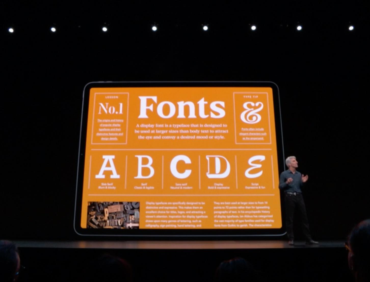
Apple is known for its closed ecosystem and font use is no exception. Until recently, there was no official way to install fonts on the mobile operating system of Apple devices. With iOS 13 and the new iPad OS, font installation on the system level is now officially supported. 

But you might have guessed it: you won’t be able to just use a mobile browser on your iPhone or iPad and download and install any font from the internet. Apple only lets apps install fonts on the system level. So foundries and other font providers need to create an app or embed this functionality into an existing one. We can expect implementations from companies like Adobe and Monotype soon, since Apple already announced a partnership during their keynote in June 2019. 

One of the first apps to support the new font installation feature is the Font Diner app. At this time, it only lets you install a bundle of fonts free for personal use, but it’s a good and easy way to try out the feature.  

The fonts delivered through this new feature can be directly included in the app package or downloaded in the background. Apple performs a validation of the fonts to make sure they are secure and functional. As you can see on the screenshot above, system-level font installation always requires user consent. 
Once the fonts are installed, you can get an overview of all custom fonts under Settings → General → Fonts. You can browse an alphabetic list of the fonts and see the styles, file size, copyright information and a font sample. You can also remove a font directly without having to access the app which installed it. Uninstalling a font installation app will also remove all fonts which came with the app. 

It is also worth mentioning that custom fonts being installed with this new method will not be available automatically in every app that uses system fonts. Apps need to opt in to use custom fonts. Going forward, most apps will likely do so, but you might need to wait for future updates of your favorite apps, before your custom fonts will appear as a choice in the font menu of certain apps. If you want to try out the feature, you can check out Pages, which already supports custom fonts. 

Custom fonts in the Pages app
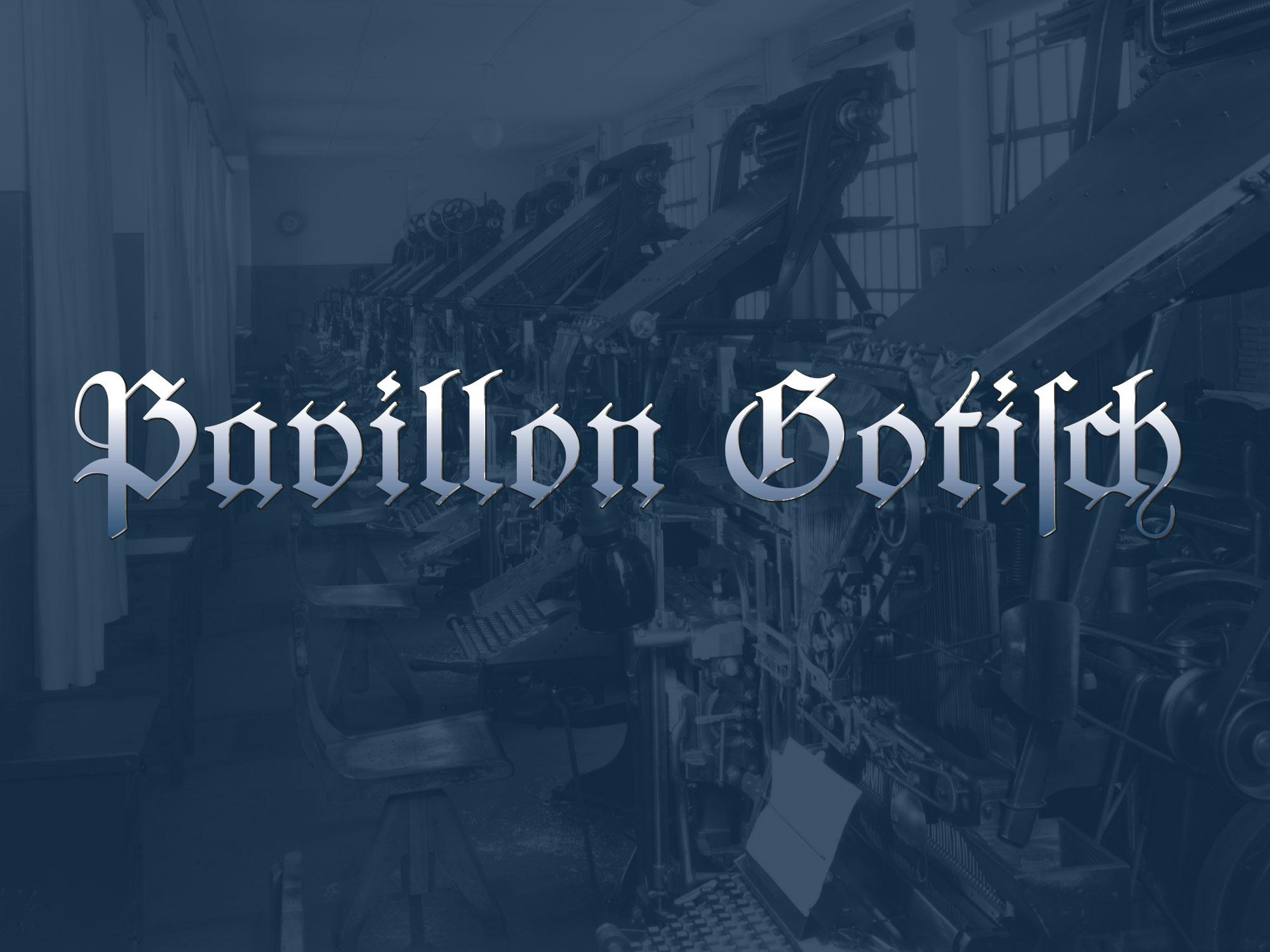
The font in use in the printing museum Pavillon-Presse
Many of today’s revivals of letterpress fonts are created from original type specimen prints. Scanning and digitizing the letterforms is easy to do, but it also has its limits. For one, the technique of letterpress printing doesn’t create an exact representation of the original face on the letterpress letters. The way the letters press into the paper makes the ink spread out. The outline of the letters gets larger and softer and the ink might even close gaps or create unwanted blobs. The smaller the type, the stronger the impact of those effects. Type designers of digital type always need to make a choice about how they want to deal with this. Do they want to keep those letterpress effects or do they try to guess the original design of the face on the letterpress letters?

Original type specimen print
And there is another problem when typefaces are digitized from printed type specimens: The prints don’t reveal the actual size of the letters, so setting the sidebearings of each letter is usually guesswork. But with access to the original font, there was a way to overcome this problem. Not by trying to measure the tiny distances with a ruler, but by revealing them in a print. So the alphabet was set in a way, where all letters are enclosed in brass borders. 

Things got a little bit more complicated than originally expected—as you can see in the picture above. Some letters had overhanging parts (a.k.a. “kerns”), so a full brass line in the type size pressed against the letters would have easily broken off the kerns. So a matching combination of brass rules and spacing material was used for certain letters. But in the end, this process proved to be successful. From the print of this form specifically made for digitization, vectorizing the font using the original metrics was rather easy. 

The design was carefully digitized and extended to a complete Latin 1 character set. The font is called “Pavillon Gotisch” after the museum. Version A contains the original design with all the ligatures and swash characters, which can be accessed easily through OpenType. 


A second style (“B”) was added, which contains romanized letter variations, so the font can be more legible for people not trained in reading German blackletter texts. 


The fonts cannot be licensed directly. They are exclusively available to supporters of the museum or the Schriftkontor community websites Typography.Guru and Typografie.info. You can become a Typography.Guru now and get instant access to Pavillon Gotisch A and B with a full desktop license for up to 5 users. 
https://typography.guru/subscriptions/
By Thomas Bohm
 
I work with typography week in week out designing, illustrating and typesetting books, publications and websites and there is an issue that keeps coming up, which I would like to discuss. I am always amazed at the range of new typefaces being offered and new typographic possibilities, but there is a need in the market for very large and diverse typeface families. We need highly legible typeface families for extended reading which have a very broad language, character and symbol coverage. We are currently not swamped with typefaces in this area. If you or a graphic communication designer had to think of one typeface to use that may support an unusual character that you need, which is not supported in the typeface you are currently using, what would you try?: Minion by Robert Slimbach, I bet.
We have over 150,000 typefaces (also known as fonts) available for direct download, more are added every week. Most historical typefaces are also available in a digital form. How many though are truly up to the job and able to handle the most complex and diverse content? Let us take an academic article (like in an academic journal) as a case study. You would have the print edition in which you would have the Latin characters, possible small caps in upright and italic and oldstyle numerals, superscripts and subscripts, mathematical characters, foreign characters such as Greek for possible equations or formula, you also have tables of numerical data which you would need lining numerals. You may also need some dingbats (miscellaneous symbols). How many typefaces do you think that are available that can handle this type of information? The fact is, actually not a lot. You could probably count the ones immediately available to you on your computer on one hand. Next scenario, the print edition will also be published online, on a webpage in HTML. Most typefaces these days have webfont versions available, but does the typeface even support all the characters and symbols this academic article needs?
Veronika Burian (Burian, 2016) wrote an article called Why Do We Need More Typefaces? In it she mentions:
An effective way of weakening this question usually asked by lay persons is to pose another question, such as, ‘Do we have enough music, or clothes, or art?’ In the same spirit, I agree with Cyrus Highsmith’s reply, ‘You know, I heard the same thing about people!’.
Let me respond to this: we have lots of music, how much is actually good, truly unique and motivating? If you listen to music regularly, what percentage do you really like and keep, and what percentage do you wish you had not bought, downloaded and thus discarded? If you listen to a specific genre of music, as a percentage of all the music you have listened to, what percentage would you say is actually original and truly unique or inspiring? I think you know the answers to these questions, and feel I have made my point… I know this is a highly personal and subjective issue, who is to say what is truly good and what is truly bad? If we discuss clothing, which of your clothes last the longest and which ones disintegrate in no time at all. Which ones do you wear the most and which ones never? If we are discussing art, we could say: all art is good, it is good for the person making it, it is thought provoking for the person interacting with it, and better than probable blank walls. If we apply this analogy to typefaces, we could say all typefaces can be enjoyed and have a purpose. I am not going to attempt to bash or criticize things, merely to suggest an opportunity and active need in the market of typefaces. The issue is not necessarily: of how much (quantity), but of how useful (how useful is it and how useful could and should it be).

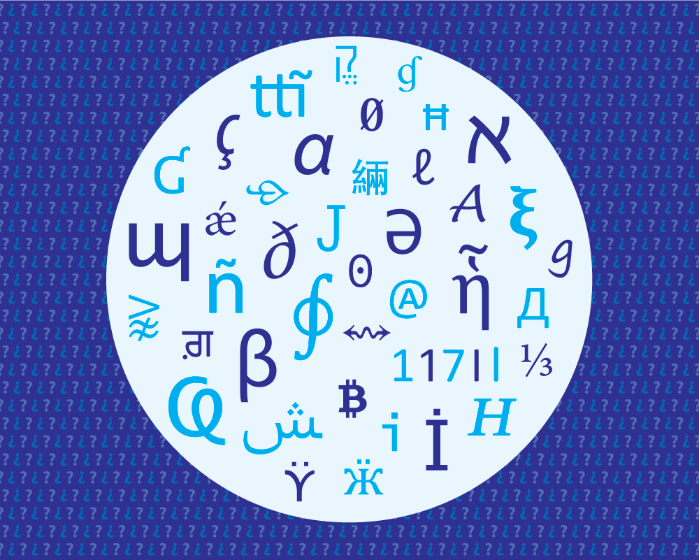
Why design new typefaces which are not really any different to others already designed in previous years and that non-typographers and non-designers would not be able to see any difference in? People think new is automatically better, how is it any better, in what way? I think we are getting to the stage where we have enough typefaces (at least from a shape style point of view). It seems typeface designers are happy with ‘reinventing a design of a wheel that already works’. Erik van Blokland (Biľak, 2011) says: ‘If an existing typeface does the job, there is no reason to make a new one.’ Erik Spiekermann (Båtevik, 2015) says ‘If you look at the type foundries, every foundry has a Times New Roman, Garamond, Helvetica, Futura and Din’. The point can also be made that: we cannot edit and extend an existing typeface because of copyright or ownership issues… I get this, so then a new typeface has to be created. The thing which is frustrating for me as a designer is that with new typefaces, they might not be much better or better at all aesthetically than something previously done. So what we have is a new typeface which might not be more usable (in terms of language and symbol support) which also might not be as good from a letter design/aesthetic point of view than a previously historical proven one. Maybe, as information designer Paul Mijksenaar (Mijksenaar, 2018) says on his companies website ‘Build on the good and make it better’. Essentially the point I am striving for is, if you make something new and similar to something that exists, make it much better than what has been previously available. Better in the letter design, language and symbol support, weight range, technically, hinting, etc. I would like to propose a new possibility that would really benefit typographers, people using typography and a wide variety of content. Why do we not faithfully update and add to previously well designed, used and proven typefaces? Are there any examples of this happening?, yes, Nadine Chahine at Monotype has designed Frutiger Arabic, Neue Helvetica Arabic and Univers Next Arabic. There is also the Frutiger Next family which supports Greek and Cyrillic, has small caps in all weights and has oldstyle and lining numerals. Recently the road signage typeface in the UK called Transport was updated and extended. It was originally designed between 1957–1963 by Jock Kinneir and Margaret Calvert, and then updated to include many different weights, text figures and small capitals by Henrik Kubel and Margaret Calvert in 2012. The first release of Transport did not have expert features and so was not really usable in an extended text setting. The typeface Noto commissioned by Google is also worth mentioning. Noto fonts cover all 93 scripts defined in Unicode version 6.0 (released 2010), although less than 30,000 of the nearly 75,000 Chinese, Japanese and Korean (CJK) unified ideographs in version 6.0 are covered. In total, Noto fonts cover nearly 64,000 characters, which is under half of the 137,439 characters defined in Unicode 11.0 (released in June 2018).
Maybe we could use two typefaces, there is the possibility of using two or more typefaces (the x-height of the second typeface can be made the same as the containing/body text and the closest matching weight can be chosen from the second typeface), which is more in-keeping and contains all the characters and symbols you need. This is not ideal, it is much better to have everything you need from one font family.
What is the benefit of designing a very extensive character and symbol range for your typeface?: your typeface can be used for many more items, from airport signage to academic books and the web. The wider your typeface character and symbol support is, the more chance people will use it and the more useful it will be. Not for 1 minute am I suggesting that wide character and symbol support is easy for typeface designers to achieve. Typeface design is very hard, fact, it requires the input from specialists in many different areas and can take many years to finish. There is the actual design of the shapes, there is the kerning, there is the glyph naming and sorting, there is the hinting, coding, there are testing issues with people, software testing, and then there are sale and distribution issues. This is no easy process.
 
Accessible and more usable variations of characters and symbols
There are clear and actual needs for typefaces to have the option to choose more accessible and usable variations of characters and symbols. See research from myself called Letter and symbol misrecognition in highly legible typefaces for general, children, dyslexic, visually impaired and ageing readers [2018 third edition] (Bohm, 2018). Characters such as the capital I (i), lowercase l (el), number 1 (one) and 0 (zero) are usually not defined enough and can get misrecognised. There may also be a need for infant characters, for children. Here is a current need, not often available or supplied, that would be welcome for complex information design projects. Recently the typeface Source Sans has been released (16th September 2015), what is interesting from an accessibility view is that it offers through OpenType ‘sylistic sets’ option a capital I (i) with a stroke on the top and bottom, and infant lowercase a and g, and a slashed zero. This is what users of typefaces want, they want accessible character options. Unfortunately there is no capital I (i) with a stroke on the top and bottom in small caps upright or italic… and what about the diacritics, foreign language marks for this variant. Also, why not provide the default typeface setup using the most legible characters?, if the user then decides to use less legible characters available, then that is their choice. Provide the most legible character and symbols by default which does not rely on advanced typographic knowledge to implement.
 
Major brands commissioning new typefaces
In recent years we have seen major brands commission typeface designers to design them their own typeface. Recent examples include IBM (IBM Plex), Netflix (Netflix Sans), Apple (San Francisco) and BBC (Reith). Here once again we are seeing new typefaces. Why so? The main reason being that they can avoid huge typeface licensing costs associated with pre-existing typefaces. I actually understand and get why they do it and the important thing to note from a ‘new typeface perspective’ is that they are not directly offering them to the public, they are not giving us the option to buy them. The need and requirement for the new typeface primarily satisfies their own needs. Yes some might be available for public use, but they are not commissioning and designing them directly for the public to buy (like fulfilling consumer demand, put another way).
 
Examples of diverse information
Different number styles like in timetables or financial tables.
Use of a typeface on the web, which can encounter very diverse uses and applications.
Different languages of the world.
Mathematical formula.
Signage in the environment.
Information for children or the ageing, for example.
Information being used by people with some kind of impairment.
Dictionaries.
 
Examples of similar typefaces
Non-designers and non-typographers will not be able to tell the aesthetic difference communicated from the typeface’s letters and symbol shapes in typefaces like:
Sans serif
Neue Haas Grotesk (1956), Helvetica (1957), Arial (1982), Bau (2002), Akkurat (2004), Aktiv Grotesk (2010), Acumin (2015), Real (2015).
Frutiger (1976), Myriad (1992), Monotype SST (2017), Squad (2018), Silta (2018) (see Figure 1).

Figure 1: four typefaces (Frutiger, Myriad Pro, SST Pro, Squad, Silta) which non-designers and non-typographers will not notice the difference between.
Avenier (1988), Corbel (2005).
Avant Garde (1970), Century Gothic (1991).
Serif
Arnhem (1998), Mercury Text (1999), Rosart (2016).
Times (1931), Times New Roman (1932), Lyon Text (2009).
Clarendon (1845), Sentinel (2009).
ITC Century (1894), Clarion (1985), Miller Text (1997), Source Serif (2014).
Swift (1987), Constantina (2006).
Collis (1993), Novel (2008), Elena (2010), Permian (2011), Lava (2013).
Slab serif
Serifa (1967), PMN Caecilia (1991), Roboto Slab (2013), Zilla Slab (2017).
Rockwell (1934), Lubalin Graph (1974).
 
Examples of good, versatile and wide supporting typefaces
Lucida
The huge Lucida family designed by Charles Bigelow and Kris Holmes and released from 1984 onwards, consists of: Lucida Arrows, Lucida Blackletter, Lucida Bright (it features more contrasted strokes and serifs than Lucida Serif), Lucida Calligraphy, Lucida Casual (similar to Lucida Handwriting, but without connecting strokes), Lucida Console, Lucida Typewriter Serif, Lucida Fax, Lucida Handwriting, Lucida Icons, Lucida Math, Lucida OpenType, Lucida Sans, Lucida Grande (which supports Latin, Greek, Cyrillic, Arabic, Hebrew, Thai languages), Lucida Sans Typewriter, Lucida Sans Unicode, and Lucida Serif.
Minion
Designed by Robert Slimbach, the first version of Minion was released in 1990. A Minion Pro version was released in 2000 which contained expert glyphs (small caps, superscripts/subscripts, different numeral styles, etc.) in a range of weights (from regular to bold) and in condensed versions. It also supports Greek, Cyrillic and Vietnamese. There are italic swashes and ornaments also available. There is a Minion Math version externally available from Johannes Küster, each font has 5800 glyphs. In 2018 Minion Pro was re-released again, which is now called Minion 3. New features in the typeface include: African and Vietnamese languages, full IPA (International Phonetic Alphabet) support, refinement of both the Cyrillic and the Greek extensively (even adding a second Greek style), and introduced a new script: Armenian.
Meta and Meta Serif (see also Fira)
Meta designed by Erik Spiekermann. The first version was digitally available in 1991 and contained basic Latin, small caps and oldstyle and lining numerals. Later an OpenType Pro version was released which supports Latin, Cyrillic, Greek and Hebrew. The typeface is available in weights from Thin to Black and also condensed. In 2017 a Meta Georgian was released with design support from Akaki Razmadze which supports modern Georgian, as well as additional symbols for the Old Georgian, Megrelian, Svan, Abkhazian and Ossetian languages. In 2018 a Variable version of Meta was also made available.
Meta Serif was designed in 2007 by Erik Spiekermann, Christian Schwartz and Kris Sowersby. It is available from Light to Black and in a Pro version which contains expert glyphs (small caps, superscripts/subscripts, different numeral styles, etc.). Language support is extensive and supports Cyrillic and Greek.
Between 2011–2012 as part of the Carrois Type Design team and together with Erik Spiekermann commissioned by Edenspiekermann, a DG Meta Science was created for De Gruyter publishing house. It contains an expanded version of Meta and Meta Serif (called Meta Science and Meta Science Serif). It has two weights plus italics with more than 2800 glyphs. The typefaces contain extensive coverage of Latin Extended, Greek Extended, Cyrillic and Coptic writing systems, and also phonetic extensions, geometrical shapes and much more.
Fira
Originally designed by Erik Spiekermann, Ralph du Carrois, Anja Meiners and Botio Nikoltchev in 2013, it is available in 16 weights and has small caps and oldstyle numerals, it is also open-source (open-source means it is free for personal and commercial use and can be modified). Condensed and compressed versions were added along with Fira Mono and Fira Code.
Fira Go as of 2018 supports Arabic, Devanagari, Georgian, Hebrew and Thai letters in addition to Latin, Greek and Cyrillic. The designers were: Arabic (Ralph du Carrois, Titus Nemeth and Hasan Abu Afash), Devanagari (Rob Keller, Kimya Gandhi and Natalie Rauch), Georgian (Akaki Razmadze and Anja Meiners), Hebrew (Natalie Rauch with consultancy support by Yanek Iontef), Thai (Mark Frömberg with consultancy support by Ben Mitchell).

Figure 2: Fira typeface showing the different weights and styles available.

Figure 3: World map showing the language coverage of Fira Go. Dark blue text: languages covered by FiraGO. Light blue text: languages partly covered by FiraGO. Grey text: languages not yet covered by FiraGO. Map courtesy of bBox Type.
TheSans, TheMix, TheSerif
Designed by Lucas de Groot between 1994–1999. The most current version is fully OpenType Pro and supports Cyrillic and Greek. TheSans and TheMix come in Arabic versions. There is also a TheSans and TheMix Mono.
Cambria and Cambria Math
Cambria was commissioned by Microsoft and designed by Jelle Bosma in 2004. It has full OpenType Pro features and supports Greek and Cyrillic. Cambria Math was the first font to implement the OpenType math extension, itself inspired by TeX led by Jelle Bosma and Ross Mills. These typefaces come free with Windows Vista operating system up and Microsoft Office 2007 up.
Fedra Serif
Fedra Serif was designed in 2003 by Peter Biľak. It is fully OpenType Pro and has some range of math characters and symbols. It supports Greek, Latin, Cyrillic, Arabic, Hebrew, and Armenian. It is available in weights from Book to Bold. Fedra is also available in Fedra Sans, Fedra Mono and Fedra Serif A and B with different ascender and descender heights (very useful for compact texts like in newspapers or dictionaries).
 
Examples of old typefaces which need to be faithfully and respectfully updated for 21st century use
Why is Monotype Bembo italic small caps not available?
Why is Info Display small caps not available?
Why is Monotype Baskerville italic small caps not available?
Why is Collis bold not available?
Why is Arnhem Greek not available?
Why is Lola small caps not available?
Why is Adobe Symbol Medium italic, bold or Light not available?
Why is Meta with a stroke on the top and bottom of the capital I (i) not available?
 
So what do we ideally need from new typefaces?
Proper superscripts and subscripts.
A range of numerical styles (oldstyle and lining).
Small caps in all weights and variants.
Extensive language support (Latin, European, Greek, Cyrillic, Arabic, Hebrew, CJK: Chinese/Japanese/Korean, etc.).
Scientific and mathematical symbols.
A range of dingbats.
Swashes.
Accessible characters.
Infant characters.
The typeface to be available in a wide range of weights (Thin to Extra Bold, Condensed).
Maybe in styles such as monospace, handwritten, informal, slab and rounded sans serif versions.
Available to buy and also open-source.
Original and useful designs, or extension of historically proven typefaces.
Good hinting (so the typeface renders well on screen).
 
Summary
You could say we need no more similar typefaces which have a small character and symbol support, all which are basically the same to non-designers and non-typographers (the majority of your users).
Is new automatically better? Do we need better of what we have?
You could say we just need better and more extensive versions of typefaces already designed.
We need some of the really good old typefaces like Monotype Bembo to have a full OpenType Pro range and have mathematical symbols, Greek, etc.
Let’s collaborate better together as typeface designers and with typeface designers who can design for different languages and character support.
Let’s build extensive typefaces available in both sans and serif which are truly useful and can support a wide range of information.
In the typeface industry, we need both professional typefaces which are purchasable, and open-source typefaces which are free. The two different typeface categories each have their own uses for different circumstances.
 
References
Båtevik, B. (2015). Subtle Expression in Typography. BA thesis: Westerdals School of Communication, Norway. Retrieved October 2018, from http://arvebaat.com/erik-spiekermann.html.
Bohm, T. (2018). Letter and symbol misrecognition in highly legible typefaces for general, children, dyslexic, visually impaired and ageing readers [2018 third edition]. Retrieved October 2018, from https://typography.guru/journal/letters-symbols-misrecognition/.
Burian, V. (2016). Why Do We Need More Typefaces? Retrieved October 2018, from http://www.alphabettes.org/why-do-we-need-more-typefaces/.
Mijksenaar, P. (2018). https://www.mijksenaar.com.
This paper was amended half a day later after the publication date in regard to comments by Fred Smeijers and Erik Spiekermann, thanks Fred and Erik.
About the author
Thomas Bohm studied graphic communication design at college (BTEC, Leicester College, UK) and university (BA, Norwich University of the Arts, UK). Now works for book publishers and businesses, and continues to run User Design, Illustration and Typesetting a graphic communication design, illustration and production service. Writes, researches and occasionally publishes. Published Punctuation..? (2nd edition, User Design, 2012) a fun and fully illustrated book on punctuation. Has been published in Information Design Journal, Baseline, Slanted and is a member of the Association of Illustrators and the International Institute for Information Design. 

Important Information

We are placing functional cookies on your device to help make this website better.

Account

Navigation

Search

Search

Configure browser push notifications

Chrome (Android)
  1. Tap the lock icon next to the address bar.
  2. Tap Permissions → Notifications.
  3. Adjust your preference.
Chrome (Desktop)
  1. Click the padlock icon in the address bar.
  2. Select Site settings.
  3. Find Notifications and adjust your preference.