


We usually use the term ligature when we want to talk about a certain kind of ligature, to which cases like fi and fl belong. Their use suggests, that there are “real” letters of the alphabet like a, b, c and then there are ligatures like fi and fl. People then assume, that when something is a ligature, it cannot be a “real” letter of the alphabet. But this is not true.
The truth is, that the term ligature just means “connection” (from Latin ligari). The term itself doesn’t imply a certain purpose or use itself. Today, there are two possible ways to define a ligature and both ways can appear in connection or individually. If we talk about the appearance of type, a ligature is made from two or more letters, which appear connected. In hand writing such connections are created all the time.
But since the invention of moveable type, a new and more technical definition has appeared. When in metal typesetting two ore more letters are cast together to one sort, this is considered a ligature. This use in metal type has also transcended into the digital age. Ligatures are now usually included as single glyphs in a font, even though they might represent different characters in the underlying text.
Often these definitions of appearance and technical implementation occur in combination. For example, the the “f” and the “i” in the fi ligature are visually connected and included as a single glyph in a font.

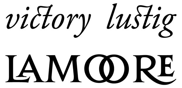
A typical typographic ligature as one glyph
But “f” and “i” might also appear connected, even if they are separated glyphs, just because the arc of the “f” extends over the right side bearing of the glyph. On the other hand, a type designer might create an fi ligature, where the unwanted collision is avoided by drawing an “f” with a shorter arc. Then “f” and “i” don’t appear connected, but they are still displayed using a ligature in the technical sense.

A technical ligature, where the letters appear optically unconnected
As we can’t judge a book by its cover, we also cannot always tell from the appearance of a text, whether or not ligatures have been used.
Classifying Ligatures
If its not clear from the context, it is a good idea to specify the types of ligatures we talk about. There are basically two main categories: typographic and orthographic ligatures.
Typographic Ligatures
These ligatures are just connected for typographic reasons. In today’s digital typesetting with smart-font technologies like OpenType we usually divide typographic ligatures in Standard Ligatures and Discretionary Ligatures. The first group of ligatures (fi/fi/ff/Th …) is usually applied by default, because they are considered an improvement of the text setting.
Discretionary Ligatures (ct, st …) are used as stylistic option, often used in headlines or logotypes. Note that typographic ligatures never affect the orthography of the underlying text. As the name suggest, they are purely typographic.
Orthographic Ligatures
These ligatures serve a very different purpose than typographic ligatures. The best example of this category is the letter w/W. It actually derived from a ligature of two V or U, which were not differentiated at that time. And that’s why this character is still called Double-U. From this example it should be clear, that it doesn’t make sense to make a distinction between “real” letters and ligatures. In contrast to typographic ligatures, orthographic ligatures are not optional. Even though they might be derived from a ligature historically— in today’s orthography of a certain country they only stand for themselves and cannot be separated like an fi ligature. They are treated like any other letter of the alphabet. And that’s why they also usually exist as a lowercase and uppercase version. Typical orthographic ligatures in the Latin script are w/W, æ/Æ and œ/Œ.
Orthographic Ligature or Digraph?
But beside the obvious cases like Æ and Œ there are also some more complicated ones which usually cause confusion, even among typographers. Those cases are IJ/ij, DŽ/Dž/dž, NJ/Nj/nj, LJ/Lj,/lj. They do have a Unicode code point, so they can be used as one character/glyph. But it is also common to just type the individual characters, which is usually called a digraph. So what are they? A letter, a ligature or a digraph? From just viewing at printed text, we can’t even tell if one or two glyphs have been used. Just because we see two optically separated characters, doesn’t mean it was technically achieved this way.
What we can tell, is that they are an orthographic and phonetic unit. And there is a simple way to find out: just ask a literate native if these cases would fill one square in a crossword puzzle. If they do, it is safe to say, that they are considered letters of the alphabet. Whether or not they are typeset as one glyph (→ ligature) or two glyphs (→ digraph) is a purely technical or practical side note, that doesn’t affect the orthographic use or understanding of these letters. Some orthographic ligatures might have earned a spot on typewriter and later on computer keyboards, some orthographic ligatures might not.
In contrast, there are also digraphs which are never considered one letter. For example, in modern German there is the digraph ch/Ch/CH and even a trigraph (sch/Sch/SCH). So two or three letters represent just one sound, but those cases are never considered one letter when set in the Latin script—they fail the crossword puzzle check. So while the Dutch ij/IJ can indeed be considered a letter, the German ch/Ch/CH cannot. The latter are always considered individual letters.
The Very Special Case of the Letter ß
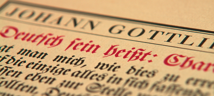
In such a discussion about letters, ligatures and digraphs one case always causes the most heated discussions: the German Eszett (ß). Many typographers and type designers insist, that the German ß is just a ligature, and they usually believe it is made from a combination of ſ and s. To put it simple: Those people are wrong. Let me straighten this out for you …
It is true, that there is an ſs ligature in (usually cursive) Latin writing and printing, that has been used for centuries. And today’s type designers often use this old design principle for designing their modern ß characters.
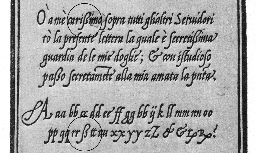
Looks like a modern ß, doesn’t it? But this Latin ligature is not the source of the German ß character. (Note that the example above isn’t set in German!) The real ß character developed in blackletter writing and there is no consensus yet, how it actually evolved. But while we don’t know for sure, how the ß character developed in blackletter writing, we know for sure, how the German ß in the Latin script came into being. And this is actually the source of the modern ß character we use today.
German was traditionally set in blackletter writing. Up until the end of the 19th century there was no standardized orthography and also no agreement how the special rules of blackletter typesetting would translate to the Latin script. This changed around 1900. First there were orthographic conferences which defined the first “official” German orthography and then another committee of printers, publishers and type founders had to agree on typographic issues following those orthographic decisions. And that’s when the Latin ß was “invented”.
Here is a scan from 1903 when the new Latin ß glyph was announced to type foundries and printers in Germany, Austria and Switzerland.
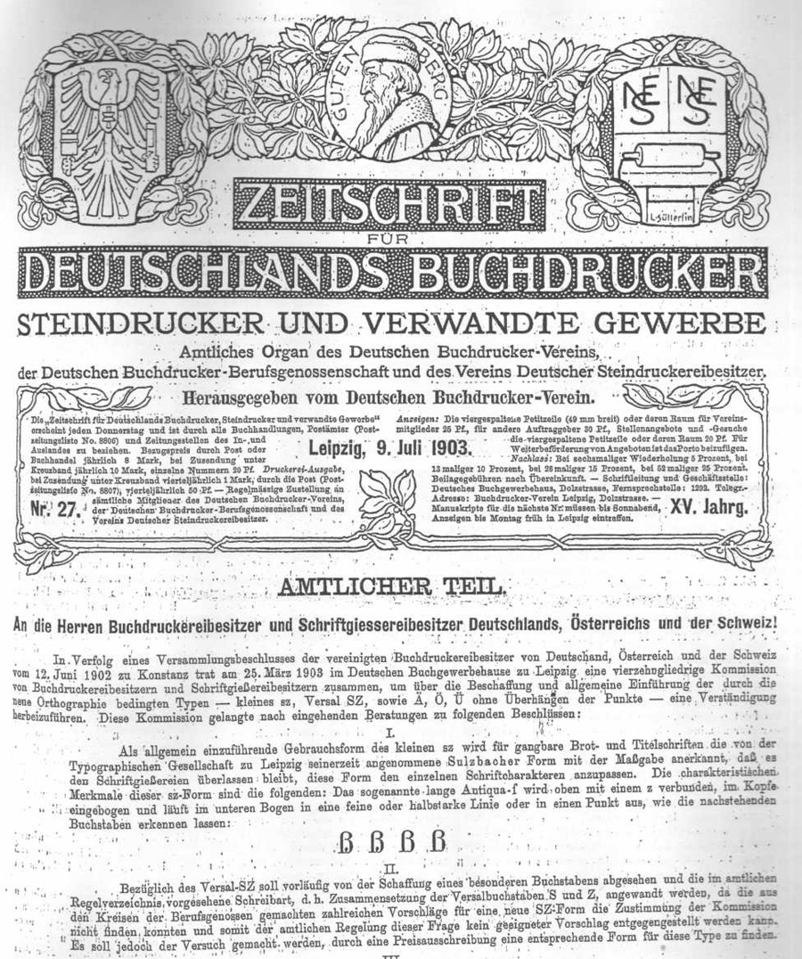
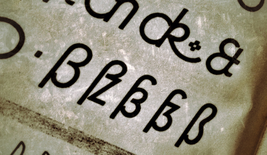
It was agreed, that German type foundries had to add a new letter to their Latin typefaces and out of many different design suggestions, the so-called Sulzbacher Form was chosen. The design (see image above) was selected because it bears resemblance to an ſ + z connection, but that is a purely stylistic choice. The Latin ß came into being as one character of the German alphabet at the beginning of the 20th century. It served a purely orthographic, not typographic purpose, just like the “w” is not an option for two “v” in the German or any other orthography.
The design principles of the ß character changed over the course of the 20st century. Some typefaces use the original Sulzbacher Form, some designers try to replicate the blackletter glyph and more and more type designers go for the connected ſs approach. But those are all purely stylistic decisions, as we can choose between different designs of “a” and “g”. It does not however, affect how these letters are understood and used orthographically. The letter ß came into the Latin script for German typesetting as a single glyph, introduced from one day to the next. Calling it a ligature is usually misleading, as the letter “w” is usually not called a ligature, despite its history.
Some key facts to take away:
- When one talks about ligatures, it makes sense to differentiate between typographic and orthographic ligatures. It also makes sense to point out, if one talks about the technical implementation or the appearance of a ligature. What is considered a letter of the alphabet is defined by the orthography, not the appearance or the technical implementation. Therefore …
- … the ß in modern German is still one letter, even if it looks like ligature
- … the Croatian Dž is still one letter, even if it looks like two common glyphs and is typeset using two glyphs


Recommended Comments
Create an account or sign in to comment