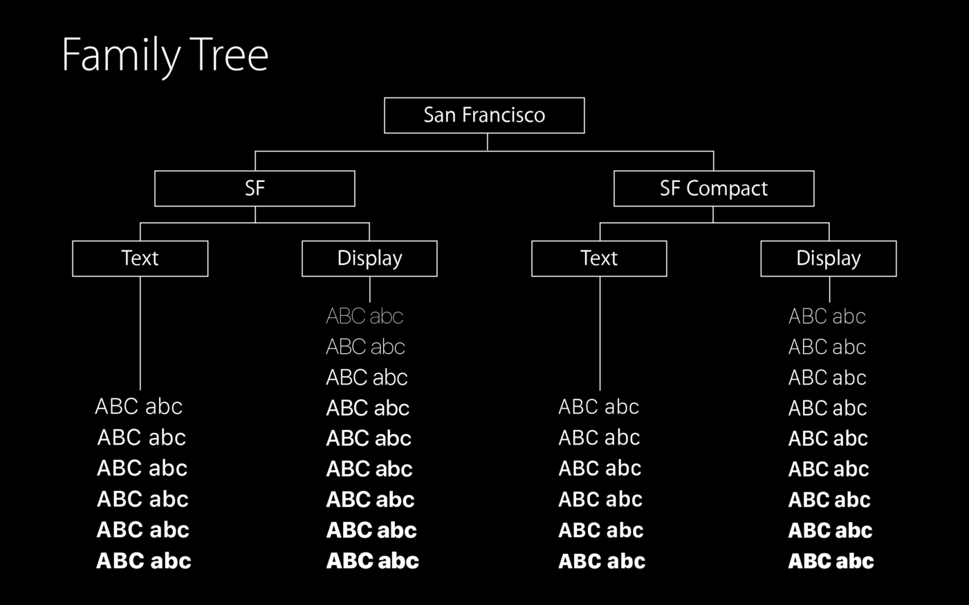
Apples search for a fitting and consistent typography is an ongoing quest. Lucida Grande defined the look of Mac OS X since 2001, while the iPhone uses Helvetica. But Apple’s corporate typeface used in ads, on the web or on packaging is a version of Myriad. Lately, Mac OS X took over Helvetica from iOS, while a completely new typeface appeared for the Apple Watch: San Francisco. With the upcoming releases of Mac OS X and iOS yet another change was announced. The watch font is now renamed to “SF Compact” and iOS and Mac OS will use a new branch of the San Francisco type family called “SF”.
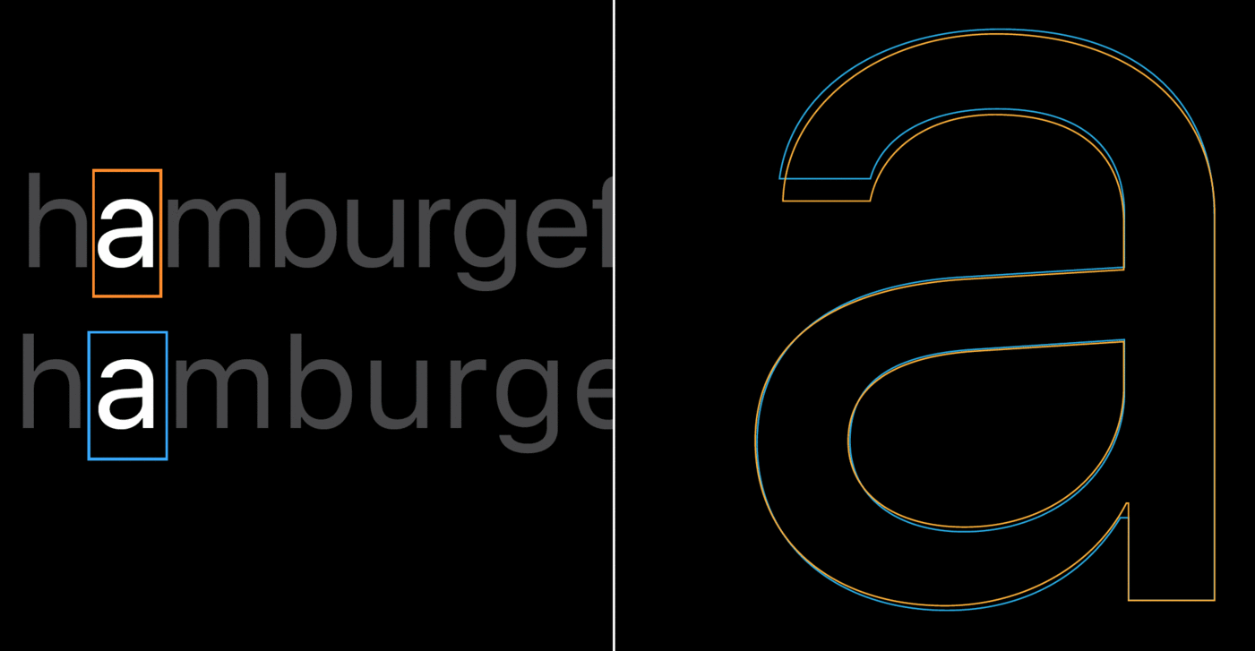
The SF branch is a compromise between the current use of Helvetica and Apples own watch font design. SF uses the same metrics and proportions as Helvetica, but borrows design features from the watch font. The main difference between SF and SF Compact is the treatment of the curves. While they are rounded in the SF branch, they are rather flat in the SF Compact branch. This gives the latter a more legible appearance on smaller screens, such as on the Apple Watch.
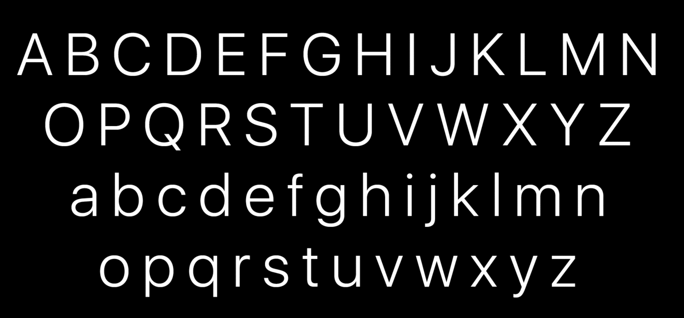
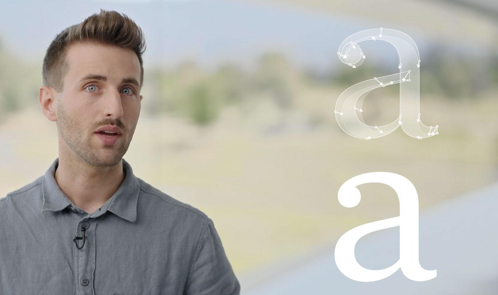
 The fonts currently cover extended Latin, Cyrillic and Greek. Both branches of the San Francisco type family come with optical sizes. There are 6 weights (including italics) for the text sub-family and 11 weights for the display sub-family (without italics). The correct choice for the optical sizes and the tracking values can be made automatically by the operating system.
The fonts are also equipped with smart font replacement options like subscript/superscript figures, different figure sets (including variations for the figures 6 and 9), as well as special versions of punctuation and math characters which better suit all-caps or number settings.
Conclusion:
It’s good to see that Apple now has in-house type designers who create this extensive family and pay great attention to details. I also like that advanced features such as optical sizes are not only available in the font family, but can be automatically applied throughout the system. The look of the typeface itself is unfortunately rather bland. Apple is known for creating trends rather than following them. This design mix of typefaces such as Helvetica or Akkurat can’t really achieve this. It doesn’t have its own clear voice and doesn’t separate Apple’s UI from that of competitors such as Google who use a pretty similar font.
An open question is the use of Myriad as a corporate font. Mixing Myriad and San Francisco doesn’t seem like a good idea. The fonts are different, but not different enough to be a good mix. So will San Francisco become the corporate font as well someday? The great variety of styles would certainly allow it.
The full presentation (around 30 minutes) from the developer conferenced can be watched here. The fonts are available free of charge for Apple developers. But I would like to point out, that the fonts are currently only licensed for the development of apps for Apple devices. The fact that you might find these fonts for free on certain websites does not mean that you can use them like regular freeware or Open Source fonts.
-
 2
2






Recommended Comments
Create an account or sign in to comment
You need to be a member in order to leave a comment
Create an account
Sign up for a new account in our community. It's easy!
Register a new accountSign in
Already have an account? Sign in here.
Sign In Now