


The “black” in the English term blackletter refers to usually very dark appearance of these kind of typefaces. But this appearance isn’t really the defining characteristic. The German term “Gebrochene Schrift” (broken script) says it much better. In blackletter fonts, elements which used to be rounded in preceding Latin designs were broken down to individual line segments with emphasised sharp corners. And since this type style developed somewhat independently of the Roman type style we use until today, blackletter developed some letter skeletons, which greatly differ from the Roman design and make them hard to read for many today.
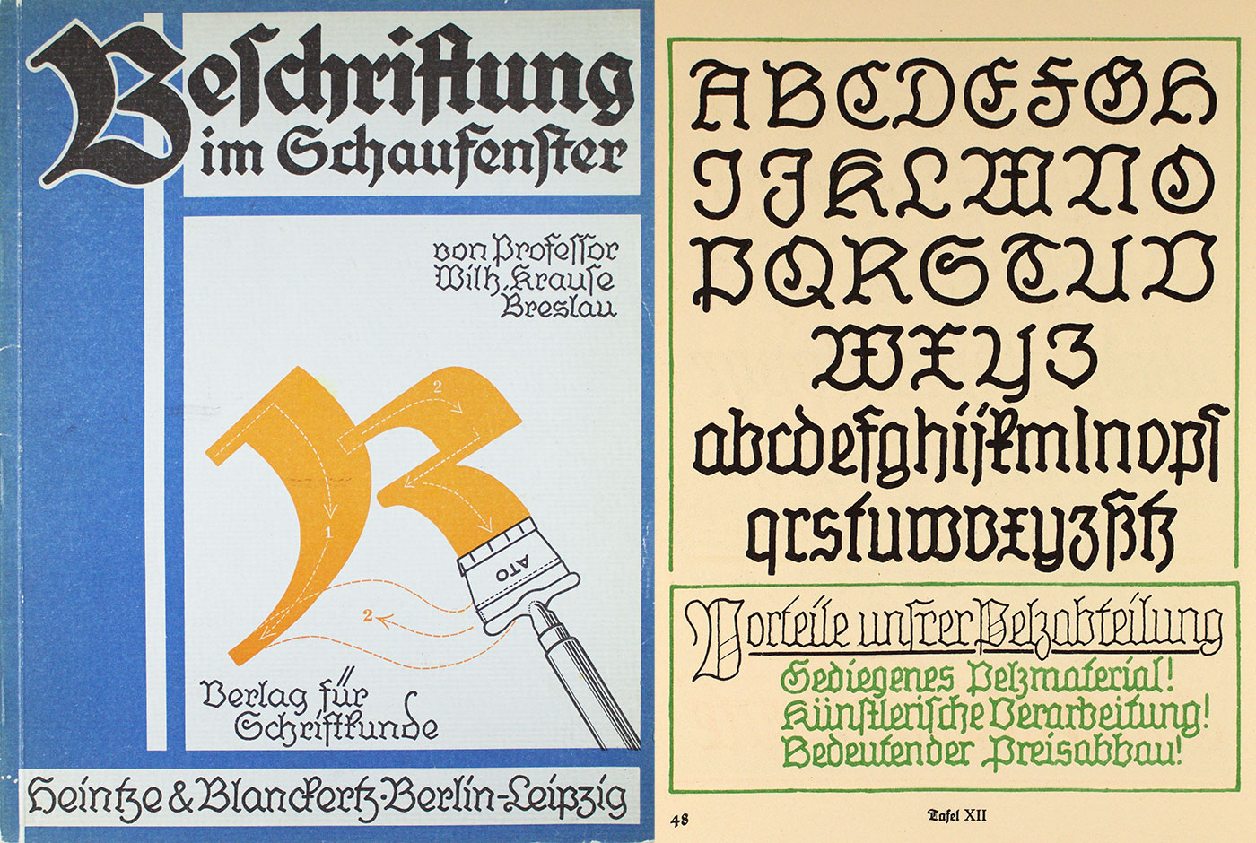
In Germany blackletter fonts were in broad use until the middle of the 20th century. The most used category of blackletter fonts was Fraktur—a much more open and legible design than the original dark and narrow blackletter fonts in medieval books. Fraktur fonts were available in a great variety of designs—from thin and delicate calligraphic typefaces to bold and geometric. But they all shared one characteristic: the typical change of weight caused by the use of a broad-nip pen. This feature could almost be understood as a necessity to make blackletter fonts work. Experimental monolinear blackletter fonts appeared occasionally like in this booklet for sign painters from a German pen maker who also sold pens for monolinear writing.

But such designs rarely made it into typefaces. The only two know designs appeared around 1920: The wobbly Lehmann-Fraktur and Elfen-Fraktur from an otherwise unknown designer listed as M Beck.
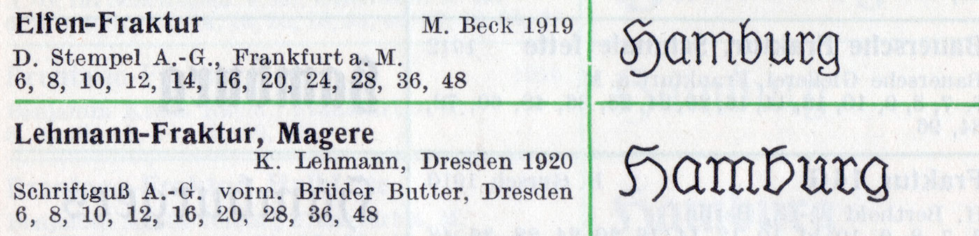
Elfen-Fraktur was originally published by the foundry H. Hoffmeister, which was later absorbed by D. Stempel, one of the largest type foundries in Europe at that time. The typeface then appeared in Stempel’s catalogue of 1925—with around 1200 pages one of the biggest type specimen book ever produced.
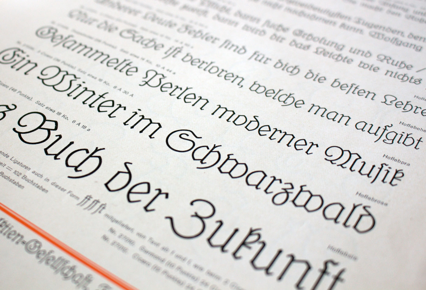
Elfen-Fraktur in the 1925 Stempel catalog
When I got my copy of this book and browsed through it, Elfen-Fraktur was the one design that fascinated me the most—but more for it’s uniqueness and peculiarities than its quality. It was by no means a perfect design. It’s easy to see how the designer struggled with the design concept. While it has a monolinear look, it actually can’t be written. The designer has added little corners and weight changes throughout the design to make it work as a blackletter typefaces.
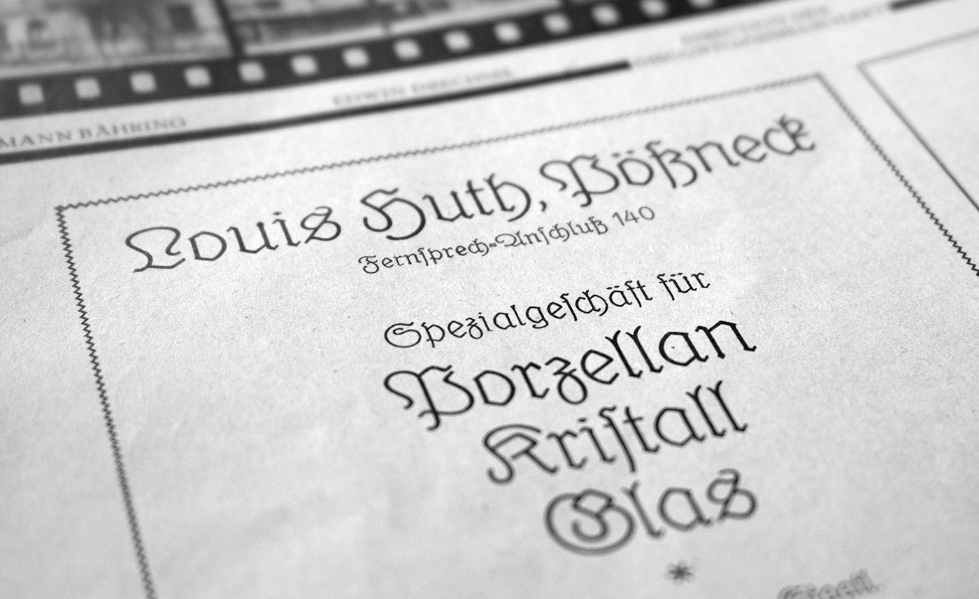
An ad in Elfen-Fraktur, published in a German newspaper in 1928
Even with the huge market share of Stempel, the typeface wasn’t used very often and is almost forgotten today. So a while ago I began to digitize and revamp it. The new version of Elfen-Fraktur is now available via FDI Type. But I didn’t actually trace the outlines to make a perfect copy of the original. Instead, I used the specialty of the original design and drew all letter from scratch as monolinear letters and then refined the details.
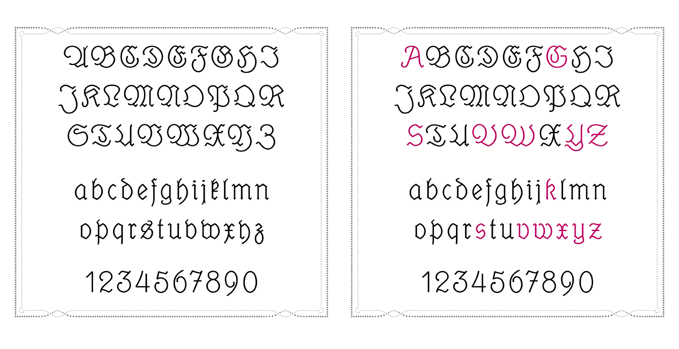
The FDI version of Elfen-Fraktur comes in two versions. Style A sticks rather close to the original letter skeletons. In combination with the discretionary ligatures it is perfect for setting German texts according to traditional blackletter and orthography rules. Style B contains alternative letters which make the typeface more legible for readers, who don’t have experience in reading Fraktur. Both sets are otherwise identical and contain the full Western character set (Win1252/Mac Roman).
A free bonus is a set of 22 decorative border elements, which can be used in combination with Elfen-Fraktur or any other typeface. The border elements can directly be typed on the keyboard (letters a to v). The size of the elements (including the space character) is based on the em-square. So by keeping the tracking to zero and the line height identical to the font size the border elements will always connect seamlessly.


Related links:


Recommended Comments
Create an account or sign in to comment