


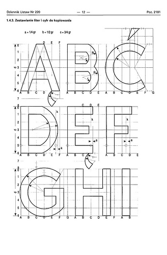
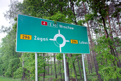
When I first saw a digital version of the Polish traffic typeface, I though I must have gotten a really bad digitization. It had characters which were obviously cut off by mistake …

But I later found out that this is the way the typeface is supposed to look like according to the official specifications:

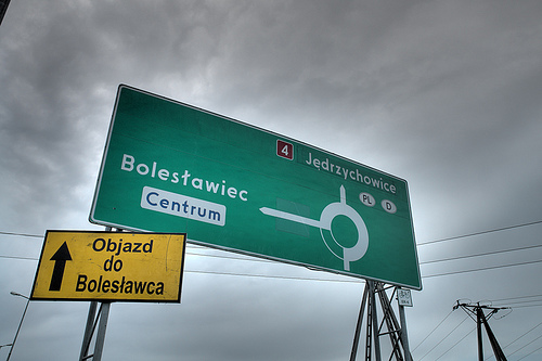
The typeface has a very simple geometric design almost without any typographic corrections. Only one style is in use. There is no condensed style available and no variations for positive/negative contrasts. The typeface was originally developed in 1975 by Marek Sigmund for the Ministry of Transportation and put into effect on April 1 of that year. It is currently used in accordance with the Ministry of Infrastructure regulation of July 3, 2003 on all types of road signs in Poland. But Poland is a good example that type design isn’t everything when it comes to the design of traffic signs. The Polish signs compensate for the poor type design by making most of the information and direction signs very large, thus still achieving a good legibility.

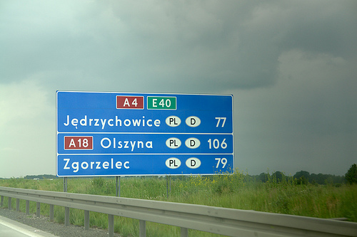
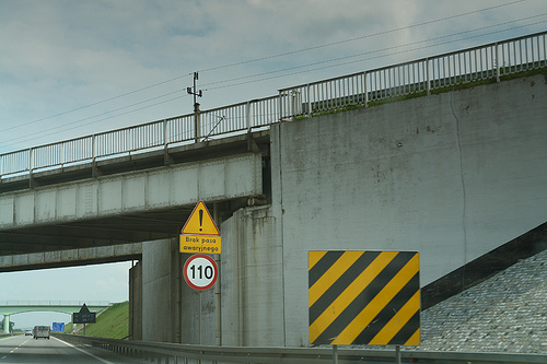
Unfortunately, the typeface almost always fails when the type has to get smaller. See this next example on a motorway, which is supposed to be read at 110 km/h (70 MPH).
There are two digital versions available: Tablica drogowa by Grzegorz Klimczewski and Drogowskaz by Emil Wojtacki. The latter is freeware and I recommend using the TrueType version. The OpenType PS font has some outline bugs.


Recommended Comments
Create an account or sign in to comment