Skip to content

Google has a new logo

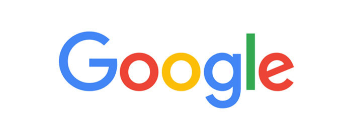
“Just a month after unveiling a major restructuring of the company, Google is updating its image, too. The new Google logo is still a wordmark, but it's now using a sans-serif typeface, making it look a lot more modern and playful. ”

User Feedback

Recommended Comments

Riccardo Sartori

Standard Member
(edited)

And a type specimen of the logo font

It's worth nothing that, perhaps unsurprisingly, Product Sans appears to be the same typeface* as Alphabet's logo (but Alphabet's website is still using images for the headers and Lineto's Circular as webfont).

* edit: with some tweaks, as in Google's logo (bottom-right of |t|, for example).

Edited by Riccardo Sartori

Create an account or sign in to comment

Don’t miss the latest typography news!

Typography Weekly via email: Subscribe here

Typography Weekly via RSS feed: Subscribe here

Important Information

We are placing functional cookies on your device to help make this website better.

Account

Navigation

Search

Search

Configure browser push notifications

Chrome (Android)
  1. Tap the lock icon next to the address bar.
  2. Tap Permissions → Notifications.
  3. Adjust your preference.
Chrome (Desktop)
  1. Click the padlock icon in the address bar.
  2. Select Site settings.
  3. Find Notifications and adjust your preference.