Skip to content

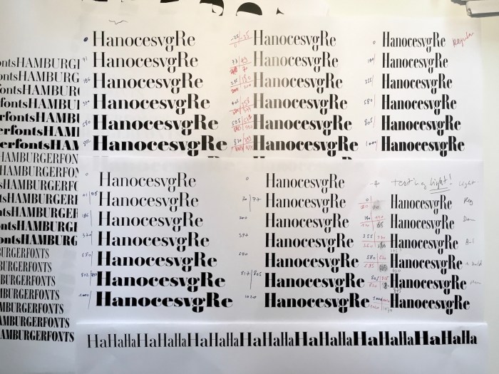
Ambroise Pro: fifteen years in the making

“To better understand the history of Ambroise, at least a few references to the Didot’s history provide some clarity. Where to start when exploring the Didot story? From Romain du Roi or Fournier, as strategic roots? For the sake of brevity, we will start with: Gillé.”

User Feedback

Recommended Comments

Fournier

Standard Member

Hello,


¶ I purchased a licence of Ambroise Pro because in the first release of 2001, the format was PostScript —that included the alternate files (Alt)— and no italics were provided.

¶ Now Porchez offered OpenType files and expanded the weights to seven (light, regular, demi, bold, extra bold, heavy, black) and added the related italics: very good news!

¶ The style of Ambroise Pro is based on the design of Pierre Didot's Romantic leaning: see François Rappo's Didot Elder for reference.

http://www.optimo.ch/typefaces_Didot-Elder_Roman_ABCD1234.html


Create an account or sign in to comment

Don’t miss the latest typography news!

Typography Weekly via email: Subscribe here

Typography Weekly via RSS feed: Subscribe here

Important Information

We are placing functional cookies on your device to help make this website better.

Account

Navigation

Search

Search

Configure browser push notifications

Chrome (Android)
  1. Tap the lock icon next to the address bar.
  2. Tap Permissions → Notifications.
  3. Adjust your preference.
Chrome (Desktop)
  1. Click the padlock icon in the address bar.
  2. Select Site settings.
  3. Find Notifications and adjust your preference.