Typography Weekly #49
10 typography news links in this category
-
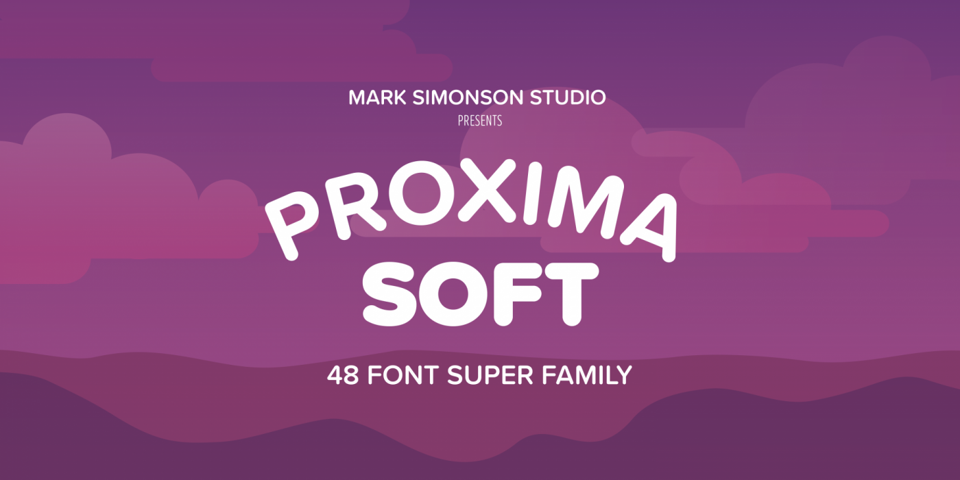
A rounded version of Proxima Nova with the same 48 styles and the same language coverage (including Greek and Cyrillic).
-
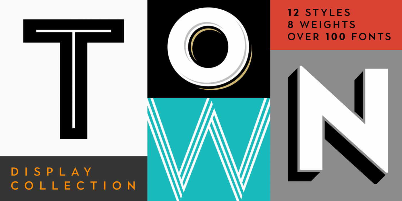
“Town is a display collection inspired by art deco and contemporary lettering.” Introductory offer: 85% off.
-
FIT is a hyper-stylized series of caps designed with one thing in mind: filling up space with maximum impact.
-
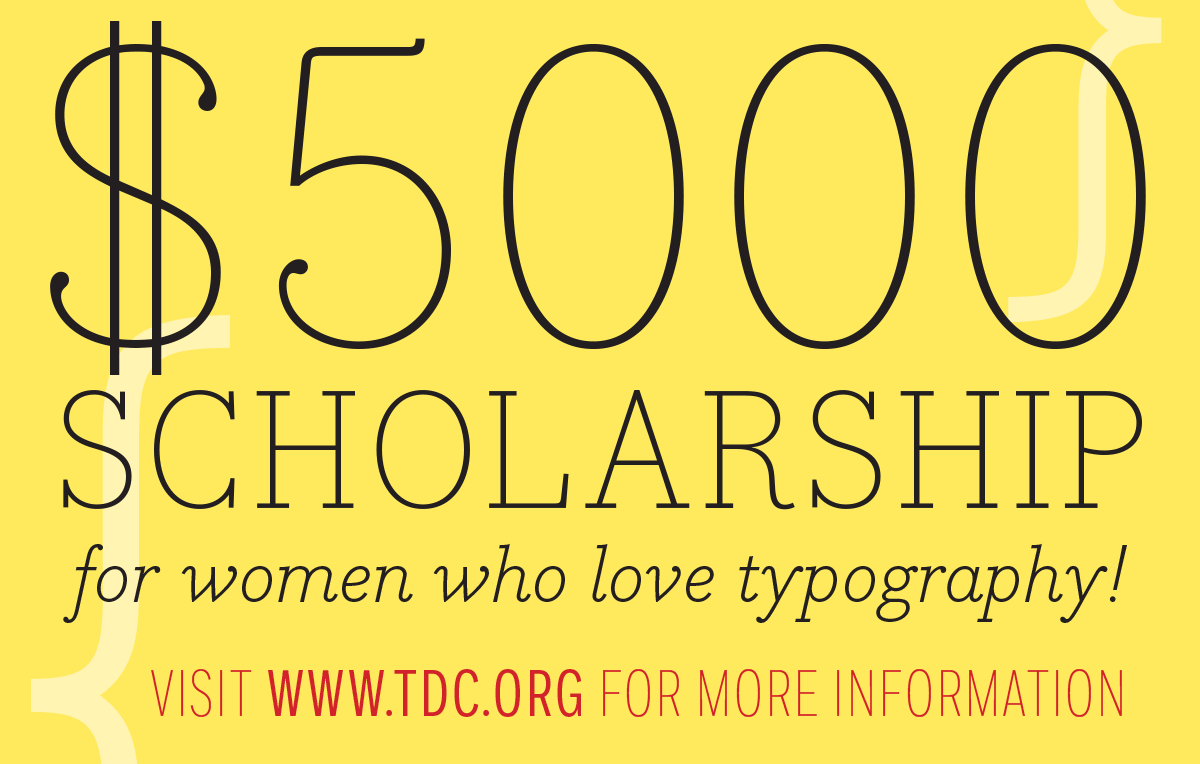
The TDC Beatrice Warde Scholarship is sponsored by the Type Directors Club and Monotype in the amount of $5,000. It will be awarded to a female student currently enrolled in her junior undergraduate year and will be applied directly to her senior year tuition, which begins September 2017 and concludes in May 2018.
-
A selection of commercial typefaces published in 2016, grouped by category.
-
-
“The work on this release has been a long time coming, and represents a major step forward.”
-
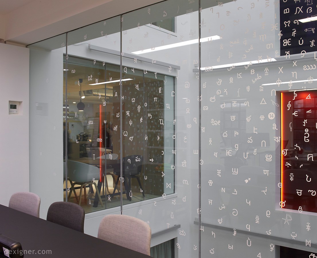
“Monotype needed an agile and inspiring workplace for now, and for its future needs,” stated Ben Adams, director of Ben Adams Architects. “Our scheme provides designed-in scope for expansion and picks up inspiring cues from their amazing archive of typefaces.”
-
“Invest in your career as a designer—become a true typography expert and get guaranteed flawless typography on every design project.”
-
Glenn Fleishman: “The trouble with being a former typesetter is that every day online is a new adventure in torture. Take the shape of quotation marks. These humble symbols are a dagger in my eye when a straight, or typewriter-style, pair appears in the midst of what is often otherwise typographic beauty.”


Don’t miss the latest typography news!
Typography Weekly via email: Subscribe here
Typography Weekly via RSS feed: Subscribe here