


Typography Weekly #56
9 typography news links in this category
-
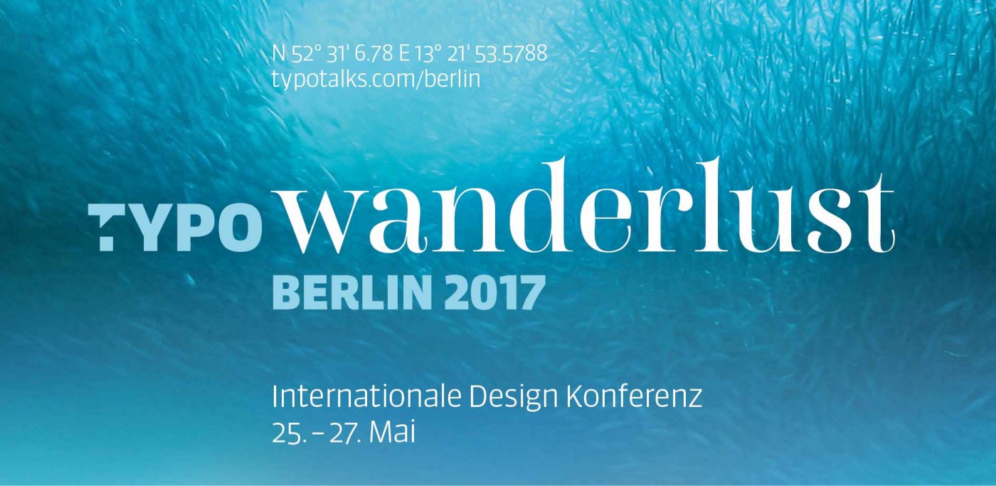
If you couldn’t make it to Berlin for TYPO 2017, Monotype is live streaming a selection of talks.
-
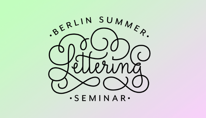
In this 3 days intensive session (for €645) you’ll design a piece of lettering from sketch to final color digital artwork. The attendants will drive the process of thinking, sketching, refining and digitising a lettering piece.
-
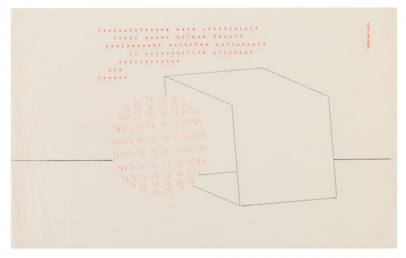
An exhibition in London showcasing the work of Dom Sylvester Houédard (1924 – 1992), a Benedictine monk who became a cult figure of counter-culture sixties London. Known simply as dsh, he was a pioneer of Concrete Poetry (typewriter art), wrote extensively on new spiritual approaches to art and was an authority on the Beat movement. His abstract visual poems, known as ‘Typestracts’, were A4 in size and typed on an Olivetti Lettera 22.
-
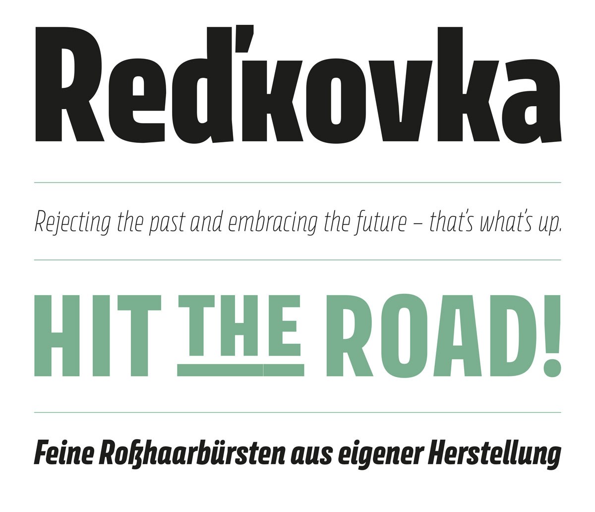
“Condensed by design, Pilot is an informal jobbing typeface for short texts and striking display use – e.g. headlines, posters, book jackets or packaging.”
-
“Avory is a gently condensed sans that challenges convention. Inspired by the lettering work of Czech designer Jaroslav Benda, a lesser known treasure of mid-century graphic design. From there it developed into a full-fledged typographic power tool.”
-
“Over 98 percent of the passwords were cracked, thanks to the site's poor password security.”
-
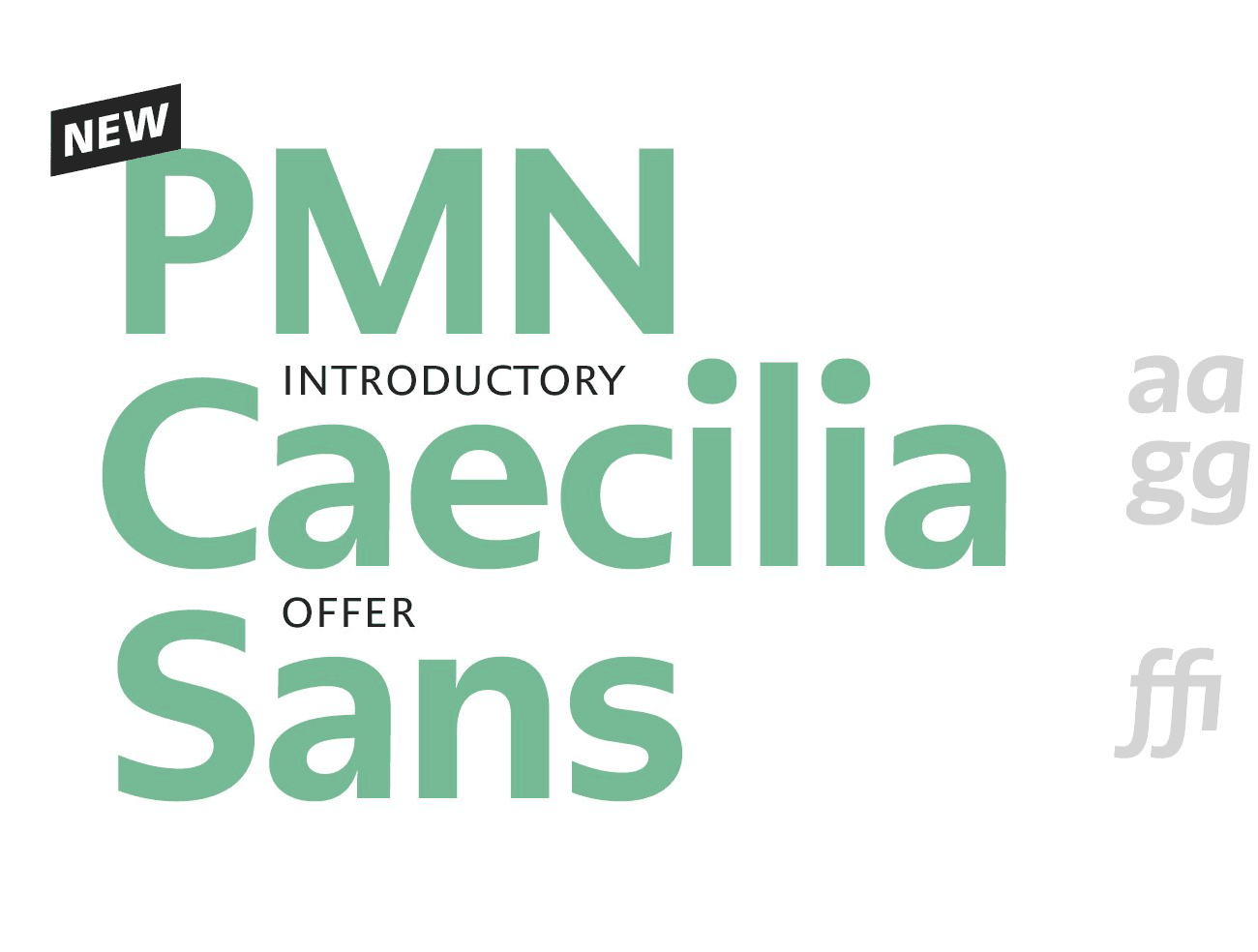
“Almost 30 years after the development of the very popular and widely used slab serif font PMN Caecilia, Peter Matthias Noordzij has expanded his font, adding a sans variant to the extended family.”
-
For designers of type, creating the characters is only part of the job. Much of the hidden engineering and heavy lifting comes in fine tuning how letters, ligatures, digits, and punctuation work together in combination—and kerning the whitespace between them. Many type designers have favorite words and phrases which they use to assess and stress-test some of the more unusual letter sequences.
-
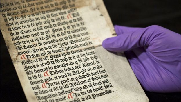
“Pages printed more than 500 years ago by William Caxton, who brought printing to England, have been discovered by the University of Reading.”


Don’t miss the latest typography news!
Typography Weekly via email: Subscribe here
Typography Weekly via RSS feed: Subscribe here

