Skip to content

Exchange by Frere-Jones Type released

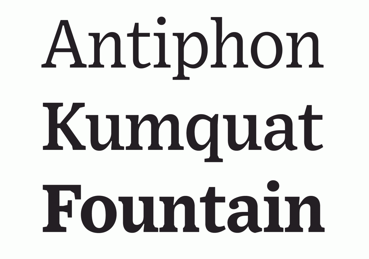
“Originally designed for newspaper text, Exchange strives for clarity and efficient copyfit across multiple platforms. Its strategy relies on an unorthodox collection of historical references, from nineteenth-century Britain to Depression-era America.”

User Feedback

Recommended Comments

R::bert

Standard Member
Quote

Originally designed for newspaper text, Exchange strives for clarity …

I’m everytime so excited to hear from a new release of Tobias Frere Jones. But in this case here is what I don’t understand:

594a27637b880_Bildschirmfoto2017-06-21um09_53_00.png.990b469327f7e86916675140780b5958.png

Do these edges really support “clarity”?

Abraham Lee

Standard Member

Wow! I'm quite enamored with this design.

At first, I was skeptical about the rough-cut internal corners, just as you were @R::bert, but having printed out the specimen and looked at it more closely, I think it works really well at the smaller print sizes (where those lower-frequency features become the main structure). At display sizes, they do seem a bit out of place to me because they no longer serve their function. I wonder if Tobias would consider a Display size that either smooths those out or removes them altogether. Would be a fit optical companion!

Also, a nice use of ink traps to ensure acute corners (like on the /p) are still white at even very small sizes.

And bravo on the hinting! The demos on their site look exceptional at all display sizes on the screen. Would be interested to know how much was manually done.

R::bert

Standard Member
17 hours ago, Abraham Lee said:

I think it works really well at the smaller print sizes

17 hours ago, Abraham Lee said:

I wonder if Tobias would consider a Display size that either smooths those out or removes them altogether. Would be a fit optical companion!

Thanks for your thoughts! I guess that nails it! But nevertheless I wonder a bit why these edges are still in the standard fonts and not only in the so called microplus sizes. But okay at 10 pt you will probably not recognize them.

R::bert

Standard Member
16 hours ago, Abraham Lee said:

Would be interested to know how much was manually done.

Me too! :open-mouth:

Create an account or sign in to comment

Don’t miss the latest typography news!

Typography Weekly via email: Subscribe here

Typography Weekly via RSS feed: Subscribe here

Important Information

We are placing functional cookies on your device to help make this website better.

Account

Navigation

Search

Search

Configure browser push notifications

Chrome (Android)
  1. Tap the lock icon next to the address bar.
  2. Tap Permissions → Notifications.
  3. Adjust your preference.
Chrome (Desktop)
  1. Click the padlock icon in the address bar.
  2. Select Site settings.
  3. Find Notifications and adjust your preference.