Typography Weekly #70
8 typography news links in this category
-
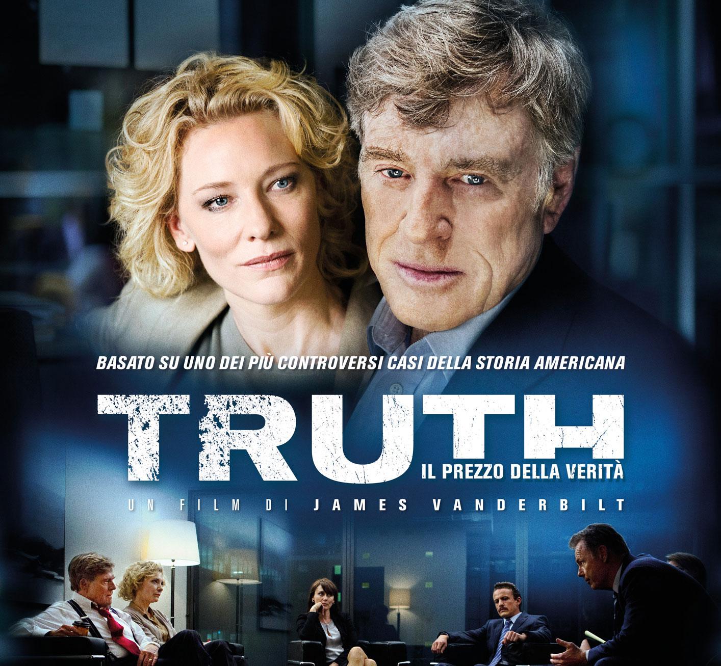
Debunking false stories with typographic knowledge. Another one of Thomas Phinney’s cases.
-
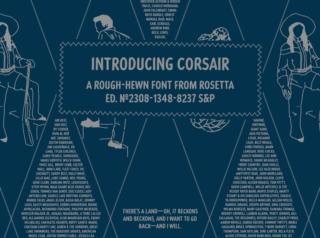
“Originally commissioned by Best Made Co., its functional beauty was made to mimic the idiosyncrasies of handwriting. Naturally randomised letterforms lend it authenticity, while weathered edges and subtle variations add a rustic charm. The effect is an honest, approachable, and organic look that’s careful, but that doesn’t overthink it. ”
-
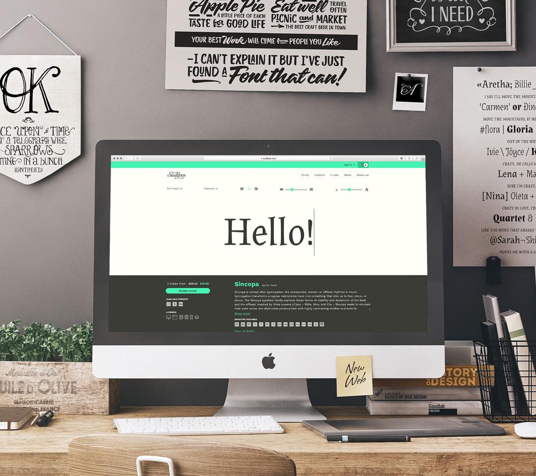
“At last, a comprehensive way to explore the entire Sudtipos type library. To celebrate the launch, enjoy 50% off any desktop or webfont purchase by entering offer code SUDTIPOSNEW at checkout.”
-
“This family began with material I had collected for In Letters We Trust a few years ago. Like that lecture, Conductor began with a simple observation, which prompted questions and conjecture and before long, a whole type family. Conductor is also the first family I’ve worked on with Nina Stössinger from the start, making it especially satisfying to launch. — Tobias Frere-Jones”
-
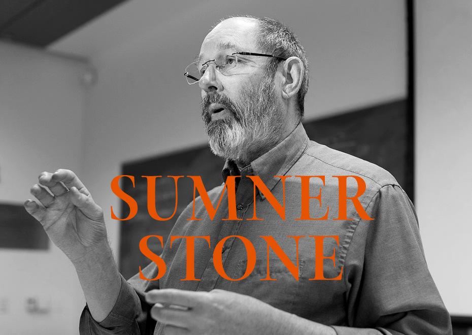
Sumner Stone talked to Misha Beletsky about type techniques, life, work, teaching and his plans.
-
A serif typeface in 56 styles (including optical sizes, widths and weights) designed by Riley Cran, inspired by the mid century advertising lettering of Mortimer Leach.
-
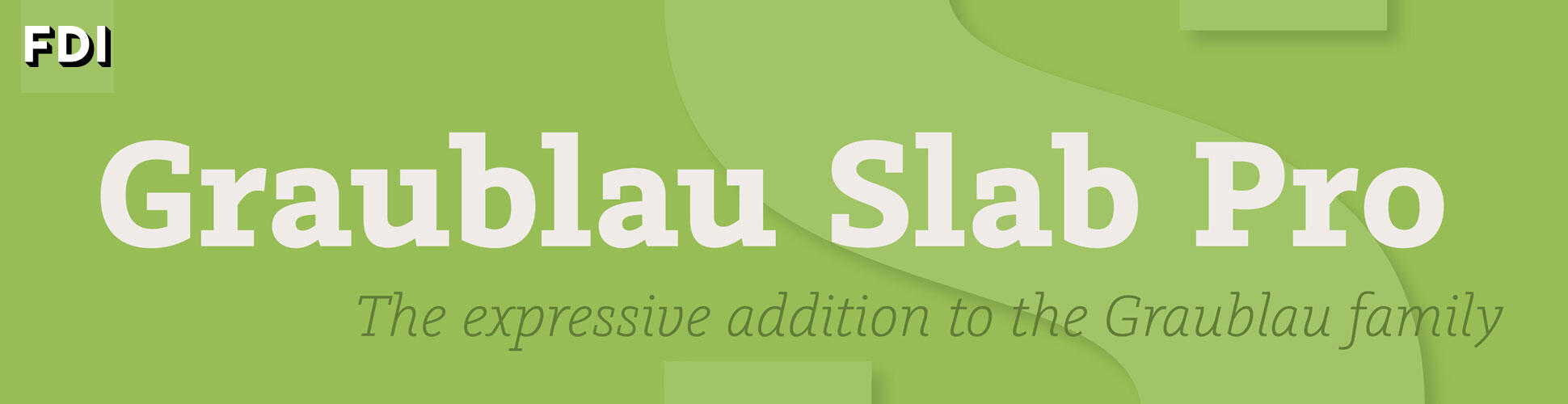
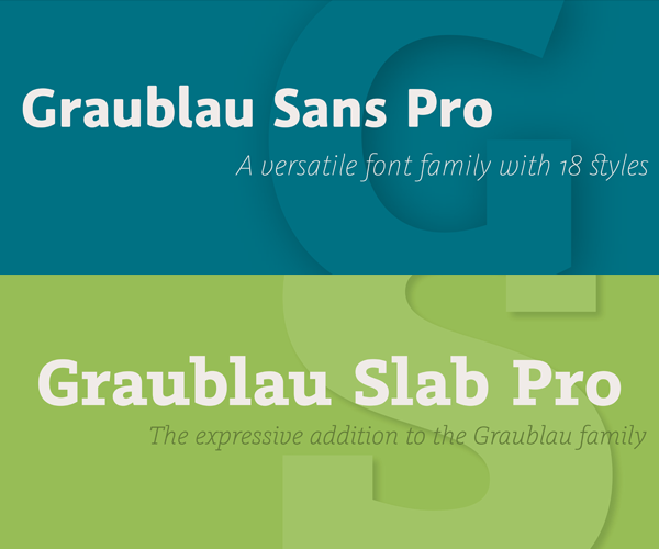
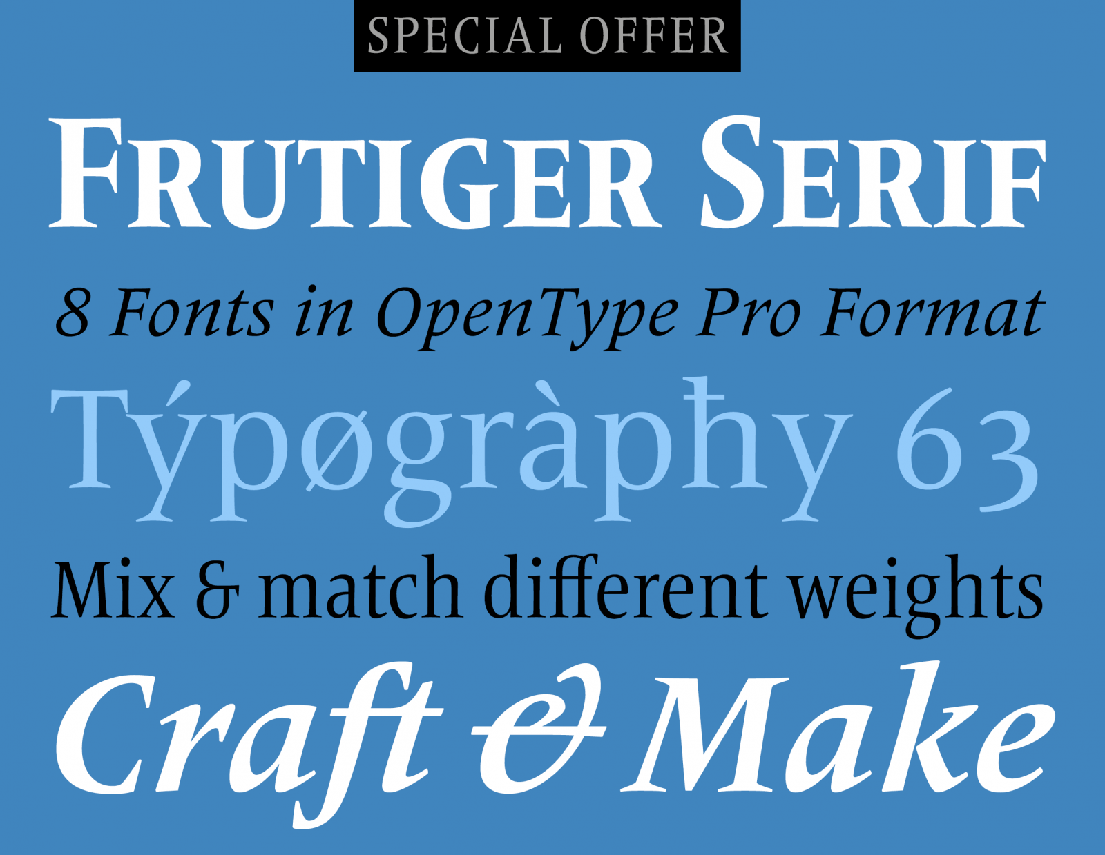
“Of the 20 styles in this comprehensive font, which also include condensed variants, we have selected eight base styles, which will convince you of the versatility of this modern, high-quality typeface design.”
-
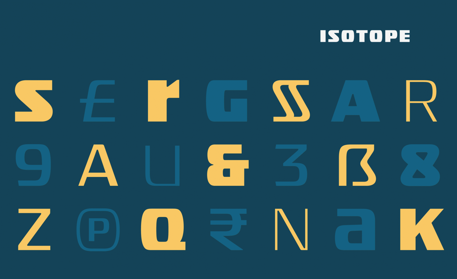
“Inspired by a style of lettering invented to convey precision and reliability, Isotope is a new family of typefaces designed to be both luxurious and fit.”


Don’t miss the latest typography news!
Typography Weekly via email: Subscribe here
Typography Weekly via RSS feed: Subscribe here