Jump to content
Education typography videos. Check out our YouTube channel …
  • Renaissance metal, french sieves and Spanish borders

    Open the Link

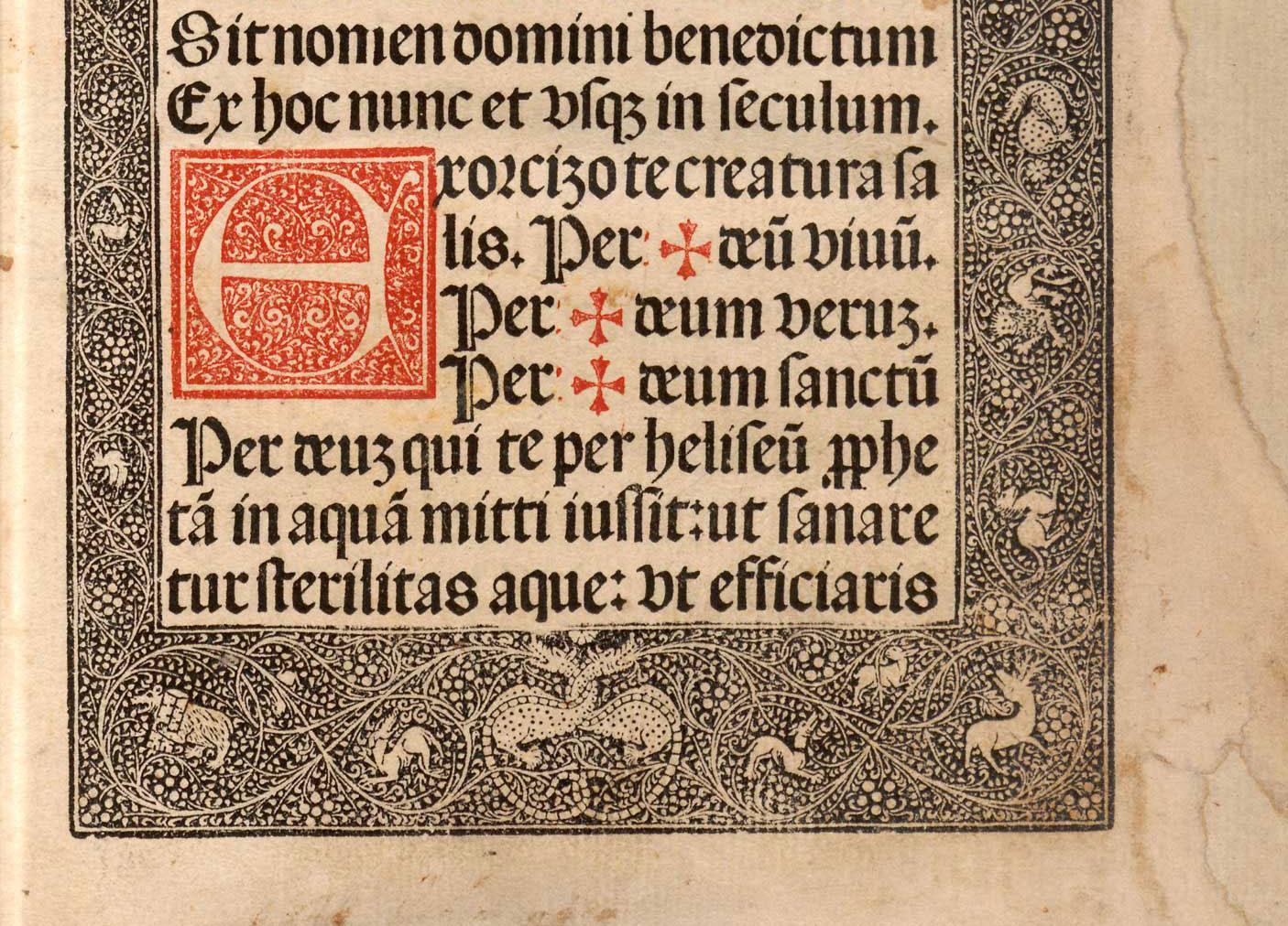
    “Many of the first printed books in Europe were decorated with illustrations, initials and borders. Each served a purpose: initials signaled, via their range of sizes, a textual hierarchy, working in much the same way as chapter headings and sub-headings do today …”

    ilovetypography.com

    • very interesting! 1

    Subscribe now!

    … and get these links once a week via email. Subscribe now

    User Feedback

    Recommended Comments

    There are no comments to display.


    Create an account or sign in to comment

    You need to be a member in order to leave a comment

    Create an account

    Sign up for a new account in our community. It's easy!

    Register a new account

    Sign in

    Already have an account? Sign in here.

    Sign In Now

Our partners

Discover the Best Deals for Freelance Designers.
Discover the fonts from the Germany foundry FDI Type. A brand of Schriftkontor Ralf Herrmann.
The largest selection of professional fonts for any project. Over 130,000 available fonts, and counting.
Get to your apps and creative work. Explore curated inspiration, livestream learning, tutorials, and creative challenges.
  • Upcoming Events

  • Add your content!

    We spread your news free of charge among a growing list of subscribers and tens of thousands of followers of our social media channels.
    Learn more about this
Try Adobe Stock for free and get 10 free photos …
×
×
  • Create New...

🍪 Important Information:

This website uses functional cookies.