Jump to content
Check out our typography channel on Instagram
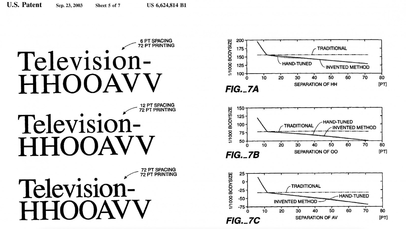
  • Size-Specific Spacing of Fonts

    Riccardo Sartori

    Open the Link

    “Type design must consider not only the shape of the letters, but also the white space around them, which is essential for the ease of reading.”

    www.typotheque.com

    • Like 1


    User Feedback

    Recommended Comments

    There are no comments to display.


    Create an account or sign in to comment

    You need to be a member in order to leave a comment

    Create an account

    Sign up for a new account in our community. It's easy!

    Register a new account

    Sign in

    Already have an account? Sign in here.

    Sign In Now

Our typography network

Discover the fonts from the Germany foundry FDI Type. A brand of Schriftkontor Ralf Herrmann.
Typografie.info – The German typography community
The type specimens of the world.
The best typography links of the week.
  • Upcoming Events

  • Add your content!

    We spread your news free of charge among a growing list of subscribers and tens of thousands of followers of our social media channels.
    Learn more about this
Krimhilde: Blackletter meets Geometric Sans
×
×
  • Create New...

Important Information

We are placing functional cookies on your device to help make this website better.