Link suggestions
50 typography news links in this category
-
Making a typeface that one hundred million people see every day is no small task. Plau partnered with Rede Globo’s creative team to do just that. The result is Globotipo, a 3-style, 30-font super family created to refreshed and expand the typographic voice for Brazil’s ultimate broadcaster. Check out the video case above or scroll to learn more.
-
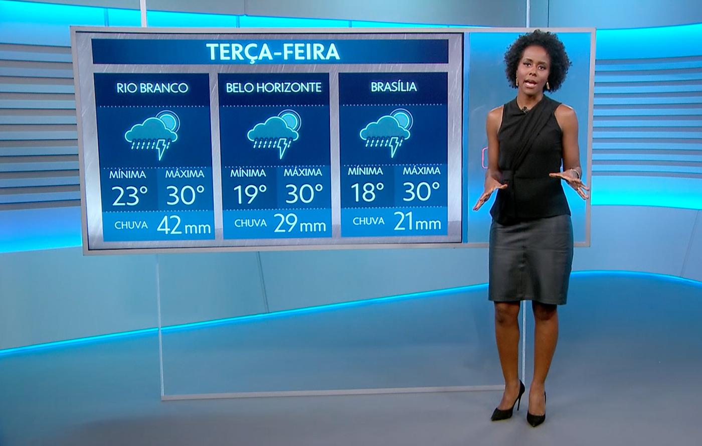
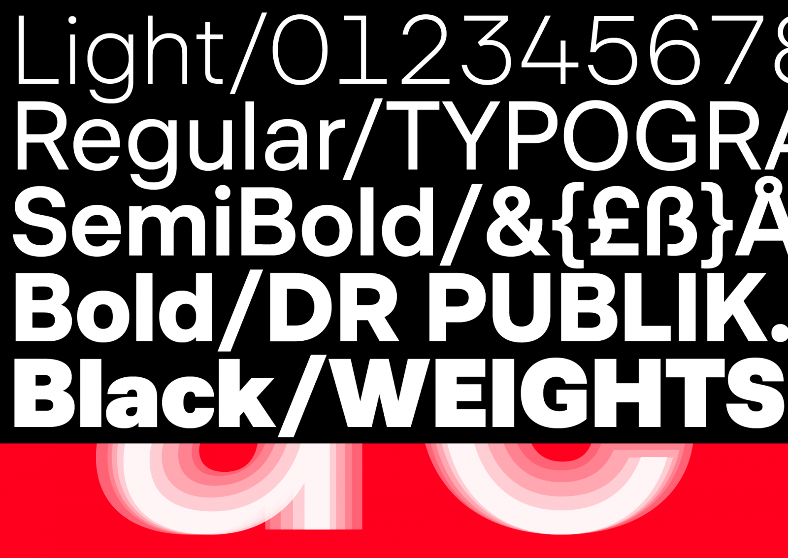
The bespoke type family DR Publik is designed to strengthen legibility and ensure visual consistency on all platforms for millions of users. DR Publik will be used on TV channels, streaming platforms, news services, radio channels, websites, apps, concert hall, symphony orchestra, big band, choirs etc.
-
“For our international Font Development Team we are hiring a Font Engineer (m/f) for our Bad Homburg office”.
-
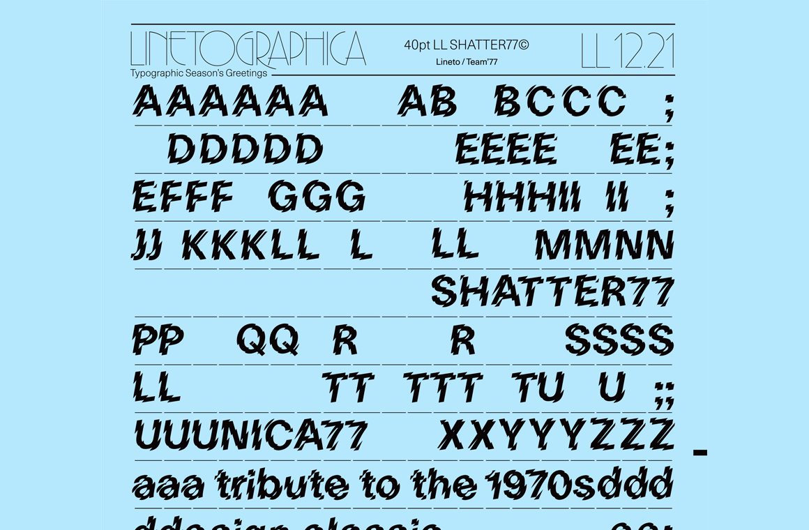
For a limited time, Swiss foundry Lineto is offering a free download of Shatter77, a design that applies the Shatter treatment to their Unica77.
-
ATypI Tech Talks is an event devoted to advances and innovation in technology, engineering, standards, formats, experimentation, tools, and other essential subjects related to type design, typography, font production, font formats, browsers, apps, web development, multiscript design, type education, type business, and more. ATypI Tech Talks will feature three days filled with presentations, panel discussions, workshops, and conversation.
-
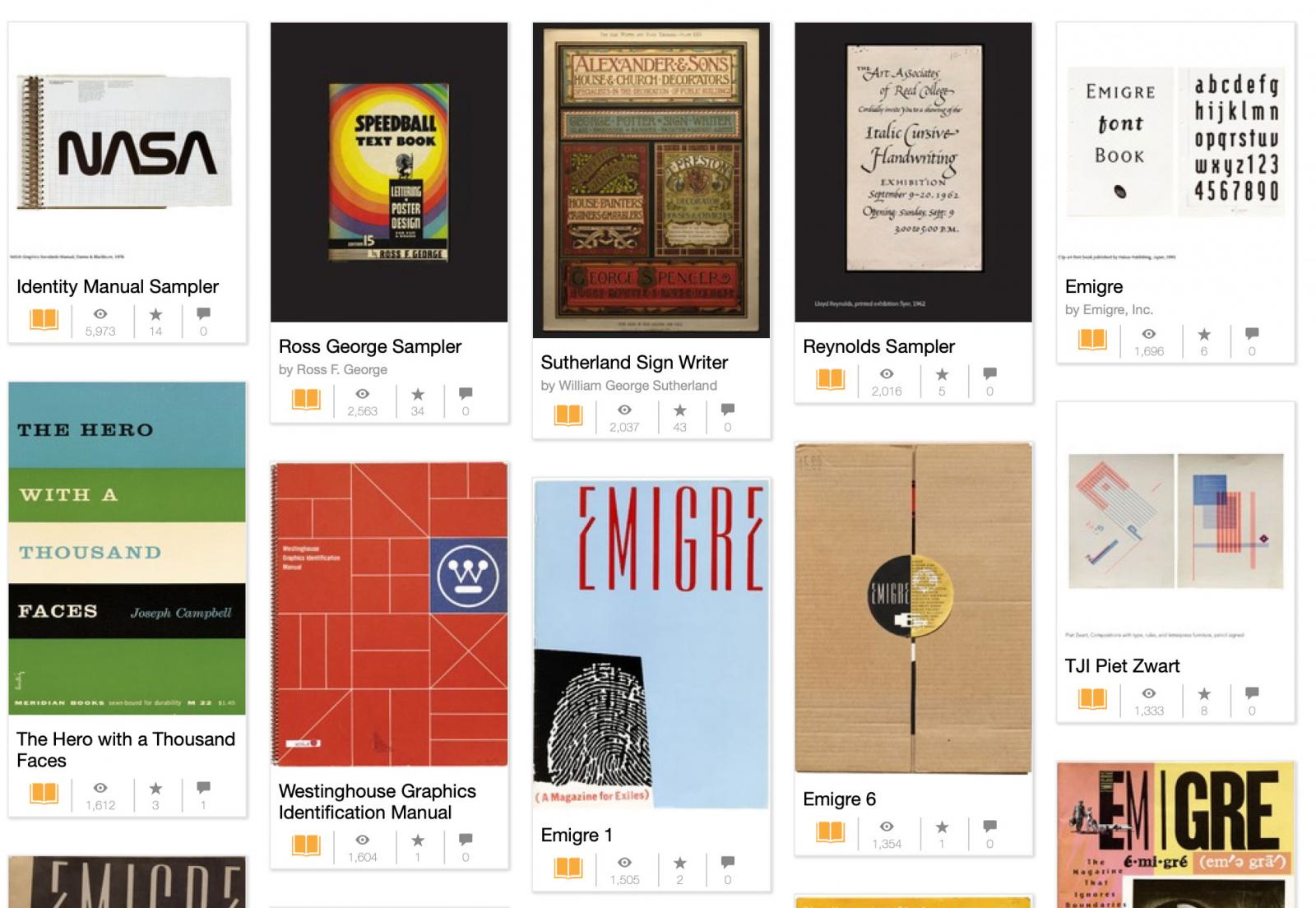
Archive of typography related magazines and other graphic design resources. The Letterform Archive is a non-profit library, museum, and educational institution dedicated to serving existing and potential practitioners, students, and admirers of the letter arts. Founded in 2014 and opened to the public in 2015, the San Francisco-based organization holds an extensive collection of 30,000 items ranging in age over 2,000 years.
-
“A majestic typeface uses digital means to achieve traditional ends.” From Hoefler & Co.
-
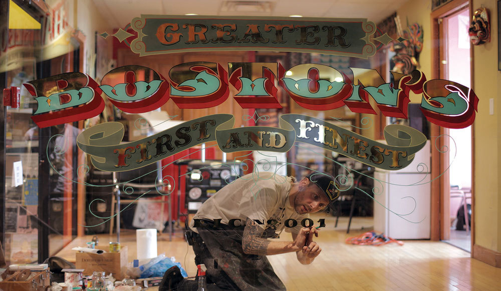
“Patrick Slack focuses on design influenced by art and technology. To showcase his work we chose to feature a collaboration that speaks volumes. “Fringe Intermission is an exploration of space using the city as medium” writes Slack.”
-
-
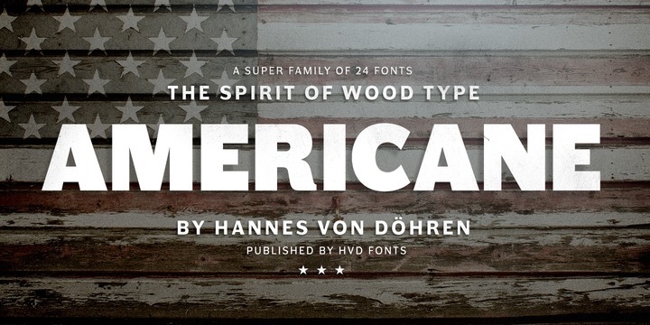
Americane Condensed & Americane by HvD fonts is a super family of 24 fonts in total – a normal and a condensed width in six weights with matching italics.
-
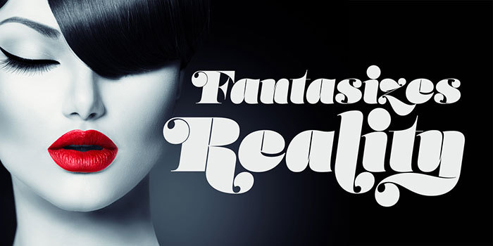
A display typeface by Neil Summerour. Microsite: http://lust.positype.com/Lust-Hedonist/
-
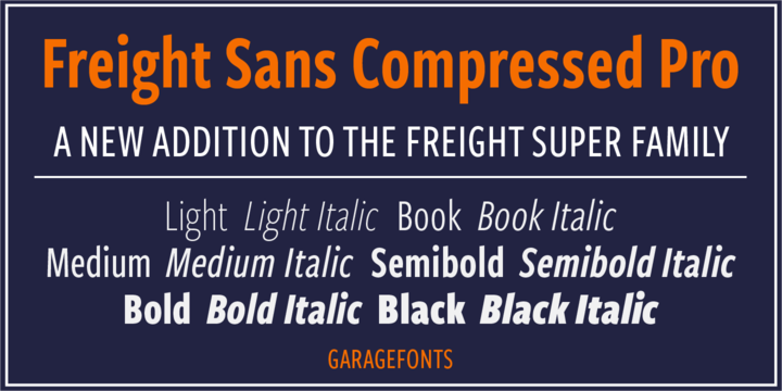
Phil’s Fonts and GarageFonts are pleased to announce the release of Freight Sans Compressed, the slimmer, taller brother of Freight Sans.
-
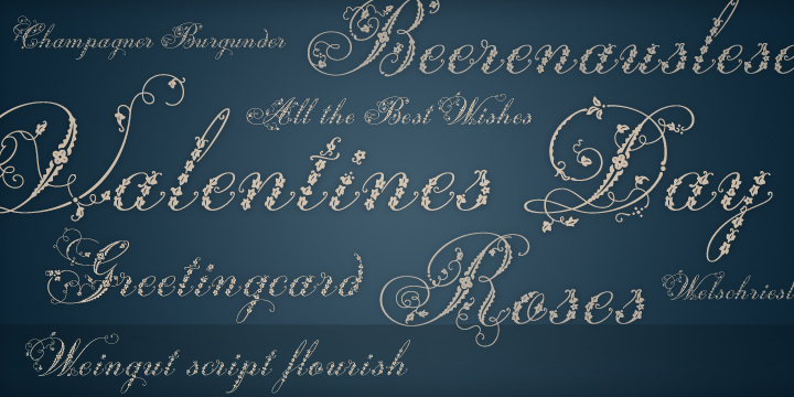
Weingut Script Flourish is a decorative display font with high contrasts, perfectly drawn to the tiniest details. It’s currently 90% off.
-
A typeface that pays tribute to all letterers that created amazing signs in magazines, walls and windows through the brush lettering during many years, especially in the 50s and 60s. This font is 100% based on the brush traces, it has 2100 glyphs, contextual ligatures from two to four characters …
-
The newest version 1.7 of the OpenType spec is fully equivalent to the ISO/IEC 14496-22:2015 (3rd edition) “Open Font Format” standard. The standard will be published in June 2015 and at that time will be freely available for download from the ISO website.


Don’t miss the latest typography news!
Typography Weekly via email: Subscribe here
Typography Weekly via RSS feed: Subscribe here