Display phototype in New York: folks, firms and fonts
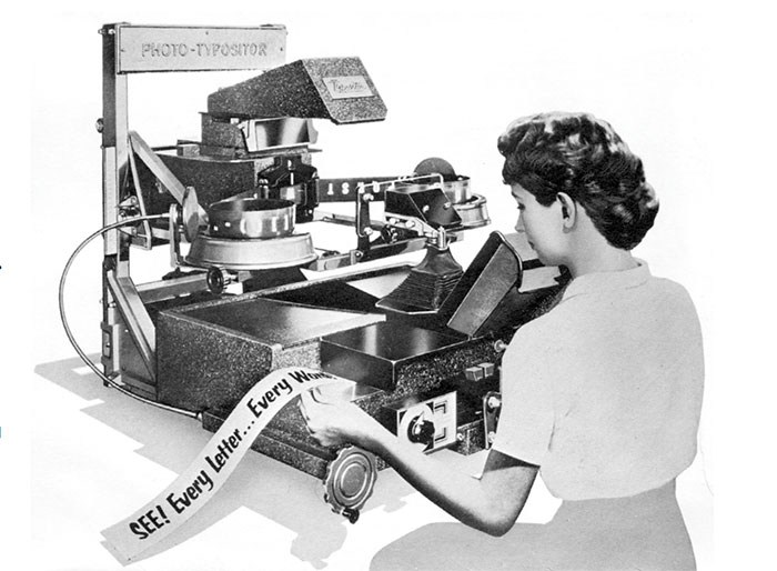
By Peter Bain. There was probably no place that photocomposition had a greater effect than on the New York advertising scene in the mid-20th century. The liberation from the limitations of metal type … provided the typographic designers and type directors of the city with more possibilities”


Recommended Comments
Create an account or sign in to comment