


Typography Weekly #37
11 typography news links in this category
-
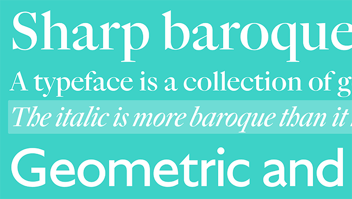
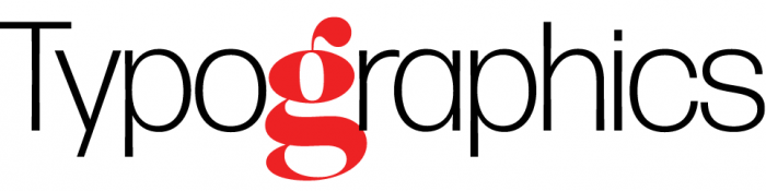
A FontShop article by Ferdinand Ulrich.
-
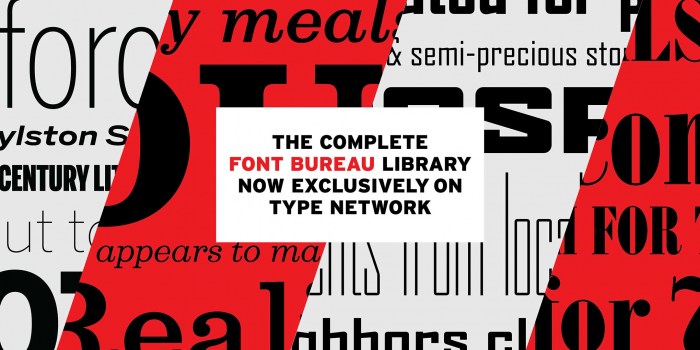
“Our font library is no longer for sale at Fonts.com, MyFonts, or FontShop,” said David Berlow, president of Font Bureau.
-
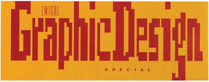
After a Twitter discussion following a Fontstand article about Emigre, Kris Sowersby published a detailed comment about the interview and state of type design/distribution today.
-
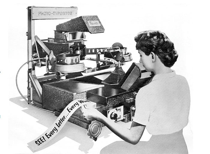
By Peter Bain. There was probably no place that photocomposition had a greater effect than on the New York advertising scene in the mid-20th century. The liberation from the limitations of metal type … provided the typographic designers and type directors of the city with more possibilities”
-
“Tiny Type co. is a small independent type foundry. It’s run by Rob Mientjes, a Dutch typographic and type designer.”
-
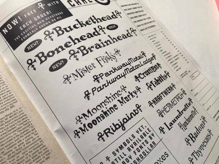
“You may not know Chank Diesel as a person, but you’re likely well-acquainted with his work. If you’ve glanced at The Hunger Games‘s cover, seen last year’s World Series logo, or picked up a box of Crayola crayons, you’ve already spent time with the font pioneer”
-
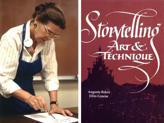
“New Yorkers or any of the city’s millions of visitors who walked along Madison Avenue in the ’60s, ’70s and ’80s know her masterful posters for the Morgan Library. Scribes in the U.S. and abroad know her through her celebrated workshops. She is Alice Koeth, known professionally simply as Alice”
-
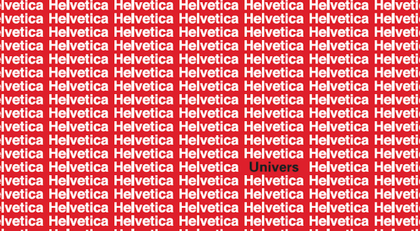
“How did Helvetica become the typographic celebrity that it is today… and why didn’t Univers land the role instead? In this piece from Print’s Spring 2016 Issue, Paul Shaw takes us on a guided tour through type history.”
-
A new publication about type. The focus is designers who uses type, create it, or just love it. The magazine is starting with a simple group blog. A preview printed edition is scheduled this autumn.
-
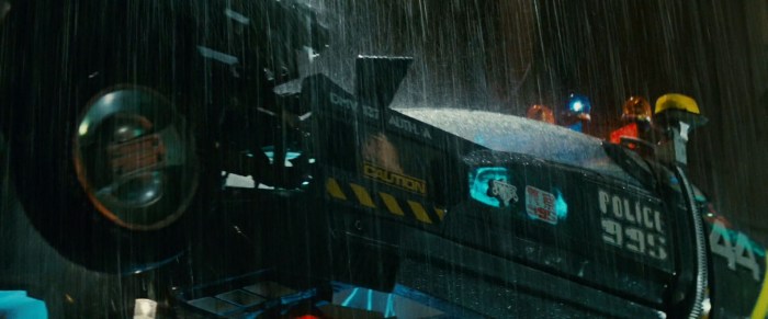
A look at the typography and design of Ridley Scott’s classic sci-fi movie, Blade Runner.
-
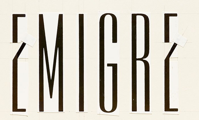
“The renowned digital type foundry’s collection includes the original paste-up for the Emigre logo, paste-ups for Emigre magazine and a complete run of the publication, as well as audio tapes of interviews, merchandise, ephemera, typeface development files, and type catalogs.”


Don’t miss the latest typography news!
Typography Weekly via email: Subscribe here
Typography Weekly via RSS feed: Subscribe here

