


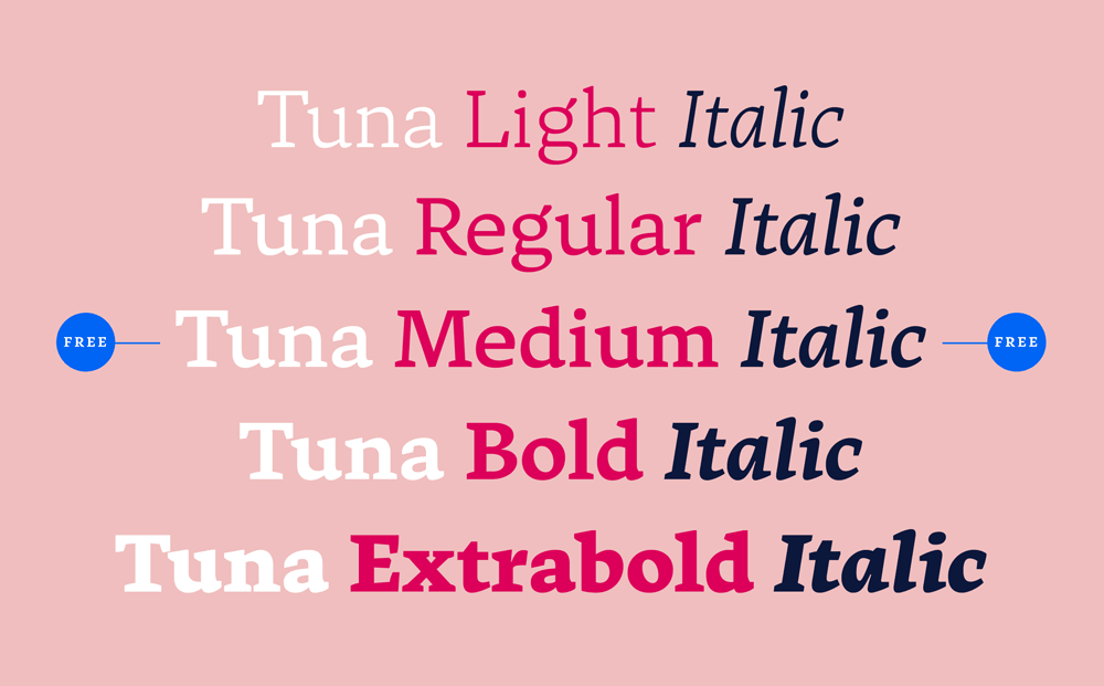
We proudly announce the release of our new typeface TUNA. Optimized for crossmedia publishing TUNA is smooth like butter while reading on screen as well as paper. The complete family is 50% off in the first month at MyFonts. Both Medium weights are completely free! If you want to find out, how we used the charming broad-nibbed calligraphic style to optimize legibilty on screen, or simply want to see the webfont in use, please have a look at our promotion website: http://tuna-typeface.com
Tuna Family – A Typeface Optimized for On-Screen Reading
-
 1
1
User Feedback
Don’t miss the latest typography news!
Typography Weekly via email: Subscribe here
Typography Weekly via RSS feed: Subscribe here

Recommended Comments
Create an account or sign in to comment