Jump to content
The type specimens of the world in one database …
  • Typography Weekly #51

      Open the Link

      Goudy & Syracuse: The Tale of a Typeface Found

      “The tale of rediscovering Sherman, a typeface designed by Frederic Goudy in 1910 and revived by Chester Jenkins in 2016 for Syracuse University.”

      vimeo.com

      Open the Link

      2017 version of the free Vollkorn typeface released

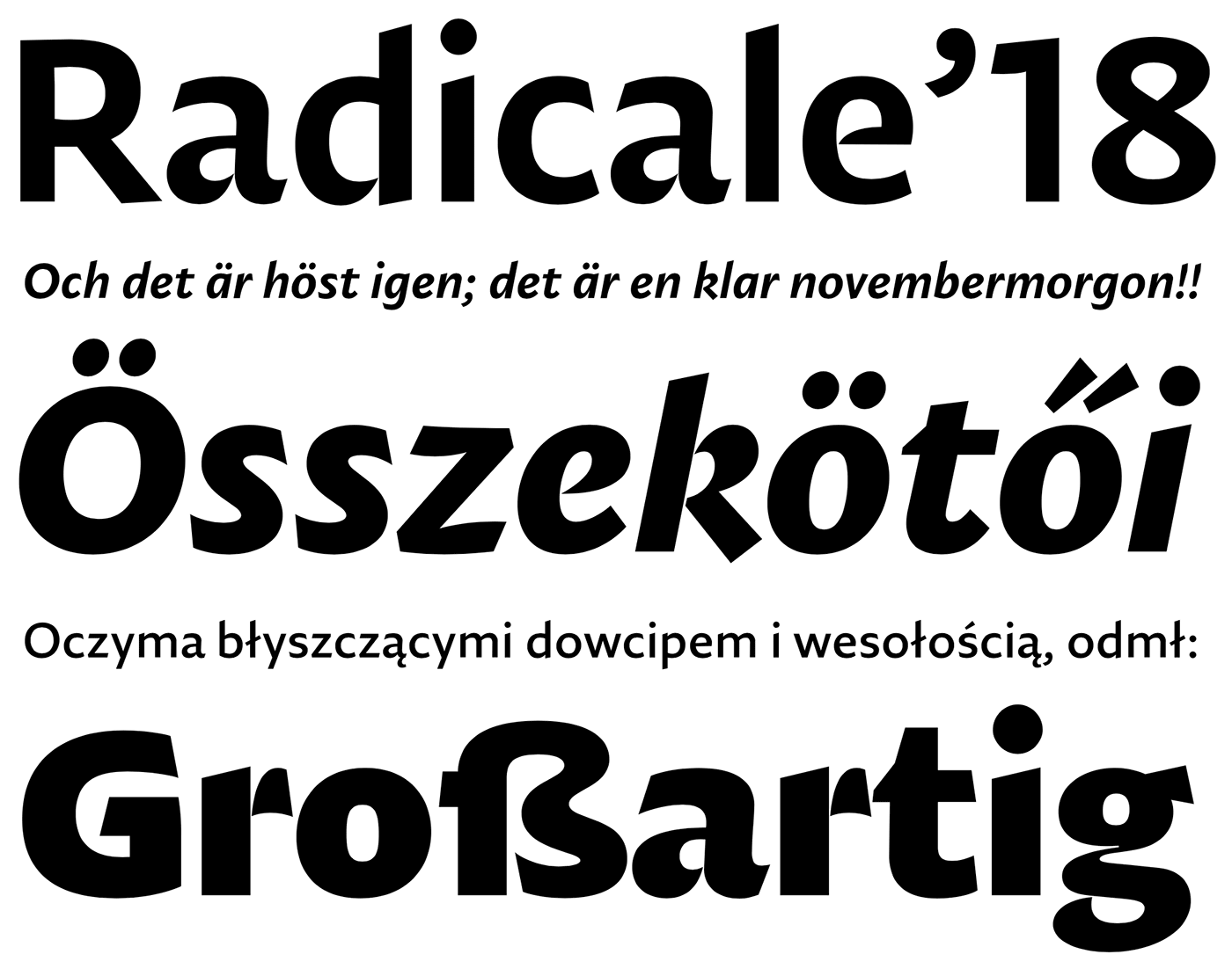
      A new extended version of Friedrich Althausen’s typeface was just released.

      vollkorn-typeface.com

      • Like 1
      Riccardo Sartori

      Open the Link

      A Magazine for People Curious About Fonts

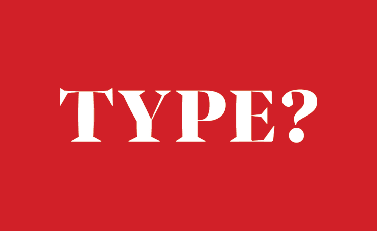
      TYPE is a new publication for people who love fonts, typography, calligraphy, lettering, sign painting—letterforms of all kinds.

      www.typemag.org

      Open the Link

      New and 50% off: Marshmallow from Positype

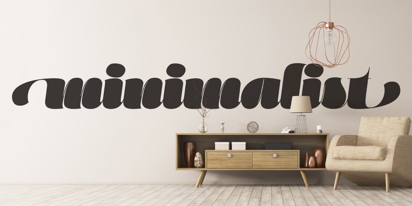
      “Marshmallow is a fun, fat, super high-contrast script typeface in two variants. A slick connected (Script) and a mellow unconnected (Fluff) style that provides the versatility you need regardless of the display usage you plan.”

      www.myfonts.com

      Riccardo Sartori

      Open the Link

      Frere-Jones Type is hiring

      “This is a full-time position at Frere-Jones Type’s office in Brooklyn, New York. The position centers on the design, production and demonstration of new digital typefaces, under the direct supervision of Tobias Frere-Jones.”

      frerejones.com

      Open the Link

      The Jock Kinneir Library launches with an appeal for submissions

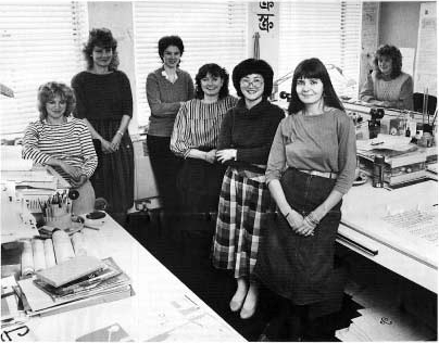
      An online library dedicated to the work and teaching of graphic designer Jock Kinneir has been launched by his family – and they are seeking submissions from people who knew him

      www.creativereview.co.uk

      Open the Link

      New and 75% off: Atlan from Latinotype

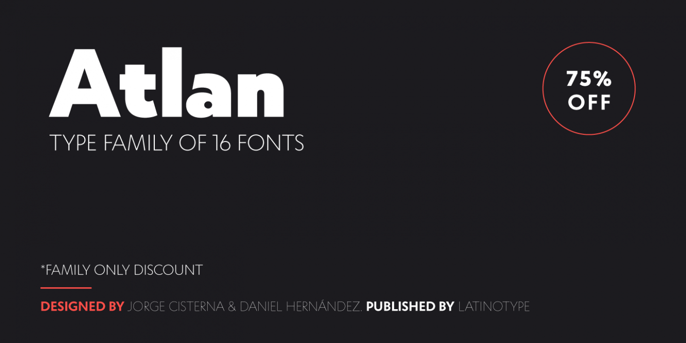
      “Atlan—a Latin ’spin-off’ of classic geometric sans typefaces.”

      www.myfonts.com

      • Like 1

      Open the Link

      Motogi Shōzō and the Japanese Typography

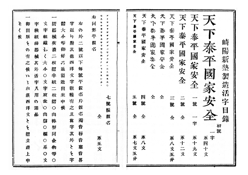
      “ I dived into the history of japanese typography, focusing on the figure of Motogi Shōzō. As there are only few sources in english or in french about the development of japanese typography, I want to share here some of the elements I discovered.”

      www.aisforapple.fr

      1 comment

      • Like 1

      Open the Link

      Diurnal, a Sans for long, continuous reading

      Diurnal is the sans-serif version of the Nocturno typeface.

      www.typotheque.com

      Open the Link

      Making the Thesaurus type family

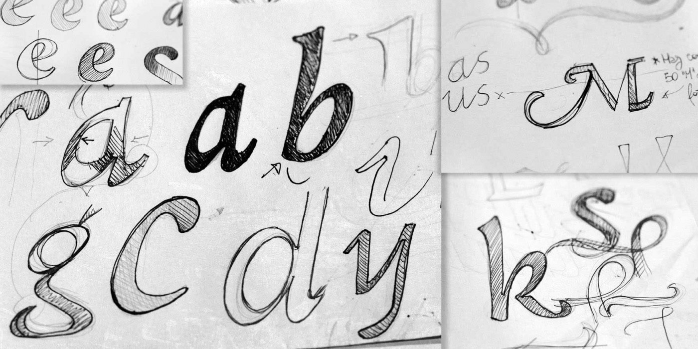
      “The concept behind Thesaurus goes back to 2014, when I was finishing my bachelor’s degree in visual communications at the Haute École d’Art et Design, Geneva …”

      ilovetypography.com

      Open the Link

      ATypI 2017 Call for Papers

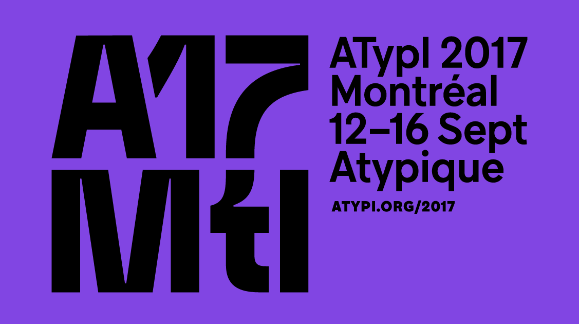
      Join the global typographic community in Montréal, Quebec, Canada, September 12–16, 2017. ATypI is celebrating sixty years of typographic education and camaraderie this year.

      atypi2017.dryfta.com

      Riccardo Sartori

      Open the Link

      Non-Latin Type Design at Linotype

      This was text originally presented by Dr Fiona Ross as a talk at the First annual Friends of St Bride conference, 24 & 25 September 2002.

      tntypography.eu

      Riccardo Sartori

      Open the Link

      Jonathan Barnbrook joined the FontFont Type Board

      In this interview, Barnbrook talks about early digital type design, what he looks for in submitted typefaces, and the role of the FontFont type library.

      www.fontshop.com

      Riccardo Sartori

      Open the Link

      The man trying to leave an Indian imprint on typeface design

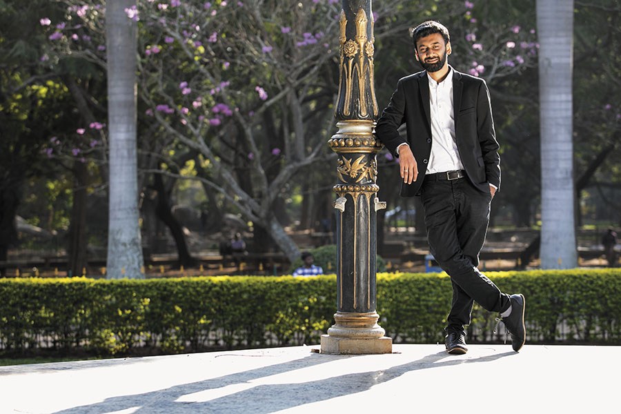
      A brief profile of Shiva Nallaperumal for Forbes India’s “30 Under 30” feature.

      www.forbesindia.com

      Open the Link

      Colorfonts.WTF website launched

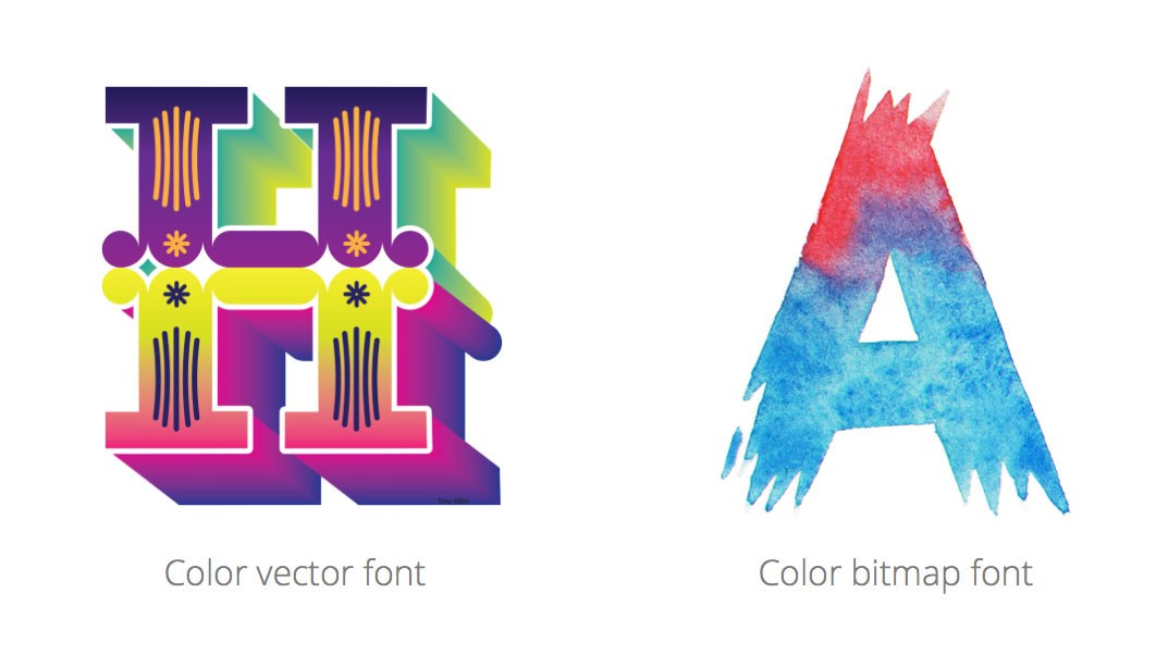
      This website aims to be your one-stop place to learn everything about color fonts, to discover the latest and best color font designs, and to bring you more stories about the people behind them. Colorfonts.wtf is a project sponsored by the Fontself team

      www.colorfonts.wtf

      • Like 1

      Open the Link

      Typefaces from TypeMedia 2016

      TypeMedia is a full-time one year master program held at The Royal Academy of Art, in The Hague, The Netherlands, that gives participants the possibility of delving deeper in the field of type design.

      typemedia-2016.com

      • Like 1
      Floodfonts

      Open the Link

      Tuna Family – A Typeface Optimized for On-Screen Reading

      We proudly announce the release of our new typeface TUNA. Optimized for crossmedia publishing TUNA is smooth like butter while reading on screen as well as paper. The complete family is 50% off in the first month at MyFonts. Both Medium weights are completely free! If you want to find out, how we used the charming broad-nibbed calligraphic style to optimize legibilty on screen, or simply want to see the webfont in use, please have a look at our promotion website: http://tuna-typeface.com

      tuna-typeface.com

      • Like 1

      Open the Link

      MyFonts bestsellers of 2016

      “Welcome to MyFonts’ annual round up of bestselling fonts from the previous year, where we compile our list of new type families that have proven popular with you, the customer.”

      www.myfonts.com

      Open the Link

      Rialto dF now available at CAST

      “A bridge between calligraphy and typography, by a pen-master designer.”

      rialto.c-a-s-t.com

Our partners

Discover the Best Deals for Freelance Designers.
Get to your apps and creative work. Explore curated inspiration, livestream learning, tutorials, and creative challenges.
The largest selection of professional fonts for any project. Over 130,000 available fonts, and counting.
Discover the fonts from the Germany foundry FDI Type. A brand of Schriftkontor Ralf Herrmann.
Try Adobe Stock for free and get 10 free photos …
×
×
  • Create New...

Important Information

We are placing functional cookies on your device to help make this website better.