Jump to content
Join our community of friends of typography!
  • Ten features for topnotch text fonts

    Open the Link

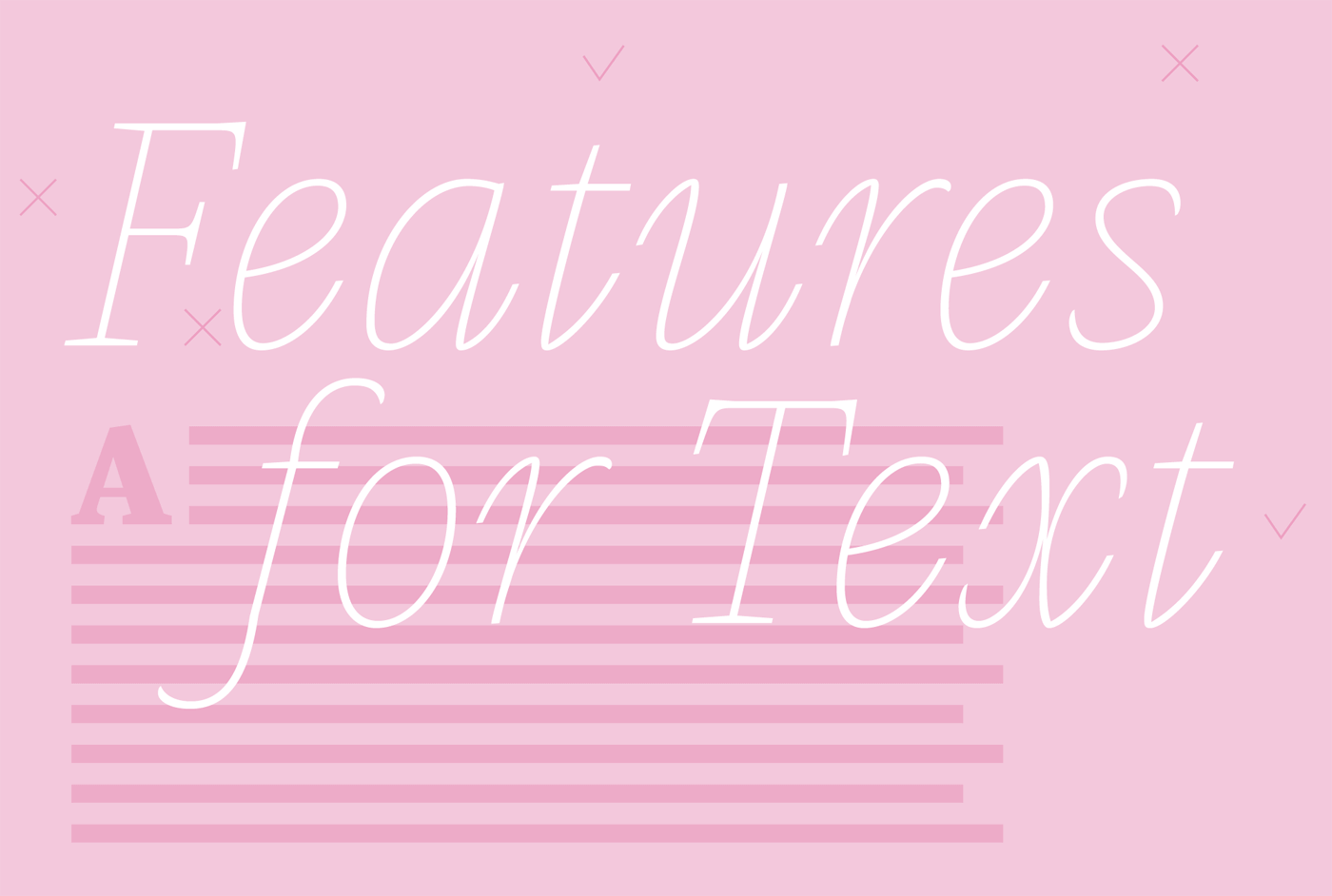
    “Most features for improving the legibility of typefaces are not yet scientifically proved and most of them are more a question of readability – the typographical treatment of text – not a question of the typeface’s design. Anyhow we would like to introduce you to some features you should look for when choosing typefaces for text.”

    www.typemates.com

    • Like 1
    • very interesting! 1

    Subscribe now!

    … and get these links once a week via email. Subscribe now

    User Feedback

    Recommended Comments

    There are no comments to display.


    Create an account or sign in to comment

    You need to be a member in order to leave a comment

    Create an account

    Sign up for a new account in our community. It's easy!

    Register a new account

    Sign in

    Already have an account? Sign in here.

    Sign In Now

Our partners

Get to your apps and creative work. Explore curated inspiration, livestream learning, tutorials, and creative challenges.
The largest selection of professional fonts for any project. Over 130,000 available fonts, and counting.
Discover the Best Deals for Freelance Designers.
Discover the fonts from the Germany foundry FDI Type. A brand of Schriftkontor Ralf Herrmann.
  • Upcoming Events

  • Add your content!

    We spread your news free of charge among a growing list of subscribers and tens of thousands of followers of our social media channels.
    Learn more about this
Krimhilde: Blackletter meets Geometric Sans
×
×
  • Create New...

🍪 Important Information:

This website uses functional cookies.