Jump to content
Join our community of friends of typography!
  • Are two spaces better than one? A response to new research

    Open the Link

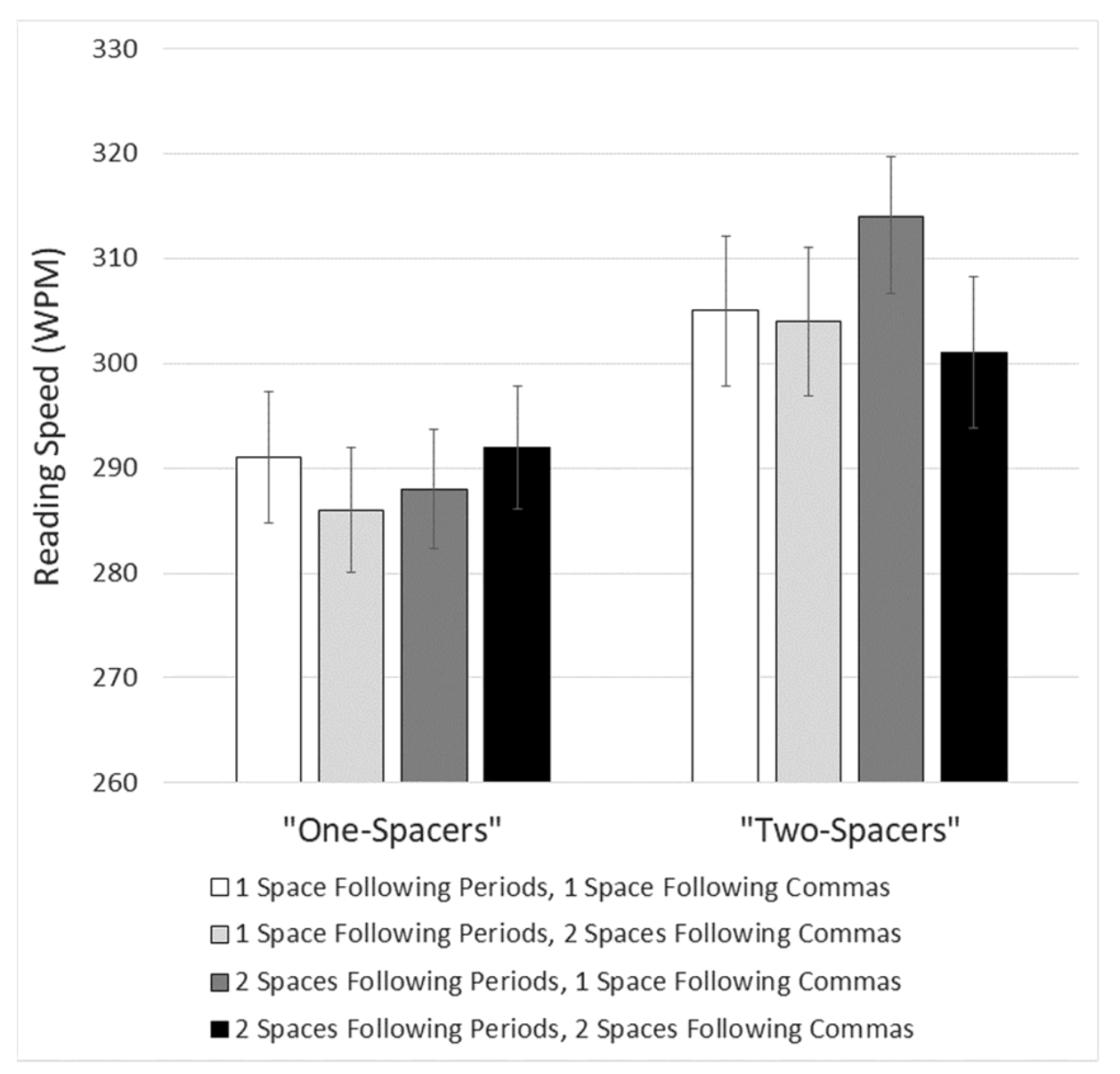
    An article by Matthew Butterick, responding to the study “Are two spaces bet­ter than one? The ef­fect of spac­ing fol­low­ing pe­ri­ods and com­mas dur­ing read­ing”, writ­ten by Re­becca John­son, Becky Bui, and Lind­say Schmitt.

    practicaltypography.com

    Subscribe now!

    … and get these links once a week via email. Subscribe now

    User Feedback

    Recommended Comments

    There are no comments to display.


    Create an account or sign in to comment

    You need to be a member in order to leave a comment

    Create an account

    Sign up for a new account in our community. It's easy!

    Register a new account

    Sign in

    Already have an account? Sign in here.

    Sign In Now

Our partners

The largest selection of professional fonts for any project. Over 130,000 available fonts, and counting.
Get to your apps and creative work. Explore curated inspiration, livestream learning, tutorials, and creative challenges.
Discover the Best Deals for Freelance Designers.
Discover the fonts from the Germany foundry FDI Type. A brand of Schriftkontor Ralf Herrmann.
Graublau Slab Pro: The expressive addition to the Graublau Sans family.
×
×
  • Create New...

🍪 Important Information:

This website uses functional cookies.