


Typography Weekly #77
6 typography news links in this category
-
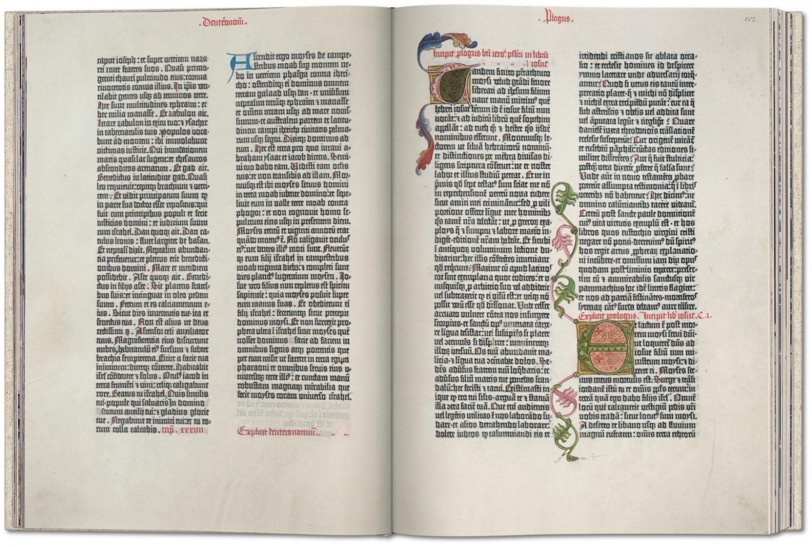
Published in Mainz around 1454, the Gutenberg Bible was the first major Western publication to be printed with movable metal type, ushering in a whole new age of knowledge distribution through mass-produced books. This fascimile edition derives from one of the very few surviving complete vellum Latin originals worldwide; the Göttingen Library edition, one of the most valuable books in the world, listed in the UNESCO Memory of the World program.
-
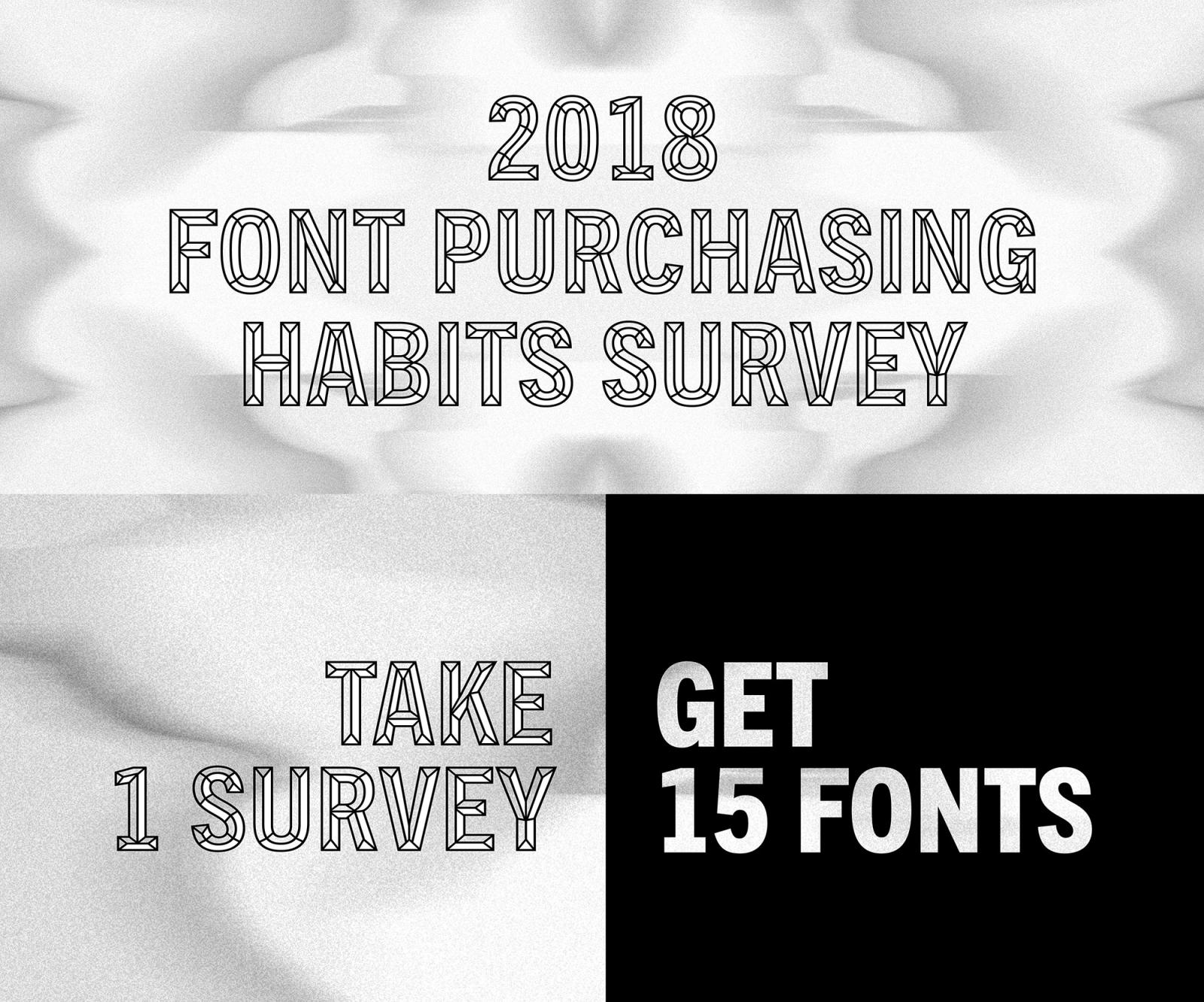
“Take the 2018 Font Purchasing Habits Survey to share your font preferences and purchasing habits. After completing the survey, you will receive a pack of 15 fonts for free.”
-
In this article, adapted from «TipoItalia» 3, De Franceschi deals with the popular Italian script face and shows more samples of its use
-
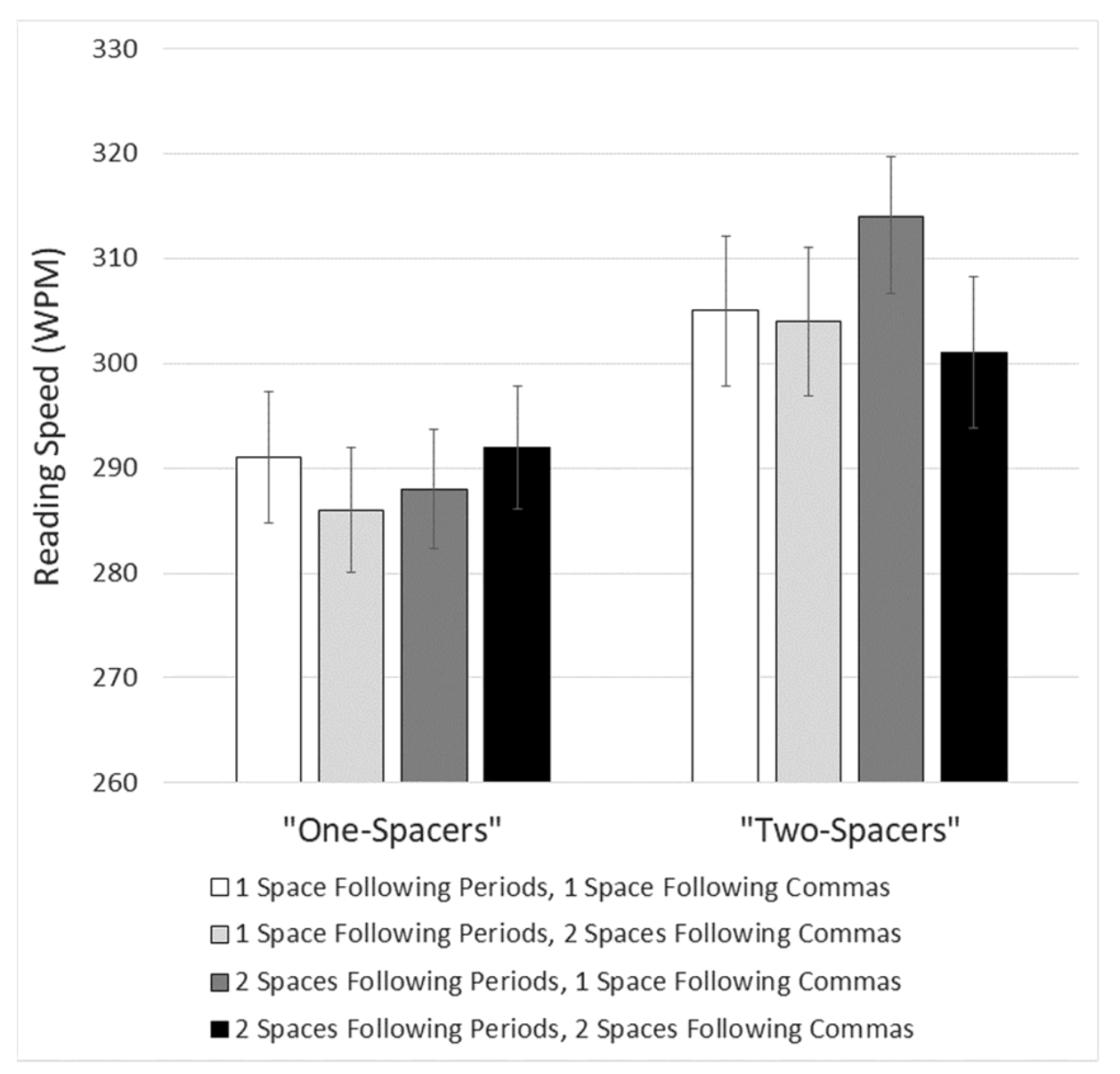
An article by Matthew Butterick, responding to the study “Are two spaces better than one? The effect of spacing following periods and commas during reading”, written by Rebecca Johnson, Becky Bui, and Lindsay Schmitt.
-
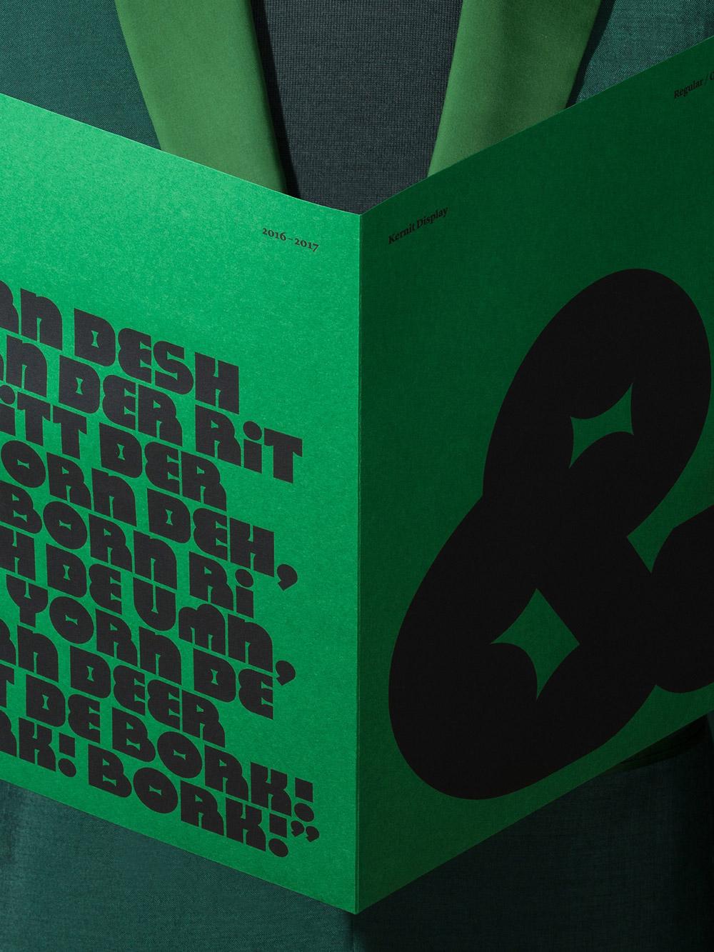
Kernit is a typeface inspired by the work and characters created by the late Jim Henson. It was developed as part of the initial design exploration for The Jim Henson Exhibition at The Museum of the Moving Image in New York City.
-
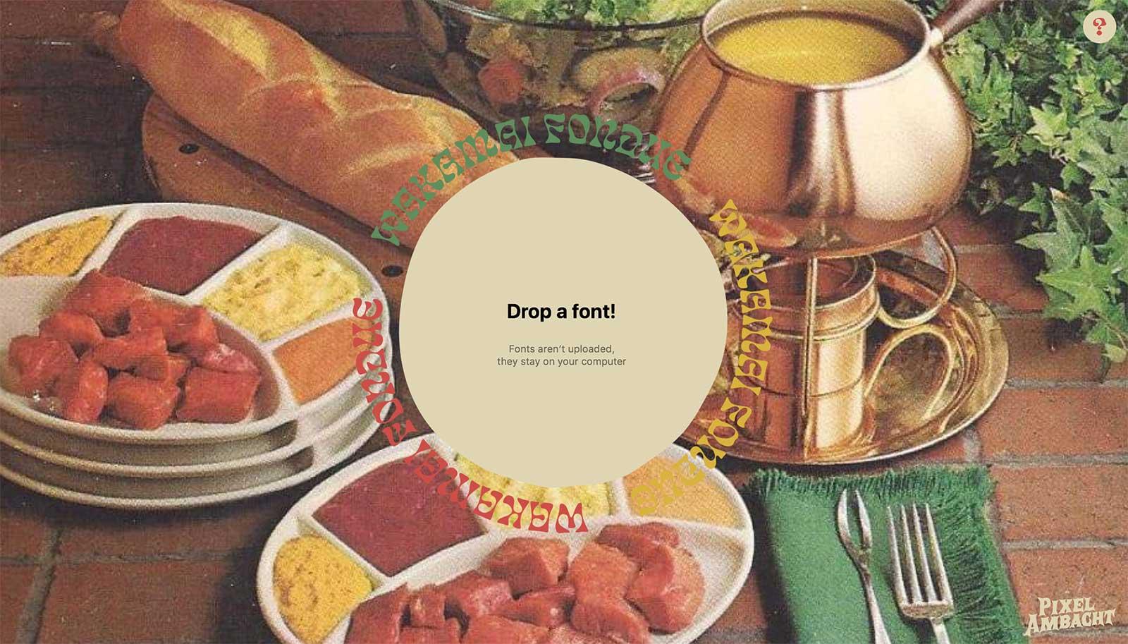
This tools by Pixel Ambacht shows font meta data, the character set, OpenType features, and generates CSS code for web use.


Don’t miss the latest typography news!
Typography Weekly via email: Subscribe here
Typography Weekly via RSS feed: Subscribe here

