Jump to content
Check out our exclusive articles, videos and font downloads on Patreon!
  • Type design science: Horizontal Is Perceived as Thicker than Vertical

    Open the Link

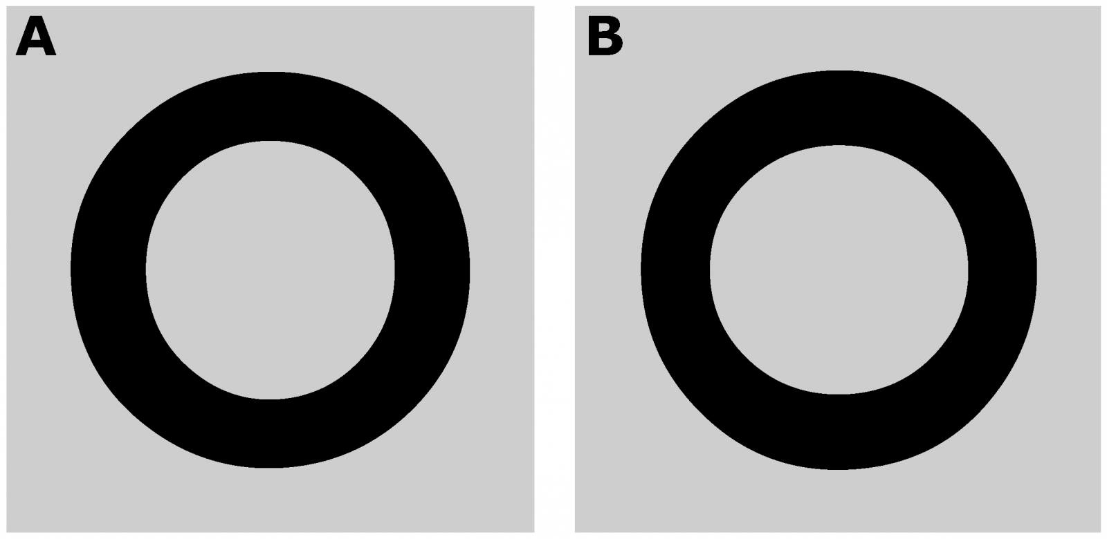
    “We report two psychophysical experiments that investigate a visual illusion that is considered common knowledge among type designers, but has never been studied scientifically. Specifically, the thickness of a horizontal line is overestimated in relation to that of a vertical line.”

    www.mdpi.com

    • very interesting! 1


    User Feedback

    Recommended Comments

    There are no comments to display.


    Create an account or sign in to comment

    You need to be a member in order to leave a comment

    Create an account

    Sign up for a new account in our community. It's easy!

    Register a new account

    Sign in

    Already have an account? Sign in here.

    Sign In Now

Our partners

Get to your apps and creative work. Explore curated inspiration, livestream learning, tutorials, and creative challenges.
Discover the Best Deals for Freelance Designers.
The largest selection of professional fonts for any project. Over 130,000 available fonts, and counting.
Discover the fonts from the Germany foundry FDI Type. A brand of Schriftkontor Ralf Herrmann.
Download the blackletter font FDI Wiking for free …
×
×
  • Create New...

Important Information

We are placing functional cookies on your device to help make this website better.