Skip to content

A typeface for visual impairment

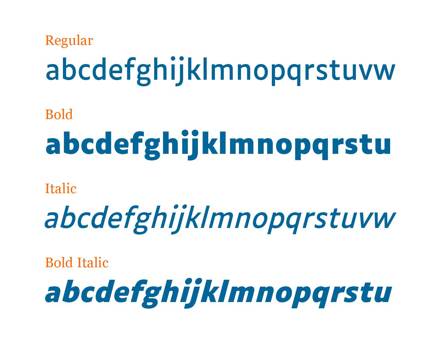
“Word massing, spacing, the structure of the letters: the concept for Luciole adheres to a dozen specific design criteria to provide the best possible reading experience for the visually impaired. Particular care has been taken in drawing the figures, mathematical signs, and punctuation.”
Available under a Creative Commons Attribution license.

User Feedback

Recommended Comments

Greg Yerbury

Standard Member

It is surprising that the lower case l doesn't have a little serif on it.. 

Riccardo Sartori

Standard Member
52 minutes ago, Greg Yerbury said:

It is surprising that the lower case l doesn't have a little serif on it.. 

The uppercase |I| has very prominent serifs, so there is no risk of confusion between the two. Of course, a |l| with a curved bottom remains identifiable even without (or with limited) context.

Create an account or sign in to comment

Don’t miss the latest typography news!

Typography Weekly via email: Subscribe here

Typography Weekly via RSS feed: Subscribe here

Important Information

We are placing functional cookies on your device to help make this website better.

Account

Navigation

Search

Search

Configure browser push notifications

Chrome (Android)
  1. Tap the lock icon next to the address bar.
  2. Tap Permissions → Notifications.
  3. Adjust your preference.
Chrome (Desktop)
  1. Click the padlock icon in the address bar.
  2. Select Site settings.
  3. Find Notifications and adjust your preference.