Typography Weekly #90
10 typography news links in this category
-
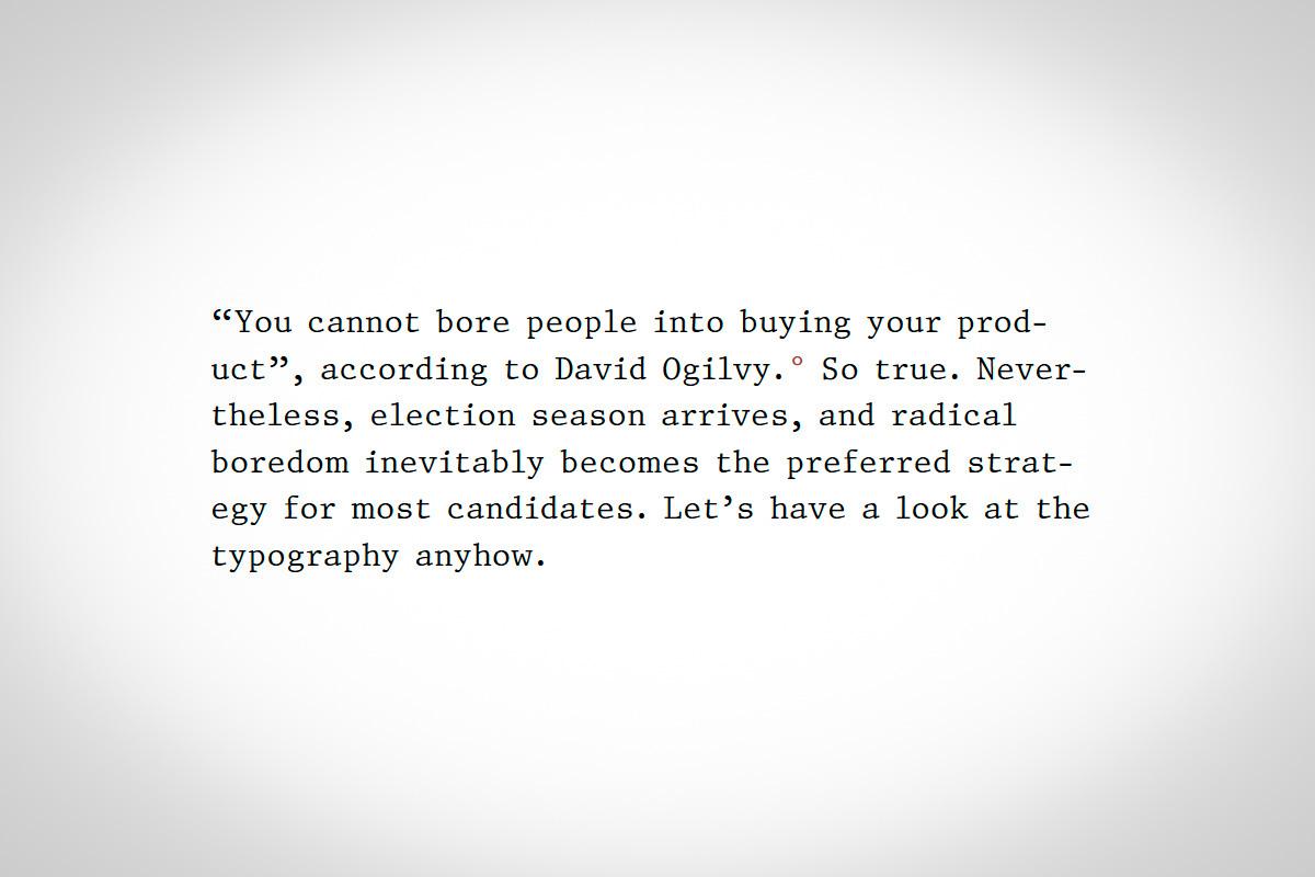
“Book publishers spend a lot on cover design. Candidates likewise spend a lot on their public presentation. Why? For the same reasons: voters (or readers) are going to make judgments based on design factors (whether consciously or not). So just as we should feel justified judging a book by its cover—because that’s what it’s for—we should likewise feel justified considering how typography reflects on each candidate.”
-
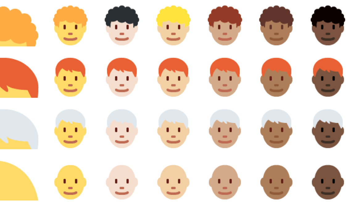
“To read Unicode’s own assessment, it sounds very much like the consortium would prefer to remove itself from the role of emoji arbiter by allowing anyone to send any characters they like, not only the emoji in the Unicode standard, as images embedded in their text.”
-
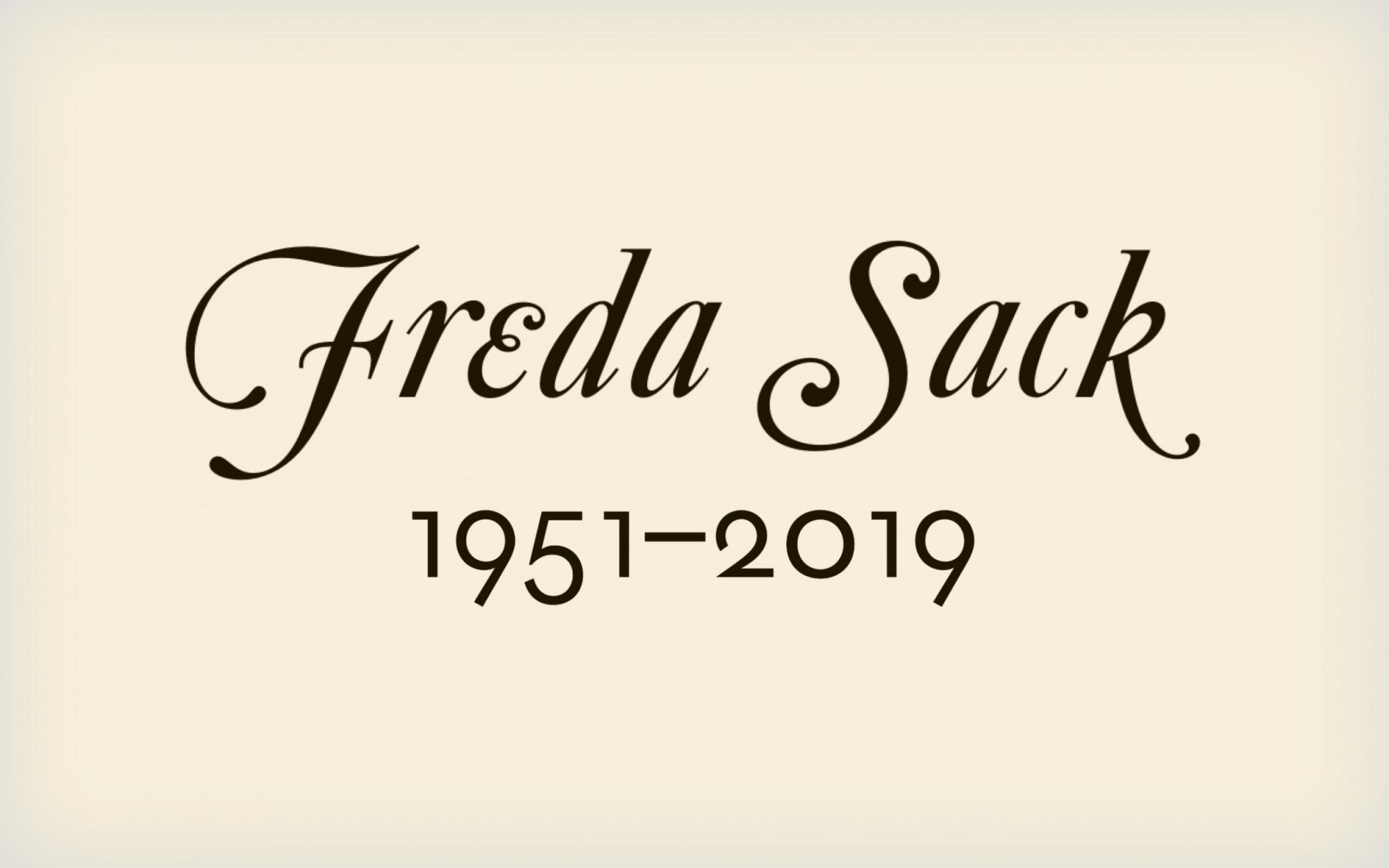
“Freda Sack was a type designer and typographer who took an important lead in shaping the professional craft of type design and, through her work with the International Society of Typographic Designers (ISTD), helped to improve standards and to enhance educational opportunities in the field of typography.”
-
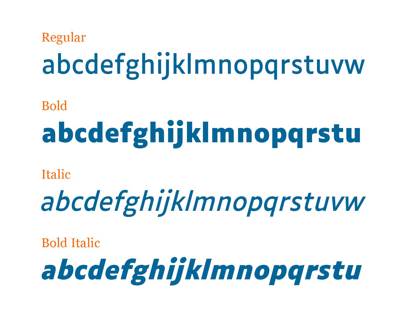
“Word massing, spacing, the structure of the letters: the concept for Luciole adheres to a dozen specific design criteria to provide the best possible reading experience for the visually impaired. Particular care has been taken in drawing the figures, mathematical signs, and punctuation.” Available under a Creative Commons Attribution license.
-
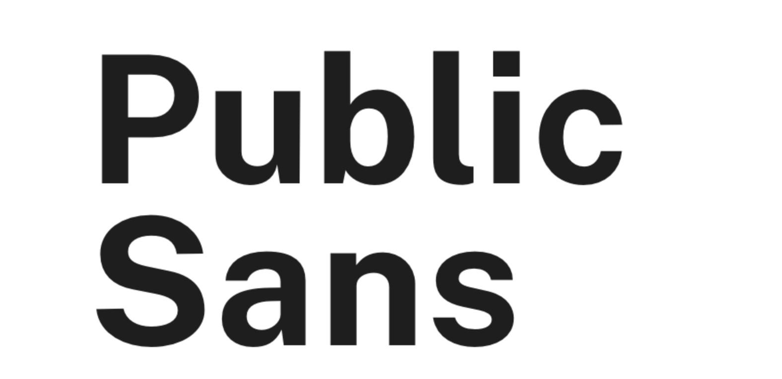
“Public Sans, a sharp new typeface for interface design has been made freely available, courtesy of a somewhat unusual source: the United States federal government.”
-
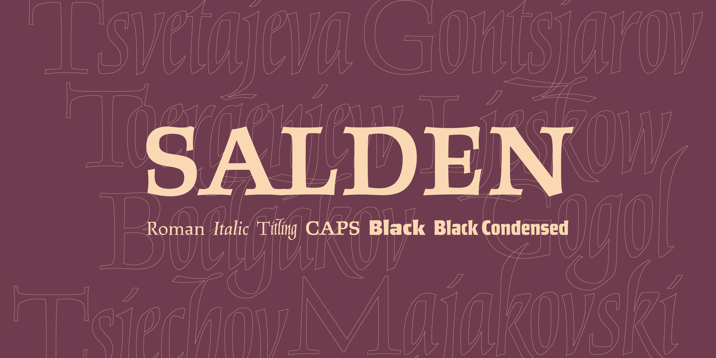
“The Salden fonts are our tribute to the man who was dubbed the face of the Dutch book, and whose work is considered essential in 20th century Dutch design history: Helmut Salden.”
-
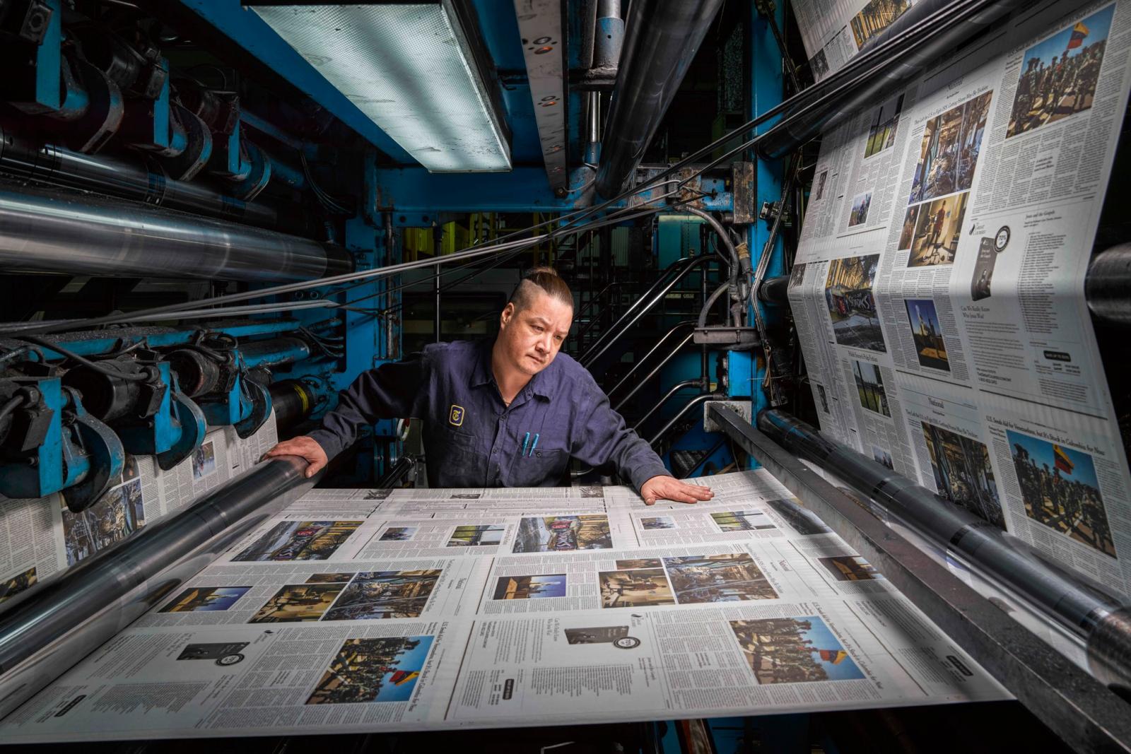
The photographer Christopher Payne spent two years shooting The Times’s printing plant in College Point, Queens. He captured the craft, precision, and unexpected beauty of the newspaper printing process.
-
-
“Pulpo is a friendly and comfortable looking slab serif typeface suitable for running text – a Clarendon using the skeleton of Century Schoolbook. Massive body well readable on screen and on newsprint paper.”
-
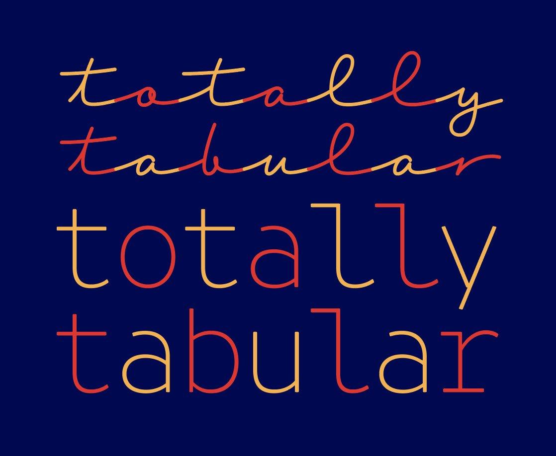
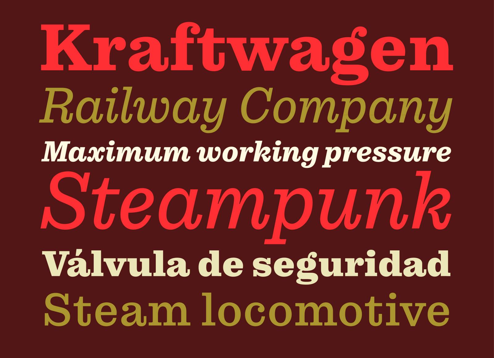
“Combining typefaces to convey a message is challenging, inspiring and fun but is also hard work. It takes time and practice. We have selected for you 10 awesome Fontown font combinations for all your design needs with a contemporary aesthetic. ¡We reveal the font pairings that is going to be trending in 2019!”


.jpg.04eea96f513bc94b697557d4d8445c0a.jpg)

Don’t miss the latest typography news!
Typography Weekly via email: Subscribe here
Typography Weekly via RSS feed: Subscribe here