Join our typography community!
A friendly online forum for all questions around fonts and typography. Get answers to all your typography questions or help others with your expertise.
Typography Feed (complete)
- Past hour
-
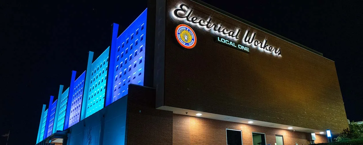
Trying to match the font used for the "Electrical Workers" letters. I believe this location is in Chicago. Commercial fonts are fine.
- Today
-
ariadna gomez zuñiga joined the community
- Last week
-
 Lipi.ai is an online platform for: identifying typefaces from images or screenshots, detecting a font's copyright and licensing status, generating new typefaces with AI, and Font Studio for hands-on customization. Available as a web app or an API for teams embedding typography workflows into their own products.
 -
fontGuy joined the community
-
Hector Ortiz joined the community
-
Thank you Kevin!
-
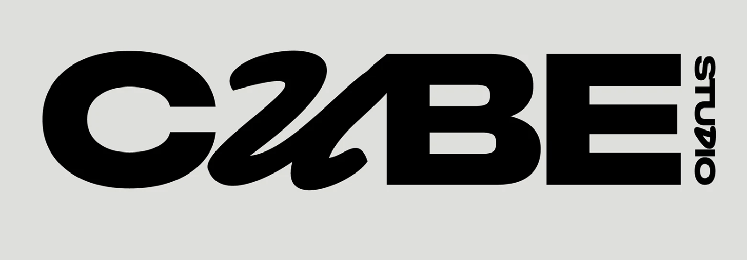
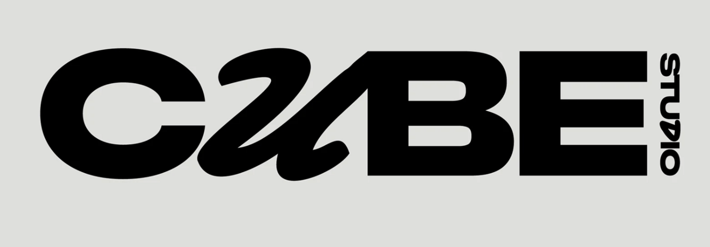
Strike that sans serif ID—it is very similar to an older version of Rules Gothic, but not a match to the version currently sold. Anybody ExtraExpanded ExtraBold is also similar.
-
For anyone who might be wondering what the sans serif is, it appears to be Rules Gothic Expanded Extra Bold, by Blaze Type
-
Appears to be custom. Similar: Mr Stalwart, Porongo (which seems to be based on the same Blumlein Script source)
-
I'm trying to identify the font used for the "u" in this design (and perhaps it is the same as the one used for the "D" in Studio). This is from a Behance project by Jennie Svartsjö Thank you for your sleuthing !
- Earlier
-
masthomsyndicate joined the community
-
Philip Jansseune joined the community
-
Julian joined the community
-
nicobacile joined the community
-
cabinetcat joined the community
-
MType joined the community
-
anggerdestamara joined the community
-
The double vé style of W is most often seen in serif typefaces, not sans serif. It may have to be something you construct yourself from two capital Vs. Equally difficult is finding a sans serif with that degree of calligraphic flare in the terminals. Typefaces similar to your sample (Burneside Grotesk by Atelier Dyakova, custom to its identity for Paper Foundation): Neue Freigeist Agrandir Caslon Doric Classic Grotesque TG Glifko
-
 “Many major graphics/publishing apps have missed the boat with their user interface choices for variable fonts. Given the ongoing steady growth of variable font usage and availability, it seems worth fixing things.”
 -
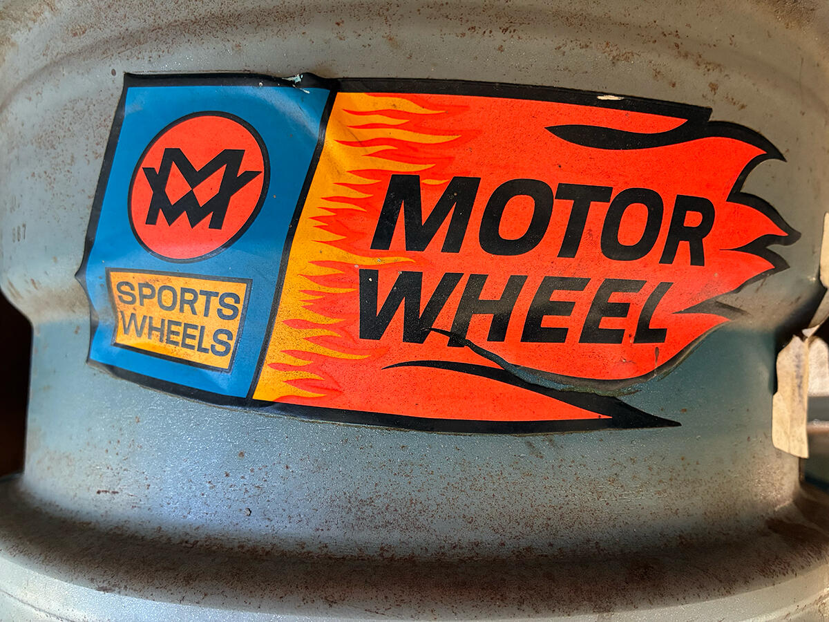
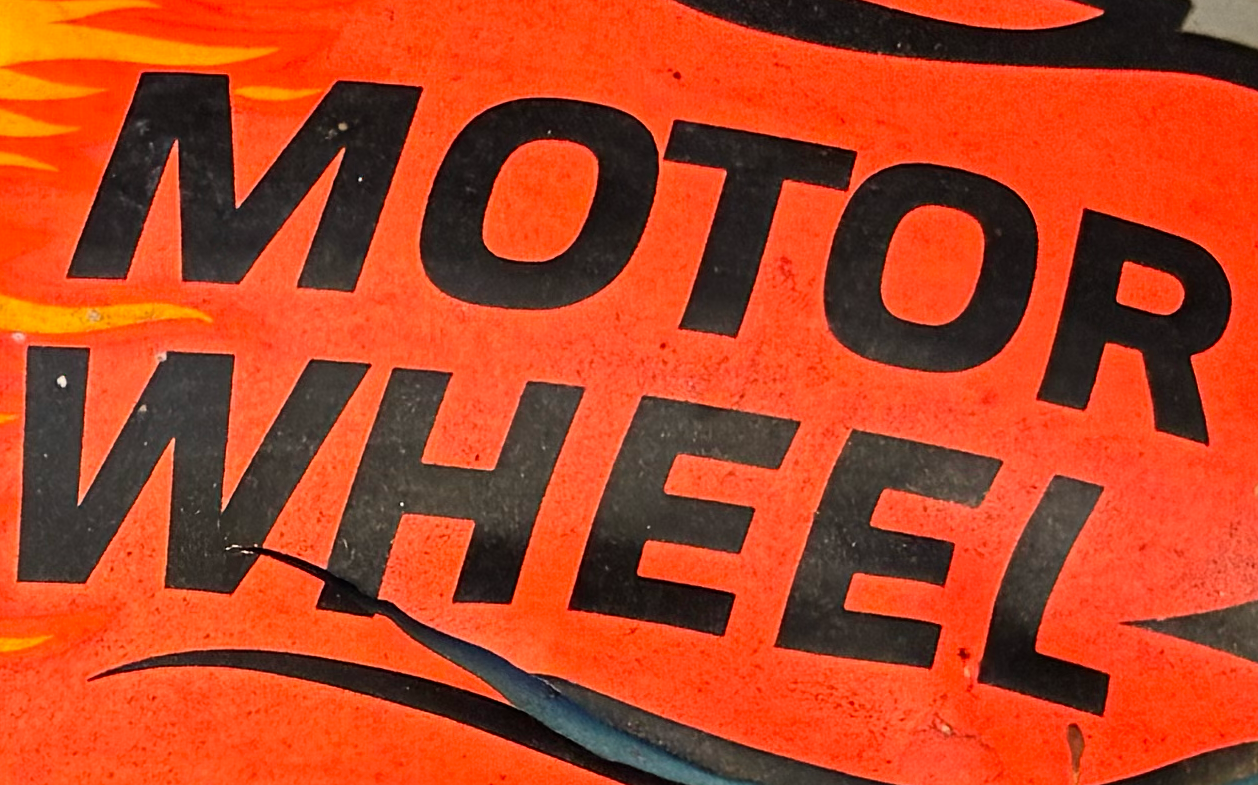
FF Clan is a solid call, thanks for looking! I am so strict about getting the repro 100 percent right. I know some faces were hand-drawn and there may not be a match but all the letterforms are consistent so I think its got to be a letraset or other, hard to find!
-
No luck with an ID of the original from the 60s or 70s yet, but one modern digital typeface replicates the look (save for the S): FF Clan Manual Medium, Tofino Wide Bold, Liberation Sans are other modern options that come close.
-
Hi all! I am having a tough time with ID of the typeface on this vintage 60s or 70s mag wheel (US) sticker. Cannot find any other image of it online, so any help appreciated! I am just looking to recreate the sticker for my friend and was looking to be as authentic as possible in terms of design and type. Looking to ID "MOTOR WHEEL" and "SPORTS WHELLS" looks like they are same family, diff weights.
-
BINGO!!!! tHaNk YoU!
-
Orator Used to be available digitally from Mecanorma as Orator MN, now available simply as Orator from Red Rooster.
-
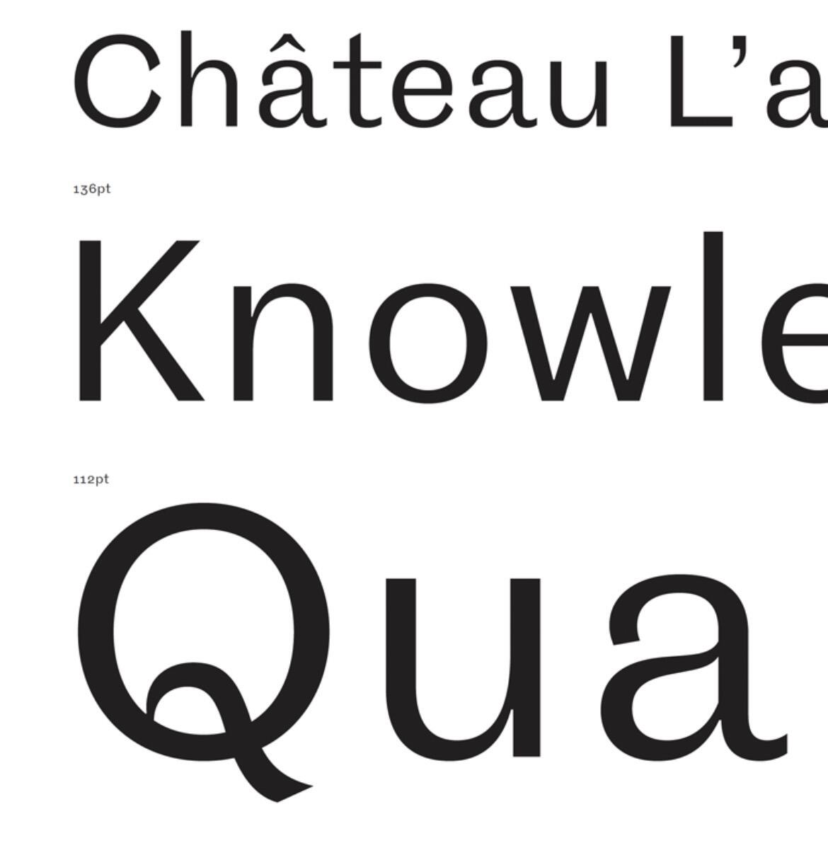
Hi all. I’m after a don’t like the image attached - something that has beautiful chiselled letterforms (see the capital Q). Going to be using in uppercase so something like this that ideally has a cap W where the centrally ascenders overlap to make a V type shape. Any examples of suitable faces would be fantastic. Thanks!
-
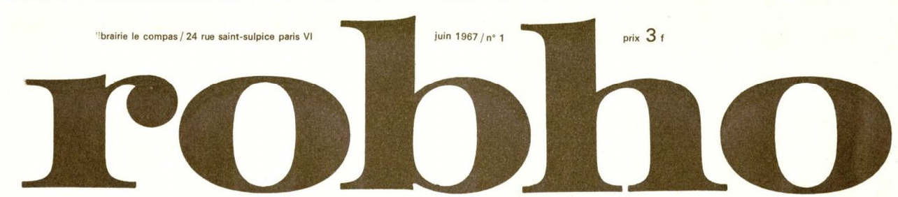
this masthead is from a french art criticism magazine named ROBHO published in 1967-71 by Jean Clay and Julian Blane. all 6 issues were designed by Carlos Cruz-Diez. i'm trying to identity the font of the masthead; any assistance please?
-
On a role... Thanks Kevin!
-
Thanks again Kevin! The clue was in the name!
-
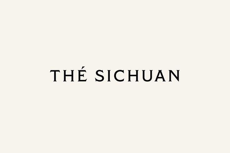
It is a bespoke typeface by Atelier Dyakova. Similar: Modesto, Capstone, Tiller Demi, Cantoria
-
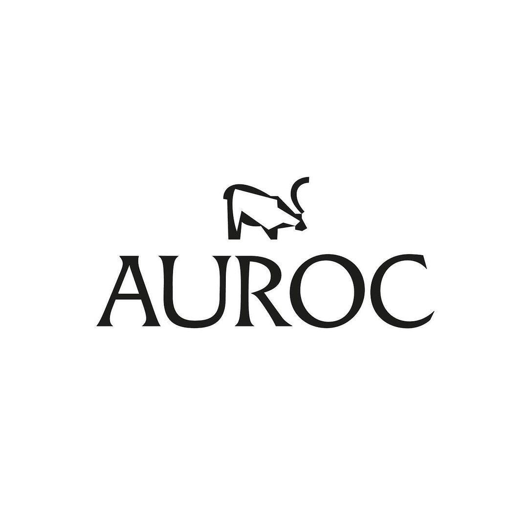
Not a company, but the actual name of the typeface—Auroc, by East of Rome. Your sample is a slightly earlier version (Version 0.3) than the one currently available for sale, as there are subtle differences.
-
My addled brain finally kicked in : it's Co Title if you're curious.
-
Hi all, I have another font i'm trying to source. It's for a fragrance brand. Trying to find something as close as possible. Thanks!
-
Hi Everyone, Have another font I'm trying to source. It's this for the company 'AUROC' - looks a little like Flareserif but some of the characters aren't correct, particularly the cap 'R' - thanks!
-
Thanks so much Kevin - Perfect!
-
Thanks Kevin !