


Join our typography community!
A friendly online forum for all questions around fonts and typography. Get answers to all your typography questions or help others with your expertise.
Typography Feed (complete)
- Today
-
Brilliant one more time, Kevin! 🤩
-
designmike joined the community
-
Negro (late 1920s) by Lucian Bernhard, also digitally revived as Berlin Sans
- Yesterday
-
VFC Besson is the closest I've found. https://www.myfonts.com/products/vfc-besson-vintage-fonts-collection-32746?queryId=undefined&index=universal_search_data&objectIDs=5414892002 Essay Display is kinda/sorta similar. https://www.myfonts.com/products/display-essay-322042?queryId=undefined&index=universal_search_data&objectIDs=8662906001
-
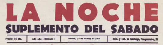
I want to know about the font used in the words «La Noche» and «Suplemento del sabado». Thanks a lot
- Last week
-
millionaireblitz joined the community
-
Need to match this font exactly so I can put it on a type path in Illustrator. It is for a plumbing client called Darnold & Lyons. darnoldandlyons.com

-
THAT'S IT!

-
chticamember joined the community
-
Foam seems to be based on Obliq, a Letraset typeface from 1984. Harold now offers it under the name Obligado.
-
Found a match if not similar, I found it as Foam by Harold Lohner, but can't find it anywhere for purchase. All I found is this: FOAM computer fonts v1.0 2006 Harold Lohner [email protected] www.haroldsfonts.com
-
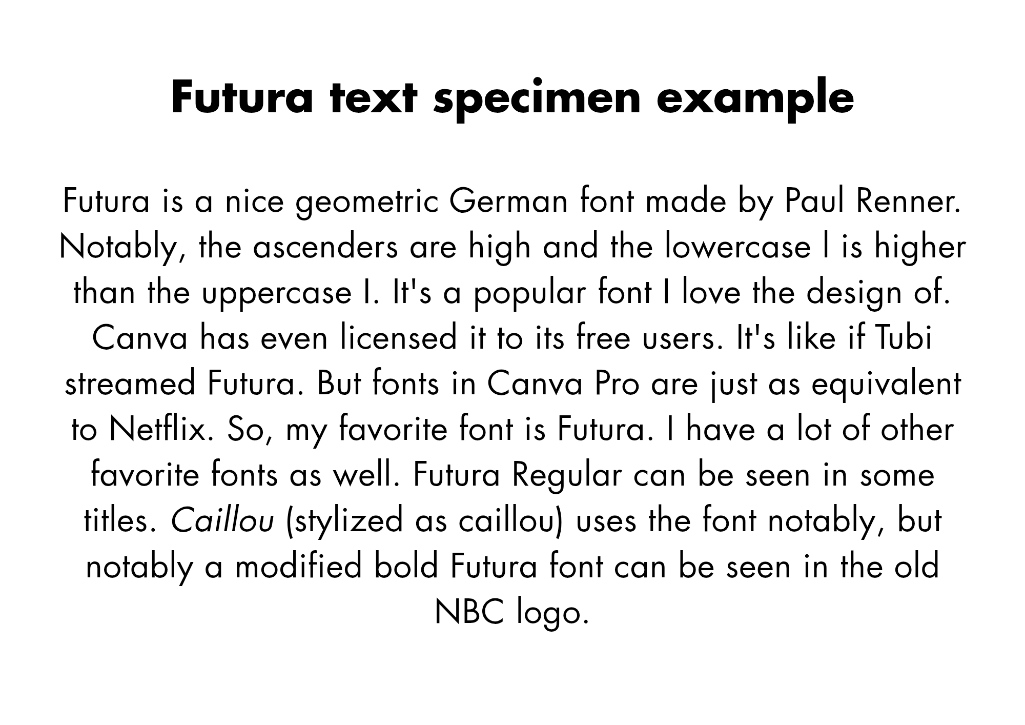
I use Futura for titles and headings. I have always liked it. I don't think it's suitable for body text.
-
I merged the accounts manually. (keeping the new one)
-
I could not find a way to take over my old Typophile account. So, I created a new account, hoping I could merge it, but I still can't find anything. All I can find is this post. My typophile account name was levonk. Apparently, I have only 4 posts in that account. I don't know if the low number of posts is the problem.
-
lkardash joined the community
-
Imprimo joined the community
-
Yeah I love the design of Futura, a lot. An Italian typeface named Forma looks like a blend of Helvetica and Futura. I think Futura looks nice. I like using it. How would I get more into typography, since I used Canva. I like fonts like Futura, Gill Sans, Proxima Nova and Gotham for being geometric.
-
Night Flight was a programming block on USA Network from 1981-1988.
-
jwg2695 joined the community
-
I like the design of this font, and it looks good. I have some example sentences. What are you thoughts on futura?

-
chesstounette joined the community
-
A.C. Jung joined the community
-
thanks Ralf :)
-
miguel_flaco joined the community
-
Nice! Thank Ralf, that was quick!
-
Modern Gothic. ☞ https://www.allcapstype.com/typefaces/modern-gothic
-
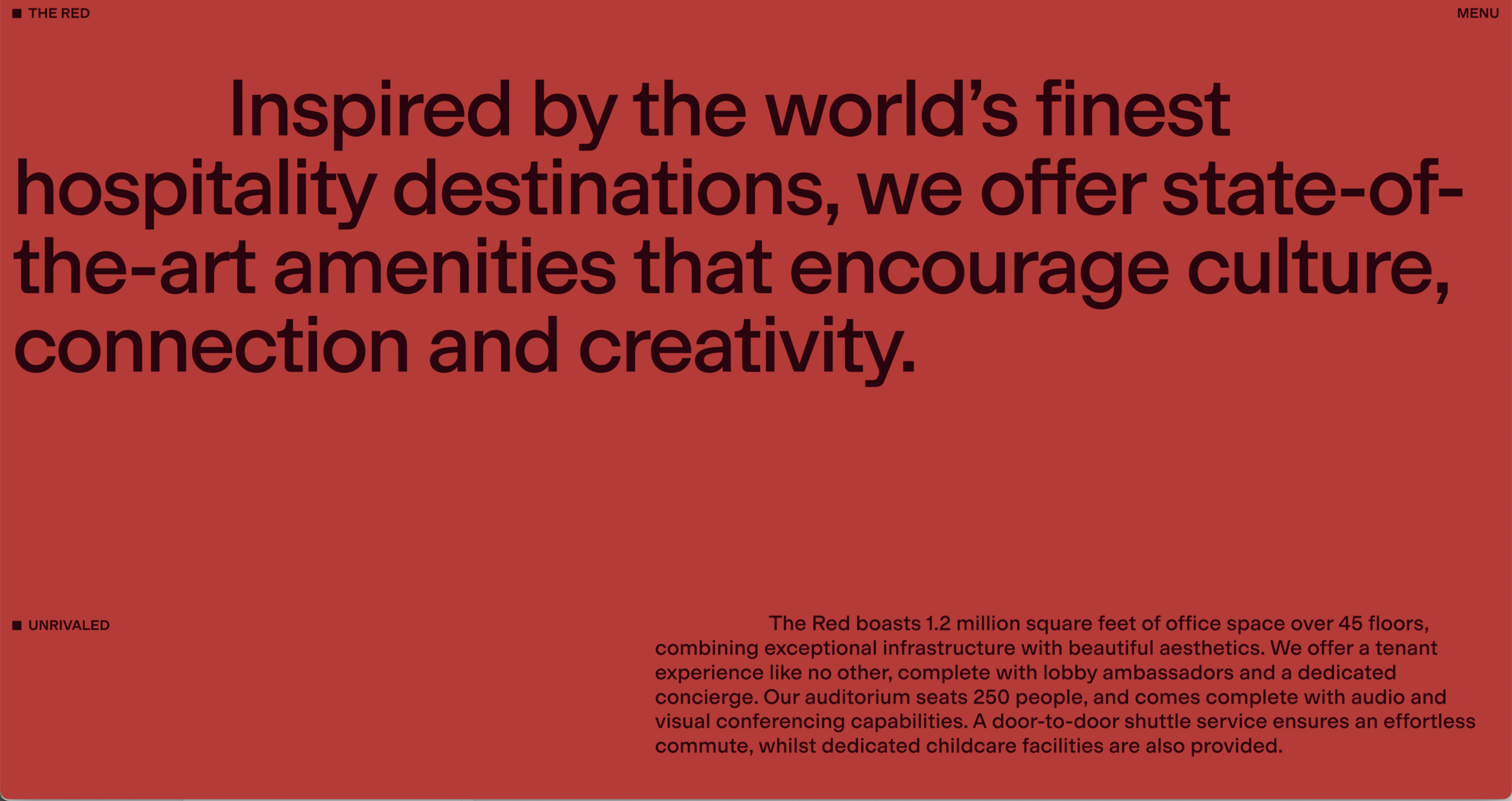
Hi! I'm trying to identify the typeface used on this website. https://www.333southwabash.com/the-red I'm curious about this typeface and was wondering if anyone recognizes it. When I inspect the page elements, the font name appears only as "MG". It's a really nice website, designed by Made Thought and developed by Aristide Benoist. I've been searching for quite a while and can't seem to find it. I'm almost certain I've seen this typeface before, but I can't remember its name. Do you think it's a custom typeface, or does it resemble an existing font family? Thanks for any leads!


-
Mario joined the community
-
Hiroshige ☞ https://fontsinuse.com/typefaces/4154/hiroshige
-
Early backend; capable of graphics; several grayscales; DIN A4; full page can be displayed; page layout can be checked before setting on film (backEnd); for the time a high-resolution screen. It was the beginning of WYSIWYGLinotype Certronic 300 Input device (frontend; CRTronic) Disadvantages: not graphic-capable; no enlargement; character matrix and number of characters specified; reduced ASCii code so, for example, no German special characters can be displayed. Typeview 300Some flavor of Garamond—Simoncini Garamond seems a likely culprit. EDIT: Upon further study, I suspect this is actually Sabon, given the italic j and f.Free: https://www.1001fonts.com/search.html?search=CaslonArial was designed as a replacement for Helvetica, and to be metrically compatible with Helvetica. A few glyphs are different but, for the most part, I regard them as interchangeable.


Important Information
We are placing functional cookies on your device to help make this website better.